Quantcast
Channel: R tutorial for Spatial Statistics
Viewing all 44 articles
Browse latest View live

Box-plot with R – Tutorial

$
0
0


Yesterday I wanted to create a box-plot for a small dataset to see the evolution of 3 stations through a 3 days period. I like box-plots very much because I think they are one of the clearest ways of showing trend in your data. R is extremely good for this type of plot and, for this reason, I decided to add a post on my blog to show how to create a box-plot, but also because I want to use my own blog to help me remember pieces of code that I might want to use in the future but that I tend to forget.
For this example I first created a dummy dataset using the function rnorm() which generates random normal-distributed sequences. This function requires 3 arguments, the number of samples to create, the mean and the standard deviation of the distribution, for example: 

rnorm(n=100,mean=3,sd=1)

This generates 100 numbers (floats to be exact), which have mean equal to 3 and standard deviation equal to 1.
To generate my dataset I used the following line of code:

data<-data.frame(Stat11=rnorm(100,mean=3,sd=2),
Stat21=rnorm(100,mean=4,sd=1),
Stat31=rnorm(100,mean=6,sd=0.5),
Stat41=rnorm(100,mean=10,sd=0.5),
Stat12=rnorm(100,mean=4,sd=2),
Stat22=rnorm(100,mean=4.5,sd=2),
Stat32=rnorm(100,mean=7,sd=0.5),
Stat42=rnorm(100,mean=8,sd=3),
Stat13=rnorm(100,mean=6,sd=0.5),
Stat23=rnorm(100,mean=5,sd=3),
Stat33=rnorm(100,mean=8,sd=0.2),
Stat43=rnorm(100,mean=4,sd=4))

This line creates a data.frame with 12 columns that looks like this:


Stat11
Stat21
Stat31
Stat41
Stat12
Stat22
Stat32
Stat42
Stat13
Stat23
Stat33
Stat43
5
2
9
-3
10
4
1
1
4
1
5
9
6
13
8
3
7
3
10
10
10
5
9
8
4
4
6
0
10
6
7
6
6
8
2
7
6
7
6
3
9
1
7
0
1
0
6
0
0
2
8
1
6
8
0
8
3
10
9
8
0
19
10
0
11
10
5
6
5
8
10
1
7
4
5
-5
7
0
3
5
2
5
5
3
4
12
9
-4
7
1
9
0
7
2
1
7
7
3
9
0
11
0
8
1
7
0
7
7
6
19
8
3
10
10
9
6
0
2
8
2
6
13
6
-5
12
8
1
4
0
4
5
10
8
11
6
-1
11
4
4
1
4
6
6
10
8
13
5
-5
7
10
0
4
2
7
3
1
2
8
5
-2
5
7
4
2
7
0
3
1
8
11
7
3
11
1
0
9
2
3
5
8
4
19
5
-1
11
6
3
4
9
5
9
0
2
9
5
-3
12
7
6
4
8
2
6
8
7
10
5
-4
8
9
6
9
1
4
3
4


As I mentioned before, this should represent 4 stations for which the measure were replicated in 3 successive days.
Now, for the creation of the box-plot the simplest function is boxplot() and can be simply called by adding the name of the dataset as only argument:

boxplot(data)

This creates the following plot:

 It is already a good plot, but it needs some adjustments. It is in black and white, the box-plots are evenly spaced, even though they are from 3 different replicates, there are no labels on the axis and the names of the stations are not all reported.


So now we need to start doing some tweaking.
First, I want to draw the names of the stations vertically, instead of horizontally. This can be easily done with the argument las. So now the call to the function boxplot()becomes:

boxplot(data, las =2)

This generates the following plot:


Next, I want to change the name of the stations so that they look less confusing. For doing that I can use the option names:

boxplot(data, las =2, names=c("Station 1","Station 2","Station 3","Station 4","Station 1","Station 2","Station 3","Station 4","Station 1","Station 2","Station 3","Station 4"))


which generates this plot:


If the names are too long and they do not fit into the plot’s window you can increase it by using the option par:

boxplot(data, las =2, par(mar =c(12, 5, 4, 2)+0.1), names=c("Station 1","Station 2","Station 3","Station 4","Station 1","Station 2","Station 3","Station 4","Station 1","Station 2","Station 3","Station 4"))


Now I want to group the 4 stations so that the division in 3 successive days is clearer. To do that I can use the option at, which let me specify the position, along the X axis, of each box-plot:

boxplot(data, las =2, at =c(1,2,3,4, 6,7,8,9, 11,12,13,14), par(mar =c(12, 5, 4, 2)+0.1), names=c("Station 1","Station 2","Station 3","Station 4","Station 1","Station 2","Station 3","Station 4","Station 1","Station 2","Station 3","Station 4"))

Here I am specifying that I want the first 4 box-plots at position x=1, x=2, x=3 and x=4, then I want to leave a space between the fourth and the fifth and place this last at x=6, and so on.


If you want to add colours to your box plot, you can use the option col and specify a vector with the colour numbers or the colour names. You can find the colour numbers here, and the colour names here


Here is an example:

boxplot(data, las =2, col=c("red","sienna","palevioletred1","royalblue2","red","sienna","palevioletred1", 
"royalblue2","red","sienna","palevioletred1","royalblue2"),
 at =c(1,2,3,4, 6,7,8,9, 11,12,13,14), par(mar =c(12, 5, 4, 2)+0.1)
 names=c("Station 1","Station 2","Station 3","Station 4","Station 1","Station 2","Station 3","Station 4","Station 1","Station 2","Station 3","Station 4"))


Now, for the finishing touches, we can put some labels to plot.
The common way to put labels on the axes of a plot is by using the arguments xlab and ylab.
Let’s try it:


boxplot(data, ylab ="Oxigen (%)", xlab ="Time", las =2, col=c("red","sienna","palevioletred1","royalblue2","red","sienna","palevioletred1","royalblue2","red","sienna","palevioletred1","royalblue2"),at =c(1,2,3,4, 6,7,8,9, 11,12,13,14), par(mar =c(12, 5, 4, 2)+0.1), names=c("Station 1","Station 2","Station 3","Station 4","Station 1","Station 2","Station 3","Station 4","Station 1","Station 2","Station 3","Station 4"))


I just added the two arguments highlighted, but the result is not what I was expecting 


As you can see from the image above, the label on the Y axis is place very well and we can keep it. On the other hand, the label on the X axis is drawn right below the stations names and it does not look good.
To solve this is better to delete the option xlab from the boxplot call and instead use an additional function called mtext(), that places a text outside the plot area, but within the plot window. To place text within the plot area (where the box-plots are actually depicted) you need to use the function text().
The function mtext() requires 3 arguments: the label, the position and the line number.
An example of a call to the function mtext is the following:

mtext(“Label”, side = 1, line = 7)

the option side takes an integer between 1 and 4, with these meaning: 1=bottom, 2=left, 3=top, 4=right

The option line takes an integer with the line number, starting from 0 (which is the line closer to the plot axis). In this case I put the label onto the 7th line from the X axis.

With these option you can produce box plot for every situation.

The following is just one example:

This is the script:


data<-data.frame(Stat11=rnorm(100,mean=3,sd=2), Stat21=rnorm(100,mean=4,sd=1), Stat31=rnorm(100,mean=6,sd=0.5), Stat41=rnorm(100,mean=10,sd=0.5), Stat12=rnorm(100,mean=4,sd=2), Stat22=rnorm(100,mean=4.5,sd=2), Stat32=rnorm(100,mean=7,sd=0.5), Stat42=rnorm(100,mean=8,sd=3), Stat13=rnorm(100,mean=6,sd=0.5), Stat23=rnorm(100,mean=5,sd=3), Stat33=rnorm(100,mean=8,sd=0.2), Stat43=rnorm(100,mean=4,sd=4))boxplot(data, las=2, col=c("red","sienna","palevioletred1","royalblue2","red","sienna","palevioletred1","royalblue2","red","sienna","palevioletred1","royalblue2"), at=c(1,2,3,4, 6,7,8,9, 11,12,13,14), par(mar=c(12, 5, 4, 2)+0.1), names=c("","","","","","","","","","","",""), ylim=c(-6,18))#Station labelsmtext("Station1", side=1, line=1, at=1, las=2, font=1, col="red")mtext("Station2", side=1, line=1, at=2, las=2, font=2, col="sienna")mtext("Station3", side=1, line=1, at=3, las=2, font=3, col="palevioletred1")mtext("Station4", side=1, line=1, at=4, las=2, font=4, col="royalblue2")mtext("Station1", side=1, line=1, at=6, las=2, font=1, col="red")mtext("Station2", side=1, line=1, at=7, las=2, font=2, col="sienna")mtext("Station3", side=1, line=1, at=8, las=2, font=3, col="palevioletred1")mtext("Station4", side=1, line=1, at=9, las=2, font=4, col="royalblue2")mtext("Station1", side=1, line=1, at=11, las=2, font=1, col="red")mtext("Station2", side=1, line=1, at=12, las=2, font=2, col="sienna")mtext("Station3", side=1, line=1, at=13, las=2, font=3, col="palevioletred1")mtext("Station4", side=1, line=1, at=14, las=2, font=4, col="royalblue2")#Axis labelsmtext("Time", side=1, line=6, cex=2, font=3)mtext("Oxigen (%)", side=2, line=3, cex=2, font=3)#In-plot labelstext(1,-4,"*")text(6,-4,"*")text(11,-4,"*")text(2,9,"A",cex=0.8,font=3)text(7,11,"A",cex=0.8,font=3)text(12,15,"A",cex=0.8,font=3)


Interfacing R and Google maps

$
0
0

Introduction

I couple of weeks ago I had an idea for a website where people can collaborate to create the first real Audio Atlas, using the power of the Google Maps API. The problem was that I do some programming in R but I did know very few things about HTML and javascript. However, I knew that having a project was a good way to get serious about learning a bit of these two languages. So I started reading some books about how to use the Google API, I borrowed some code from other, more experienced, programmers (whom I thank very very much!!!) and in the end I created a website called Audioramio.com. Here you can come, record your voice and add it to the map. If everyone helps a tiny bit we can try and build the first Audio Atlas!!

While I was writing the code to build this site I realize that it would be very cool to be able to interface the Google maps API with R. I thought about it because in the past it happened that I created some map of soil properties where on the same location I had multiple data to show. The classic example is that you perform kriging and you end up with the actual estimation, plus the uncertainty. Normally, what you do is showing two maps or if you are familiar with webGIS you can produce an interactive website where the user can select which of the two maps to show. However, it would be good to have a way to perform some kind of analysis on these data “on the fly”. So I start thinking at a way to do exactly that, to create a website where on one end you have the map, while on the other it shows some plot or at least a summary of the data. I start looking into it and I found out that the team at RStudio had created a magnificent tool, called Shiny, which is able to create an interactive webpage in HTML and javascript where the user can change interactively some parameters and the page react accordingly, changing the plot or the summary. This is just one example: spark.rstudio.com/uafsnap/RV_distributions

To create a Shiny app you simply create two .R scripts, once for the user interface and one for the server side where you specify the analysis you want to perform and the variable the user can tweak. For more info you can read the tutorial or take a look at this blog, by Matt Leonawicz.

The interesting thing is that Shiny is also able to work with the server.r script, plus a user interface completely created in HTML5 and javascript. So potentially Shiny can be used for almost everything, and specifically it can be used to plot a Google map on the side of a Histogram, for example. The problem with this idea is that it is difficult to let the two application share information. Shiny has been built around an interactive console concept, meaning that the HTML pages are created for the user to interact with R inputs and generate dynamic outputs. However, with the Google Maps API, as far as I know, it is not possible to extract data from the markers on the map. You can add an infowindow with lots of information, but it is impossible to export these data to other applications. I solved this by working around it. I created a .json file with an array of all the coordinates of the points. Then in javascript I created a simple loop that generates, from the coordinates, a series of markers. Instead of attaching an infowindow to them, I created a function that for each elements in the loop, when the point is clicked it updates a certain text form in the Shiny interface. It seems complicated, but it is actually very basic stuff. I attached an image of the console, so that I can better explain.


As you can see, the Shiny console is very basic. There is a single text input and a single plot output. The text input is connected to a subset call, and the input number is the row of the data file to be subseted. So when I click on the point, its ID goes to update the ID field (in the Shiny interface), and the focus goes on that. Now, I need to click “enter” 2 times and the plot is updated.


Code Description

Now let’s take a closer look at the code, starting from the interface.
In Red you have the bits of code related to the Google maps API, while in Green you have the bits related to Shiny.


<!DOCTYPE html>
<html>

<head>
<title>Interfacing R and Google maps</title>
<meta charset=utf-8">
<script src="http://code.jquery.com/jquery-1.10.2.min.js" type="text/javascript"></script>
<script src="shared/shiny.js" type="text/javascript"></script>
<link rel="stylesheet" type="text/css" href="shared/slider/css/jquery.slider.min.css"/>
<script src="shared/slider/js/jquery.slider.min.js"></script>
<link rel="stylesheet" type="text/css" href="shared/shiny.css"/>

<script type="text/javascript"
src="https://maps.googleapis.com/maps/api/js?&sensor=false&language=en">
</script>
<script type="text/javascript" src="http://www.fabioveronesi.net/ShinyApp/Points2.json"></script>

<script type="text/javascript">
var cluster = null;


function SetValue(i) {
document.getElementById("row").value = i;
document.getElementById("row").focus();
}


function initialize() {
var mapOptions = {
center: new google.maps.LatLng(51.781436,-1.03363),
zoom: 8,
mapTypeId: google.maps.MapTypeId.ROADMAP
};
var map = new google.maps.Map(document.getElementById("map-canvas"),
mapOptions);


var Layer0 = new google.maps.KmlLayer("http://www.fabioveronesi.net/ShinyApp/layer0.kml");
var Layer1 = new google.maps.KmlLayer("http://www.fabioveronesi.net/ShinyApp/layer1.kml");

document.getElementById('lay0').onclick = function() {
Layer0.setMap(map);
};

document.getElementById('lay1').onclick = function() {
Layer1.setMap(map);
};

var Gmarkers = [];
var infowindow = new google.maps.InfoWindow();

for (var i = 0; i < Points.length; i++) {
var lat = Points[i][1]
var lng = Points[i][0]
var marker = new google.maps.Marker({
position: new google.maps.LatLng(lat, lng),
title: i.toString(),
icon: 'http://www.fabioveronesi.net/ShinyApp/icon.png',
map: map
});

google.maps.event.addListener(marker, 'click',
(function(i) {
return function() {
SetValue(i+1);

}
})(i));


Gmarkers.push(marker);
};


document.getElementById('clear').onclick = function() {
Layer1.setMap(null);
Layer0.setMap(null);
};

};


google.maps.event.addDomListener(window, 'load', initialize);
</script>


</head>

<body>
<h1>Interfacing R with Google maps</h1>

<label for="row">ID:</label>
<input name="row" id="row" type="number" value="1"/>


<button type="button" id="lay1">Add Mean</button>
<button type="button" id="lay0">Add SD</button>
<button type="button" id="clear">Clear Map</button>


<div id="plot" class="shiny-plot-output"
style="position:absolute;top:20%;right:2%;width: 40%; height: 40%"></div>


<div id="map-canvas" style="position:absolute;top:20%;left:2%;width: 50% ; height: 50%"></div>
</body>

</html>


As you can see I have two Shiny elements: the plot of the right side and and ID text input on the top left. These are the elements that interact directly with R. To these, I simply added a map frame plus three buttons to show my data and clear the frame, if needed. The communication between Shiny and the API is done purely by these lines:


google.maps.event.addListener(marker, 'click',
(function(i) {
return function() {
SetValue(i+1);

}
})(i));

What this says is that when I click on any marker the custom function SetValue will kick in. This function simply change the value in the ID text field to the one of i, which is the element of the loop and the ID of the marker.

Now, let's see what this ID text field controls. Here is the server.R code:

library(shiny)

data_file<-read.table("http://www.fabioveronesi.net/ShinyApp/point_grid.csv",sep=";",header=T)


shinyServer(function(input,output){

output$plot <- renderPlot({
sub<-data_file[input$row,]
data<-rnorm(10000,mean=sub$Wind_Media,sd=sub$StDev_smoo)
hist(data)
})


})
The R code is extremely simple. I have one input, ID, which is used to subset the data_file data.frame and one output, which is the histogram plot.


Problems with this approach

Now let’s talk about the problems with this approach.

The first is that the plot does not update automatically, the user needs to click “enter” 2 times before this to happen. However, this may not be a problem after all, simply because as soon as the R script becomes more complex, and its execution time longer, it is good to have a way to avoid updating the plot all the time I accidentally click a point on the map.

The second problem is related to the Google Maps API and the way it shares data. In general, when I plot markers on the map the only way to access their data is clicking on them and look at the infowindow. This is not true for KMZ map layers. When I plot a raster layer on the map it is treated exactly as an image (it is in fact a .png file georeferenced inWGS84), and it is therefore impossible to access its data. The only way to plot a map and give the user a way to access it is by plotting a marker layer on top of it, with invisible icons so that they do not disturb the visualization of the map. When the user clicks of the map, he is clicking on the invisible markers layer that triggers the Id field update. However, if I increase the zoom level the markers get smaller and therefore it becomes more difficult to click on them. So accessing the map is possible only at the zoom level at which it is presented. A way to solve this would be showing (by using a different icon, maybe a point) the markers, but when they are on a grid their visual impact is not very pretty at all.


Conclusions

I think this approach has the potential to be used for very cool mapping experiments. It relies directly on all the packages available in R and therefore it can virtually visualize every sort of statistics from the map. However, it is a bit difficult to set up, because you need to transform all of your data into KML, extract the coordinates of your cells into WGS84, and transform them into a .json array. For these steps I used ArcGIS and Notepad++. They are not difficult to complete, but they may take half of your working day or more, depending on your dataset.

A possible, quicker, alternative is http://www.jstat.org/. However, I never used it and so I do not know how to set it up for working with the Google Maps API. In addition, I do not think it has the same potential as R for performing mind blowing statistics.


Download

To run the App on your PC just open R, install the package shiny and run these two lines:

library(shiny)

runUrl("http://www.fabioveronesi.net/ShinyApp/InterfacingRGoogleMaps.zip")

Displaying spatial sensor data from Arduino with R on Google Maps

$
0
0

For Christmas I decided to treat myself with an Arduino starter kit. I started doing some basic experiments and I quickly found out numerous website that sell every sort of sensor: from temperature and humidity, to air quality.

Long story short, I bought a bunch of sensors to collect spatial data. I have a GPS, accelerometer/magnetometer, barometric pressure, temperature/humidity, UV Index sensor.

Below is the picture of the sensors array, still in a breadboard version. Of course I also had to use an Arduino pro mini 3.3V and an openlog to record the data. Below the breadboard there is a 2200mA lithium battery that provides 3.7V to the Arduino pro mini.


With this system I can collect 19 columns of data: Date, Time, Latitude and Longitude, Speed, Angle, Altitude, Number of Satellites and Quality of the signal, Acceleration in X, Y and Z, Magnetic field in X, Y and Z, Temperature, Humidity, Barometric Pressure, UV Index.
With all these data I can have some fun testing different plotting method on R. In particular I was interested in plotting my data on Google Maps.

These are my results.


First of all I installed the package xlsx, because I have to first import the data into Excel for some preliminary cleaning. Sometimes the satellite sensor loses the connection and I have to delete those entries, or maybe the quality of the signal is poor and the coordinates are not reliable. In all these case I have to delete the entry and I cannot do it in R because of the way the GPS write the coordinates.
In fact, the GPS library, created by Adafruit, writes the coordinate in a format similar to this: 
4725.43N        831.39E


This is read into a string format in R, so it requires a visual inspection to get rid of bad data.
This format is a combination of degrees and minutes, so it needs to be cleaned up before use. In the example above, the real coordinate in decimal degrees in calculated using the following formula:


47 + 25.43/60 N        8 + 31.39/60 E


Luckily, the fact that R recognises it as a string facilitates this transformation. With the following two lines of code I can transform each entry into a format that I can use:


data$LAT <- as.numeric(substr(paste(data[,"Lat"]),1,2)) + as.numeric(substr(paste(data[,"Lat"]),3,7))/60
data$LON <- as.numeric(substr(paste(data[,"Lon"]),1,1)) + as.numeric(substr(paste(data[,"Lon"]),2,6))/60
UPDATE 28.02.2014:
I found this website http://arduinodev.woofex.net/2013/02/06/adafruit_gps_forma/ where the author suggest a function to convert the coordinates in decimal degrees directly within the arduino code. I tried it and it works perfectly.


Then I assign these two columns as coordinate for the file with the sp package and set the projection to WGS84.

Now I can start working on visualising the data. I installed two packages: plotGoogleMaps and RgoogleMaps
The first is probably the simplest to use and let the user create a javascript page to plot the data from R to google maps through the google maps API. The plot is displayed into the default web browser and it looks extremely good.
With one line of code I can plot the temperature for each spatial point with bubble markers:

plotGoogleMaps(data,zcol="Temp")

"Temp" is the name of the column in the SpatialPointsDataFrame that has the temperature data.


By adding an additional line of code I can set the markers as coloured text:


ic=iconlabels(data$Temp, height=12)

plotGoogleMaps(data,iconMarker=ic,zcol="Temp")


The package RgoogleMaps works differently, because it allows the user to plot google maps as background for static plots. This creates less stunning results but also allows more customisation of the output. It also requires a bit more work.

In this example, I will plot the locations for which I have a data with the road map as background.

I first need to create the map object and for centre the map in the centre of the area I visited, I used the bounding box of my spatial dataset:


box<-bbox(data)

Map<-GetMap(center = c(lat =(box[2,1]+box[2,2])/2, lon = (box[1,1]+box[1,2])/2), size = c(640, 640),zoom=16,maptype = c("roadmap"),RETURNIMAGE = TRUE, GRAYSCALE = FALSE, NEWMAP = TRUE)


Then I need to transform the spatial coordinates into plot coordinates:


tranf=LatLon2XY.centered(Map,data$LAT, data$LON, 16)
x=tranf$newX
y=tranf$newY


this function creates a new set of coordinates optimised for the zoom of the Map I created above.
At this point I can create the plot with the following two lines:


PlotOnStaticMap(Map)
points(x,y,pch=16,col="red",cex=0.5)


as you would do with any other plot, you can add points to the google map with the function points.


As I mentioned above, this package creates less appealing results, but allows you to customise the output. In the following example I will compute the heading (the direction I was looking at) using the data from the magnetometer to plot arrows on the map.

I computed the heading with these lines:


Isx = as.integer(data$AccX)

Isy = as.integer(data$AccY)

heading = (atan2(Isy,Isx) * 180) / pi
heading[heading<0]=360+heading[heading<0]


I did not tilt compensated the heading because the sensor was almost horizontal all the times. If you need tilt compensation, please look at the following websites for help:
http://theccontinuum.com/2012/09/24/arduino-imu-pitch-roll-from-accelerometer/ 


With the heading I can plot arrows directed toward my heading with the following loop:


PlotOnStaticMap(Map)

for(i in 1:length(heading)){

if(heading[i]>=0 & heading[i]<90){arrows(x[i],y[i],x1=x[i]+(10*cos(heading[i])), y1=y[i]+(10*sin(heading[i])),length=0.05, col="Red")}

if(heading[i]>=90 & heading[i]<180){arrows(x[i],y[i],x1=x[i]+(10*sin(heading[i])), y1=y[i]+(10*cos(heading[i])),length=0.05, col="Red")}

if(heading[i]>=180 & heading[i]<270){arrows(x[i],y[i],x1=x[i]-(10*cos(heading[i])), y1=y[i]-(10*sin(heading[i])),length=0.05, col="Red")}

if(heading[i]>=270 & heading[i]<=360){arrows(x[i],y[i],x1=x[i]-(10*sin(heading[i])), y1=y[i]-(10*cos(heading[i])),length=0.05, col="Red")}

}


I also tested the change of the arrow length according to my speed, using this code:


length=data$Speed.Km.h.*10

for(i in 1:length(heading)){
if(heading[i]>=0 & heading[i]<90){arrows(x[i],y[i],x1=x[i]+(length[i]*cos(heading[i])), y1=y[i]+(length[i]*sin(heading[i])),length=0.05, col="Red")}
if(heading[i]>=90 & heading[i]<180){arrows(x[i],y[i],x1=x[i]+(length[i]*sin(heading[i])), y1=y[i]+(length[i]*cos(heading[i])),length=0.05, col="Red")}
if(heading[i]>=180 & heading[i]<270){arrows(x[i],y[i],x1=x[i]-(length[i]*cos(heading[i])), y1=y[i]-(length[i]*sin(heading[i])),length=0.05, col="Red")}
if(heading[i]>=270 & heading[i]<=360){arrows(x[i],y[i],x1=x[i]-(length[i]*sin(heading[i])), y1=y[i]-(length[i]*cos(heading[i])),length=0.05, col="Red")}
}


However, the result is not perfect because in some occasions the GPS recorded a speed of 0 km/h, even though I was pretty sure to be walking.
The arrow plot looks like this:


Plotting an Odd number of plots in single image

$
0
0
Sometimes I have the need to reduce the number of images for a presentation or an article. A good way of doing it is putting multiple plot on the same tif or jpg file.
R has multiple functions to achieve this objective and a nice tutorial for this topic can be reached at this link: http://www.statmethods.net/advgraphs/layout.html

The most common function is par. This function let the user create a table of plots by defining the number of rows and columns.
An example found in website above, is:

attach(mtcars)
par(mfrow=c(3,1))
hist(wt)
hist(mpg)
hist(disp)

In this case I create a table with 3 rows and 1 column and therefore each of the 3 plot will occupy a single line in the table.

The limitation of this method is that I can only create ordered tables of plots. So for example, if I need to create an image with 3 plots, my options are limited:

A plot per line, created with the code above, or a table of 2 columns and 2 rows:

attach(mtcars)
par(mfrow=c(2,2))
hist(wt)
hist(mpg)
hist(disp)


However, for my taste this is not appealing. I would rather have an image with 2 plots on top and 1 in the line below but centered.
To do this we can use the function layout. Let us see how it can be used:

First of all I created a fake dataset:

 data<-data.frame(D1=rnorm(500,mean=2,sd=0.5),  
D2=rnorm(500,mean=2.5,sd=1),
D3=rnorm(500,mean=5,sd=1.3),
D4=rnorm(500,mean=3.5,sd=1),
D5=rnorm(500,mean=4.3,sd=0.8),
D6=rnorm(500,mean=5,sd=0.4),
D7=rnorm(500,mean=3.3,sd=1.3))
I will use this data frame to create 3 identical boxplots.
The lines of code to create a single boxplot are the following:

 boxplot(data,par(mar = c(10, 5, 1, 2) + 0.1),   
ylab="Rate of Change (%)",
cex.lab=1.5, names=c("24/01/2011","26/02/2011",
"20/03/2011","25/04/2011","23/05/2011",
"23/06/2011","24/07/2011"),
col=c("white","grey","red","blue"),
at=c(1,3,5,7,9,11,13),
yaxt="n",
las=2)

axis(side=2,at=seq(0,8,1),las=2)

abline(0,0)

mtext("Time (days)",1,line=8,at=7)

mtext("a)",2,line=2,at=-4,las=2,cex=2)
This creates the following image:


I used the same options I explored in one of my previous post about box plots: BoxPlots

Notice however how the label of the y axes is bigger than the label on the x axes. This was done by using the option cex.lab = 1.5 in the boxplot function.

Also notice that the label on the x axes ("Time (days)") is two lines below the names. This was done by increasing the line parameter in the mtext call.

These two elements are crucial for producing the final image, because when we will plot the three boxplots together in a jpg file, all these elements will appear natural. Try different option to see the differences.

Now we can put the 3 plots together with the function layout.
This function uses a matrix to identify the position of each plots, in may case I use the function with the following options:

layout(matrix(c(1,1,1,1,1,0,2,2,2,2,2,0,0,0,3,3,3,3,3,0,0,0), 2, 11, byrow = TRUE))

This creates a 2x11 matrix that looks like this:

1  1  1  1  1  0  2  2  2  2  2
0  0  0  3  3  3  3  3  0  0  0
what this tells the function is:
  • create a plotting window with 2 rows and 11 columns
  • populate the first 5 cells of the first row with plot number 1
  • create a space (that's what the 0 means)
  • populate the remaining 5 spaces of the first row with plot number 2
  • in the second row create 3 spaces
  • add plot number 3 and use 5 spaces to do so
  • finish with 3 spaces
The results is the image below:


The script is available here: Multiple_Plots_Script.r


Merge .ASC grids with R

$
0
0
A couple of years ago I found online a script to merge several .asc grids into a single file in R.
I do not remember where I found it but if you have the same problem, the script is the following:

 setwd("c:/temp")  
library(rgdal)
library(raster)


# make a list of file names, perhaps like this:
f <-list.files(pattern = ".asc")


# turn these into a list of RasterLayer objects
r <- lapply(f, raster)


# as you have the arguments as a list call 'merge' with 'do.call'
x <- do.call("merge",r)


#Write Ascii Grid
writeRaster(x,"DTM_10K_combine.asc")

It is a simple and yet very affective script.
To use this script you need to put all the .asc grids into the working directory, the script will take all the file with extension .asc in the folder, turn them into raster layers and then merge them together and save the combined file.

NOTE:
if there are other file with ".asc" in their name, the function
list.files(pattern = ".asc") 

will consider them and it may create errors later on. For example, if you are using ArcGIS to visualize your file, it will create pyramids files that will have the same exact name of the ASCII grid and another extension.
I need to delete these file and keep only the original .asc for this script and the following to work properly.


A problem I found with this script is that if the raster grids are not properly aligned it will not work.
The function merge from the raster package has a work around for this eventuality; using the option tolerance, it is possible to merge two grids that are not aligned.
This morning, for example, I had to merge several ASCII grids in order to form the DTM shown below:


The standard script will not work in this case, so I created a loop to use the tolerance option.
This is the whole script to use in with non-aligned grids:

 setwd("c:/temp")  
library(rgdal)
library(raster)

# make a list of file names, perhaps like this:
f <-list.files(pattern = ".asc")

# turn these into a list of RasterLayer objects
r <- lapply(f, raster)


##Approach to follow when the asc files are not aligned
for(i in 2:length(r)){
x<-merge(x=r[[1]],y=r[[i]],tolerance=5000,overlap=T)
r[[1]]<-x
}

#Write Ascii Grid
writeRaster(r[[1]],"DTM_10K_combine.asc") 

The loop merge the first ASCII grid with all the other iteratively, re-saving the first grid with the newly created one. This way I was able to create the DTM in the image above.

Extract Coordinates and Other Data from KML in R

$
0
0
KML files are used to visualize geographical data in Google Earth. These files are written in XML and allow to visualize places and to attach additional data in HTML format.

In these days I am working with the MIDAS database of wind measuring stations across the world, which can be freely downloaded here:

First of all, the file is in KMZ format, which is a compressed KML. In order to use it you need to extract its contents. I used 7zip for this purpose.
The file has numerous entries, one for each point on the map. Each entry generally looks like the one below:

<Placemark>
<visibility>0</visibility>
<Snippet>ABERDEEN: GORDON BARRACKS</Snippet>
<description>
<![CDATA[
<table>
<tr><td><b>src_id:</b><td>14929
<tr><td><b>Name:</b><td>ABERDEEN: GORDON BARRACKS
<tr><td><b>Area:</b><td>ABERDEENSHIRE
<tr><td><b>Start date:</b><td>01-01-1956
<tr><td><b>End date:</b><td>31-12-1960
<tr><td><b>Postcode:</b><td>AB23 8
</table>
<center><a href="http://badc.nerc.ac.uk/cgi-bin/midas_stations/station_details.cgi.py?id=14929">Station details</a></center>
]]>

</description>
<styleUrl>#closed</styleUrl>
<Point>
<coordinates>-2.08602,57.1792,23</coordinates>
</Point>
</Placemark>


This chunk of XML code is used to show one point on Google Earth. The coordinates and the elevation of the points are shown between the <coordinates> tag. The <styleUrl> tag tells Google Earth to visualize this points with the style declared earlier in the KML file, which in this case is a red circle because the station is no longer recording.
If someone clicks on this point the information in HTML tagged as CDATA will be shown. The user will then have access to the source ID of the station, the name, the location, the start date, end date, postcode and link from which to view more info about it.

In this work I am interested in extracting the coordinates of each point, plus its ID and the name of the station. I need to do this because then I have to correlate the ID of this file with the ID written in the txt with the wind measures, which has just the ID without coordinates.

In maptools there is a function to extract coordinates and elevation, called getKMLcoordinates.
My problem was that I also needed the other information I mentioned above, so I decided to teak the source code of this function a bit to solve my problem.

#Extracting Coordinates and ID from KML
kml.text <-
readLines("midas_stations.kml")

re <- "<coordinates> *([^<]+?) *<\\/coordinates>"
coords <-
grep(re,kml.text)

re2 <- "src_id:"
SCR.ID <-
grep(re2,kml.text)

re3 <- "<tr><td><b>Name:</b><td>"
Name <-
grep(re3,kml.text)

kml.coordinates <-
matrix(0,length(coords),4,dimnames=list(c(),c("ID","LAT","LON","ELEV")))
kml.names <-
matrix(0,length(coords),1)

for(i in 1:length(coords)){
sub.coords <- coords[i]
temp1 <-
gsub("<coordinates>","",kml.text[sub.coords])
temp2 <-
gsub("</coordinates>","",temp1)
coordinates <-
as.numeric(unlist(strsplit(temp2,",")))

sub.ID <- SCR.ID[i]
ID <-
as.numeric(gsub("<tr><td><b>src_id:</b><td>","",kml.text[sub.ID]))

sub.Name <- Name[i]
NAME <-
gsub(paste("<tr><td><b>Name:</b><td>"),"",kml.text[sub.Name])

kml.coordinates[i,] <-
matrix(c(ID,coordinates),ncol=4)
kml.names[i,] <-
matrix(c(NAME),ncol=1)
}


write.table(kml.coordinates,"KML_coordinates.csv",sep=";",row.names=F)

The first thing I had to do was import the KML in R. The function readLines imports the KML file and stores it as a large character vector, with one element for each line of text.
For example, if we look at the KML code shown above, the vector will look like this:

 kml.text <- c("<Placemark>", "<visibility>0</visibility>",   
"<Snippet>ABERDEEN: GORDON BARRACKS</Snippet>", ...

So if I want to access the tag <Placemark>, I need to subset the first element of the vector:
kml.text [1]

This allows to locate the elements of the vector (and therefore the rows of the KML) where a certain word is present.
I can create the object re and use the function grep to locate the line where the tag <coordinates> is written. This method was taken from the function getKMLcoordinates.

By using other key words I can locate the lines on the KML that contains the ID and the name of the station.

Then I can just run a loop for each element in the coords vector and collect the results into a matrix with ID and coordinates.


Conclusions
I am sure that this is a rudimentary effort and that there are other, more elegant ways of doing it, but this was quick and easy to implement and it does the job perfectly.


NOTE
In this work I am interested only in stations that are still collecting data, so I had to manually filter the file by deleting all the <Placemark> for non-working stations (such as the one shown above).
It would be nice to find an easy way of filtering a file like this by ignoring the whole <Placemark> chunk if R finds this line: <styleUrl>#closed</styleUrl>


Any suggestions?

Transform point shapefile to SpatStat object

$
0
0
Today I wanted to do some point pattern analysis in R using the fantastic package spatstat.
The problem was that I only had a point shapefile, so I googled a way to transform a shapefile into a ppp object (which is the point pattern object used by spatstat).
I found a method that involves the use of as.ppp(X) to transform both spatial points and spatial points data frames into ppp objects. The problem is when I tested with my dataset I received an error and I was not able to perform the transformation.

So I decided to do it myself and I now want to share my two lines of code for doing it, maybe someone has has encountered the same problem and does not know how to solve it. Is this not the purpose of these blogs?

First of all, you need to create the window for the ppp object, which I think it is like a bounding box. To do that you need to use the function owin.
This functions takes 3 arguments: xrange, yrange and units.

Because I assumed you need to give spatstat a sort of bounding box for your data, I imported a polygon shapefile with the border of my area for creating the window.
The code therefore looks like this:

library(raster)
library(spatstat)

border <- shapefile("Data/britain_UTM.shp")

window <- owin(xrange=c(bbox(border[1,1],bbox(border[1,2]),
yrange=c(bbox(border)[2,1],bbox(border)[2,2]),
unitname=c("metre","metres"))


Then I loaded my datafile (i.e. WindData) and used the window object to transform it into a point pattern object, like so:

WindData <- shapefile("Data/WindMeanSpeed.shp")

WindDataPP <- ppp(x=WindData@coords[,1],
y=WindData@coords[,2],
marks=WindData@data$MEAN,
window=window)


Now I can use all the functions available in spatstat to explore my dataset.

summary(WindDataPP)


@fveronesi_phd

Changing the Light Azimuth in Shaded Relief Representation by Clustering Aspect

$
0
0
Some time ago I published an article on "The Cartographic Journal" regarding a method to automatically change the light azimuth in shaded relief representations.
This method was based on clustering the aspect derivative of the DTM. The method was developed originally in R and then translated into ArcGIS, with the use of model builder, so that it could be imported as a Toolbox.
The ArcGIS toolbox is available here: www.fabioveronesi.net/Cluster_Shading.html

Below is the Abstract of the article for more info:

Abstract
Manual shading, traditionally produced manually by specifically trained cartographers, is still considered superior to automatic methods, particularly for mountainous landscapes. However, manual shading is time-consuming and its results depend on the cartographer and as such difficult to replicate consistently. For this reason there is a need to create an automatic method to standardize its results. A crucial aspect of manual shading is the continuous change of light direction (azimuth) and angle (zenith) in order to better highlight discrete landforms. Automatic hillshading algorithms, widely available in many geographic information systems (GIS) applications, do not provide this feature. This may cause the resulting shaded relief to appear flat in some areas, particularly in areas where the light source is parallel to the mountain ridge. In this work we present a GIS tool to enhance the visual quality of hillshading. We developed a technique based on clustering aspect to provide a seamless change of lighting throughout the scene. We also provide tools to change the light zenith according to either elevation or slope. This way the cartographer has more room for customizing the shaded relief representation. Moreover, the method is completely automatic and this guarantees consistent and reproducible results. This method has been embedded into an ArcGIS toolbox.

Article available here: The Cartographic Journal


Today I decided to go back to R to distribute the original R script I used for developing the method.
The script is downloadable from here: Cluster_Shading_RSAGA.R

Both the ArcGIS toolbox and the R script are also available on my ResearchGate profile:
ResearchGate - Fabio Veronesi


Basically it replicates all the equations and methods presented in the paper (if you cannot access the paper I can send you a copy privately). The script loads a DTM, calculates slope and aspect with the two dedicated functions in the raster package; then it cluster aspect, creating 4 sets.
At this point I used RSAGA to perform the majority filter and the mean filter. Then I applied a sine wave equation to automatically calculate the azimuth value for each pixel in the raster, based on the clusters.
Zenith can be computed in 3 ways: constant, elevation and slope.
Constant is the same as the classic method, when the zenith value does not change in space. For elevation and slope, zenith changes according to weights calculated from these two parameters.
This allows the creation of maps with a white tone in the valleys (similar to the combined shading presented by Imhof) and a black tone that increases with elevation or slope.


R Object-oriented Programming - Book Review

$
0
0


I have been asked to review the book “R Object-oriented Programming” by Kelly Black, edited by Packt publishing (£14.45 for the E-Book, £27.99 for Print+E-Book).

The scope of the book is “to provide a resource for programming using the R language” and therefore it can be seen as a good and practical introduction to all the most commonly used part of R. The first 2 chapters deal with data type and data organization in R. They basically quickly review how to handle each type of data (such as integers, doubles) and how to organize them into R objects. The third chapter deals with reading data from files and save them. This chapter gives a pretty good introduction into reading and writing every sort of data, even binaries, and from a variety of sources, including from the web. Chapter 4 provides an introduction to R commands to generate random numbers, in particular it gives a thorough overview of the sample command. Chapters 5 and 6 give a good background into the use of R to manipulate string and time variables. Of particular interest throughout the book is the handling of data gathered from public source on the web. For these particular data skills in string manipulation become crucial both for handling web addresses and also to extract the actual data from the information returned by the server. For this reason I think this book does a good job in introducing these important aspect of the R language.
Chapter 7 introduces some basic programming concepts, such as if statements and loops. Chapters 8 and 9 provide a complete overview of the S3 and S4 classes and finally chapters 10 and 11 are two hands on examples on how to put together all the concepts learned in the book to solve very practical problems. In these example the reader will be guided towards the creation of powerful R programs to grade student and perform a Monte Carlo simulation.
The book is written in a very practical form, meaning that not much time is wasted explaining each function in details, readers can browse the help pages of each function for more details. This means that probably this book is not for newbies to programming languages. Most of the learning is done by exploring the lines of code provided and for this reason I think the best readers would be people familiar with a programming language, even though I do not think that readers necessarily needs some familiarity with R. However as stated on the website, the target for this book are beginners who wants to become more “fluent” with the language.
Overall, I think this book does a good of providing the reader with a strong and neat introduction to all the bits of coding required to become more comfortable writing advance scripts. For example, at the end of chapter 2 the author discuss the use of the applyset of commands. These are crucial milestone to be learned for every individual who wants to switch from a mundane use of R to a more advanced and rigorous use of the language. In my personal experience when I began using R I would often create very long script using lots of loops and if statements, which tends to greatly decrease the execution speed. As soon as I learned to master the apply set of commands I was able to reduce my code and crucially I was also able to substantially increase its executing speed. Personally I would have loved to have access to such a book back then! The use of web sources for data manipulation is also a very nice addition that as far as I know is not common in other introductory texts. Nowadays gathering data from the web has become the norm and therefore I think it is important to provide beginners with tools to handle these type of data.
The strength of this book however is in chapters 8 and 9, which provide an extensive introduction to the use of the classes S3 and S4. I think these two chapters alone would justify the price for buying it. As far as I know these concepts are generally not treated with the right attention in books for beginners. They may explain you that when you load a package then the functions you normally use, such as plot, may change their function and options. However, I never found an introductory book that provides such as exhaustive explanation of how to fully control these classes to create advance programs. Of particular interest are also the two examples provided in Chapters 10 and 11. These are practical exercises that put together all the concepts learned in the previous chapters with the purpose of creating R programs that can be easily implemented and share. Chapter 10 for example describe a neat and powerful way to create a new R program to grade students. In this chapter the reader will use all the basic programming concept learned during the course of the book and he/she will put them together for creating an R program to import grades from csv files, manipulate them and create summary statistics and plot.
In conclusion, I see a variety of uses for this book. Clearly it is targeted to post beginners who need a short way to unlock the full power of R for their daily statistical routines. However, this book does not loose its purpose after we learned to properly use the language. It is written in such a way that even for experienced R users it is a useful way to quickly look-up functions and methods that maybe they do not use very often. I sometimes forget how to use certain functions and having such a book on my office bookshelf will certainly help me in these frustrating situations. So I think it will become part of the set of references that future R user will use on a regular basis.

World Point Grid

$
0
0
These days I am following a couple of master projects dealing with renewable energy potentials at the global scale. We wanted to try and compute these potential using only free data and see how far we could go.
For wind speed there are plenty of resources freely available on the web. In particular my students downloaded the daily averages from NOAA: http://gis.ncdc.noaa.gov/geoportal/catalog/search/resource/details.jsp?id=gov.noaa.ncdc%3AC00516

One of the problem they encountered was that obviously these data are available for discrete locations, where meteorological stations are located, and if we want to create a map out of them we need to use some form of estimation. The time was limited so we opted for one of the simplest out there, i.e. kriging. Using other form of estimations optimized for wind, like dispersion or other physical modelling would have been almost impossible to pull off at the global scale. These models need too much time, we are talking about month of computations for estimating wind speed in one single country.
Anyway, ETH is an ESRI development centre and therefore the students normally do their work in ArcGIS, this project was no exception. For this reason we used Geostatistical Analyst in ArcGIS for the interpolation. The process was fast considering that we were dealing with a global scale interpolation; even when we used two covariates and we tested co-kriging the entire process was completed in less that 10 minutes, more or less.
The problem is that the output of Geostatistical Analyst is a sort of contours raster, which cannot be directly used to export its value onto a point grid. In this project we were planning to work on a 1Km scale, meaning that we would have need a mean wind speed value for each point on a 1Km grid. In theory this can be done directly from ArcGIS, you can use the function "Create Fishnet" to create the point grid and then the prediction function in Geostatistical Analyst to estimate an interpolated value for each point in the grid. I said in theory because in practice creating a point grid for the whole world is almost impossible with standard PCs. In our students labs we have 4Gb of RAM in each PC and with that there is no way to do the create the grid. We also tried a sort of "raw parallellization", meaning that we used 10 PCs to create one small parts of the grid, then extract just the part that overlay with land (and exclude oceans). Even with this process (which is by no means practical, elegant or fast) we were unable to finish the process. Even 1/10 of the world grid is enough to fill 4Gb of RAM.
In the end we decided to work on a 10Km scale because we simply did not have time to try alternative routes. However, the whole thing make me think about possible ways of creating a point grid for the whole World in R. We could use the function spsample to create point grids using polygon shapefiles, but unless you have a ton of RAM there is no way of doing it in one go. So I thought about iterating through the country polygons, create small grid and export their coordinates in an external txt. Even this process did not work, as soon as the loop reached Argentina the process filled the 8Gb of RAM of my PC and it stopped.
The solution was the use of even smaller scale polygons. I downloaded the Natural Earth 1:10m cultural dataset with States and Provinces and iterated through that. The process takes quite a long time, using one CPU, but it can probably be parallelized. The final dimension of the file with just two columns with the coordinates is 4.8Gb. This can be used directly by loading it as an ff data.frame (read.table.ffdf) or by loading only small chucks of it in an iterative fashion once you need to use it for estimations.
The R script I created takes care of the whole process. It downloads the dataset from Natural Earth, excludes Antartica, which is too big, run the loop and saves a TXT file in the working directory.

This is my code, I hope it can help you somehow:


library(raster)
library(ff)


setwd("C:/")

download.file("http://www.naturalearthdata.com/http//www.naturalearthdata.com/download/10m/cultural/ne_10m_admin_1_states_provinces.zip",destfile="ne_10m_admin_1_states_provinces.zip")
unzip("ne_10m_admin_1_states_provinces.zip",exdir="StateProvinces")

setwd("C:/StateProvinces")

polygons <- shapefile(list.files(pattern=".shp"))
polygons <- polygons[! paste(polygons$name) %in% paste("Antarctica"),]

names(polygons)

i=1
while(i<=nrow(polygons)){
if(paste(polygons[i,]$name)!=paste("NA")){
grids <- try(spsample(polygons[i,],cellsize=0.01,type="regular"))

if(inherits(grids, "try-error"))
{
i = i+1
} else {

write.table(as.data.frame(grids),"Grid_1Km.txt",sep="",row.names=F,col.names=F,append=T)

print(i)
flush.console()
i=i+1 }
} else { i = i+1 }
}

#file.remove("Grid_1Km.txt")

grid <- read.table.ffdf(file="Grid_1Km.txt",nrows=1000,sep=",")
names(grid)

Accessing, cleaning and plotting NOAA Temperature Data

$
0
0
In my previous post I said that my students are using data from NOAA for their research.
NOAA in fact provides daily averages of several environmental parameters for thousands of weather stations scattered across the globe, completely free.
In details, NOAA provides the following data:
  • Mean temperature for the day in degrees Fahrenheit to tenths
  • Mean dew point for the day in degrees Fahrenheit to tenths
  • Mean sea level pressure for the day in millibars to tenths
  • Mean station pressure for the day in millibars to tenths
  • Mean visibility for the day in miles to tenths
  • Mean wind speed for the day in knots to tenths
  • Maximum sustained wind speed reported for the day in knots to tenths
  • Maximum wind gust reported for the day in knots to tenths
  • Maximum temperature reported during the day in Fahrenheit to tenths
  • Minimum temperature reported during the day in Fahrenheit to tenths
  • Total precipitation (rain and/or melted snow) reported during the day in inches and hundredths
  • Snow depth in inches to tenths

A description of the dataset can be found here: GSOD_DESC.txt
All these data are available from 1929 to 2014.

The problem with these data is that they require some processing before they can be used for any sort of computation.
For example, the stations ID and coordinates are available in a text file external to the data file, so each data file needs to be cross referenced to this text file to extract the coordinates of the weather station.
Moreover, the data files are supplied as either one single .tar file or as a series of .gz files, that if extract give a series of .op textual files, which can then be opened in R.
All these steps would require some sort of processing before they can be used in R. For example one could download the data file and extract them with 7zip.

In this blog post I would provide a way of downloading the NOAA data, cleaning them (meaning define outliers and extract the coordinates for each location), and then plot them to observe their location and spatial pattern.

The first thing we need to do is loading the necessary packages:

library(raster)
library(XML)
library(plotrix)


Then I can define my working directory:

setwd("C:/")

At this point I can download and read the coordinates file from this address: isd-history.txt

The only way of reading it is by using the function read.fwt, which is used to read "fixed width tables" in R.
Typical entries of this table are provided as examples below:

024160 99999 NO DATA NO DATA
024284 99999 MORA SW +60.958 +014.511 +0193.2 20050116 20140330
024530 99999 GAVLE/SANDVIKEN AIR FORCE BAS SW +60.717 +017.167 +0016.0 20050101 20140403


Here the columns are named as follow:
  • USAF = Air Force station ID. May contain a letter in the first position
  • WBAN = NCDC WBAN number
  • CTRY = FIPS country ID
  • ST = State for US stations
  • LAT = Latitude in thousandths of decimal degrees
  • LON = Longitude in thousandths of decimal degrees
  • ELEV = Elevation in meters
  • BEGIN = Beginning Period Of Record (YYYYMMDD)
  • END = Ending Period Of Record (YYYYMMDD)

As you can see, the length of each line is identical but its content varies substantially from one line to the other. Therefore there is no way of reading this file with the read.table function.
However, in read.fwt we can define the length of each column in the dataset so that we can create a data.frame out of it.
I used the following widths:
  • 6 - USAF
  • 1 - White space
  • 5 - WBAN
  • 1 - White space
  • 38 - CTRY and ST
  • 7 - LAT
  • 1 - White space
  • 7 - LON
  • 9 - White space, plus Elevation, plus another White space
  • 8 - BEGIN
  • 1 - White space
  • 8 - END

After this step I created a data.frame with just USAF, WBAN, LAT and LON.
The two lines of code for achieving all this are presented below:


coords.fwt <- read.fwf("ftp://ftp.ncdc.noaa.gov/pub/data/gsod/isd-history.txt",widths=c(6,1,5,1,38,7,1,8,9,8,1,8),sep=";",skip=21,fill=T)<br />
coords <- data.frame(ID=paste(as.factor(coords.fwt[,1])),WBAN=paste(as.factor(coords.fwt[,3])),Lat=as.numeric(paste(coords.fwt$V6)),Lon=as.numeric(paste(coords.fwt$V8)))

As you can see, I can work directly using the data link, there is actually no need to have this file local.

After this step I can download the data files for a particular year and extract them. I can use the function download.file from XML to download the .tar file, then the function untar to extract its contents.
The code for doing so is the following:

#Download Measurements
year = 2013
download.file(paste("ftp://ftp.ncdc.noaa.gov/pub/data/gsod/",year,"/gsod_",year,".tar",sep=""),destfile=paste(getwd(),"/Data/","gsod_2013.tar",sep=""),method="auto",mode="wb")

#Extract Measurements
dir.create(paste(getwd(),"/Data/Files",sep=""))
untar(paste(getwd(),"/Data/","gsod_2013.tar",sep=""),exdir=paste(getwd(),"/Data/Files",sep=""))

I created a variable year so that I can change the year I want to investigate and the script will work in the same way.
I also included a call to dir.create to create a new folder to store the 12'511 data files included in the .tar file.
At this point I created a loop to iterate through the file names.


#Create Data Frame
files <- list.files(paste(getwd(),"/Data/Files/",sep=""))

classes <- c(rep("factor",3),rep("numeric",14),rep("factor",3),rep("numeric",2))

t0 <- Sys.time()
station <- data.frame(Lat=numeric(),Lon=numeric(),TempC=numeric())
for(i in 1:length(files)){

data <- read.table(gzfile(paste(getwd(),"/Data/Files/",files[i],sep=""),open="rt"),sep="",header=F,skip=1,colClasses=classes)
if(paste(unique(data$V1))!=paste("999999")){
coords.sub <- coords[paste(coords$ID)==paste(unique(data$V1)),]

if(nrow(data)>(365/2)){
ST1 <- data.frame(TempC=(data$V4-32)/1.8,Tcount=data$V5)
ST2 <- ST1[ST1$Tcount>12,]
ST3 <- data.frame(Lat=coords.sub$Lat,Lon=coords.sub$Lon,TempC=round(mean(ST2$TempC,na.rm=T),2))
station[i,] <- ST3
}
} else {
coords.sub <- coords[paste(coords$WBAN)==paste(unique(data$V2)),]

if(nrow(data)>(365/2)&coords.sub$Lat!=0&!is.na(coords.sub$Lat)){
ST1 <- data.frame(TempC=(data$V4-32)/1.8,Tcount=data$V5)
ST2 <- ST1[ST1$Tcount>12,]
ST3 <- data.frame(Lat=coords.sub$Lat,Lon=coords.sub$Lon,TempC=round(mean(ST2$TempC,na.rm=T),2))
station[i,] <- ST3
}

}
print(i)
flush.console()
}
t1 <- Sys.time()
t1-t0

I also included a time indication so that I could check the total time required for executing the loop, which is around 8 minutes.

Now let's look at the loop a bit more in details. I start it by opening the data file from the file.list named files using the function read.table coupled with the function gzip. This function can read the content of the .gz file as text so that it can be read as a table.
Then I set up an if statement because in some cases the station can be identified by the USAF value, in other cases USAF is equal to 999999 and therefore it needs to be identified by its WBAN value.
Inside this statement I put another if statement to exclude values without coordinates or with less than 6 months of data.
Then I also included another quality check, because after each measurements NOAA provides also the number of observation used to calculate each daily average. So I used this information to exclude the daily averages computed from less than 12 hours.
In this case I was only interested in Temperature data, so all my data.frames extracted only that property from the data files (and converted it to Celsius). However, it would be fairly easy to focus on different environmental data.
The loop fills the empty data.frame named station I create just before starting the loop.
At this point I can exclude the NAs from the data.frame, use the package sp to assign coordinates and plot them on top of country polygons:


Temperature.data <- na.omit(station)
coordinates(Temperature.data)=~Lon+Lat

dir.create(paste(getwd(),"/Data/Polygons",sep=""))
download.file("http://thematicmapping.org/downloads/TM_WORLD_BORDERS_SIMPL-0.3.zip",destfile=paste(getwd(),"/Data/Polygons/","TM_WORLD_BORDERS_SIMPL-0.3.zip",sep=""))
unzip(paste(getwd(),"/Data/Polygons/","TM_WORLD_BORDERS_SIMPL-0.3.zip",sep=""),exdir=paste(getwd(),"/Data/Polygons",sep=""))
polygons <- shapefile(paste(getwd(),"/Data/Polygons/","TM_WORLD_BORDERS_SIMPL-0.3.shp",sep=""))

plot(polygons)
points(Temperature.data,pch="+",cex=0.5,col=color.scale(Temperature.data$TempC,color.spec="hsv"))

The results is the plot is presented below:


The nice thing about this script is that I just need to chance the variable called year at the beginning of the script to change the year of the investigation. 
For example, let's say we want to look at how many stations meet the criteria I set here in 1940. I can just change the year to 1940, run the script and wait for the results. In this case the waiting is not long, because at that time there were only few stations in USA, see below:

However, if we skip forward 10 years to 1950, the pictures changes. 


The second world war was just over and now we have weather stations all across countries that were highly involved in it. We have several stations in UK, Germany, Australia, Japan, Turkey, Palestine, Iran and Iraq.
A similar pattern can be seen if we take a look at the dataset available in 1960:


Here the striking addition are the numerous stations in Vietnam and surroundings. It is probably easy to understand the reason.

Sometimes we forget that our work can be used for good, but it can also be very useful in bad times!!

Here is the complete code to reproduce this experiment:


library(raster)
library(gstat)
library(XML)
library(plotrix)


setwd("D:/Wind Speed Co-Kriging - IPA Project")

#Extract Coordinates for each Station
coords.fwt <- read.fwf("ftp://ftp.ncdc.noaa.gov/pub/data/gsod/isd-history.txt",widths=c(6,1,5,1,38,7,1,8,9,8,1,8),sep=";",skip=21,fill=T)
coords <- data.frame(ID=paste(as.factor(coords.fwt[,1])),WBAN=paste(as.factor(coords.fwt[,3])),Lat=as.numeric(paste(coords.fwt$V6)),Lon=as.numeric(paste(coords.fwt$V8)))


#Download Measurements
year = 2013
dir.create(paste(getwd(),"/Data",sep=""))
download.file(paste("ftp://ftp.ncdc.noaa.gov/pub/data/gsod/",year,"/gsod_",year,".tar",sep=""),destfile=paste(getwd(),"/Data/","gsod_",year,".tar",sep=""),method="auto",mode="wb")
#Extract Measurements
dir.create(paste(getwd(),"/Data/Files",sep=""))
untar(paste(getwd(),"/Data/","gsod_",year,".tar",sep=""),exdir=paste(getwd(),"/Data/Files",sep=""))


#Create Data Frame
files <- list.files(paste(getwd(),"/Data/Files/",sep=""))

classes <- c(rep("factor",3),rep("numeric",14),rep("factor",3),rep("numeric",2))

t0 <- Sys.time()
station <- data.frame(Lat=numeric(),Lon=numeric(),TempC=numeric())
for(i in 1:length(files)){

data <- read.table(gzfile(paste(getwd(),"/Data/Files/",files[i],sep=""),open="rt"),sep="",header=F,skip=1,colClasses=classes)
if(paste(unique(data$V1))!=paste("999999")){
coords.sub <- coords[paste(coords$ID)==paste(unique(data$V1)),]

if(nrow(data)>(365/2)){
ST1 <- data.frame(TempC=(data$V4-32)/1.8,Tcount=data$V5)
ST2 <- ST1[ST1$Tcount>12,]
ST3 <- data.frame(Lat=coords.sub$Lat,Lon=coords.sub$Lon,TempC=round(mean(ST2$TempC,na.rm=T),2))
station[i,] <- ST3
}
} else {
coords.sub <- coords[paste(coords$WBAN)==paste(unique(data$V2)),]

if(nrow(data)>(365/2)&coords.sub$Lat!=0&!is.na(coords.sub$Lat)){
ST1 <- data.frame(TempC=(data$V4-32)/1.8,Tcount=data$V5)
ST2 <- ST1[ST1$Tcount>12,]
ST3 <- data.frame(Lat=coords.sub$Lat,Lon=coords.sub$Lon,TempC=round(mean(ST2$TempC,na.rm=T),2))
station[i,] <- ST3
}

}
print(i)
flush.console()
}
t1 <- Sys.time()
t1-t0

Temperature.data <- na.omit(station)
coordinates(Temperature.data)=~Lon+Lat

dir.create(paste(getwd(),"/Data/Polygons",sep=""))
download.file("http://thematicmapping.org/downloads/TM_WORLD_BORDERS_SIMPL-0.3.zip",destfile=paste(getwd(),"/Data/Polygons/","TM_WORLD_BORDERS_SIMPL-0.3.zip",sep=""))
unzip(paste(getwd(),"/Data/Polygons/","TM_WORLD_BORDERS_SIMPL-0.3.zip",sep=""),exdir=paste(getwd(),"/Data/Polygons",sep=""))
polygons <- shapefile(paste(getwd(),"/Data/Polygons/","TM_WORLD_BORDERS_SIMPL-0.3.shp",sep=""))


jpeg(paste(getwd(),"/Data/",year,".jpg",sep=""),2000,1500,res=300)
plot(polygons,main=paste("NOAA Database ",year,sep=""))
points(Temperature.data,pch="+",cex=0.5,col=color.scale(Temperature.data$TempC,color.spec="hsv"))
dev.off()

Downloading and Visualizing Seismic Events from USGS

$
0
0
The unlucky events that took place in Nepal have flooded the web with visualization of the earthquakes from USGS. They normally visualize earthquakes with a colour scale that depends on the age of the event and a marker size that depends on magnitude. I remembered that some time ago I tested ways for downloading and visualizing data from USG in the same way in R. So I decided to take those tests back, clean them up and publish them. I hope this will not offend anyone, I do not want to disrespect the tragedy, just share my work.

The USGS provides access to csv files for seismic events recording in several time frames: past hour, past day, past week, and in the past 30 days. For each of these, several choices of significance are provided, user can download all the events in the time frame or limit their request to events with magnitude higher than: 1.0, 2.5, 4.5 and significant events. The data are provided in csv files with standard names so that they are always accessible and updated every 15 minutes with new data.
USGS provides the csv files in links with standard names. For example in this case we are downloading all the data in the last month, so the csv file’s name is: all_month.csv. If we wanted to download only the earthquakes in the last day and with a magnitude above 4.5, we would have used the file name: 4.5_day.csv. The links to all the csv provided by USGS are available here: http://earthquake.usgs.gov/earthquakes/feed/v1.0/csv.php

For this experiment we need the following packages: sp, plotrix, and raster
In R we can easily import the data by simply calling the read.table function and reading the csv file from the server:
URL <- "http://earthquake.usgs.gov/earthquakes/feed/v1.0/summary/all_month.csv"
Earthquake_30Days <- read.table(URL, sep = ",", header = T)

This will download all the seismic events in the past 30 days.
Now we can transform the data, which are stored in a data.frame, into a spatial object using the following two lines:
coordinates(Earthquake_30Days)=~longitude+latitude
projection(Earthquake_30Days)=CRS("+init=epsg:4326")

The first line transforms the object Earthquake_30Days into a SpatialPointsDataFrame. The second gives it its proper projection, which is a geographical projection like Google Maps.
At this point I want to download the borders of all the countries in the world so that I can plot the seismic events with some geographical references:
download.file("http://thematicmapping.org/downloads/TM_WORLD_BORDERS_SIMPL-0.3.zip",destfile="TM_WORLD_BORDERS_SIMPL-0.3.zip")
unzip("TM_WORLD_BORDERS_SIMPL-0.3.zip",exdir=getwd())
polygons <- shapefile("TM_WORLD_BORDERS_SIMPL-0.3.shp")

These three lines can download the border shapefile from the web, unzip it into the working directory and load it.
In this example I will visualize the earthquakes using the same technique used by the USGS, with a colour that varies with the age of the event and a size that depends on magnitude. So the first thing to do is take care of the time. If we check the format of the time variable in the USGS file we see that it is a bit uncommon:
Earthquake_30Days$time[1]
[1] 2015-04-28T12:20:43.410Z

For this reason I created a function to transform this format into something we can use:
conv.time <- function(vector){
split1 <- strsplit(paste(vector),"T")
split2 <- strsplit(split1[[1]][2],"Z")
fin <- paste0(split1[[1]][1],split2[[1]][1])
paste(as.POSIXlt(fin,formate="%Y-%m-%d%H:%M:%OS3"))
}

If I apply this function to the previous example I obtain the following:
conv.time(Earthquake_30Days$time[1])
[1] "2015-04-28 12:20:43"

Now I can create a new variable in the object with this time-stamp:
DT <- sapply(Earthquake_30Days$time,FUN=conv.time)
Earthquake_30Days$DateTime <- as.POSIXlt(DT)

Now we can start the tricky part. For plotting the events with a custom colour scale and a custom size scale, we first need to create them. Moreover, we also need to create the thresholds needed for the legend.
For the colour scale we can do all that using the following lines:
days.from.today <- round(c(Sys.time()-Earthquake_30Days$DateTime)/60,0)
colour.scale <- color.scale(days.from.today,color.spec="rgb",extremes=c("red","blue"),alpha=0.5)
colors.DF <- data.frame(days.from.today,color.scale(days.from.today,color.spec="rgb",extremes=c("red","blue")))
colors.DF <- colors.DF[with(colors.DF, order(colors.DF[,1])), ]
colors.DF$ID <- 1:nrow(colors.DF)
breaks <- seq(1,nrow(colors.DF),length.out=10)

In the first line I calculate the age of the event as the difference between the system time and the event time-stamp. In the second line I create the colour scale with the function in plotrix, from red to blue and with a certain transparency.
Then I need to create the thresholds for the legend. I first create a data.frame with age and colours, then I order it by age and insert an ID column. At this point I can create the thresholds by simply using the seq function.
I do the same thing with the size thresholds:
size.DF <- data.frame(Earthquake_30Days$mag,Earthquake_30Days$mag/5)
size.DF <- size.DF[with(size.DF, order(size.DF[,1])), ]
size.DF$ID <- 1:nrow(size.DF)
breaks.size <- seq(0,max(Earthquake_30Days$mag/5),length.out=5)

Then I can plot the whole thing:

tiff(filename="Earthquake_Map.tif",width=7000,height=4000, res=300)

#Plot
plot(polygons)
plot(Earthquake_30Days, col= colour.scale, cex=Earthquake_30Days$mag/5, pch=16, add=T)

#Title and Legend
title("Earthquakes in the last 30 days",cex.main=3)
legend.pos <- list(x=-28.52392,y=-20.59119)
rect(xleft=legend.pos$x-5, ybottom=legend.pos$y-30, xright=legend.pos$x+30, ytop=legend.pos$y+10, col="white", border=NA)
legendg(legend.pos,legend=c(round(colors.DF[colors.DF$ID %in% round(breaks,0),1],2)),fill=paste(colors.DF[colors.DF$ID %in% round(breaks,0),2]),bty="n",bg=c("white"),y.intersp=0.75,title="Age",cex=0.8)
text(x=legend.pos$x+5,y=legend.pos$y+5,"Legend:")
legend(x=legend.pos$x+15,y=legend.pos$y,legend=breaks.size[2:5]*5,pch=points(rep(legend.pos$x+15,4),c(legend.pos$y-6,legend.pos$y-9,legend.pos$y-12,legend.pos$y-15),pch=16,cex=breaks.size[2:5]),cex=0.8,bty="n",bg=c("white"),y.intersp=1.1,title="Magnitude")

dev.off()

I divided the magnitude by 5, so that the bubbles are not too big. The position of the legends is something that depends of the image, if you decrease the area plotted on the map their location will change and you can use geographical coordinates to change it.
The result is the following image:
Download the image here: Earthquake_Map.jpg

The full script is available here: Script

Extract values from numerous rasters in less time

$
0
0
These days I was working with a Shiny app for which the computation time is a big problem.
Basically this app takes some coordinates, extract values from 1036 rasters for these coordinates and make some computations. 
As far as I can (and please correct me if I'm wrong!) tell there are two ways of doing this task:
1) load all the 1036 rasters and extract the values from each of them in a loop
2) create a stack raster and extract the values only one time

In the first approach it helps if I have all my rasters in one single folder, since in that case I can run the following code:

f <- list.files(getwd())
ras <- lapply(f,raster)
ext <- lapply(ras,extract,MapUTM)
ext2 <- unlist(ext)
t1 <- Sys.time()


The first line creates a list of all the raster file in the working directory, then with the second line I can read them in R using the package raster.
The third line extracts from each raster the values that corresponds to the coordinates of the SpatialPoints object named MapUTM. The object ext is a list, therefore I have to change it into a numeric vector for the computations I will do later in the script.
This entire operation takes 1.835767 mins.

Since this takes too much time I thought of using a stack raster. I can just run the following line to create
a RasterStack object with 1036 layers. This is almost instantaneous.

STACK <- stack(ras)
 
The object looks like this:
> STACK
class : RasterStack
dimensions : 1217,658,800786,1036(nrow,ncol, ncell, nlayers)
resolution : 1000,1000(x, y)
extent : 165036.8,823036.8,5531644,6748644(xmin, xmax, ymin, ymax)
coord. ref. : NA
names : Dir_10, Dir_11, Dir_12, Dir_13, Dir_14, Dir_15, Dir_16, Dir_17, Dir_18, Dir_19, Dir_20, Dir_21, Dir_22, Dir_23, Dir_24, ...
min values : 59.032657,141.913933,84.781970,147.634633,39.723591,154.615133,45.868360,197.306633,85.839959,272.336367,93.234409,339.732100,79.106781,566.522933,175.075968, ...
max values : 685.689288,2579.985700,840.835621,3575.341167,1164.557067,5466.193933,2213.728126,5764.541400,2447.792437,4485.639133,1446.003349,5308.407167,1650.665136,5910.945967,2038.332471, ...


At this point I can extract the coordinates from all the rasters in one go, with the following line:
ext <- extract(STACK,MapUTM)
  

This has the advantage of creating a numeric vector, but unfortunately this operation is only slightly faster than the previous one, with a total time of 1.57565 mins

At this point, from a suggestion of a colleague Kirill Müller (http://www.ivt.ethz.ch/people/muelleki), I tested ways of translating the RasterStack into a huge matrix and then query it to extract values.
I encountered two problems with this approach, first is the amount of RAM needed to create the matrix and second is identify the exact row to extract from it.
In the package raster I can transform a Raster object into a matrix simply by calling the function as.matrix. However my RasterStack object has 800786 cells and 1036 layers, meaning that I would need to create a 800786x1036 matrix and I do have enough RAM for that.
I solved this problem using the package ff. I can create a matrix object in R that is associated with a physical object on disk. This approach allowed me to use a minimum amount of RAM and achieve the same results. This is the code I used:

mat <- ff(vmode="double",dim=c(ncell(STACK),nlayers(STACK)),filename=paste0(getwd(),"/stack.ffdata"))
 
for(i in1:nlayers(STACK)){
mat[,i]<- STACK[[i]][]
}
save(mat,file=paste0(getwd(),"/data.RData"))

With the first line I create an empty matrix with the characteristics above (800786 rows and 1036 columns) and place it on disk.
Then in the loop I fill the matrix row by row. There is probably a better way of doing it but this does the job and that is all I actually care about. finally I save the ff object into an RData object on disk, simply because I had difficulties loading the ff object from disk.
This process takes 5 minutes to complete, but it is something you need to do just once and then you can load the matrix from disk and do the rest.

At this point I had the problem of identifying the correct cell from which to extract all the values. I solved it by creating a new raster and fill it with integers from 1 to the maximum number of cells. I did this using the following two lines:

ID_Raster <- raster(STACK[[1]])
ID_Raster[]<- 1:ncell(STACK[[1]])

Now I can use the extract function on this raster to identify the correct cell and the extract the corresponding values from the ff matrix, with the following lines:

ext_ID <- extract(ID_Raster,MapUTM)
ext2 <- mat[as.numeric(ext_ID),]

If I do the extract this way I complete the process in 2.671 secs, which is of great importance for the Shiny interface.


R code snippets created by Pretty R at inside-R.org

Run Shiny app on a Ubuntu server on the Amazon Cloud

$
0
0
This guide is more for self reference than anything else. 
Since I struggled for two days trying to find all the correct setting to complete this task, gathering information from several websites, I decided to write a little guide on this blog so that if I want to do it again in the future and I do not remember anything (this happens a lot!!) at least I have something to resuscitate my memory.

I found most of the information and code I used from these websites:
http://tylerhunt.co/2014/03/amazon-web-services-rstudio/
http://www.howtogeek.com/howto/41560/how-to-get-ssh-command-line-access-to-windows-7-using-cygwin/
http://www.rstudio.com/products/shiny/download-server/


Preface
First I would like to point out that this guide assumes you (I am talking to myself of the future) remember how to open an instance in the Amazon Cloud. It is not that difficult, you go to this page:
http://aws.amazon.com/ec2/

you log in (if you remember the credentials) and you should see the "Amazon Web Services" page, here you can select EC2 and launch an instance. Remember to select the correct server from the menu on the top right corner since the last time you run all the instances from Oregon, and you live in freaking Switzerland!!


Guide
NOTE
Instead of installing cygwin and cover step 1 and 2 we can just first cover step 4 and connect to the ubuntu server using WinSCP, then start putty from WinSCP and it will be already connected.


1) Install Cygwin
This software is needed to communicate with the Ubuntu server.
It is important to follow the instructions on this page (http://www.howtogeek.com/howto/41560/how-to-get-ssh-command-line-access-to-windows-7-using-cygwin/) to install the software correctly.
In particular during the installation process a "select packages" windows appears where we need to select openssh and click on "skip", until there is a cross on the column bin.

When Cygwin is installed we need to click with the right button on the icon and select "run as administrator", then open it.
Now we can run the following line to install ssh:

ssh-host-config

During the process several questions will be asked, the following answers apply:
- Should privilege separation be used? YES
- New local account sshd? YES
- Run ssh as a service? YES
- Enter a value for daemon:  ntsec
- Do you want to use a different name? NO
- Create a new privilege account user? YES  -> then insert a password


After the installation we need to insert the following line to start the sshd service:

net start sshd

Then this line to configure the service:

ssh-user-config

Again it will ask a series of questions. There is a difference between the new version and what is written on the website.
Now it asks only about an SSH2 RSA identity file to be created, the answer is YES.
Then it asks other two questions regarding DSA files and another thing, the answers here are two NO.


2) Connect to the Amazon Server
Open Cygwin.
Go to the folder where the .pem file is saved, using the following line:

cd D:/<folder>/<folder>


NOTE:
Cygwin does not like folder names with spaces!


Now we need to be sure that the .pem key will not be publicly available using the following line

chmod 400 <NAME>.pem

and then we can connect to the ubuntu server using the following line:

ssh -i <NAME>.pem ubuntu@<PUBLIC IP>

These information are provided in Amazon if we click on "Connect" once the instance has properly been launched.
Once we are in we can installing R and Shiny.


3) Install R and Shiny
The first thing to do is set up the root user with the following line:

sudo passwd root

The system will ask to input a password.
Then we can log in using the following line:

su

Now we are logged in as root users.

Now we need to update everything with the following:

apt-get update

At this point we can install R with the following line:

apt-get install r-base


NOTE:
It may be that during the installation process an older version of R is installed and this may create problems with some packages.
To solve this problem we need to modify the file sources.list located in /etc/apt/sources.list
We can do this by using WinSCP, but first we need to be sure that we have access to the folder.
We should run the following two lines:

cd /etc/

chmod 777 apt

This gives us access to modify the files in the folder apt via WinSCP (see point 4).

This line of code gives indiscriminate access to the folder, so it is not super secure.

Now we can connect and add the following line at the end:

deb http://cran.stat.ucla.edu/bin/linux/ubuntu trusty/

Then we need to first remove the old version of R using:

apt-get remove r-base

or

apt-get remove r-base-dev

Then we need to run once again both the update and the installation calls.


We can check the amount of disk space left on the server using the following command:

df -h


Then we can start R just by typing R in the console.
At this point we need to install all the packages we would need to run shiny using standard R code:

install.packages("raster")


Now we can exit from R with q() and install shiny suing the following line in ubuntu:

sudo su - \
-c "R -e \"install.packages('shiny', repos='http://cran.rstudio.com/')\""


Now we need to install gdebi with the following lines (check here for any update:http://www.rstudio.com/products/shiny/download-server/):

apt-get install gdebi-core
wget http://download3.rstudio.org/ubuntu-12.04/x86_64/shiny-server-1.3.0.403-amd64.deb
gdebi shiny-server-1.3.0.403-amd64.deb


4) Transfer file between windows and Ubuntu
We can use WinSCP (http://winscp.net/eng/index.php) for this task.

First of all we need to import the .pem file that is need for the authentication.
From the "New Site" window we can go to "advanced", then click on "SSH -> Authentication".
From the "Private key file" we can browse and open the .pem file. We need to transform it into a ppk file but we can do that using the default settings.
We can just click on "Save private key" to save the ppk file and then import it again on the same field, and click OK.

Now the Host name is the name of the instance, for example:
ec2-xx-xx-xxx-xxx.eu-west-1.compute.amazonaws.com

The user name is ubuntu and the password is left blank. The protocol is SFTP and the port is 22.

The shiny server is located in the folder /srv/shiny-server

We need to give WinSCP access to this folder using again the command

cd srv
chmod 777 shiny-server


5) Transfer shiny app files on the server
In WinSCP open the folder /srv/shiny-server and create a new folder with the name of your shiny app.
Then transfer the files from your PC to the folder.
Remember to change the address of the files or working directory in the R script with the new links.


6) Allow the port 3838 to access the web
To do this we need to change the rule in the "security groups" menu.
This menu is visible in the main window where all your instances are shown. However, do not access the menu from the panel of the left, that area may be a bit confusing.
Instead select the instance in which you need to add the rule, look at the window at the bottom of the page (the one that shows the name of the instance) and click on the name in light blue near "security group".
This will open the security group menu specific for the instance you selected.
Here we need to add a rule by clicking on "add rule", select custom TCP, write the port number 3838 in the correct area and the select "anywhere" in the IP section.

Now if you go to the following page you should see the app:
<PUBLIC IP>:3838/<FOLDER>

It is sometimes necessary to open port 22 as well, using the same procedure to keep connecting to the server with cygwin or putty.


7) Stop, start and restart Shiny server

sudo start shiny-server

sudo stop shiny-server

sudo restart shiny-server


8) Installing rgdal
This package require some tweaks before its installations. On this site I found what I needed: http://askubuntu.com/questions/206593/how-to-install-rgdal-on-ubuntu-12-10

Basically from the Ubuntu console just run these three lines of code:
sudo apt-get install aptitude
sudo aptitude install libgdal-dev
sudo aptitude install libproj-dev


Then go back to R and install rgdal normally (with install.packages)


9) Installing rCharts
Before installing rCharts we need to run the line above to install rgdal (I also run the first two lines suggested in the comments, but I do not know if it helped). I also run the following lines from here: http://stackoverflow.com/questions/16363144/install-rcharts-package-on-r-2-15-2

sudo apt-get install libcurl4-openssl-dev
sudo apt
-get install openjdk-6-jdk
export LD_LIBRARY_PATH
=/usr/lib/jvm/java-6-openjdk-amd64/jre/lib/amd64/server
R CMD javareconf 
 
but I do not know if they helped or not. 

If we not do that "devtools" will not install and therefore we will not be able to install rCharts from github:

require(devtools)
install_github
('rCharts','ramnathv')


To run rCharts from the ubuntu server we need to make sure that the links to the javascript library are not referring to


NOTE:
You may need to add packages in R after the installation. For doing that you always need to remember to access ubuntu as root user, so first thing to do is write the code:

su

and insert the password. Now you can start R and install the packages. Otherwise the lib folder where the packages are installed would not be accessible.


#UPDATE from Mike Rutter
To make the install easier, add the following PPAs:

sudo apt-add-repository ppa:marutter/rrutter
sudo apt-add-repository ppa:marutter/c2d4u

The first is the same as the CRAN repository, but you don't need to edit "sources.list". The second has over 2,500 R packages ready to install. For example:

sudo apt-get install r-cran-raster r-cran-rgdal r-cran-shiny

will install the R packages mentioned in the the post. No need to install the "dev" packages either, as that will be taken care of by apt. And the will be updated via the regular Ubuntu update process.

NOTE
Without updating the file in /etc/apt we can just run the first two lines suggested by Mike, then remove r-base and re-install it to have the updated version.

Exchange data between R and the Google Maps API using Shiny

$
0
0
A couple of years ago I wrote a post about using Shiny to exchange data between the Google Maps API and R: http://r-video-tutorial.blogspot.ch/2013/07/interfacing-r-and-google-maps.html

Back then as far as I remember Shiny did not allow a direct exchange of data between javascript, therefore I had to improvise and extract data indirectly using an external table. In other words, that work was not really good!!

The new versions of Shiny however features a function to send data directly from javascript to R:
Shiny.onInputChange

This function can be used to communicate any data from the Google Maps API to R. Starting from this I thought about creating an example where I use the Google Maps API to draw a rectangle on the map, send the coordinates of the rectangle to R, create a grid of random point inside it and then plot them as markers on the map. This was I can exchange data back and forth from the two platforms.

For this experiment we do not need  an ui.R file, but a custom html page. Thus we need to create a folder named "www" in the shiny-server folder and add an index.html file.
Let's look at the HTML and javascript code for this page:

<!DOCTYPE html>  
<html>
<head>
<title>TEST</title>

<!--METADATA-->
<meta name="author" content="Fabio Veronesi">
<meta name="copyright" content="©Fabio Veronesi">
<meta http-equiv="Content-Language" content="en-gb">
<meta charset="utf-8"/>


<style type="text/css">

html { height: 100% }
body { height: 100%; margin: 0; padding: 0 }
#map-canvas { height: 100%; width:100% }

</style>


<script type="text/javascript"
src="https://maps.googleapis.com/maps/api/js?&sensor=false&language=en">
</script>

<script type="text/javascript" src="http://google-maps-utility-library-v3.googlecode.com/svn/tags/markerclusterer/1.0/src/markerclusterer.js"></script>

<script src="https://maps.googleapis.com/maps/api/js?v=3.exp&signed_in=true&libraries=drawing"></script>


<script type="text/javascript">
//We need to create the variables map and cluster before the function
var cluster = null;
var map = null;

//This function takes the variable test, which is the json we will create with R and creates markers from it
function Cities_Markers() {
if (cluster) {
cluster.clearMarkers();
}
var Gmarkers = [];
var infowindow = new google.maps.InfoWindow({ maxWidth: 500,maxHeight:500 });

for (var i = 0; i < test.length; i++) {
var lat = test[i][2]
var lng = test[i][1]
var marker = new google.maps.Marker({
position: new google.maps.LatLng(lat, lng),
title: 'test',
map: map
});

google.maps.event.addListener(marker, 'click', (function(marker, i) {
return function() {
infowindow.setContent('test');
infowindow.open(map, marker);
}
})(marker, i));
Gmarkers.push(marker);
};
cluster = new MarkerClusterer(map,Gmarkers);
$("div#field_name").text("Showing Cities");
};


//Initialize the map
function initialize() {
var mapOptions = {
center: new google.maps.LatLng(54.12, -2.20),
zoom: 5
};

map = new google.maps.Map(document.getElementById('map-canvas'),mapOptions);


//This is the Drawing manager of the Google Maps API. This is the standard code you can find here:https://developers.google.com/maps/documentation/javascript/drawinglayer
var drawingManager = new google.maps.drawing.DrawingManager({
drawingMode: google.maps.drawing.OverlayType.MARKER,
drawingControl: true,
drawingControlOptions: {
position: google.maps.ControlPosition.TOP_CENTER,
drawingModes: [
google.maps.drawing.OverlayType.RECTANGLE
]
},

rectangleOptions: {
fillOpacity: 0,
strokeWeight: 1,
clickable: true,
editable: false,
zIndex: 1
}

});

//This function listen to the drawing manager and after you draw the rectangle it extract the coordinates of the NE and SW corners
google.maps.event.addListener(drawingManager, 'rectanglecomplete', function(rectangle) {
var ne = rectangle.getBounds().getNorthEast();
var sw = rectangle.getBounds().getSouthWest();

//The following code is used to import the coordinates of the NE and SW corners of the rectangle into R
Shiny.onInputChange("NE1", ne.lat());
Shiny.onInputChange("NE2", ne.lng());
Shiny.onInputChange("SW1", sw.lat());
Shiny.onInputChange("SW2", sw.lng());

});


drawingManager.setMap(map);

}


google.maps.event.addDomListener(window, 'load', initialize);
</script>


<script type="application/shiny-singletons"></script>
<script type="application/html-dependencies">json2[2014.02.04];jquery[1.11.0];shiny[0.11.1];bootstrap[3.3.1]</script>
<script src="shared/json2-min.js"></script>
<script src="shared/jquery.min.js"></script>
<link href="shared/shiny.css" rel="stylesheet" />
<script src="shared/shiny.min.js"></script>
<meta name="viewport" content="width=device-width, initial-scale=1" />
<link href="shared/bootstrap/css/bootstrap.min.css" rel="stylesheet" />
<script src="shared/bootstrap/js/bootstrap.min.js"></script>
<script src="shared/bootstrap/shim/html5shiv.min.js"></script>
<script src="shared/bootstrap/shim/respond.min.js"></script>


</head>


<body>

<div id="json" class="shiny-html-output"></div>
<div id="map-canvas"></div>


</body>
</html>

As you know an HTML page has two main elements: head and body.
In the head we put all the style of the page, the metadata and the javascript code. In the body we put the elements that would be visible to the user.

After some basic metadata (written in orange), such as Title, Author and Copyright, we find a style section (in yellow) with the style of the Google Maps API. This is standard code that you can find here, where they explain how to create a simple page with google maps: Getting Started

Below we have some script calls (in blue) where we import some elements we would need to run the rest of the code. We have here the scripts to run the Google Maps API itself, plus the script to run the drawing manager, which is used to draw a rectangle onto the map, and the js script to create the clusters from the markers, otherwise we would have too many overlapping icons.

Afterward we can write the core script of the Google Maps API; here I highlighted the start and the end of the script in red and all the comments in pink so that you can work out the subdivision I made.

First of all we need to declare two variables, map and cluster as null. This is because these two variables are used in the subsequent function and if we do not declare them the function will not work. Then we can define a function, which I call Cities_Marker() because I have taken the code directly from Audioramio. This function takes a json, stored into a variable called test, loops through it and creates a mark for each pair of coordinates in the json. Then it cluster the markers.

Afterward there is the code to initialize the map and the drawing manager. The code for the drawing manager can be found here: Drawing Manager

The crucial part of the whole section is the Listener function. This code, as soon as you draw a rectangle on the map, extracts the coordinates of the NE and SW corners and store them in two variables. Then we can use the function Shiny.onInputChange to transfer these variable from javascript to R.

The final step to allow the communication back to javascript from R is create a div element in the body of the page (in blue) of the class "shiny-html-output" with the ID "json". The ID is the part that allow Shiny to identify this element.

Now we can look at the server.R script:

 # server.R  
library(sp)
library(rjson)

shinyServer(function(input, output, session) {

output$json <- reactive({
if(length(input$NE1)>0){

#From the Google Maps API we have 4 inputs with the coordinates of the NE and SW corners
#using these coordinates we can create a polygon
pol <- Polygon(coords=matrix(c(input$NE2,input$NE1,input$NE2,input$SW1,input$SW2,input$SW1,input$SW2,input$NE1),ncol=2,byrow=T))
polygon <- SpatialPolygons(list(Polygons(list(pol),ID=1)))


#Then we can use the polygon to create 100 points randomly
grid <- spsample(polygon,n=100,type="random")

#In order to use the function toJSON we first need to create a list
lis <- list()
for(i in 1:100){
lis[[i]] <- list(i,grid$x[i],grid$y[i])
}

#This code creates the variable test directly in javascript for export the grid in the Google Maps API
#I have taken this part from:http://stackoverflow.com/questions/26719334/passing-json-data-to-a-javascript-object-with-shiny
paste('<script>test=',
RJSONIO::toJSON(lis),
';Cities_Markers();', # print 1 data line to console
'</script>')

}
})
})

For this script we need two packages: sp and rjson.
The first is needed to create the polygon and the grid, the second to create the json that we need to export to the webpage.

Shiny communicates with the page using the IDs of the elements in the HTML body. In this case we created a div called "json", and in Shiny we use output$json to send code to this element.
Within the reactive function I first inserted an if sentence to avoid the script to start if no polygon has been drawn yet. As soon as the user draws a polygon onto the map, the four coordinates are transmitted to R and used to create a polygon (in blue). Then we can create a random grid within the polygon area with the function spSample (in orange).

Subsequently we need to create a list with the coordinates of the points, because the function toJSON takes a list as main argument.
The crucial part of the R script is the one written in red. Here we basically take the list of coordinates, we transform it into a json file and we embed it into the div element as HTML code.
This part was taken from this post: http://stackoverflow.com/questions/26719334/passing-json-data-to-a-javascript-object-with-shiny

This allow R to transmit its results to the Google Maps API as a variable named test, which contains a json file. As you can see from the code, right after the json file we run the function Cities_Markers(), which takes the variable test and creates markers on the map.


Conclusion
This way we have demonstrated how to exchanged data back and forth between R and the Google Maps API using Shiny.


Global Economic Maps

$
0
0
Introduction
In this post I am going to show how to extract data from web pages in table format, transform these data into spatial objects in R and then plot them in maps.


Procedure
For this project we need the following two packages: XML and raster.
The first package is used to extract data from HTML pages, in particular from the sections marked with the tag <table>, which marks text ordered in a table format on HTML pages.
The example below is created using a sample of code from: http://www.w3schools.com/Html/html_tables.asp. If we look at the code in plain text you can see that is included within the tag <table></table>.
<table style="width:100%">
  <tr>
    <td>Jill</td>
    <td>Smith</td>
    <td>50</td>
  </tr>
  <tr>
    <td>Eve</td>
    <td>Jackson</td>
    <td>94</td>
  </tr>
  <tr>
    <td>John</td>
    <td>Doe</td>
    <td>80</td>
  </tr>
</table>

In an HTML page the code above would look like this:
JillSmith50
EveJackson94
JohnDoe80


In the package XML we have a function, readHTMLTable, which is able to extract only the data written within the two tags <table> and </table>. Therefore we can use it to download data potentially from every web page.
The problem is the data are imported in R in textual string and therefor they need some processing before we can actually use them.

Before starting importing data from the web however, we are going to download and import a shapefile with the borders of all the countries in the world from this page: thematicmapping.org

The code for doing it is the following:

download.file("http://thematicmapping.org/downloads/TM_WORLD_BORDERS_SIMPL-0.3.zip",destfile="TM_WORLD_BORDERS_SIMPL-0.3.zip")
unzip("TM_WORLD_BORDERS_SIMPL-0.3.zip",exdir=getwd())
polygons <- shapefile("TM_WORLD_BORDERS_SIMPL-0.3.shp")

In the first line we use the function download.file to download the zip containing the shapefile. Here we need to specify the destination, which I called with the same name of the object.
At this point we have downloaded a zip file in the working directory, so we need to extract its contents. We can do that using unzip, which require as arguments the name of the zip file and the directory where to extract its contents, in this case I used getwd() to extract everything in the working directory.
Finally we can open the shapefile using the function with the same name, creating the object polygons, which looks like this:

> polygons
class : SpatialPolygonsDataFrame
features : 246
extent : -180,180, -90,83.57027(xmin, xmax, ymin, ymax)
coord. ref. : +proj=longlat +datum=WGS84 +no_defs
variables : 11
names : FIPS, ISO2, ISO3, UN, NAME, AREA, POP2005, REGION, SUBREGION, LON, LAT
min values : AA, AD, ABW,4,Ã…land Islands,0,0,0,0, -102.535, -10.444
max values : ZI, ZW, ZWE,894, Zimbabwe,1638094,1312978855,150,155,179.219,78.830

As you can see from the column NAME, some country names are not well read in R and this is something that we would need to correct later on in the exercise.

At this point we can start downloading economic data from the web pages of The World Bank. An example of the type of data and the page we are going to query is here: http://data.worldbank.org/indicator/EN.ATM.CO2E.PC

For this exrcise we are going to download the following data: CO2 emissions (metric tons per capita), Population in urban agglomerations of more than 1 million, Population density (people per sq. km of land area), Population in largest city, GDP per capita (current US$), GDP (current US$), Adjusted net national income per capita (current US$), Adjusted net national income (current US$), Electric power consumption (kWh per capita), Electric power consumption (kWh), Electricity production (kWh).

The line of code to import  this page into R is the following:

CO2_emissions_Tons.per.Capita_HTML <- readHTMLTable("http://data.worldbank.org/indicator/EN.ATM.CO2E.PC")

The object CO2_emissions_Tons.per.Capita_HTML is a list containing two elements:

> str(CO2_emissions_Tons.per.Capita_HTML)
List of 2
$ NULL:'data.frame': 213 obs. of 4 variables:
..$
Country name : Factor w/ 213levels"Afghanistan",..: 12345678910 ...
..$
2010 : Factor w/ 93levels"","0.0","0.1",..: 516521771773631550 ...
..$
: Factor w/ 1 level "": 1111111111 ...
..$
: Factor w/ 1 level "": 1111111111 ...
$ NULL:'data.frame': 10 obs. of 2 variables:
..$ V1: Factor w/ 10levels"Agriculture & Rural Development",..: 12345678910
..$ V2: Factor w/ 10levels"Health","Infrastructure",..: 12345678910

That is because at the very end of the page there is a list of topics that is also displayed using the tag <table>. For this reason if we want to import only the first table we need to subset the object like so:

CO2_emissions_Tons.per.Capita_HTML <- readHTMLTable("http://data.worldbank.org/indicator/EN.ATM.CO2E.PC")[[1]]

In yellow is highlighted the subsetting call.
The object CO2_emissions_Tons.per.Capita_HTML is a data.frame:

> str(CO2_emissions_Tons.per.Capita_HTML)
'data.frame': 213 obs. of 4 variables:
$
Country name : Factor w/ 213levels"Afghanistan",..: 12345678910 ...
$
2010 : Factor w/ 93levels"","0.0","0.1",..: 516521771773631550 ...
$
: Factor w/ 1 level "": 1111111111 ...
$
: Factor w/ 1 level "": 1111111111 ...

It has 4 columns, two of which are empty; we only nee the column named "Country name" and the one with data for the year 2010. The problem is, not every dataset has the data from the same years; in some case we only have 2010, like here, in other we have more than one year. Therefore, depending on what we want to achieve the approach to do it would be slightly different. For example, if we just want to plot the most recent data we could subset each dataset keeping only the most columns with the most recent year and exclude the others. Alternatively, if we need data from a particular year we could create variable and then try to mach it to the column in each dataset.
I will try to show how to achieve both.

The first example finds the most recent year in the data and extracts only those values.
To do this we just need to find the highest number among the column names, with the following line:

CO2.year <- max(as.numeric(names(CO2_emissions_Tons.per.Capita_HTML)),na.rm=T)

This lines does several thing at once; first uses the function names() to extract the names of the columns in the data.frame, in textual format. Then converts these texts into numbers, when possible (for example the column named "Country name" would return NA), with the function as.numeric(), which forces the conversion. At this point we have a list of numbers and NAs, from which we can calculate the maximum using the function max() with the option na.rm=T that excludes the NAs for the computation. The as.numeric() call returns a warning, since it creates NAs, but you should not worry about it.
The result for CO2 emission is a single number: 2010

Once we have identified the most recent year in the dataset, we can identify its column in the data.frame. We have two approaches to do so, the first is based on the function which():

CO2.col <- which(as.numeric(names(CO2_emissions_Tons.per.Capita_HTML))==CO2.year)

This returns a warning, for the same reason explained above, but it does the job. Another possibility is to use the function grep(), which is able to search within character vectors for particular patterns.
We can use this function like so:

CO2.col <- grep(x=names(CO2_emissions_Tons.per.Capita_HTML),pattern=paste(CO2.year))

This function takes two argument: x and pattern.
The first is the character vector where to search for particular words, the second is the pattern to be identified in x. In this case we are taking the names of the columns and we are trying to identify the one string that contains the number 2010, which needs to be in a character format, hence the use of paste(). Both functions return the number of the element corresponding to the clause in the character vector. In other words, if we have for example a character vector composed by the elements: "Banana", "Pear", "Apple" and we apply these two function searching for the word "Pear", they will return the number 2, which is position of the word in the vector.


A second way of extracting data from the economic tables is by defining a particular year and then match it to the data. For this we first need to create a new variable:

YEAR = 2010

The object CO2.year would then be equal to the value assigned to the variable YEAR:

CO2.year <- YEAR

The variable YEAR can also be used to identify the column in the data.frame:

CO2.col <- grep(x=names(CO2_emissions_Tons.per.Capita_HTML),pattern=paste(YEAR))


At this point we have all we need to attach the economic data to the polygon shapefile, matching the Country names in the economic tables with the names in the shapefile. As I mentioned before, some names do not match between the two datasets and in the case of "Western Sahara" the state is not present in the economic table. For this reason, before we can proceed in creating the map we need to modify the polygons object to match the economic table using the following code:

#Some Country names need to be changed for inconsistencies between datasets
polygons[polygons$NAME=="Libyan Arab Jamahiriya","NAME"]<- "Libya"
polygons[polygons$NAME=="Democratic Republic of the Congo","NAME"]<- "Congo, Dem. Rep."
polygons[polygons$NAME=="Congo","NAME"]<- "Congo, Rep."
polygons[polygons$NAME=="Kyrgyzstan","NAME"]<- "Kyrgyz Republic"
polygons[polygons$NAME=="United Republic of Tanzania","NAME"]<- "Tanzania"
polygons[polygons$NAME=="Iran (Islamic Republic of)","NAME"]<- "Iran, Islamic Rep."
 
#The States of "Western Sahara", "French Guyana" do not exist in the World Bank Database

These are the names that we have to replace manually, otherwise there would be no way to make R understand that these names refer to the same states. However, even after these changes we cannot just link the list of countries of the shapefile with the one on the World Bank data; there are other names for which there is no direct correlation. For example, on the World Bank website The Bahamas is referred to as "Bahamas, The", while in the polygon shapefile the same country is referred to as simply "Bahamas". If we try to match the two lists we would obtain an NA. However, for such a case we can use again the function grep() to identify, in the list of countries on the World Bank, the one string than contain the word "Bahamas", using a line of code like the following:

polygons[row,"CO2"]<- as.numeric(paste(CO2_emissions_Tons.per.Capita_HTML[grep(x=paste(CO2_emissions_Tons.per.Capita_HTML[,1]),pattern=paste(polygons[row,]$NAME)),CO2.col]))

This code extracts from the World Bank data the CO2 value, for the year that we defined earlier, related to the country defined in the polygon shapefile, for a certain row, which here is defined simply as "row". This line is again rich of nested functions. The innermost is grep():

grep(x=paste(CO2_emissions_Tons.per.Capita_HTML[,1]),pattern=paste(polygons[row,]$NAME))

with this line we are searching in the list of countries the one word that corresponds to the name of the country in the polygons shapefile. As mentioned before the function grep() return a number, which identify the element in the vector. We can use this number to extract, from the object CO2_emissions_Tons.per.Capita_HTML the corresponding line, and the column corresponding to the value in the object CO2.col (that we created above).

This line works in the case of the Bahamas, because there is only one element in the list of countries of the World Bank with than word. However, there are other cases where more than multiple countries have the same word in their name, for example: "China", "Hong Kong SAR, China" and "Macao SAR, China". If we use the line above with China for example, since the function grep() looks for word that contain China, it would identify all of them and it would be tricky in R to automatically identify the correct element. To resolve to such a situation we can add another line specifically created for these cases:

polygons[row,"CO2"]<- as.numeric(paste(CO2_emissions_Tons.per.Capita_HTML[paste(CO2_emissions_Tons.per.Capita_HTML[,1])==paste(polygons[row,]$NAME),CO2.col]))

In this case we have to match the exact words so we can just use a == clause and extract only the element that corresponds to the word "China". The other two countries, Hong Kong and Macao, would be recognized by the grep function by pattern recognition.

Now that we defined all the rules we would nee we can create a loop to automatically extract all the values of CO2 for each country in the World Bank and attach them to the polygon shapefile:

polygons$CO2 <- c()
for(rowin1:length(polygons)){
if(any(grep(x=paste(CO2_emissions_Tons.per.Capita_HTML[,1]),pattern=paste(polygons[row,]$NAME)))&length(grep(x=paste(CO2_emissions_Tons.per.Capita_HTML[,1]),pattern=paste(polygons[row,]$NAME)))==1){
polygons[row,"CO2"]<- as.numeric(paste(CO2_emissions_Tons.per.Capita_HTML[grep(x=paste(CO2_emissions_Tons.per.Capita_HTML[,1]),pattern=paste(polygons[row,]$NAME)),CO2.col]))
 
}
 
if(any(grep(x=paste(CO2_emissions_Tons.per.Capita_HTML[,1]),pattern=paste(polygons[row,]$NAME)))&length(grep(x=paste(CO2_emissions_Tons.per.Capita_HTML[,1]),pattern=paste(polygons[row,]$NAME)))>1){
polygons[row,"CO2"]<- as.numeric(paste(CO2_emissions_Tons.per.Capita_HTML[paste(CO2_emissions_Tons.per.Capita_HTML[,1])==paste(polygons[row,]$NAME),CO2.col]))
 
}
 
}

First of all we create a new column in the object polygons named CO2, which for the time being is an empty vector. The we start the loop that iterates from 1 to the number of rows of the object polygons, for each row it needs to extract the CO2 values that corresponds to the country.
Since we have the two situations described above with the country names, we need to define two if sentences to guide the looping and avoid errors. We use two functions for this: any() and length().
The function any() examines the output of the grep() function and returns TRUE only if grep() returns a number. If grep() does not find any country in the World Bank data that corresponds to the country in the polygons shapefile the loop will return an NA, because both if clauses would return FALSE. The function length() is used to discriminate between the two situations we described above. i.e. we have one line for situations in which grep() returns just one number and another when grep() identify multiple countries with the same pattern.

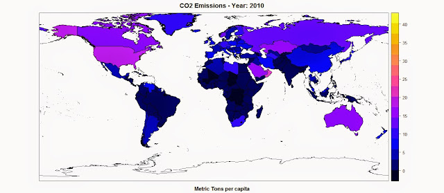
Once we finished the loop the object polygons has a column names CO2, which we can use to plot the map of the CO2 Emission using the function spplot():

spplot(polygons,"CO2",main=paste("CO2 Emissions - Year:",CO2.year),sub="Metric Tons per capita")

The result is the following map, where the function spplot creates also a color scale from the data:


R code snippets created by Pretty R at inside-R.org


Now we can apply the same exact approach for the other datasets we need to download from the World Bank and create maps of all the economic indexes available. The full script is available below (it was fully tested in date 12th May 2015).


 library(raster)  
library(XML)
library(rgdal)

#Change the following line to set the working directory
setwd("...")

#Download, unzip and load the polygon shapefile with the countries' borders
download.file("http://thematicmapping.org/downloads/TM_WORLD_BORDERS_SIMPL-0.3.zip",destfile="TM_WORLD_BORDERS_SIMPL-0.3.zip")
unzip("TM_WORLD_BORDERS_SIMPL-0.3.zip",exdir=getwd())
polygons <- shapefile("TM_WORLD_BORDERS_SIMPL-0.3.shp")


#Read Economic data tables from the World Bank website
CO2_emissions_Tons.per.Capita_HTML <- readHTMLTable("http://data.worldbank.org/indicator/EN.ATM.CO2E.PC")[[1]]
Population_urban.more.1.mln_HTML <- readHTMLTable("http://data.worldbank.org/indicator/EN.URB.MCTY")[[1]]
Population_Density_HTML <- readHTMLTable("http://data.worldbank.org/indicator/EN.POP.DNST")[[1]]
Population_Largest_Cities_HTML <- readHTMLTable("http://data.worldbank.org/indicator/EN.URB.LCTY")[[1]]
GDP_capita_HTML <- readHTMLTable("http://data.worldbank.org/indicator/NY.GDP.PCAP.CD")[[1]]
GDP_HTML <- readHTMLTable("http://data.worldbank.org/indicator/NY.GDP.MKTP.CD")[[1]]
Adj_Income_capita_HTML <- readHTMLTable("http://data.worldbank.org/indicator/NY.ADJ.NNTY.PC.CD")[[1]]
Adj_Income_HTML <- readHTMLTable("http://data.worldbank.org/indicator/NY.ADJ.NNTY.CD")[[1]]
Elect_Consumption_capita_HTML <- readHTMLTable("http://data.worldbank.org/indicator/EG.USE.ELEC.KH.PC")[[1]]
Elect_Consumption_HTML <- readHTMLTable("http://data.worldbank.org/indicator/EG.USE.ELEC.KH")[[1]]
Elect_Production_HTML <- readHTMLTable("http://data.worldbank.org/indicator/EG.ELC.PROD.KH")[[1]]


#First Approach - Find the most recent data
#Maximum Year
CO2.year <- max(as.numeric(names(CO2_emissions_Tons.per.Capita_HTML)),na.rm=T)
PoplUrb.year <- max(as.numeric(names(Population_urban.more.1.mln_HTML)),na.rm=T)
PoplDens.year <- max(as.numeric(names(Population_Density_HTML)),na.rm=T)
PoplLarg.year <- max(as.numeric(names(Population_Largest_Cities_HTML)),na.rm=T)
GDPcap.year <- max(as.numeric(names(GDP_capita_HTML)),na.rm=T)
GDP.year <- max(as.numeric(names(GDP_HTML)),na.rm=T)
AdjInc.cap.year <- max(as.numeric(names(Adj_Income_capita_HTML)),na.rm=T)
AdjInc.year <- max(as.numeric(names(Adj_Income_HTML)),na.rm=T)
EleCon.cap.year <- max(as.numeric(names(Elect_Consumption_capita_HTML)),na.rm=T)
EleCon.year <- max(as.numeric(names(Elect_Consumption_HTML)),na.rm=T)
ElecProd.year <- max(as.numeric(names(Elect_Production_HTML)),na.rm=T)


#Column Maximum Year
CO2.col <- grep(x=names(CO2_emissions_Tons.per.Capita_HTML),pattern=paste(CO2.year))
PoplUrb.col <- grep(x=names(Population_urban.more.1.mln_HTML),pattern=paste(PoplUrb.year))
PoplDens.col <- grep(x=names(Population_Density_HTML),pattern=paste(PoplDens.year))
PoplLarg.col <- grep(x=names(Population_Largest_Cities_HTML),pattern=paste(PoplLarg.year))
GDPcap.col <- grep(x=names(GDP_capita_HTML),pattern=paste(GDPcap.year))
GDP.col <- grep(x=names(GDP_HTML),pattern=paste(GDP.year))
AdjInc.cap.col <- grep(x=names(Adj_Income_capita_HTML),pattern=paste(AdjInc.cap.year))
AdjInc.col <- grep(x=names(Adj_Income_HTML),pattern=paste(AdjInc.year))
EleCon.cap.col <- grep(x=names(Elect_Consumption_capita_HTML),pattern=paste(EleCon.cap.year))
EleCon.col <- grep(x=names(Elect_Consumption_HTML),pattern=paste(EleCon.year))
ElecProd.col <- grep(x=names(Elect_Production_HTML),pattern=paste(ElecProd.year))


#Second Approach - Find data for specific Years
YEAR = 2010

#Year
CO2.year <- YEAR
PoplUrb.year <- YEAR
PoplDens.year <- YEAR
PoplLarg.year <- YEAR
GDPcap.year <- YEAR
GDP.year <- YEAR
AdjInc.cap.year <- YEAR
AdjInc.year <- YEAR
EleCon.cap.year <- YEAR
EleCon.year <- YEAR
ElecProd.year <- YEAR


#Column Maximum Year
CO2.col <- grep(x=names(CO2_emissions_Tons.per.Capita_HTML),pattern=paste(YEAR))
PoplUrb.col <- grep(x=names(Population_urban.more.1.mln_HTML),pattern=paste(YEAR))
PoplDens.col <- grep(x=names(Population_Density_HTML),pattern=paste(YEAR))
PoplLarg.col <- grep(x=names(Population_Largest_Cities_HTML),pattern=paste(YEAR))
GDPcap.col <- grep(x=names(GDP_capita_HTML),pattern=paste(YEAR))
GDP.col <- grep(x=names(GDP_HTML),pattern=paste(YEAR))
AdjInc.cap.col <- grep(x=names(Adj_Income_capita_HTML),pattern=paste(YEAR))
AdjInc.col <- grep(x=names(Adj_Income_HTML),pattern=paste(YEAR))
EleCon.cap.col <- grep(x=names(Elect_Consumption_capita_HTML),pattern=paste(YEAR))
EleCon.col <- grep(x=names(Elect_Consumption_HTML),pattern=paste(YEAR))
ElecProd.col <- grep(x=names(Elect_Production_HTML),pattern=paste(YEAR))


#Some Country names need to be changed for inconsistencies between datasets
polygons[polygons$NAME=="Libyan Arab Jamahiriya","NAME"] <- "Libya"
polygons[polygons$NAME=="Democratic Republic of the Congo","NAME"] <- "Congo, Dem. Rep."
polygons[polygons$NAME=="Congo","NAME"] <- "Congo, Rep."
polygons[polygons$NAME=="Kyrgyzstan","NAME"] <- "Kyrgyz Republic"
polygons[polygons$NAME=="United Republic of Tanzania","NAME"] <- "Tanzania"
polygons[polygons$NAME=="Iran (Islamic Republic of)","NAME"] <- "Iran, Islamic Rep."

#The States of "Western Sahara", "French Guyana" do not exist in the World Bank Database


#Now we can start the loop to add the economic data to the polygon shapefile
polygons$CO2 <- c()
polygons$PoplUrb <- c()
polygons$PoplDens <- c()
polygons$PoplLargCit <- c()
polygons$GDP.capita <- c()
polygons$GDP <- c()
polygons$AdjInc.capita <- c()
polygons$AdjInc <- c()
polygons$ElectConsumpt.capita <- c()
polygons$ElectConsumpt <- c()
polygons$ElectProduct <- c()


for(row in 1:length(polygons)){
if(any(grep(x=paste(CO2_emissions_Tons.per.Capita_HTML[,1]),pattern=paste(polygons[row,]$NAME)))&length(grep(x=paste(CO2_emissions_Tons.per.Capita_HTML[,1]),pattern=paste(polygons[row,]$NAME)))==1){
polygons[row,"CO2"] <- as.numeric(paste(CO2_emissions_Tons.per.Capita_HTML[grep(x=paste(CO2_emissions_Tons.per.Capita_HTML[,1]),pattern=paste(polygons[row,]$NAME)),CO2.col]))
polygons[row,"PoplUrb"] <- as.numeric(gsub(",","",paste(Population_urban.more.1.mln_HTML[grep(x=paste(Population_urban.more.1.mln_HTML[,1]),pattern=paste(polygons[row,]$NAME)),PoplUrb.col])))
polygons[row,"PoplDens"] <- as.numeric(paste(Population_Density_HTML[grep(x=paste(Population_Density_HTML[,1]),pattern=paste(polygons[row,]$NAME)),PoplDens.col]))
polygons[row,"PoplLargCit"] <- as.numeric(gsub(",","",paste(Population_Largest_Cities_HTML[grep(x=paste(Population_Largest_Cities_HTML[,1]),pattern=paste(polygons[row,]$NAME)),PoplLarg.col])))
polygons[row,"GDP.capita"] <- as.numeric(gsub(",","",paste(GDP_capita_HTML[grep(x=paste(GDP_capita_HTML[,1]),pattern=paste(polygons[row,]$NAME)),GDPcap.col])))
polygons[row,"GDP"] <- as.numeric(gsub(",","",paste(GDP_HTML[grep(x=paste(GDP_HTML[,1]),pattern=paste(polygons[row,]$NAME)),GDP.col])))
polygons[row,"AdjInc.capita"] <- as.numeric(gsub(",","",paste(Adj_Income_capita_HTML[grep(x=paste(Adj_Income_capita_HTML[,1]),pattern=paste(polygons[row,]$NAME)),AdjInc.cap.col])))
polygons[row,"AdjInc"] <- as.numeric(gsub(",","",paste(Adj_Income_HTML[grep(x=paste(Adj_Income_HTML[,1]),pattern=paste(polygons[row,]$NAME)),AdjInc.col])))
polygons[row,"ElectConsumpt.capita"] <- as.numeric(gsub(",","",paste(Elect_Consumption_capita_HTML[grep(x=paste(Elect_Consumption_capita_HTML[,1]),pattern=paste(polygons[row,]$NAME)),EleCon.cap.col])))
polygons[row,"ElectConsumpt"] <- as.numeric(gsub(",","",paste(Elect_Consumption_HTML[grep(x=paste(Elect_Consumption_HTML[,1]),pattern=paste(polygons[row,]$NAME)),EleCon.col])))
polygons[row,"ElectProduct"] <- as.numeric(gsub(",","",paste(Elect_Production_HTML[grep(x=paste(Elect_Production_HTML[,1]),pattern=paste(polygons[row,]$NAME)),ElecProd.col])))
}

if(any(grep(x=paste(CO2_emissions_Tons.per.Capita_HTML[,1]),pattern=paste(polygons[row,]$NAME)))&length(grep(x=paste(CO2_emissions_Tons.per.Capita_HTML[,1]),pattern=paste(polygons[row,]$NAME)))>1){
polygons[row,"CO2"] <- as.numeric(paste(CO2_emissions_Tons.per.Capita_HTML[paste(CO2_emissions_Tons.per.Capita_HTML[,1])==paste(polygons[row,]$NAME),CO2.col]))
polygons[row,"PoplUrb"] <- as.numeric(gsub(",","",paste(Population_urban.more.1.mln_HTML[paste(Population_urban.more.1.mln_HTML[,1])==paste(polygons[row,]$NAME),PoplUrb.col])))
polygons[row,"PoplDens"] <- as.numeric(paste(Population_Density_HTML[paste(Population_Density_HTML[,1])==paste(polygons[row,]$NAME),PoplDens.col]))
polygons[row,"PoplLargCit"] <- as.numeric(gsub(",","",paste(Population_Largest_Cities_HTML[paste(Population_Largest_Cities_HTML[,1])==paste(polygons[row,]$NAME),PoplLarg.col])))
polygons[row,"GDP.capita"] <- as.numeric(gsub(",","",paste(GDP_capita_HTML[paste(GDP_capita_HTML[,1])==paste(polygons[row,]$NAME),GDPcap.col])))
polygons[row,"GDP"] <- as.numeric(gsub(",","",paste(GDP_HTML[paste(GDP_HTML[,1])==paste(polygons[row,]$NAME),GDP.col])))
polygons[row,"AdjInc.capita"] <- as.numeric(gsub(",","",paste(Adj_Income_capita_HTML[paste(Adj_Income_capita_HTML[,1])==paste(polygons[row,]$NAME),AdjInc.cap.col])))
polygons[row,"AdjInc"] <- as.numeric(gsub(",","",paste(Adj_Income_HTML[paste(Adj_Income_HTML[,1])==paste(polygons[row,]$NAME),AdjInc.col])))
polygons[row,"ElectConsumpt.capita"] <- as.numeric(gsub(",","",paste(Elect_Consumption_capita_HTML[paste(Elect_Consumption_capita_HTML[,1])==paste(polygons[row,]$NAME),EleCon.cap.col])))
polygons[row,"ElectConsumpt"] <- as.numeric(gsub(",","",paste(Elect_Consumption_HTML[paste(Elect_Consumption_HTML[,1])==paste(polygons[row,]$NAME),EleCon.col])))
polygons[row,"ElectProduct"] <- as.numeric(gsub(",","",paste(Elect_Production_HTML[paste(Elect_Production_HTML[,1])==paste(polygons[row,]$NAME),ElecProd.col])))
}

}


#Spatial Plots
spplot(polygons,"CO2",main=paste("CO2 Emissions - Year:",CO2.year),sub="Metric Tons per capita")
spplot(polygons,"PoplUrb",main=paste("Population - Year:",PoplUrb.year),sub="In urban agglomerations of more than 1 million")
spplot(polygons,"PoplDens",main=paste("Population Density - Year:",PoplDens.year),sub="People per sq. km of land area")
spplot(polygons,"PoplLargCit",main=paste("Population in largest city - Year:",PoplLarg.year))
spplot(polygons,"GDP.capita",main=paste("GDP per capita - Year:",GDPcap.year),sub="Currency: USD")
spplot(polygons,"GDP",main=paste("GDP - Year:",GDP.year),sub="Currency: USD")
spplot(polygons,"AdjInc.capita",main=paste("Adjusted net national income per capita - Year:",AdjInc.cap.year),sub="Currency: USD")
spplot(polygons,"AdjInc",main=paste("Adjusted net national income - Year:",AdjInc.year),sub="Currency: USD")
spplot(polygons,"ElectConsumpt.capita",main=paste("Electric power consumption per capita - Year:",EleCon.cap.year),sub="kWh per capita")
spplot(polygons,"ElectConsumpt",main=paste("Electric power consumption - Year:",EleCon.year),sub="kWh")
spplot(polygons,"ElectProduct",main=paste("Electricity production - Year:",ElecProd.year),sub="kWh")

Interactive maps for the web in R

$
0
0
Static Maps
In the last post I showed how to download economic data from the World Bank's website and create choropleth maps in R (Global Economic Maps).
In this post I want to focus more on how to visualize those maps.

Sp Package
Probably the simplest way of plotting choropleth maps in R is the one I showed in the previous post, using the function ssplot(). For example with a call like the following:

library(sp)
spplot(polygons,"CO2",main=paste("CO2 Emissions - Year:",CO2.year),sub="Metric Tons per capita")

This function takes the object polygons, which is a SpatialPolygonsDataFrame, and in quotations marks the name of the column where to find the values to assign, as colors, to each polygon. This are two basic mandatory elements to call the function. However, we can increase the information in the plot by adding additional elements, such as a title, option main, and a sub title, option sub.

This function creates the following plot:

The color scale is selected automatically and can be changed with a couple of standard functions or using customized color scales. For more information please refer to this page: http://rstudio-pubs-static.s3.amazonaws.com/7202_3145df2a90a44e6e86a0637bc4264f9f.html


Standard Plot
Another way of plotting maps is by using the standard plot() function, which allows us to increase the flexibility of the plot, for example by customizing the position of the color legend.
The flip side is that, since it is the most basic plotting function available and it does not have many built-in options, this function require more lines of code to achieve a good result.
Let's take a look at the code below:

library(plotrix)
CO2.dat <- na.omit(polygons$CO2)
colorScale <- color.scale(CO2.dat,color.spec="rgb",extremes=c("red","blue"),alpha=0.8)
 
colors.DF <- data.frame(CO2.dat,colorScale)
colors.DF <- colors.DF[with(colors.DF,order(colors.DF[,1])),]
colors.DF$ID <- 1:nrow(colors.DF)
breaks <- seq(1,nrow(colors.DF),length.out=10)
 
 
jpeg("CO2_Emissions.jpg",7000,5000,res=300)
plot(polygons,col=colorScale)
title("CO2 Emissions",cex.main=3)
 
legend.pos <- list(x=-28.52392,y=-20.59119)
legendg(legend.pos,legend=c(round(colors.DF[colors.DF$ID %in% round(breaks,0),1],2)),fill=paste(colors.DF[colors.DF$ID %in% round(breaks,0),2]),bty="n",bg=c("white"),y.intersp=0.75,title="Metric tons per capita",cex=0.8)
 
dev.off()


By simpling calling the plot function with the object polygons, R is going to create an image of the country borders with no filling. If we want to add colors to the plot we first need to create a color scale using our data. To do so we can use the function color.scale() in the package plotrix, which I used also in the post regarding the visualization seismic events from USGS (Downloading and Visualizing Seismic Events from USGS ). This function takes a vector, plus the color of the extremes of the color scale, in this case red and blue, and creates a vector of intermediate colors to assign to each element of the data vector.
In this example I first created a vector named CO2.dat, with the values of CO2 for each polygon, excluding NAs. Then I feed it to the color.scale() function.

The next step is the creation of the legend. The first step is the creation of the breaks we are going to need to present the full spectrum of colors used in the plot. For this I first created a data.frame with values and colors and then I subset it into 10 elements, which is the length of the legend.
Now we can submit the rest of the code to create a plot and the legend and save it into the jpeg file below:


Interactive Maps
The maps we created thus far are good for showing our data on papers and allow the reader to have a good understanding of what we are trying to show with them. Clearly these are not the only two methods available to create maps in R, many more are available. In particular ggplot2 now features ways of creating beautiful static maps. For more information please refer to these website and blog posts:
Maps in R
Making Maps in R
Introduction to Spatial Data and ggplot2
Plot maps like a boss
Making Maps with R

In this post however, I would like to focus on ways to move away from static maps and embrace the fact that we are now connected to the web all the times. This allow us to create maps specifically design for the web, which can also be much more easy to read by the general public that is used to them.
These sort of maps are the interactive maps that we see all over the web, for example from Google. These are created in javascript and are extremely powerful. The problem is, we know R and we work on it all the time, but we do not necessarily know how to code in javascript. So how can we create beautiful interactive maps for the web if we cannot code in javascript and HTML?

Luckily for us developers have create packages that allow us to create maps using standard R code but n the form of HTML page that we can upload directly on our website. I will now examine the packages I know and use regularly for plotting choropleth maps.


googleVis
This package is extremely simple to use and yet capable of creating beautiful maps that can be uploaded easily to our website.
Let's look at the code below:

data.poly <- as.data.frame(polygons)
data.poly <- data.poly[,c(5,12)]
names(data.poly)<- c("Country Name","CO2 emissions (metric tons per capita)")
 
map <- gvisGeoMap(data=data.poly, locationvar = "Country Name", numvar='CO2 emissions (metric tons per capita)',options=list(width='800px',heigth='500px',colors="['0x0000ff', '0xff0000']"))
plot(map)
 
print(map,file="Map.html")
 
#http://www.javascripter.net/faq/rgbtohex.htm
#To find HEX codes for RGB colors

The first thing to do is clearly to load the package googleVis. Then we have to transform the SpatialPolygonsDataFrame into a standard data.frame. Since we are interested in plotting only the data related to the CO2 emissions for each country (as far as I know with this package we can plot only one variable for each map), we can subset the data.frame, keeping only the column with the names of each country and the one with the CO2 emissions. Then we need to change the names of these two columns so that the user can readily understand what he is looking at.
Then we can simply use the function gvisGeoMap() to create a choropleth maps using the Google Visualisation API. This function does not read the coordinates from the object, but we need to provide the names of the geo locations to use with the option locationvar, in this case the Google Visualisation API will take the names of the polygons and match them to the geometry of the country. Then we have the option numvar, which takes the name of the column where to find the data for each country. Then we have options, where we can define various customizations available in the Google Visualisation API and provided at this link: GoogleVis API Options
In this case I specified the width and height of the map, plus the two color extremes to use for the color scale. 
The result is the plot below:


This is an interactive plot, meaning that if I hover the mouse over a country the map will tell me the name and the amount of CO2 emitted. This map is generated directly from R but it all written in HTML and javascript. We can use the function print(), presented in the snippet above, to save the map into an HTML file that can upload as is on the web.
The map above is accessible from this link:  GoogleVis Map


plotGoogleMaps
This is another great package that harness the power of Google's APIs to create intuitive and fully interactive web maps. The difference between this and the previous package is that here we are going to create interactive maps using the Google Maps API, which is basically the one you use when you look up a place on Google Maps.
Again this API uses javascript to create maps and overlays, such as markers and polygons. However, with this package we can use very simple R code and create stunning HTML pages that we can just upload to our websites and share with friends and colleagues.

Let's look at the following code:

library(plotGoogleMaps)
 
polygons.plot <- polygons[,c("CO2","GDP.capita","NAME")]
polygons.plot <- polygons.plot[polygons.plot$NAME!="Antarctica",]
names(polygons.plot)<- c("CO2 emissions (metric tons per capita)","GDP per capita (current US$)","Country Name")
 
#Full Page Map
map <- plotGoogleMaps(polygons.plot,zoom=4,fitBounds=F,filename="Map_GoogleMaps.html",layerName="Economic Data")
 
 
#To add this to an existing HTML page
map <- plotGoogleMaps(polygons.plot,zoom=2,fitBounds=F,filename="Map_GoogleMaps_small.html",layerName="Economic Data",map="GoogleMap",mapCanvas="Map",map.width="800px",map.height="600px",control.width="200px",control.height="600px")

Again there is a bit of data preparation to make. Again we need to subset the polygons dataset and keep only the variable we would need for the plot (with this package this is not mandatory, but it is maybe good to avoid large objects). Then we have to exclude Antarctica, otherwise the interactive map will have some problems (you can try and leave it to see what it does and maybe figure out a way to solve it). Then again we change the names of the columns in order to be more informative.

At this point we can use the function plotGoogleMaps() to create web maps in javascript. This function is extremely simple to use, it just takes one argument, which is the data.frame and creates a web map (R opens the browser to show the output). There are clearly ways to customize the output, for example by choosing a level of zoom (in this case the fiBounds option needs to be set to FALSE). We can also set a layerName to show in the legend, which is automatically created by the function.
Finally, because we want to create an HTML file to upload to our website, we can use the option filename to save it.
The result is a full screen map like the one below:


This map is available here: GoogleMaps FullScreen


With this function we also have ways to customize not only the map itself but also the HTML page so that we can later add information to it. In the last line of the code snippet above you can see that I added the following options to the function plotGoogleMaps():

mapCanvas="Map",map.width="800px",map.height="600px",control.width="200px",control.height="600px"


These options are intended to modify the aspect of the map on the web page, for example its width and height, and the aspect of the legend and controls, with controls.width and controls.height. We can also add the id of the HTML <div> element that will contain the final map.
If we have some basic experience with HTML we can then open the file and tweak a bit, for example by shifting map and legend to the center and adding a title and some more info.


This map is available here: GoogleMaps Small

The full code to replicate this experiment is presented below:

 #Methods to Plot Choropleth Maps in R  
load(url("http://www.fabioveronesi.net/Blog/polygons.RData"))

#Standard method
#SP PACKAGE
library(sp)
spplot(polygons,"CO2",main=paste("CO2 Emissions - Year:",CO2.year),sub="Metric Tons per capita")


#PLOT METHOD
library(plotrix)
CO2.dat <- na.omit(polygons$CO2)
colorScale <- color.scale(CO2.dat,color.spec="rgb",extremes=c("red","blue"),alpha=0.8)

colors.DF <- data.frame(CO2.dat,colorScale)
colors.DF <- colors.DF[with(colors.DF, order(colors.DF[,1])), ]
colors.DF$ID <- 1:nrow(colors.DF)
breaks <- seq(1,nrow(colors.DF),length.out=10)


jpeg("CO2_Emissions.jpg",7000,5000,res=300)
plot(polygons,col=colorScale)
title("CO2 Emissions",cex.main=3)

legend.pos <- list(x=-28.52392,y=-20.59119)
legendg(legend.pos,legend=c(round(colors.DF[colors.DF$ID %in% round(breaks,0),1],2)),fill=paste(colors.DF[colors.DF$ID %in% round(breaks,0),2]),bty="n",bg=c("white"),y.intersp=0.75,title="Metric tons per capita",cex=0.8)

dev.off()


#INTERACTIVE MAPS
#googleVis PACKAGE
library(googleVis)

data.poly <- as.data.frame(polygons)
data.poly <- data.poly[,c(5,12)]
names(data.poly) <- c("Country Name","CO2 emissions (metric tons per capita)")

map <- gvisGeoMap(data=data.poly, locationvar = "Country Name", numvar='CO2 emissions (metric tons per capita)',options=list(width='800px',heigth='500px',colors="['0x0000ff', '0xff0000']"))
plot(map)

print(map,file="Map.html")

#http://www.javascripter.net/faq/rgbtohex.htm
#To find HEX codes for RGB colors


#plotGoogleMaps
library(plotGoogleMaps)

polygons.plot <- polygons[,c("CO2","GDP.capita","NAME")]
polygons.plot <- polygons.plot[polygons.plot$NAME!="Antarctica",]
names(polygons.plot) <- c("CO2 emissions (metric tons per capita)","GDP per capita (current US$)","Country Name")

#Full Page Map
map <- plotGoogleMaps(polygons.plot,zoom=4,fitBounds=F,filename="Map_GoogleMaps.html",layerName="Economic Data")


#To add this to an existing HTML page
map <- plotGoogleMaps(polygons.plot,zoom=2,fitBounds=F,filename="Map_GoogleMaps_small.html",layerName="Economic Data",map="GoogleMap",mapCanvas="Map",map.width="800px",map.height="600px",control.width="200px",control.height="600px")


R code snippets created by Pretty R at inside-R.org

Introductory Time-Series analysis of US Environmental Protection Agency (EPA) pollution data

$
0
0
Download EPA air pollution data
The US Environmental Protection Agency (EPA) provides tons of free data about air pollution and other weather measurements through their website. An overview of their offer is available here: http://www.epa.gov/airdata/

The data are provided in hourly, daily and annual averages for the following parameters:
Ozone, SO2, CO,NO2, Pm 2.5 FRM/FEM Mass, Pm2.5 non FRM/FEM Mass, PM10, Wind, Temperature, Barometric Pressure, RH and Dewpoint, HAPs (Hazardous Air Pollutants), VOCs (Volatile Organic Compounds) and Lead.

All the files are accessible from this page:
http://aqsdr1.epa.gov/aqsweb/aqstmp/airdata/download_files.html

The web links to download the zip files are very similar to each other, they have an initial starting URL: http://aqsdr1.epa.gov/aqsweb/aqstmp/airdata/
and then the name of the file has the following format: type_property_year.zip
The type can be: hourly, daily or annual. The properties are sometimes written as text and sometimes using a numeric ID. Everything is separated by an underscore.

Since these files are identified by consistent URLs I created a function in R that takes year, property and type as arguments, downloads and unzip the data (in the working directory) and read the csv.
To complete this experiment we would need the following packages: sp, rasterxts, plotGoogleMaps
The code for this function is the following:

download.EPA <- function(year, property = c("ozone","so2","co","no2","pm25.frm","pm25","pm10","wind","temp","pressure","dewpoint","hap","voc","lead"), type=c("hourly","daily","annual")){
if(property=="ozone"){PROP="44201"}
if(property=="so2"){PROP="42401"}
if(property=="co"){PROP="42101"}
if(property=="no2"){PROP="42602"}
 
if(property=="pm25.frm"){PROP="88101"}
if(property=="pm25"){PROP="88502"}
if(property=="pm10"){PROP="81102"}
 
if(property=="wind"){PROP="WIND"}
if(property=="temp"){PROP="TEMP"}
if(property=="pressure"){PROP="PRESS"}
if(property=="dewpoint"){PROP="RH_DP"}
if(property=="hap"){PROP="HAPS"}
if(property=="voc"){PROP="VOCS"}
if(property=="lead"){PROP="lead"}
 
URL <- paste0("http://aqsdr1.epa.gov/aqsweb/aqstmp/airdata/",type,"_",PROP,"_",year,".zip")
download.file(URL,destfile=paste0(type,"_",PROP,"_",year,".zip"))
unzip(paste0(type,"_",PROP,"_",year,".zip"),exdir=paste0(getwd()))
read.table(paste0(type,"_",PROP,"_",year,".csv"),sep=",",header=T)
}

This function can be used as follow to create a data.frame with exactly the data we are looking for:

data<- download.EPA(year=2013,property="ozone",type="daily")

This creates a data.frame object with the following characteristics:

> str(data)
'data.frame': 390491 obs. of 28 variables:
$ State.Code : int 1111111111 ...
$ County.Code : int 3333333333 ...
$ Site.Num : int 10101010101010101010 ...
$ Parameter.Code : int 44201442014420144201442014420144201442014420144201 ...
$ POC : int 1111111111 ...
$ Latitude : num 30.530.530.530.530.5 ...
$ Longitude : num -87.9 -87.9 -87.9 -87.9 -87.9 ...
$ Datum : Factor w/ 4levels"NAD27","NAD83",..: 2222222222 ...
$ Parameter.Name : Factor w/ 1 level "Ozone": 1111111111 ...
$ Sample.Duration : Factor w/ 1 level "8-HR RUN AVG BEGIN HOUR": 1111111111 ...
$ Pollutant.Standard : Factor w/ 1 level "Ozone 8-Hour 2008": 1111111111 ...
$ Date.Local : Factor w/ 365levels"2013-01-01","2013-01-02",..: 59606162636465666768 ...
$ Units.of.Measure : Factor w/ 1 level "Parts per million": 1111111111 ...
$ Event.Type : Factor w/ 3levels"Excluded","Included",..: 3333333333 ...
$ Observation.Count : int 1242424242424242424 ...
$ Observation.Percent: num 4100100100100100100100100100 ...
$ Arithmetic.Mean : num 0.030.03640.03440.02880.0345 ...
$ X1st.Max.Value : num 0.030.0440.0360.0420.0450.0450.0450.0480.0570.059 ...
$ X1st.Max.Hour : int 2310181091011121210 ...
$ AQI : int 25373136383838414850 ...
$ Method.Name : Factor w/ 1 level " - ": 1111111111 ...
$ Local.Site.Name : Factor w/ 1182levels""," 201 CLINTON ROAD, JACKSON",..: 353353353353353353353353353353 ...
$ Address : Factor w/ 1313levels" Edgewood Chemical Biological Center (APG), Waehli Road",..: 907907907907907907907907907907 ...
$ State.Name : Factor w/ 53levels"Alabama","Alaska",..: 1111111111 ...
$ County.Name : Factor w/ 631levels"Abbeville","Ada",..: 32323232323232323232 ...
$ City.Name : Factor w/ 735levels"Adams","Air Force Academy",..: 221221221221221221221221221221 ...
$ CBSA.Name : Factor w/ 414levels"","Adrian, MI",..: 94949494949494949494 ...
$ Date.of.Last.Change: Factor w/ 169levels"2013-05-17","2013-07-01",..: 125125125125125125125125125125 ...

The csv file contains a long series of columns that should again be consistent among all the dataset cited above, even though it changes slightly between hourly, daily and annual average.
A complete list of the meaning of all the columns is available here:
aqsdr1.epa.gov/aqsweb/aqstmp/airdata/FileFormats.html

Some of the columns are self explanatory, such as the various geographical names associated with the location of the measuring stations. For this analysis we are particularly interested in the address (that we can use to extract data from individual stations), event type (that tells us if extreme weather events are part of the averages), the date and the actual data (available in the column Arithmetic.Mean).


Extracting data for individual stations
The data.frame we loaded using the function download.EPA contains Ozone measurements from all over the country. To perform any kind of analysis we first need a way to identify and then subset the stations we are interested in.
For doing so I though about using one of the interactive visualization I presented in the previous post. To use that we first need to transform the csv into a spatial object. We can use the following loop to achieve that:

locations <- data.frame(ID=numeric(),LON=numeric(),LAT=numeric(),OZONE=numeric(),AQI=numeric())
for(i inunique(data$Address)){
dat <- data[data$Address==i,]
locations[which(i==unique(data$Address)),]<- data.frame(which(i==unique(data$Address)),unique(dat$Longitude),unique(dat$Latitude),round(mean(dat$Arithmetic.Mean,na.rm=T),2),round(mean(dat$AQI,na.rm=T),0))
}
 
locations$ADDRESS <- unique(data$Address)
 
coordinates(locations)=~LON+LAT
projection(locations)=CRS("+init=epsg:4326")

First of all we create an empty data.frame declaring the type of variable for each column. With this loop we can eliminate all the information we do not need from the dataset and keep the one we want to show and analyse. In this case I kept Ozone and the Air Quality Index (AQI), but you can clearly include more if you wish.
In the loop we iterate through the addresses of each EPA station, for each we first subset the main dataset to keep only the data related to that station and then we fill the data.frame with the coordinates of the station and the mean values of Ozone and AQI.
When the loop is over (it may take a while!), we can add the addresses to it and transform it into a SpatialObject. We also need to declare the projection of the coordinates, which in WGS84.
Now we are ready to create an interactive map using the package plotGoogleMaps and the Google Maps API. We can simply use the following line:

map <- plotGoogleMaps(locations,zcol="AQI",filename="EPA_GoogleMaps.html",layerName="EPA Stations")

This creates a map with a marker for each EPA station, coloured with the mean AQI. If we click on a marker we can see the ID of the station, the mean Ozone value and the address (below). The EPA map I created is shown at this link: EPA_GoogleMaps


From this map we can obtain information regarding the EPA stations, which we can use to extract values for individual stations from the dataset.
For example, we can extract values using the ID we created in the loop or the address of the station, which is also available on the Google Map, using the code below:

ID = 135
Ozone <- data[paste(data$Address)==unique(data$Address)[ID]&paste(data$Event.Type)=="None",]
 
ADDRESS = "966 W 32ND"
Ozone <- data[paste(data$Address)==ADDRESS&paste(data$Event.Type)=="None",]

Once we have extracted only data for a single station we can proceed with the time-series analysis.


Time-Series Analysis
There are two ways to tell R that a particular vector or data.frame is in fact a time-series. We have the function ts available in the package basic and the function xts, available in the package xts.
I will first analyse how to use xts, since this is probably the best way of handling time-series.
The first thing we need to do is make sure that our data have a column of class Date. This is done by transforming the current date values into the proper class. The EPA datasets has a Date.local column that R reads as factors:

> str(Ozone$Date.Local)
Factor w/ 365levels"2013-01-01","2013-01-02",..: 90919293949596979899 ...

We can transform this into the class Date using the following line, which creates a new column named DATE in the Ozone object:

Ozone$DATE <- as.Date(Ozone$Date.Local)

Now we can use the function xts to create a time-series object:

Ozone.TS <- xts(x=Ozone$Arithmetic.Mean,order.by=Ozone$DATE)
plot(Ozone.TS,main="Ozone Data",sub="Year 2013")

The first line creates the time-series using the Ozone data and the DATE column we created above. The second line plots the time-series and produces the image below:


To extract the dates of the object Ozone we can use the function index and we can use the function coredata to extract the ozone values.

index(Ozone.TS)
Date[1:183],format: "2013-03-31""2013-04-01""2013-04-02""2013-04-03" ...
 
coredata(Ozone.TS)
num [1:183,1]0.0440.04620.04460.03830.0469 ...


Subsetting the time-series is super easy in the package xts, as you can see from the code below:

Ozone.TS['2013-05-06']#Selection of a single day
 
Ozone.TS['2013-03']#Selection of March data
 
Ozone.TS['2013-05/2013-07']#Selection by time range

The first line extracts values for a single day (remember that the format is year-month-day); the second extracts values from the month of March. We can use the same method to extract values from one particular year, if we have time-series with multiple years.
The last line extracts values in a particular time range, notice the use of the forward slash to divide the start and end of the range.

We can also extract values by attributes, using the functions index and coredata. For example, if we need to know which days the ozone level was above 0.03 ppm we can simply use the following line:

index(Ozone.TS[coredata(Ozone.TS)>0.03,])

The package xts features some handy function to apply custom functions to specific time intervals along the time-series. These functions are: apply.weeklyapply.monthlyapply.quarterly and apply.yearly

The use of these functions is similar to the use of the apply function. Let us look at the example below to clarify:

apply.weekly(Ozone.TS,FUN=mean)
apply.monthly(Ozone.TS,FUN=max)

The first line calculates the mean value of ozone for each week, while the second computes the maximum value for each month. As for the function apply we are not constrained to apply functions that are available in R, but we can define our own:

apply.monthly(Ozone.TS,FUN=function(x){sd(x)/sqrt(length(x))})

in this case for example we can define a function to calculate the standard error of the mean for each month.

We can use these functions to create a simple plot that shows averages for defined time intervals with the following code:

plot(Ozone.TS,main="Ozone Data",sub="Year 2013")
lines(apply.weekly(Ozone.TS,FUN=mean),col="red")
lines(apply.monthly(Ozone.TS,FUN=mean),col="blue")
lines(apply.quarterly(Ozone.TS,FUN=mean),col="green")
lines(apply.yearly(Ozone.TS,FUN=mean),col="pink")

These lines return the following plot:


From this image it is clear that ozone presents a general decreasing trend over 2013 for this particular station. However, in R there are more precise ways of assessing the trend and seasonality of time-series.

Trends
Let us create another example where we use again the function download.EPA to download NO2 data over 3 years and then assess their trends.

NO2.2013.DATA <- download.EPA(year=2013,property="no2",type="daily")
NO2.2012.DATA <- download.EPA(year=2012,property="no2",type="daily")
NO2.2011.DATA <- download.EPA(year=2011,property="no2",type="daily")
 
ADDRESS = "2 miles south of Ouray and south of the White and Green River confluence"#Copied and pasted from the interactive map
NO2.2013 <- NO2.2013.DATA[paste(NO2.2013.DATA$Address)==ADDRESS&paste(NO2.2013.DATA$Event.Type)=="None",]
NO2.2012 <- NO2.2012.DATA[paste(NO2.2012.DATA$Address)==ADDRESS&paste(NO2.2012.DATA$Event.Type)=="None",]
NO2.2011 <- NO2.2011.DATA[paste(NO2.2011.DATA$Address)==ADDRESS&paste(NO2.2011.DATA$Event.Type)=="None",]
 
 
NO2.TS <- ts(c(NO2.2011$Arithmetic.Mean,NO2.2012$Arithmetic.Mean,NO2.2013$Arithmetic.Mean),frequency=365,start=c(2011,1))

The first lines should be clear from we said before. The only change is that the time-series is created using the function ts, available in base R. With ts we do not have to create a column of class Date in our dataset, but we can just specify the starting point of the time series (using the option start, which in this case is January 2011) and the number of samples per year with the option frequency. In this case the data were collected daily so the number of times per year is 365; if we had a time-series with data collected monthly we would specify a frequency of 12.

We can decompose the time-series using the function decompose, which is based on moving averages:

dec <- decompose(NO2.TS)
plot(dec)

The related plot is presented below:


There is also another method, based on the loess smoother (for more info: Article) that can be accessed using the function stl:

STL <- stl(NO2.TS,"periodic")
plot(STL)

This function is able to calculate the trend along the whole length of the time-series:


Conclusions
This example shows how to download and access the open pollution data for the US available from the EPA directly from R.
Moreover we have seen here how to map the locations of the stations and subset the dataset. We also looked at ways to perform some introductory time-series analysis on pollution data.
For more information and material regarding time-series analysis please refer to the following references:

A Little Book of R For Time Series

Analysis of integrated and cointegrated time series with R

Introductory time series with R


R code snippets created by Pretty R at inside-R.org

Introductory Point Pattern Analysis of Open Crime Data in London

$
0
0
Introduction
Police in Britain (http://data.police.uk/) not only register every single crime they encounter, and include coordinates, but also distribute their data free on the web.
They have two ways of distributing data: the first is through an API, which is extremely easy to use but returns only a limited number of crimes for each request, the second is a good old manual download from this page http://data.police.uk/data/. Again this page is extremely easy to use, they did a very good job in securing that people can access and work with these data; we can just select the time range and the police force from a certain area, and then wait for the system to create the dataset for us. I downloaded data from all forces for May and June 2014 and it took less than 5 minutes to prepare them for download.
These data are distributed under the Open Government Licence, which allows me to do basically whatever I want with them (even commercially) as long as I cite the origin and the license.


Data Preparation
For completing this experiment we would need the following packages: sp, raster, spatstatmaptools and plotrix.
As I mentioned above, I downloaded all the crime data from the months of May and June 2014 for the whole Britain. Then I decided to focus on the Greater London region, since here the most crimes are committed and therefore the analysis should be more interesting (while I am writing this part I have not yet finished the whole thing so I may be wrong). Since the Open Government License allows me to distribute the data, I uploaded them to my website so that you can easily replicate this experiment.
The dataset provided by the British Police is in csv format, so to load it we just need to use the read.csv function:

data<- read.csv("http://www.fabioveronesi.net/Blog/2014-05-metropolitan-street.csv")

We can look at the structure of the dataset simply by using the function str:

> str(data)
'data.frame': 79832 obs. of 12 variables:
$ Crime.ID : Factor w/ 55285levels"","0000782cea7b25267bfc4d22969498040d991059de4ebc40385be66e3ecc3c73",..: 11111292628741196644521921769 ...
$ Month : Factor w/ 1 level "2014-05": 1111111111 ...
$ Reported.by : Factor w/ 1 level "Metropolitan Police Service": 1111111111 ...
$ Falls.within : Factor w/ 1 level "Metropolitan Police Service": 1111111111 ...
$ Longitude : num 0.1410.1370.140.1360.135 ...
$ Latitude : num 51.651.651.651.651.6 ...
$ Location : Factor w/ 20462levels"No Location",..: 15099145961503191912357150388551406088558855 ...
$ LSOA.code : Factor w/ 4864levels"","E01000002",..: 24242424242424242424 ...
$ LSOA.name : Factor w/ 4864levels"","Barking and Dagenham 001A",..: 2222222222 ...
$ Crime.type : Factor w/ 14levels"Anti-social behaviour",..: 1111133577 ...
$ Last.outcome.category: Factor w/ 23levels"","Awaiting court outcome",..: 111112182188 ...
$ Context : logi NANANANANANA ...

This dataset provides a series of useful information regarding the crime: its locations (longitude and latitude in degrees), the address (if available), the type of crime and the court outcome (if available). For the purpose of this experiment we would only need to look at the coordinates and the type of crime.
For some incidents the coordinates are not provided, therefore before we can proceed we need to remove NAs from data:

data<- data[!is.na(data$Longitude)&!is.na(data$Latitude),]

This eliminates 870 entries from the file, thus data now has 78'962 rows.


Point Pattern Analysis
A point process is a stochastic process for which we observe its results, or events, only in a specific region, which is the area under study, or simply window. The location of the events is a point pattern (Bivand et al., 2008).
In R the package for Point Pattern Analysis is spatstat, which works with its own format (i.e. ppp). There are ways to transform a data.frame into a ppp object, however in this case we have a problem. The crime dataset contains lots of duplicated locations. We can check this by first transform data into a SpatialObject and then use the function zerodist to check for duplicated locations:

> coordinates(data)=~Longitude+Latitude
> zero <- zerodist(data)
> length(unique(zero[,1]))
[1]47920

If we check the amount of duplicates we see that more than half the reported crimes are duplicated somehow. I checked some individual cases to see if I could spot a pattern but it is not possible. Sometime we have duplicates with the same crime, probably because more than one person was involved; in other cases we have two different crimes for the same locations, maybe because the crime belongs to several categories. Whatever the case the presence of duplicates creates a problem, because the package spatstat does not allow them. In R the function remove.duplicates is able to get rid of duplicates, however in this case I am not sure we can use it because we will be removing crimes for which we do not have enough information to assess whether they may in fact be removed.

So we need to find ways to work around the problem.
This sort of problems are often encountered when working with real datasets, but are mostly not referenced in textbook, only experience and common sense helps us in these situations.

There is also another potential issue with this dataset. Even though the large majority of crimes are reported for London, some of them (n=660) are also located in other areas. Since these crimes are a small fraction of the total I do not think it makes much sense to include them in the analysis, so we need to remove them. To do so we need to import a shapefile with the borders of the Greater London region. Natural Earth provides this sort of data, since it distributes shapefiles at various resolution. For this analysis we would need the following dataset: Admin 1 – States, Provinces

To download it and import it in R we can use the following lines:

download.file("http://www.naturalearthdata.com/http//www.naturalearthdata.com/download/10m/cultural/ne_10m_admin_1_states_provinces.zip",destfile="ne_10m_admin_1_states_provinces.zip")
unzip("ne_10m_admin_1_states_provinces.zip",exdir="NaturalEarth")
border <- shapefile("NaturalEarth/ne_10m_admin_1_states_provinces.shp")

These lines download the shapefile in a compressed archive (.zip), then uncompress it in a new folder named NaturalEarth in the working directory and then open it.

To extract only the border of the Greater London regions we can simply subset the SpatialPolygons object as follows:

GreaterLondon <- border[paste(border$region)=="Greater London",]

Now we need to overlay it with crime data and then eliminate all the points that do not belong to the Greater London region. To do that we can use the following code:

projection(data)=projection(border)
overlay <- over(data,GreaterLondon)
 
data$over <- overlay$OBJECTID_1
 
data.London <- data[!is.na(data$over),]

The first line assigns to the object data the same projection as the object border, we can do this safely because we know that the crime dataset is in geographical coordinates (WGS84), the same as border.
Then we can use the function over to overlay the two objects. At this point we need a way to extract from data only the points that belong to the Greater London region, to do that we can create a new column and assign to it the values of the overlay object (here the column of the overlay object does not really matter, since we only need it to identify locations where this has some data in it). In locations where the data are outside the area defined by border the new column will have values of NA, so we can use this information to extract the locations we need with the last line.

We can create a very simple plot of the final dataset and save it in a jpeg using the following code:

jpeg("PP_plot.jpg",2500,2000,res=300)
plot(data.London,pch="+",cex=0.5,main="",col=data.London$Crime.type)
plot(GreaterLondon,add=T)
legend(x=-0.53,y=51.41,pch="+",col=unique(data.London$Crime.type),legend=unique(data.London$Crime.type),cex=0.4)
dev.off()

This creates the image below:


Now that we have a dataset of crimes only for Greater London we can start our analysis.


Descriptive Statistics
The focus of a point pattern analysis is firstly to examine the spatial distribution of the events, and secondly making inferences about the process that generated the point pattern. Thus the first step in every point pattern analysis, as in every statistical and geostatistical analysis, is describe the dataset in hands with some descriptive indexes. In statistics we normally use mean and standard deviation to achieve this, however here we are working in 2D space, so things are slightly more complicated. For example instead of computing the mean we compute the mean centre, which is basically the point identified by the mean value of longitude and the mean value of latitude:


Using the same principle we can compute the standard deviation of longitude and latitude, and the standard distance, which measures the standard deviation of the distance of each point from the mean centre. This is important because it gives a measure of spread in the 2D space, and can be computed with the following equation from Wu (2006):


In R we can calculate all these indexes with the following simple code:

mean_centerX <- mean(data.London@coords[,1])
mean_centerY <- mean(data.London@coords[,2])
 
standard_deviationX <- sd(data.London@coords[,1])
standard_deviationY <- sd(data.London@coords[,2])
 
standard_distance <- sqrt(sum(((data.London@coords[,1]-mean_centerX)^2+(data.London@coords[,2]-mean_centerY)^2))/(nrow(data.London)))

We can use the standard distance to have a visual feeling of the spread of our data around their mean centre. We can use the function draw.circle in the package plotrix to do that:

jpeg("PP_Circle.jpeg",2500,2000,res=300)
plot(data.London,pch="+",cex=0.5,main="")
plot(GreaterLondon,add=T)
points(mean_centerX,mean_centerY,col="red",pch=16)
draw.circle(mean_centerX,mean_centerY,radius=standard_distance,border="red",lwd=2)
dev.off()

which returns the following image:


The problem with the standard distance is that it averages the standard deviation of the distances for both coordinates, so it does not take into account possible differences between the two dimensions. We can take those into account by plotting an ellipse, instead of a circle, with the two axis equal to the standard deviations of longitude and latitude. We can use again the package plotrix, but with the function draw.ellipse to do the job:

jpeg("PP_Ellipse.jpeg",2500,2000,res=300)
plot(data.London,pch="+",cex=0.5,main="")
plot(GreaterLondon,add=T)
points(mean_centerX,mean_centerY,col="red",pch=16)
draw.ellipse(mean_centerX,mean_centerY,a=standard_deviationX,b=standard_deviationY,border="red",lwd=2)
dev.off()

This returns the following image:


Working with spatstat
Let's now look at the details of the package spatstat. As I mentioned we cannot use this if we have duplicated points, so we first need to eliminate them. In my opinion we cannot just remove them because we are not sure about their cause. However, we can subset the dataset by type of crime and then remove duplicates from it. In that case the duplicated points are most probably multiple individuals caught for the same crime, and if we delete those it will not change the results of the analysis.
I decided to focus on drug related crime, since they are not as common as other and therefore I can better present the steps of the analysis. We can subset the data and remove duplicates as follows:

Drugs <- data.London[data.London$Crime.type==unique(data.London$Crime.type)[3],]
Drugs <- remove.duplicates(Drugs)

we obtain a dataset with 2745 events all over Greater London.
A point pattern is defined as a series of events in a given area, or window, of observation. It is therefore extremely important to precisely define this window. In spatstat the function owin is used to set the observation window. However, the standard function takes the coordinates of a rectangle or of a polygon from a matrix, and therefore it may be a bit tricky to use. Luckily the package maptools provides a way to transform a SpatialPolygons into an object of class owin, using the function as.owin (Note: a function with the same name is also available in spatstat but it does not work with SpatialPolygons, so be sure to load maptools):

window<- as.owin(GreaterLondon)

Now we can use the function ppp, in spatstat, to create the point pattern object:

Drugs.ppp <- ppp(x=Drugs@coords[,1],y=Drugs@coords[,2],window=window)


Intensity and Density
A crucial information we need when we deal with point patterns is a quantitative definition of the spatial distribution, i.e. how many events we have in a predefined window. The index to define this is the Intensity, which is the average number of events per unit area.
In this example we cannot calculate the intensity straight away, because the we are dealing with degrees and therefore we would end up dividing the number of crimes (n=2745) by the total area of Greater London, which in degrees in 0.2. It would make much more sense to transform all of our data in UTM and then calculate the number of crime per square meter. We can transform any spatial object in a different coordinate system using the function spTransform, in package sp:

GreaterLondonUTM <- spTransform(GreaterLondon,CRS("+init=epsg:32630"))

We just need to define the CRS of the new coordinate system, which can be found here: http://spatialreference.org/

Now we can compute the intensity as follows:

Drugs.ppp$n/sum(sapply(slot(GreaterLondonUTM,"polygons"),slot,"area"))

The numerator is the number of point in the ppp object; while the denominator is the sum of the areas of all polygons (this function was copied from here: r-sig-geo). For drug related crime the average intensity is 1.71x10^-6 per square meter, in the Greater London area.

Intensity may be constant across the study window, in that case in every square meter we would find the same number of points, and the process would be uniform of homogeneous. Most often the intensity is not constant and varies spatially throughout the study window, in that case the process is inhomogeneous. For inhomogeneous processes we need a way to determine the amount of spatial variation of the intensity. There are several ways of dealing with this problem, one example is quadrat counting, where the area is divided into rectangles and the number of events in each of them is counted:

jpeg("PP_QuadratCounting.jpeg",2500,2000,res=300)
plot(Drugs.ppp,pch="+",cex=0.5,main="Drugs")
plot(quadratcount(Drugs.ppp, nx = 4, ny = 4),add=T,col="blue")
dev.off()

which divides the area in 8 rectangles and then counts the number of events in each of them:


This function is good for certain datasets, but in this case it does not really make sense to use quadrat counting, since the areas it creates do not have any meaning in reality. It would be far more valuable to extract the number of crimes by Borough for example. To do this we need to use a loop and iterate through the polygons:

Local.Intensity <- data.frame(Borough=factor(),Number=numeric())
for(i inunique(GreaterLondonUTM$name)){
sub.pol <- GreaterLondonUTM[GreaterLondonUTM$name==i,]
 
sub.ppp <- ppp(x=Drugs.ppp$x,y=Drugs.ppp$y,window=as.owin(sub.pol))
Local.Intensity <- rbind(Local.Intensity,data.frame(Borough=factor(i,levels=GreaterLondonUTM$name),Number=sub.ppp$n))
}

We can take a look at the results in a barplot with the following code:

colorScale <- color.scale(Local.Intensity[order(Local.Intensity[,2]),2],color.spec="rgb",extremes=c("green","red"),alpha=0.8)
 
jpeg("PP_BoroughCounting.jpeg",2000,2000,res=300)
par(mar=c(5,13,4,2))
barplot(Local.Intensity[order(Local.Intensity[,2]),2],names.arg=Local.Intensity[order(Local.Intensity[,2]),1],horiz=T,las=2,space=1,col=colorScale)
dev.off()

which returns the image below:


Another way in which we can determine the spatial distribution of the intensity is by using kernel smoothing (Diggle, 1985; Berman and Diggle, 1989; Bivand et. al., 2008). Such method computes the intensity continuously across the study area. To perform this analysis in R we need to define the bandwidth of the density estimation, which basically determines the area of influence of the estimation. There is no general rule to determine the correct bandwidth; generally speaking if h is too small the estimate is too noisy, while if h is too high the estimate may miss crucial elements of the point pattern due to oversmoothing (Scott, 2009). In spatstat the functions bw.digglebw.ppl, and bw.scott can be used to estimate the bandwidth according to difference methods. We can test how they work with our dataset using the following code:

jpeg("Kernel_Density.jpeg",2500,2000,res=300)
par(mfrow=c(2,2))
plot(density.ppp(Drugs.ppp, sigma = bw.diggle(Drugs.ppp),edge=T),main=paste("h =",round(bw.diggle(Drugs.ppp),2)))
plot(density.ppp(Drugs.ppp, sigma = bw.ppl(Drugs.ppp),edge=T),main=paste("h =",round(bw.ppl(Drugs.ppp),2)))
plot(density.ppp(Drugs.ppp, sigma = bw.scott(Drugs.ppp)[2],edge=T),main=paste("h =",round(bw.scott(Drugs.ppp)[2],2)))
plot(density.ppp(Drugs.ppp, sigma = bw.scott(Drugs.ppp)[1],edge=T),main=paste("h =",round(bw.scott(Drugs.ppp)[1],2)))
dev.off()

which generates the following image, from which it is clear that every method works very differently:


As you can see a low value of bandwidth produces a very detailed plot, while increasing this value creates a very smooth surface where the local details are lost. This is basically an heat map of the crimes in London, therefore we need to be very careful in choosing the right bandwidth since these images if shown alone may have very different impact particularly on people not familiar with the matter. The first image may create the illusion that the crimes are clustered in very small areas, while the last may provide the opposite feeling.


Complete spatial randomness
Assessing if a point pattern is random is a crucial step of the analysis. If we determine that the pattern is random it means that each point is independent from each other and from any other factor. Complete spatial randomness implies that events from the point process are equally as likely to occur in every regions of the study window. In other words, the location of one point does not affect the probability of another being observed nearby, each point is therefore completely independent from the others (Bivand et al., 2008).
If a point pattern is not random it can be classified in two other ways: clustered or regular. Clustered means that there are areas where the number of events is higher than average, regular means that basically each subarea has the same number of events. Below is an image that should better explain the differences between these distributions:


In spatstat we can determine which distribution our data have using the G function, which computes the distribution of the distances between each event and its nearest neighbour (Bivand et al., 2008). Based on the curve generated by the G function we can determine the distribution of our data. I will not explain here the details on how to compute the G function and its precise meaning, for that you need to look at the references. However, just by looking at the plots we can easily determine the distribution of our data.
Let's take a look at the image below to clarify things:


These are the curves generated by the G function for each distribution. The blue line is the G function computed for a complete spatial random point pattern, so in the first case since the data more or less follow the blue line the process is random. In the second case the line calculated from the data is above the blue line, this indicates a clustered distribution. On the contrary, if the line generated from the data is below the blue line the point pattern is regular.
We can compute the plot this function for our data simply using the following lines:

jpeg("GFunction.jpeg",2500,2000,res=300)
plot(Gest(Drugs.ppp),main="Drug Related Crimes")
dev.off()

which generates the following image:


From this image is clear that the process is clustered. We could have deduced it by looking at the previous plots, since it is clear that there are areas where more crimes are committed; however, with this method we have a quantitative way of support our hypothesis.


Conclusion
In this experiment we performed some basic Point Pattern analysis on open crime data. The only conclusion we reached in this experiment is that the data are clearly clustered in certain areas and boroughs. However, at this point we are not able to determine the origin and the causes of these clusters.


References
Bivand, R. S., Pebesma, E. J., & Gómez-Rubio, V. (2008). Applied spatial data analysis with R (Vol. 747248717). New York: Springer.

Wu, C. (2006). Intermediate Geographic Information Science – Point Pattern Analysis. Department of Geography, The University of Winsconsin-Milwaukee. http://uwm.edu/Course/416-625/week4_point_pattern.ppt - Last accessed: 28.01.2015

Berman, M. and Diggle, P. J. (1989). Estimating weighted integrals of the second-order intensity of a spatial point process. Journal of the Royal Statistical Society B, 51:81–92. [184, 185]

Diggle, P. J. (1985). A kernel method for smoothing point process data. Applied Statistics, 34:138–147. [184, 185]

Scott, D. W. (2009). Multivariate density estimation: theory, practice, and visualization (Vol. 383). John Wiley & Sons.


R code snippets created by Pretty R at inside-R.org


The full script for this experiment is available below:

 library(sp)  
library(plotGoogleMaps)
library(spatstat)
library(raster)
library(maptools)
library(plotrix)
library(rgeos)

data <- read.csv("http://www.fabioveronesi.net/Blog/2014-05-metropolitan-street.csv")

data <- data[!is.na(data$Longitude)&!is.na(data$Latitude),]

coordinates(data)=~Longitude+Latitude
zero <- zerodist(data)
length(unique(zero[,1]))


#Loading Natural Earth Provinces dataset to define window for Point Pattern Analysis
download.file("http://www.naturalearthdata.com/http//www.naturalearthdata.com/download/10m/cultural/ne_10m_admin_1_states_provinces.zip",destfile="ne_10m_admin_1_states_provinces.zip")
unzip("ne_10m_admin_1_states_provinces.zip",exdir="NaturalEarth")
border <- shapefile("NaturalEarth/ne_10m_admin_1_states_provinces.shp")


GreaterLondon <- border[paste(border$region)=="Greater London",]


#Extract crimes in London
projection(data)=projection(border)
overlay <- over(data,GreaterLondon)

data$over <- overlay$OBJECTID_1

data.London <- data[!is.na(data$over),]


#Simple Plot
jpeg("PP_plot.jpg",2500,2000,res=300)
plot(data.London,pch="+",cex=0.5,main="",col=data.London$Crime.type)
plot(GreaterLondon,add=T)
legend(x=-0.53,y=51.41,pch="+",col=unique(data.London$Crime.type),legend=unique(data.London$Crime.type),cex=0.4)
dev.off()


#Summary statistics for point patterns
#The coordinates of the mean center are simply the mean value of X and Y
#therefore we can use the function mean() to determine their value
mean_centerX <- mean(data.London@coords[,1])
mean_centerY <- mean(data.London@coords[,2])

#Similarly we can use the function sd() to determine the standard deviation of X and Y
standard_deviationX <- sd(data.London@coords[,1])
standard_deviationY <- sd(data.London@coords[,2])

#This is the formula to compute the standard distance
standard_distance <- sqrt(sum(((data.London@coords[,1]-mean_centerX)^2+(data.London@coords[,2]-mean_centerY)^2))/(nrow(data.London)))


jpeg("PP_Circle.jpeg",2500,2000,res=300)
plot(data.London,pch="+",cex=0.5,main="")
plot(GreaterLondon,add=T)
points(mean_centerX,mean_centerY,col="red",pch=16)
draw.circle(mean_centerX,mean_centerY,radius=standard_distance,border="red",lwd=2)
dev.off()

jpeg("PP_Ellipse.jpeg",2500,2000,res=300)
plot(data.London,pch="+",cex=0.5,main="")
plot(GreaterLondon,add=T)
points(mean_centerX,mean_centerY,col="red",pch=16)
draw.ellipse(mean_centerX,mean_centerY,a=standard_deviationX,b=standard_deviationY,border="red",lwd=2)
dev.off()


#Working with spatstat
Drugs <- data.London[data.London$Crime.type==unique(data.London$Crime.type)[3],]
Drugs <- remove.duplicates(Drugs)

#Transform GreaterLondon in UTM
GreaterLondonUTM <- spTransform(GreaterLondon,CRS("+init=epsg:32630"))
Drugs.UTM <- spTransform(Drugs,CRS("+init=epsg:32630"))


#Transforming the SpatialPolygons object into an owin object for spatstat, using a function in maptools
window <- as.owin(GreaterLondonUTM)

#Now we can extract one crime and
Drugs.ppp <- ppp(x=Drugs.UTM@coords[,1],y=Drugs.UTM@coords[,2],window=window)


#Calculate Intensity
Drugs.ppp$n/sum(sapply(slot(GreaterLondonUTM, "polygons"), slot, "area"))

#Alternative approach
summary(Drugs.ppp)$intensity


#Quadrat counting Intensity
jpeg("PP_QuadratCounting.jpeg",2500,2000,res=300)
plot(Drugs.ppp,pch="+",cex=0.5,main="Drugs")
plot(quadratcount(Drugs.ppp, nx = 4, ny = 4),add=T,col="red")
dev.off()


#Intensity by Borough
Local.Intensity <- data.frame(Borough=factor(),Number=numeric())
for(i in unique(GreaterLondonUTM$name)){
sub.pol <- GreaterLondonUTM[GreaterLondonUTM$name==i,]

sub.ppp <- ppp(x=Drugs.ppp$x,y=Drugs.ppp$y,window=as.owin(sub.pol))
Local.Intensity <- rbind(Local.Intensity,data.frame(Borough=factor(i,levels=GreaterLondonUTM$name),Number=sub.ppp$n))
}


colorScale <- color.scale(Local.Intensity[order(Local.Intensity[,2]),2],color.spec="rgb",extremes=c("green","red"),alpha=0.8)

jpeg("PP_BoroughCounting.jpeg",2000,2000,res=300)
par(mar=c(5,13,4,2))
barplot(Local.Intensity[order(Local.Intensity[,2]),2],names.arg=Local.Intensity[order(Local.Intensity[,2]),1],horiz=T,las=2,space=1,col=colorScale)
dev.off()


#Kernel Density (from: Baddeley, A. 2008. Analysing spatial point patterns in R)
#Optimal values of bandwidth
bw.diggle(Drugs.ppp)
bw.ppl(Drugs.ppp)
bw.scott(Drugs.ppp)

#Plotting
jpeg("Kernel_Density.jpeg",2500,2000,res=300)
par(mfrow=c(2,2))
plot(density.ppp(Drugs.ppp, sigma = bw.diggle(Drugs.ppp),edge=T),main=paste("h =",round(bw.diggle(Drugs.ppp),2)))
plot(density.ppp(Drugs.ppp, sigma = bw.ppl(Drugs.ppp),edge=T),main=paste("h =",round(bw.ppl(Drugs.ppp),2)))
plot(density.ppp(Drugs.ppp, sigma = bw.scott(Drugs.ppp)[2],edge=T),main=paste("h =",round(bw.scott(Drugs.ppp)[2],2)))
plot(density.ppp(Drugs.ppp, sigma = bw.scott(Drugs.ppp)[1],edge=T),main=paste("h =",round(bw.scott(Drugs.ppp)[1],2)))
dev.off()


#G Function
jpeg("GFunction.jpeg",2500,2000,res=300)
plot(Gest(Drugs.ppp),main="Drug Related Crimes")
dev.off()

Interactive maps of Crime data in Greater London

$
0
0
In the previous post we looked at ways to perform some introductory point pattern analysis of open data downloaded from Police.uk. As you remember we subset the dataset of crimes in the Greater London area, extracting only the drug related ones. Subsequently, we looked at ways to use those data with the package spatstat and perform basic statistics.
In this post I will briefly discuss ways to create interactive plots of the results of the point pattern analysis using the Google Maps API and Leaflet from R.

Number of Crimes by Borough
In the previous post we looped through the GreaterLondonUTM shapefile to extract the area of each borough and then counted the number of crimes within its border. To show the results we used a simple barplot. Here I would like to use the same method I presented in my post Interactive Maps for the Web to plot these results on Google Maps.

This post is intended to be a continuation of the previous, so I will not present again the methods and objects we used in the previous experiment. To make this code work you can just copy and paste it below the code you created before and it should work just fine.

First of all, let's create a new object including only the names of the boroughs from the GreaterLondonUTM shapefile. We need to do this because otherwise when we will click on a polygons on the map it will show us a long list of useless data.

GreaterLondon.Google <- GreaterLondonUTM[,"name"]

The new object has only one column with the name of each borough.
Now we can create a loop to iterate through these names and calculate the intensity of the crimes:

Borough <- GreaterLondonUTM[,"name"]
 
for(i inunique(GreaterLondonUTM$name)){
sub.name <- Local.Intensity[Local.Intensity[,1]==i,2]
 
Borough[Borough$name==i,"Intensity"]<- sub.name
 
Borough[Borough$name==i,"Intensity.Area"]<- round(sub.name/(GreaterLondonUTM[GreaterLondonUTM$name==i,]@polygons[[1]]@area/10000),4)
}

As you can see this loop selects one name at the time, then subset the object Local.Intensity (which we created in the previous post) to extract the number of crimes for each borough. The next line attach this intensity to the object Borough as a new column named Intensity. However, the code does not stop here. We also create another column named Intensity.Area in which we calculate the amount of crimes per unit area. Since the area from the shapefile is in square meters and the number were very high, I though about dividing it by 10'000 in order to have a unit area of 10 square km. So this column shows the amount of crime per 10 square km in each borough. This should correct the fact that certain borough have a relatively high number of crimes only because their area is larger than others.

Now we can use again the package plotGoogleMaps to create a beautiful visualization of our results and save it in HTML so that we can upload it to our website or blog.
The code for doing that is very simple and it is presented below:

plotGoogleMaps(Borough,zcol="Intensity",filename="Crimes_Boroughs.html",layerName="Number of Crimes", fillOpacity=0.4,strokeWeight=0,mapTypeId="ROADMAP")

I decided to plot the polygons on top of the roadmap and not on top of the satellite image, which is the default for the function. Thus I added the option mapTypeId="ROADMAP".
The result is the map shown below and at this link: Crimes on GoogleMaps


In the post Interactive Maps for the Web in R I received a comment from Gerardo Celis, whom I thank for it, telling me that now in R is also available the package leafletR, that allows us to create interactive maps based on Leaflet. So for this new experiment I decided to try it out!

I started from the sample of code presented here: https://github.com/chgrl/leafletR and I adapted with very few changes to my data.
The function leaflet does not work directly with Spatial data, we first need to transform them into GeoJSON with another function in leafletR:

Borough.Leaflet <- toGeoJSON(Borough)

Extremely simple!!

Now we need to set the style to use for plotting the polygons using the function styleGrad, which is used to create a list of colors based on a particular attribute:

map.style <- styleGrad(pro="Intensity",breaks=seq(min(Borough$Intensity),max(Borough$Intensity)+15,by=20),style.val=cm.colors(10),leg="Number of Crimes", fill.alpha=0.4, lwd=0)

In this function we need to set several options:
pro = is the name of the attribute (as the column name) to use for setting the colors
breaks = this option is used to create the ranges of values for each colors. In this case, as in the example, I just created a sequence of values from the minimum to the maximum. As you can see from the code I added 15 to the maximum value. This is because the number of breaks needs to have 1 more element compared to the number of colors. For example, if we set 10 breaks we would need to set 9 colors. For this reason if the sequence of breaks ends before the maximum, the polygons with the maximum number of crimes would be presented in grey.
This is important!!

style.val = this option takes the color scale to be used to present the polygons. We can select among one of the default scales or we can create a new one with the function color.scale in the package plotrix, which I already discussed here: Downloading and Visualizing Seismic Events from USGS

leg = this is simply the title of the legend
fill.alpha = is the opacity of the colors in the map (ranges from 0 to 1, where 1 is the maximum)
lwd =  is the width of the line between polygons

After we set the style we can simply call the function leaflet to create the map:

leaflet(Borough.Leaflet,popup=c("name","Intensity","Intensity.Area"),style=map.style)

In this function we need to input the name of the GeoJSON object we created before, the style of the map and the names of the columns to use for the popups.
The result is the map shown below and available at this link: Leaflet Map


I must say this function is very neat. First of all the function plotGoogleMaps, if you do not set the name of the HTML file, creates a series of temporary files stored in your temp folder, which is not great. Then even if you set the name of the file the legend is saved into different image files every time you call the function, which you may do many times until you are fully satisfied the result.
The package leafletR on the other hand creates a new folder inside the working directory where it stores both the GeoJSON and the HTML file, and every time you modify the visualization the function overlays the same file.
However, I noticed that I cannot see the map if I open the HTML files from my PC. I had to upload the file to my website every time I changed it to actually see these changes and how they affected the plot. This may be something related to my PC, however.


Density of Crimes in raster format
As you may remember from the previous post, one of the steps included in a point pattern analysis is the computation of the spatial density of the events. One of the techniques to do that is the kernel density, which basically calculates the density continuously across the study area, thus creating a raster.
We already looked at the kernel density in the previous post so I will not go into details here, the code for computing the density and transform it into a raster is the following:

Density <- density.ppp(Drugs.ppp, sigma = 500,edge=T,W=as.mask(window,eps=c(100,100)))
Density.raster <- raster(Density)
projection(Density.raster)=projection(GreaterLondonUTM)

The first lines is basically the same we used in the previous post. The only difference is that here I added the option W to set the resolution of the map with eps at 100x100 m.
Then I simply transformed the first object into a raster and assign to it the same UTM projection of the object GreaterLondonUTM.
Now we can create the map. As far as I know (and for what I tested) leafletR is not yet able to plot raster objects, so the only way we have of doing it is again to use the function plotGoogleMaps:

plotGoogleMaps(Density.raster,filename="Crimes_Density.html",layerName="Number of Crimes", fillOpacity=0.4,strokeWeight=0,colPalette=rev(heat.colors(10)))

When we use this function to plot a raster we clearly do not need to specify the zcol option. Moreover, here I changed the default color scale using the function colPalette to a reverse heat.colors, which I think is more appropriate for such a map. The result is the map below and at this link: Crime Density


Density of Crimes as contour lines
The raster presented above can also be represented as contour lines. The advantage of this type of visualization is that it is less intrusive, compared to a raster, and can also be better suited to pinpoint problematic locations.
Doing this in R is extremely simple, since there is a dedicated function in the package raster:

Contour <- rasterToContour(Density.raster,maxpixels=100000,nlevels=10)

This function transforms the raster above into a series of 10 contour lines (we can change the number of lines by changing the option nlevels).

Now we can plot these lines to an interactive web map. I first tested again the use of plotGoogleMaps but I was surprised to see that for contour lines it does not seem to do a good job. I do not fully know the reason, but if I use the object Contour with this function it does not plot all the lines on the Google map and therefore the visualization is useless.
For this reason I will present below the lines to plot contour lines using leafletR:

Contour.Leaflet <- toGeoJSON(Contour)
 
colour.scale <- color.scale(1:(length(Contour$level)-1),color.spec="rgb",extremes=c("red","blue"))
map.style <- styleGrad(pro="level",breaks=Contour$level,style.val=colour.scale,leg="Number of Crimes", lwd=2)
leaflet(Contour.Leaflet,style=map.style,base.map="tls")

As mentioned, the first thing to do to use leafletR is to transform our Spatial object into a GeoJSON; the object Contour belongs to the class SpatialLinesDataFrame, so it is supported in the function toGeoJSON.
The next step is again to set the style of the map and then plot it. In this code I changed a few things just to show some more options. The first thing is the custom color scale I created using the function color.scale in the package plotrix. The only thing that the function styleGrad needs to set the colors in the option style.val is a vector of colors, which must be long one unit less than the vector used for the breaks. In this case the object Contour has only one property, namely "level", which is a vector of class factor. The function styleGrad can use it to create the breaks but the function color.scale cannot use it to create the list of colors. We can work around this problem by setting the length of the color.scale vector using another vector: 1:(length(Contour$level)-1, which basically creates a vector of integers from 1 to the length of Contours minus one. The result of this function is a vector of colors ranging from red to blue, which we can plug in in the following function.
In the function leaflet the only thing I changed is the base.map option, in which I use "tls". From the help page of the function we can see that the following options are available:

"One or a list of "osm" (OpenStreetMap standard map), "tls" (Thunderforest Landscape), "mqosm" (MapQuest OSM), "mqsat" (MapQuest Open Aerial),"water" (Stamen Watercolor), "toner" (Stamen Toner), "tonerbg" (Stamen Toner background), "tonerlite" (Stamen Toner lite), "positron" (CartoDB Positron) or "darkmatter" (CartoDB Dark matter). "

These lines create the following image, available as a webpage here: Contour


R code snippets created by Pretty R at inside-R.org

Viewing all 44 articles
Browse latest View live