Quantcast
Channel: R tutorial for Spatial Statistics
Viewing all 44 articles
Browse latest View live

Live Earthquake Map with Shiny and Google Map API

$
0
0
In the post Exchange data between R and the Google Maps API using Shiny I presented a very simple way to allow communication between R and javascript using Shiny.

This is an example of a practical approach for which the same system can be used. Here I created a tool to visualize seismic events, collected from USGS, in the Google Maps API using R to do some basic data preparation. The procedure to complete this experiment is pretty much identical to what I presented in the post mentioned above, so I will not repeated here.


The final map looks like this:


and it is accessible from this site, hosted on the Amazon Cloud: Earthquake

The colours of the markers depends on magnitude and they are set in R. For magnitudes below 2 the marker is green, between 2 and 4 is yellow, between 4 and 6 is orange and above 6 is red.
I also set R to export other information about the event to the json file that I then use to populate the infowindow of each marker.

The code for creating this map consists of two pieces, an index.html file (which needs to go in a folder names www) and the file server.r, available below:

Server.r
 # server.R  
#Title: Earthquake Visualization in Shiny
#Copyright: Fabio Veronesi

library(sp)
library(rjson)
library(RJSONIO)


shinyServer(function(input, output) {

output$json <- reactive ({
if(length(input$Earth)>0){
if(input$Earth==1){
hour <- read.table("http://earthquake.usgs.gov/earthquakes/feed/v1.0/summary/all_hour.csv", sep = ",", header = T)
if(nrow(hour)>0){
lis <- list()
for(i in 1:nrow(hour)){

if(hour$mag[i]<=2){icon="http://maps.gstatic.com/mapfiles/ridefinder-images/mm_20_green.png"}
else if(hour$mag[i]>2&hour$mag[i]<=4){icon="http://maps.gstatic.com/mapfiles/ridefinder-images/mm_20_yellow.png"}
else if(hour$mag[i]>4&hour$mag[i]<=6){icon="http://maps.gstatic.com/mapfiles/ridefinder-images/mm_20_orange.png"}
else {icon="http://maps.gstatic.com/mapfiles/ridefinder-images/mm_20_red.png"}

Date.hour <- substring(hour$time[i],1,10)
Time.hour <- substring(hour$time[i],12,23)

lis[[i]] <- list(i,hour$longitude[i],hour$latitude[i],icon,hour$place[i],hour$depth[i],hour$mag[i],Date.hour,Time.hour)
}


#This code creates the variable test directly in javascript for export the grid in the Google Maps API
#I have taken this part from:http://stackoverflow.com/questions/26719334/passing-json-data-to-a-javascript-object-with-shiny
paste('<script>test=',
RJSONIO::toJSON(lis),
';setAllMap();Cities_Markers();',
'</script>')
}
}

else if(input$Earth==4){
month <- read.table("http://earthquake.usgs.gov/earthquakes/feed/v1.0/summary/all_month.csv", sep = ",", header = T)
if(nrow(month)>0){
lis <- list()
for(i in 1:nrow(month)){

if(month$mag[i]<=2){icon="http://maps.gstatic.com/mapfiles/ridefinder-images/mm_20_green.png"}
else if(month$mag[i]>2&month$mag[i]<=4){icon="http://maps.gstatic.com/mapfiles/ridefinder-images/mm_20_yellow.png"}
else if(month$mag[i]>4&month$mag[i]<=6){icon="http://maps.gstatic.com/mapfiles/ridefinder-images/mm_20_orange.png"}
else {icon="http://maps.gstatic.com/mapfiles/ridefinder-images/mm_20_red.png"}

Date.month <- substring(month$time[i],1,10)
Time.month <- substring(month$time[i],12,23)

lis[[i]] <- list(i,month$longitude[i],month$latitude[i],icon,month$place[i],month$depth[i],month$mag[i],Date.month,Time.month)
}


#This code creates the variable test directly in javascript for export the grid in the Google Maps API
#I have taken this part from:http://stackoverflow.com/questions/26719334/passing-json-data-to-a-javascript-object-with-shiny
paste('<script>test=',
RJSONIO::toJSON(lis),
';setAllMap();Cities_Markers();',
'</script>')
}
}


else if(input$Earth==3){
week <- read.table("http://earthquake.usgs.gov/earthquakes/feed/v1.0/summary/all_week.csv", sep = ",", header = T)
if(nrow(week)>0){
lis <- list()
for(i in 1:nrow(week)){

if(week$mag[i]<=2){icon="http://maps.gstatic.com/mapfiles/ridefinder-images/mm_20_green.png"}
else if(week$mag[i]>2&week$mag[i]<=4){icon="http://maps.gstatic.com/mapfiles/ridefinder-images/mm_20_yellow.png"}
else if(week$mag[i]>4&week$mag[i]<=6){icon="http://maps.gstatic.com/mapfiles/ridefinder-images/mm_20_orange.png"}
else {icon="http://maps.gstatic.com/mapfiles/ridefinder-images/mm_20_red.png"}

Date.week <- substring(week$time[i],1,10)
Time.week <- substring(week$time[i],12,23)

lis[[i]] <- list(i,week$longitude[i],week$latitude[i],icon,week$place[i],week$depth[i],week$mag[i],Date.week,Time.week)
}


#This code creates the variable test directly in javascript for export the grid in the Google Maps API
#I have taken this part from:http://stackoverflow.com/questions/26719334/passing-json-data-to-a-javascript-object-with-shiny
paste('<script>test=',
RJSONIO::toJSON(lis),
';setAllMap();Cities_Markers();',
'</script>')
}
}


else {
day <- read.table("http://earthquake.usgs.gov/earthquakes/feed/v1.0/summary/all_day.csv", sep = ",", header = T)
if(nrow(day)>0){
lis <- list()
for(i in 1:nrow(day)){

if(day$mag[i]<=2){icon="http://maps.gstatic.com/mapfiles/ridefinder-images/mm_20_green.png"}
else if(day$mag[i]>2&day$mag[i]<=4){icon="http://maps.gstatic.com/mapfiles/ridefinder-images/mm_20_yellow.png"}
else if(day$mag[i]>4&day$mag[i]<=6){icon="http://maps.gstatic.com/mapfiles/ridefinder-images/mm_20_orange.png"}
else {icon="http://maps.gstatic.com/mapfiles/ridefinder-images/mm_20_red.png"}

Date.day <- substring(day$time[i],1,10)
Time.day <- substring(day$time[i],12,23)

lis[[i]] <- list(i,day$longitude[i],day$latitude[i],icon,day$place[i],day$depth[i],day$mag[i],Date.day,Time.day)
}


#This code creates the variable test directly in javascript for export the grid in the Google Maps API
#I have taken this part from:http://stackoverflow.com/questions/26719334/passing-json-data-to-a-javascript-object-with-shiny
paste('<script>test=',
RJSONIO::toJSON(lis),
';setAllMap();Cities_Markers();',
'</script>')
}
}
}
})
})


Index.html
<!DOCTYPE html>  
<html>
<head>
<title>Earthquake Visualization in Shiny</title>

<!--METADATA-->
<meta name="author" content="Fabio Veronesi">
<meta name="copyright" content="©Fabio Veronesi">
<meta http-equiv="Content-Language" content="en-gb">
<meta charset="utf-8"/>

<style type="text/css">

html { height: 100% }
body { height: 100%; margin: 0; padding: 0 }
map-canvas { height: 100%; width:100% }

.btn {
background: #dde6d8;
background-image: -webkit-linear-gradient(top, #dde6d8, #859ead);
background-image: -moz-linear-gradient(top, #dde6d8, #859ead);
background-image: -ms-linear-gradient(top, #dde6d8, #859ead);
background-image: -o-linear-gradient(top, #dde6d8, #859ead);
background-image: linear-gradient(to bottom, #dde6d8, #859ead);
-webkit-border-radius: 7;
-moz-border-radius: 7;
border-radius: 7px;
font-family: Arial;
color: #000000;
font-size: 20px;
padding: 9px 20px 10px 20px;
text-decoration: none;
}

.btn:hover {
background: #f29f9f;
background-image: -webkit-linear-gradient(top, #f29f9f, #ab1111);
background-image: -moz-linear-gradient(top, #f29f9f, #ab1111);
background-image: -ms-linear-gradient(top, #f29f9f, #ab1111);
background-image: -o-linear-gradient(top, #f29f9f, #ab1111);
background-image: linear-gradient(to bottom, #f29f9f, #ab1111);
text-decoration: none;
}

</style>


<script type="text/javascript" src="http://google-maps-utility-library-v3.googlecode.com/svn/tags/markerclusterer/1.0/src/markerclusterer.js"></script>

<script src="https://maps.googleapis.com/maps/api/js?v=3.exp&signed_in=true&libraries=drawing"></script>

<script type="application/shiny-singletons"></script>
<script type="application/html-dependencies">json2[2014.02.04];jquery[1.11.0];shiny[0.11.1];ionrangeslider[2.0.2];bootstrap[3.3.1]</script>
<script src="shared/json2-min.js"></script>
<script src="shared/jquery.min.js"></script>
<link href="shared/shiny.css" rel="stylesheet" />
<script src="shared/shiny.min.js"></script>
<link href="shared/ionrangeslider/css/normalize.css" rel="stylesheet" />
<link href="shared/ionrangeslider/css/ion.rangeSlider.css" rel="stylesheet" />
<link href="shared/ionrangeslider/css/ion.rangeSlider.skinShiny.css" rel="stylesheet" />
<script src="shared/ionrangeslider/js/ion.rangeSlider.min.js"></script>
<link href="shared/bootstrap/css/bootstrap.min.css" rel="stylesheet" />
<script src="shared/bootstrap/js/bootstrap.min.js"></script>
<script src="shared/bootstrap/shim/html5shiv.min.js"></script>
<script src="shared/bootstrap/shim/respond.min.js"></script>


<script type="text/javascript">
var map = null;
var Gmarkers = [];


function Cities_Markers() {

var infowindow = new google.maps.InfoWindow({ maxWidth: 500,maxHeight:500 });

//Loop to add markers to the map based on the JSON exported from R, which is within the variable test
for (var i = 0; i < test.length; i++) {
var lat = test[i][2]
var lng = test[i][1]
var marker = new google.maps.Marker({
position: new google.maps.LatLng(lat, lng),
title: 'test',
map: map,
icon:test[i][3]
});

//This sets up the infowindow
google.maps.event.addListener(marker, 'click', (function(marker, i) {
return function() {
infowindow.setContent('<div id="content"><p><b>Location</b> = '+
test[i][4]+'<p>'+
'<b>Depth</b> = '+test[i][5]+'Km <p>'+
'<b>Magnitude</b> = '+test[i][6]+ '<p>'+
'<b>Date</b> = '+test[i][7]+'<p>'+
'<b>Time</b> = '+test[i][8]+'</div>');
infowindow.open(map, marker);
}
})(marker, i));
Gmarkers.push(marker);
};


};

//Function to remove all the markers from the map
function setAllMap() {
for (var i = 0; i < Gmarkers.length; i++) {
Gmarkers[i].setMap(null);
}
}

//Initialize the map
function initialize() {
var mapOptions = {
center: new google.maps.LatLng(31.6, 0),
zoom: 3,
mapTypeId: google.maps.MapTypeId.TERRAIN
};

map = new google.maps.Map(document.getElementById('map-canvas'),mapOptions);


}


google.maps.event.addDomListener(window, 'load', initialize);
</script>


</head>


<body>

<div id="json" class="shiny-html-output"></div>


<button type="button" class="btn" id="hour" onClick="Shiny.onInputChange('Earth', 1)" style="position:absolute;top:1%;left:1%;width:100px;z-index:999">Last Hour</button>
<button type="button" class="btn" id="day" onClick="Shiny.onInputChange('Earth', 2)" style="position:absolute;top:1%;left:10%;width:100px;z-index:999">Last Day</button>
<button type="button" class="btn" id="week" onClick="Shiny.onInputChange('Earth', 3)" style="position:absolute;top:1%;left:20%;width:100px;z-index:999">Last Week</button>
<button type="button" class="btn" id="month" onClick="Shiny.onInputChange('Earth', 4)" style="position:absolute;top:1%;left:30%;width:100px;z-index:999">Last Month</button>

<div id="map-canvas" style="top:0%;right:0%;width:100%;height:100%;z-index:1"></div>


</body>
</html>
Created with CodeFormatter

Cluster analysis on earthquake data from USGS

$
0
0
Theoretical Background
In some cases we would like to classify the events we have in our dataset based on their spatial location or on some other data. As an example we can return to the epidemiological scenario in which we want to determine if the spread of a certain disease is affected by the presence of a particular source of pollution. With the G function we are able to determine quantitatively that our dataset is clustered, which means that the events are not driven by chance but by some external factor. Now we need to verify that indeed there is a cluster of points located around the source of pollution, to do so we need a form of classification of the points.
Cluster analysis refers to a series of techniques that allow the subdivision of a dataset into subgroups, based on their similarities (James et al., 2013). There are various clustering method, but probably the most common is k-means clustering. This technique aims at partitioning the data into a specific number of clusters, defined a priori by the user, by minimizing the within-clusters variation. The within-cluster variation measures how much each event in a cluster k, differs from the others in the same cluster k. The most common way to compute the differences is using the squared Euclidean distance (James et al., 2013), calculated as follow:

Where W_k (I use the underscore to indicate the subscripts) is the within-cluster variation for the cluster k, n_k is the total number of elements in the cluster k, p is the total number of variables we are considering for clustering and x_ij is one variable of one event contained in cluster k. This equation seems complex, but it actually quite easy to understand. To better understand what this means in practice we can take a look at the figure below. 


For the sake of the argument we can assume that all the events in this point pattern are located in one unique cluster k, therefore n_k is 15. Since we are clustering events based on their geographical location we are working with two variables, i.e. latitude and longitude; so p is equal to two. To calculate the variance for one single pair of points in cluster k, we simply compute the difference between the first point’s value of the first variable, i.e. its latitude, and the second point value of the same variable; and we do the same for the second variable. So the variance between point 1 and 2 is calculated as follow:


where V_(1:2) is the variance of the two points. Clearly the geographical position is not the only factor that can be used to partition events in a point pattern; for example we can divide earthquakes based on their magnitude. Therefore the two equations can be adapted to take more variables and the only difference is in the length of the linear equation that needs to be solved to calculate the variation between two points. The only problem may be in the number of equations that would need to be solved to obtain a solution. This however is something that the k-means algorithms solves very efficiently.

The algorithm starts by randomly assigning each event to a cluster, then it calculates the mean centre of each cluster (we looked at what the mean centre is in the post: Introductory Point Pattern Analysis of Open Crime Data in London). At this point it calculates the Euclidean distance between each event and the two clusters and reassigns them to a new cluster, based on the closest mean centre, then it recalculates the mean centres and it keeps going until the cluster elements stop changing. As an example we can look at the figure below, assuming we want to divide the events into two clusters. 


In Step 1 the algorithm assigns each event to a cluster at random. It then computes the mean centres of the two clusters (Step 2), which are the large black and red circles. Then the algorithm calculate the Euclidean distance between each event and the two mean centres, and reassign the events to new clusters based on the closest mean centre, so if a point was first in cluster one but it is closer to the mean centre of cluster two it is reassigned to the latter. Subsequently the mean centres are computed again for the new clusters (Step 4). This process keeps going until the cluster elements stop changing.


Practical Example
In this experiment we will look at a very simple exercise of cluster analysis of seismic events downloaded from the USGS website. To complete this exercise you would need the following packages: sp, raster, plotrix, rgeos, rgdal and scatterplot3d
I already mentioned in the post Downloading and Visualizing Seismic Events from USGS how to download the open data from the United States Geological Survey, so I will not repeat the process. The code for that is the following.

URL <- "http://earthquake.usgs.gov/earthquakes/feed/v1.0/summary/all_month.csv"
Earthquake_30Days <- read.table(URL, sep = ",", header = T)
 
 
#Download, unzip and load the polygon shapefile with the countries' borders
download.file("http://thematicmapping.org/downloads/TM_WORLD_BORDERS_SIMPL-0.3.zip",destfile="TM_WORLD_BORDERS_SIMPL-0.3.zip")
unzip("TM_WORLD_BORDERS_SIMPL-0.3.zip",exdir=getwd())
polygons <- shapefile("TM_WORLD_BORDERS_SIMPL-0.3.shp")

I also included the code to download the shapefile with the borders of all countries.

For the cluster analysis I would like to try to divide the seismic events by origin. In other words I would like to see if there is a way to distinguish between events close to plates, or volcanoes or other faults. In many cases the distinction is hard to make since many volcanoes are originated from subduction, e.g. the Andes, where plates and volcanoes are close to one another and the algorithm may find difficult to distinguish the origins. In any case I would like to explore the use of cluster analysis to see what the algorithm is able to do.

Clearly the first thing we need to do is download data regarding the location of plates, faults and volcanoes. We can find shapefiles with these information at the following website: http://legacy.jefferson.kctcs.edu/techcenter/gis%20data/

The data are provided in zip files, so we need to extract them and load them in R. There are some legal restrictions to use these data. They are distributed by ESRI and can be used in conjunction with the book: "Mapping Our World: GIS Lessons for Educators.". Details of the license and other information may be found here: http://legacy.jefferson.kctcs.edu/techcenter/gis%20data/World/Earthquakes/plat_lin.htm#getacopy

If you have the rights to download and use these data for your studies you can download them directly from the web with the following code. We already looked at code to do this in previous posts so I would not go into details here:

dir.create(paste(getwd(),"/GeologicalData",sep=""))
 
#Faults
download.file("http://legacy.jefferson.kctcs.edu/techcenter/gis%20data/World/Zip/FAULTS.zip",destfile="GeologicalData/FAULTS.zip")
unzip("GeologicalData/FAULTS.zip",exdir="GeologicalData")
 
faults <- shapefile("GeologicalData/FAULTS.SHP")
 
 
#Plates
download.file("http://legacy.jefferson.kctcs.edu/techcenter/gis%20data/World/Zip/PLAT_LIN.zip",destfile="GeologicalData/plates.zip")
unzip("GeologicalData/plates.zip",exdir="GeologicalData")
 
plates <- shapefile("GeologicalData/PLAT_LIN.SHP")
 
 
#Volcano
download.file("http://legacy.jefferson.kctcs.edu/techcenter/gis%20data/World/Zip/VOLCANO.zip",destfile="GeologicalData/VOLCANO.zip")
unzip("GeologicalData/VOLCANO.zip",exdir="GeologicalData")
 
volcano<- shapefile("GeologicalData/VOLCANO.SHP")

The only piece of code that I never presented before is the first line, to create a new folder. It is pretty self explanatory, we just need to create a string with the name of the folder and R will create it. The rest of the code downloads data from the address above, unzip them and load them in R.

We have not yet transform the object Earthquake_30Days, which is now a data.frame, into a SpatioPointsDataFrame. The data from USGS contain seismic events that are not only earthquakes but also related to mining and other events. For this analysis we want to keep only the events that are classified as earthquakes, which we can do with the following code:

Earthquakes <- Earthquake_30Days[paste(Earthquake_30Days$type)=="earthquake",]
coordinates(Earthquakes)=~longitude+latitude

This extracts only earthquakes and transform the object into a SpatialObject.


We can create a map that shows the earthquakes alongside all the other geological elements we downloaded using the following code, which saves directly the image in jpeg:

jpeg("Earthquake_Origin.jpg",4000,2000,res=300)
plot(plates,col="red")
plot(polygons,add=T)
title("Earthquakes in the last 30 days",cex.main=3)
lines(faults,col="dark grey")
points(Earthquakes,col="blue",cex=0.5,pch="+")
points(volcano,pch="*",cex=0.7,col="dark red")
legend.pos <- list(x=20.97727,y=-57.86364)
 
legend(legend.pos,legend=c("Plates","Faults","Volcanoes","Earthquakes"),pch=c("-","-","*","+"),col=c("red","dark grey","dark red","blue"),bty="n",bg=c("white"),y.intersp=0.75,title="Days from Today",cex=0.8)
 
text(legend.pos$x,legend.pos$y+2,"Legend:")
dev.off()

This code is very similar to what I used here so I will not explain it in details. We just added more elements to the plot and therefore we need to remember that R plots in layers one on top of the other depending on the order in which they appear on the code. For example, as you can see from the code, the first thing we plot are the plates, which will be plotted below everything, even the borders of the polygons, which come second. You can change this just by changing the order of the lines. Just remember to use the option add=T correctly.
The result is the image below:


Before proceeding with the cluster analysis we first need to fix the projections of the SpatialObjects. Luckily the object polygons was created from a shapefile with the projection data attached to it, so we can use it to tell R that the other objects have the same projection:

projection(faults)=projection(polygons)
projection(volcano)=projection(polygons)
projection(Earthquakes)=projection(polygons)
projection(plates)=projection(polygons)

Now we can proceed with the cluster analysis. As I said I would like to try and classify earthquakes based on their distance between the various geological features. To calculate this distance we can use the function gDistance in the package rgeos.
These shapefiles are all unprojected, and their coordinates are in degrees. We cannot use them directly with the function gDistance because it deals only with projected data, so we need to transform them using the function spTransform (in the package rgdal). This function takes two arguments, the first is the SpatialObject, which needs to have projection information, and the second is the data regarding the projection to transform the object into. The code for doing that is the following:

volcanoUTM <- spTransform(volcano,CRS("+init=epsg:3395"))
faultsUTM <- spTransform(faults,CRS("+init=epsg:3395"))
EarthquakesUTM <- spTransform(Earthquakes,CRS("+init=epsg:3395"))
platesUTM <- spTransform(plates,CRS("+init=epsg:3395"))

The projection we are going to use is the standard mercator, details here: http://spatialreference.org/ref/epsg/wgs-84-world-mercator/

NOTE:
the plates object presents lines also along the borders of the image above. This is something that R cannot deal with, so I had to remove them manually from ArcGIS. If you want to replicate this experiment you have to do the same. I do not know of any method in R to do that quickly, if you know it please let me know in the comment section.


We are going to create a matrix of distances between each earthquake and the geological features with the following loop:

distance.matrix <- matrix(0,nrow(Earthquakes),7,dimnames=list(c(),c("Lat","Lon","Mag","Depth","DistV","DistF","DistP")))
for(i in1:nrow(EarthquakesUTM)){
sub<- EarthquakesUTM[i,]
dist.v <- gDistance(sub,volcanoUTM)
dist.f <- gDistance(sub,faultsUTM)
dist.p <- gDistance(sub,platesUTM)
distance.matrix[i,]<- matrix(c(sub@coords,sub$mag,sub$depth,dist.v,dist.f,dist.p),ncol=7)
}
 
 
distDF <- as.data.frame(distance.matrix)


In this code we first create an empty matrix, which is usually wise to do since R already allocates the RAM it would need for the process and it should also be faster to fill it compared to create a new matrix directly from inside the loop. In the loop we iterate through the earthquakes and for each we calculate its distance to the geological features. Finally we change the matrix into a data.frame.

The next step is finding the correct number of clusters. To do that we can follow the approach suggested by Matthew Peeples here: http://www.mattpeeples.net/kmeans.html and also discussed in this stackoverflow post: http://stackoverflow.com/questions/15376075/cluster-analysis-in-r-determine-the-optimal-number-of-clusters

The code for that is the following:

mydata <-  scale(distDF[,5:7])
wss <- (nrow(mydata)-1)*sum(apply(mydata,2,var))
for(i in2:15) wss[i]<- sum(kmeans(mydata,
centers=i)$withinss)
plot(1:15, wss, type="b", xlab="Number of Clusters",
ylab="Within groups sum of squares")

We basically calculate clusters between 2 and 15 and we plot the number of clusters against the "within clusters sum of squares", which is the parameters that is minimized during the clustering process. Generally this quantity decreases very fast up to a point, and then basically stops decreasing. We can see this behaviour from the plot below generated from the earthquake data:


As you can see for 1 and 2 clusters the sum of squares is high and decreases fast, then it decreases  between 3 and 5, and then it gets erratic. So probably the best number of clusters would be 5, but clearly this is an empirical method so we would need to check other numbers and test whether they make more sense.

To create the clusters we can simply use the function kmeans, which takes two arguments: the data and the number of clusters:

clust <- kmeans(mydata,5)
distDF$Clusters <- clust$cluster

We can check the physical meaning of the clusters by plotting them against the distance from the geological features using the function scatterplot3d, in the package scatterplot3d:

scatterplot3d(distDF$DistV,xlab="Distance to Volcano",distDF$DistF,ylab="Distance to Fault",distDF$DistP,zlab="Distance to Plate", color = clust$cluster,pch=16,angle=120,scale=0.5,grid=T,box=F)

This function is very similar to the standard plot function, but it takes three arguments instead of just two. I wrote the line of code distinguishing between the three axis to better understand it. So we have the variable for x, and the corresponding axis label, and so on for each axis. Then we set the colours based on clusters, and the symbol with pch, as we would do in plot. The last options are only available here: we have the angle between x and y axis, the scale of the z axis compared to the other two, then we plot a grid on the xy plane and we do not plot a box all around the plot. The result is the following image:


It seems that the red and green cluster are very similar, they differ only because red is closer to volcanoes than faults and vice-versa for the green. The black cluster seems only to be farther away from volcanoes. Finally the blue and light blue clusters seem to be close to volcanoes and far away from the other two features.

We can create an image with the clusters using the following code:

clustSP <- SpatialPointsDataFrame(coords=Earthquakes@coords,data=data.frame(Clusters=clust$cluster))
 
jpeg("Earthquake_Clusters.jpg",4000,2000,res=300)
plot(plates,col="red")
plot(polygons,add=T)
title("Earthquakes in the last 30 days",cex.main=3)
lines(faults,col="dark grey")
points(volcano,pch="x",cex=0.5,col="yellow")
legend.pos <- list(x=20.97727,y=-57.86364)
 
points(clustSP,col=clustSP$Clusters,cex=0.5,pch="+")
legend(legend.pos,legend=c("Plates","Faults","Volcanoes"),pch=c("-","-","x","+"),col=c("red","dark grey","yellow"),bty="n",bg=c("white"),y.intersp=0.75,cex=0.6)
 
text(legend.pos$x,legend.pos$y+2,"Legend:")
 
dev.off()

I created the object clustSP based on the coordinates in WGS84 so that I can plot everything as before. I also plotted the volcanoes in yellow, so that differ from the red cluster. The result is the following image:


To conclude this experiment I would also like to explore the relation between the distance to the geological features and the magnitude of the earthquakes. To do that we need to identify the events that are at a certain distance from each geological feature. We can use the function gBuffer, again available from the package rgeos, for this job.

volcano.buffer <- gBuffer(volcanoUTM,width=1000)
volcano.over <- over(EarthquakesUTM,volcano.buffer)
 
plates.buffer <- gBuffer(platesUTM,width=1000)
plates.over <- over(EarthquakesUTM,plates.buffer)
 
faults.buffer <- gBuffer(faultsUTM,width=1000)
faults.over <- over(EarthquakesUTM,faults.buffer)

This function takes minimum two arguments, the SpatialObject and the maximum distance (in metres because it requires data to be projected) to reach with the buffer, option width. The results is a SpatialPolygons object that include a buffer around the starting features; for example if we start with a point we end up with a circle of radius equal to width. In the code above we first created these buffer areas and then we overlaid EarthquakesUTM with these areas to find the events located within their borders. The overlay function returns two values: NA if the object is outside the buffer area and 1 if it is inside. We can use this information to subset EarthquakesUTM later on.

Now we can include the overlays in EarthquakesUTM as follows:

EarthquakesUTM$volcano <- as.numeric(volcano.over)
EarthquakesUTM$plates <- as.numeric(plates.over)
EarthquakesUTM$faults <- as.numeric(faults.over)

To determine if there is a relation between the distance from each feature and the magnitude of the earthquakes we can simply plot the magnitude's distribution for the various events included in the buffer areas we created before with the following code:

plot(density(EarthquakesUTM[paste(EarthquakesUTM$volcano)=="1",]$mag),ylim=c(0,2),xlim=c(0,10),main="Earthquakes by Origin",xlab="Magnitude")
lines(density(EarthquakesUTM[paste(EarthquakesUTM$faults)=="1",]$mag),col="red")
lines(density(EarthquakesUTM[paste(EarthquakesUTM$plates)=="1",]$mag),col="blue")
legend(3,0.6,title="Mean magnitude per origin",legend=c(paste("Volcanic",round(mean(EarthquakesUTM[paste(EarthquakesUTM$volcano)=="1",]$mag),2)),paste("Faults",round(mean(EarthquakesUTM[paste(EarthquakesUTM$faults)=="1",]$mag),2)),paste("Plates",round(mean(EarthquakesUTM[paste(EarthquakesUTM$plates)=="1",]$mag),2))),pch="-",col=c("black","red","blue"),cex=0.8)

which creates the following plot:


It seems that earthquakes close to plates have higher magnitude on average.


R code snippets created by Pretty R at inside-R.org

Organize a walk around London with R

$
0
0
The subtitle of this post can be "How to plot multiple elements on interactive web maps in R".
In this experiment I will show how to include multiple elements in interactive maps created using both plotGoogleMaps and leafletR. To complete the work presented here you would need the following packages: sp, raster, plotGoogleMaps and leafletR.

I am going to use data from the OpenStreet maps, which can be downloaded for free from this website: weogeo.com
In particular I downloaded the shapefile with the stores, the one with the tourist attractions and the polyline shapefile with all the roads in London. I will assume that you want to spend a day or two walking around London, and for this you would need the location of some hotels and the locations of all the Greggs in the area, for lunch. You need to create a web map that you can take with you when you walk around the city with all these customized elements, that's how you create it.

Once you have downloaded the shapefile from weogeo.com you can open them and assign the correct projection with the following code:

stores <- shapefile("weogeo_j117529/data/shop_point.shp")
projection(stores)=CRS("+init=epsg:3857")
 
roads <- shapefile("weogeo_j117529/data/route_line.shp")
projection(roads)=CRS("+init=epsg:3857")
 
tourism <- shapefile("weogeo_j117529/data/tourism_point.shp")
projection(tourism)=CRS("+init=epsg:3857")

To extract only the data we would need to the map we can use these lines:

Greggs <- stores[stores$NAME %in% c("Gregg's","greggs","Greggs"),]
 
Hotel <- tourism[tourism$TOURISM=="hotel",]
Hotel <- Hotel[sample(1:nrow(Hotel),10),]
 
 
Footpaths <- roads[roads$ROUTE=="foot",]


plotGoogleMaps
I created three objects, two are points (Greggs and Hotel) and the last is of class SpatialLinesDataFrame. We already saw how to plot Spatial objects with plotGoogleMaps, here the only difference is that we need to create several maps and then link them together.
Let's take a look at the following code:

Greggs.google <- plotGoogleMaps(Greggs,iconMarker=rep("http://local-insiders.com/wp-content/themes/localinsiders/includes/img/tag_icon_food.png",nrow(Greggs)),mapTypeId="ROADMAP",add=T,flat=T,legend=F,layerName="Gregg's",fitBounds=F,zoom=13)
Hotel.google <- plotGoogleMaps(Hotel,iconMarker=rep("http://www.linguistics.ucsb.edu/projects/weal/images/hotel.png",nrow(Hotel)),mapTypeId="ROADMAP",add=T,flat=T,legend=F,layerName="Hotels",previousMap=Greggs.google)
 
plotGoogleMaps(Footpaths,col="dark green",mapTypeId="ROADMAP",filename="Multiple_Objects_GoogleMaps.html",legend=F,previousMap=Hotel.google,layerName="Footpaths",strokeWeight=2)

As you can see I first create two objects using the same function and then I call again the same function to draw and save the map. I can link the three maps together using the option add=T and previousMap.
We need to be careful here though, because the use of the option add is different from the standard plot function. In plot I can call the first and then if I want to add a second I call again the function with the option add=T. Here this option needs to go in the first and second calls, not in the last. Basically in this case we are saying to R not to close the plot because later on we are going to add elements to it. In the last line we do not put add=T, thus saying to R to go ahead and close the plot.

Another important option is previousMap, which is used starting from the second plot to link the various elements. This option is used referencing the previous object, meaning that I reference the map in Hotel.google to the map map to Greggs.google, while in the last call I reference it to the previous Hotel.google, not the very first.

The zoom level, if you want to set it, goes only in the first plot.

Another thing I changed compared to the last example is the addition of custom icons to the plot, using the option iconMarker. This takes a vector of icons, not just one, with the same length of the SpatialObject to be plotted. That is why I use the function rep, to create a vector with the same URL repeated for a number of times equal to the length of the object.
The icon can be whatever image you like. You can find a collection of free icons from this website: http://kml4earth.appspot.com/icons.html

The result is the map below, available here: Multiple_Objects_GoogleMaps.html


leafletR
We can do the same thing using leafletR. We first need to create GeoJSON files for each element of the map using the following lines:

Greggs.geojson <- toGeoJSON(Greggs)
Hotel.geojson <- toGeoJSON(Hotel)
Footpaths.geojson <- toGeoJSON(Footpaths)

Now we need to set the style for each element. For this task we are going to use the function styleSingle, which basically defines a single style for all the elements of the GeoJSON. This differ from the map in a previous post in which we used the function styleGrad to create graduated colors depending of certain features of the dataset.
We can change the icons of the elements in leafletR using the following code:

Greggs.style <- styleSingle(marker=c("fast-food","red","s"))
Hotel.style <- styleSingle(marker=c("lodging","blue","s"))
Footpaths.style <- styleSingle(col="darkred",lwd=4)

As you can see we have the option marker that takes a vector with the name of the icon, its color and its size (between "s" for small, "m" for medium and "l" for large). The names of the icons can be found here: https://www.mapbox.com/maki/, where you have a series of icons and if you hover the mouse over them you would see some info, among which there is the name to use here, as the very last name. The style of the lines is set using the two options col and lwd, for line width.

Then we can simply use the function leaflet to set the various elements and styles of the map:

leaflet(c(Greggs.geojson,Hotel.geojson,Footpaths.geojson),style=list(Greggs.style,Hotel.style,Footpaths.style),popup=list(c("NAME"),c("NAME"),c("OPERATOR")),base.map="osm")

The result is the image below and the map available here: http://www.fabioveronesi.net/Blog/map.html


R code snippets created by Pretty R at inside-R.org

Spatio-Temporal Kriging in R

$
0
0

Preface

I am writing this post more for reminding to myself some theoretical background and the steps needed to perform spatio-temporal kriging in gstat.
This month I had some free time to spend on small projects not specifically related to my primary occupation. I decided to spend some time trying to learn this technique since it may become useful in the future. However, I have never used it before so I had to first try to understand its basics both in terms of theoretical background and programming.
Since I have used several resources to get a handle on it, I decided to share my experience and thoughts on this blog post because they may become useful for other people trying the same method. However, this post cannot be considered a full review of spatio-temporal kriging and its theoretical basis. I just mentioned some important details to guide myself and the reader through the comprehension of the topic, but these are clearly not exhaustive. At the end of the post I included some references to additional material you may want to browse for more details.

Introduction

This is the first time I considered spatio-temporal interpolation. Even though many datasets are indexed in both space and time, in the majority of cases time is not really taken into account for the interpolation. As an example we can consider temperature observations measured hourly from various stations in a determined study area. There are several different things we can do with such a dataset. We could for instance create a series of maps with the average daily or monthly temperatures. Time is clearly considered in these studies, but not explicitly during the interpolation phase. If we want to compute daily averages we first perform the averaging and then kriging. However, the temporal interactions are not considered in the kriging model. An example of this type of analysis is provided by (Gräler, 2012) in the following image, which depicts monthly averages for some environmental parameter in Germany:


There are cases and datasets in which performing 2D kriging on “temporal slices” may be appropriate. However, there are other instances where this is not possible and therefore the only solution is take time into account during kriging. For doing so two possible solutions are suggested in literature: using time as a third dimension, or fit a covariance model with both spatial and temporal components (Gräler et al., 2013).

Time as the third dimension

The idea behind this technique is extremely easy to grasp. To better understand it we can simply take a look at the equation to calculate the sample semivariogram, from Sherman (2011):


Under Matheron’s Intrinsic Hypothesis (Oliver et al., 1989) we can assume that the variance between two points, si and sj, depends only on their separation, which we indicate with the vector h in Eq.1. If we imagine a 2D example (i.e. purely spatial), the vector h is simply the one that connects two points, i and j, with a line, and its value can be calculated with the Euclidean distance:


If we consider a third dimension, which can be depth, elevation or time; it is easy to imagine Eq.2 be adapted to accommodate an additional dimension. The only problem with this method is that in order for it to work properly the temporal dimension needs to have a range similar to the spatial dimension. For this reason time needs to be scaled to align it with the spatial dimension. In Gräler et al. (2013) they suggest several ways to optimize the scaling and achieve meaningful results. Please refer to this article for more information.

Spatio-Temporal Variogram

The second way of taking time into account is to adapt the covariance function to the time component. In this case for each point si there will be a time ti associated with it, and to calculate the variance between this point and another we would need to calculate their spatial separation h and their temporal separation u. Thus, the spatio-temporal variogram can be computed as follows, from Sherman (2011):


With this equation we can compute a variogram taking into account every pair of points separated by distance h and time u.


Spatio-Temporal Kriging in R

In R we can perform spatio-temporal kriging directly from gstat with a set of functions very similar to what we are used to in standard 2D kriging. The package spacetime provides ways of creating objects where the time component is taken into account, and gstat uses these formats for its space-time analysis. Here I will present an example of spatio-temporal kriging using sensors’ data.

Data

In 2011, as part of the OpenSense project, several wireless sensors to measure air pollution (O3, NO2, NO, SO2, VOC, and fine particles) were installed on top of trams in the city of Zurich. The project now is in its second phase and more information about it can be found here: http://www.opensense.ethz.ch/trac/wiki/WikiStart
In this page some examples data about Ozone and Ultrafine particles are also distributed in csv format. These data have the following characteristics: time is in UNIX format, while position is in degrees (WGS 84). I will use these data to test spatio-temporal kriging in R.

Packages

To complete this exercise we need to load several packages. First of all sp, for handling spatial objects, and gstat, which has all the function to actually perform spatio-temporal kriging. Then spacetime, which we need to create the spatio-temporal object. These are the three crucial packages. However, I also loaded some others that I used to complete smaller tasks. I loaded the raster package, because I use the functions coordinates and projection to create spatial data. There is no need of loading it, since the same functions are available under different names in sp. However, I prefer these two because they are easier to remember. The last packages are rgdal and rgeos, for performing various operations on geodata.
The script therefore starts like:


Data Preparation

There are a couple of issues to solve before we can dive into kriging. The first is that we need to do is translating the time from UNIX to POSIXlt or POSIXct, which are standard ways of representing time in R. This very first thing we have to do is of course setting the working directory and loading the csv file:

setwd("...")
data<- read.table("ozon_tram1_14102011_14012012.csv", sep=",", header=T)

Now we need to address the UNIX time. So what is UNIX time anyway?
It is a way of tracking time as the number of seconds between a particular time and the UNIX epoch, which is January the 1st 1970 GMT. Basically, I am writing the first draft of this post on August the 18th at 16:01:00 CET. If I count the number of seconds from the UNIX epoch to this exact moment (there is an app for that!!) I find the UNIX time, which is equal to: 1439910060
Now let's take a look at one entry in the column “generation_time” of our dataset:

> paste(data$generation_time[1])
[1]"1318583686494"

As you may notice here the UNIX time is represented by 13 digits, while in the example above we just had 10. The UNIX time here represents also the milliseconds, which is something we cannot represent in R (as far as I know). So we cannot just convert each numerical value into POSIXlt, but we first need to extract only the first 10 digits, and then convert it. This can be done in one line of code but with multiple functions:

data$TIME <- as.POSIXlt(as.numeric(substr(paste(data$generation_time),1,10)), origin="1970-01-01")

We first need to transform the UNIX time from numerical to character format, using the function paste(data$generation_time). This creates the character string shown above, which we can then subset using the function substr. This function is used to subtract characters from a string and takes three arguments: a string, a starting character and a stopping character. In this case we want to basically delete the last 3 numbers from our string, so we set the start on the first number (start=1), and the stop at 10 (stop=10). Then we need to change the numerical string back to a numerical format, using the function as.numeric. Now we just need one last function to tell R that this particular number is a Date/Time object. We can do this using the function as.POSIXlt, which takes the actual number we just created plus an origin. Since we are using UNIX time, we need to set the starting point at "1970-01-01". We can test this function of the first element of the vector data$generation_time to test its output:

> as.POSIXlt(as.numeric(substr(paste(data$generation_time[1]),start=1,stop=10)), origin="1970-01-01")
[1]"2011-10-14 11:14:46 CEST"

Now the data.frame data has a new column named TIME where the Date/Time information are stored. 
Another issue with this dataset is in the formats of latitude and longitude. In the csv files these are represented in the format below:

> data$longitude[1]
[1]832.88198
76918 Levels: 829.4379829.43822829.44016829.44019829.4404 ... NULL
 
> data$latitude[1]
[1]4724.22833
74463 Levels: 4721.021824721.022424721.022494721.02276 ... NULL

Basically geographical coordinates are represented in degrees and minutes, but without any space. For example, for this point the longitude is 8°32.88’, while the latitude is 47°24.22’. For obtaining coordinates with a more manageable format we would again need to use strings.

data$LAT <- as.numeric(substr(paste(data$latitude),1,2))+(as.numeric(substr(paste(data$latitude),3,10))/60)
 
data$LON <- as.numeric(substr(paste(data$longitude),1,1))+(as.numeric(substr(paste(data$longitude),2,10))/60)

We use again a combination of paste and substr to extract only the numbers we need. For converting this format into degrees, we need to sum the degrees with the minutes divided by 60. So in the first part of the equation we just need to extract the first two digits of the numerical string and transform them back to numerical format. In the second part we need to extract the remaining of the strings, transform them into numbers and then divided them by 60.This operation creates some NAs in the dataset, for which you will get a warning message. We do not have to worry about it as we can just exclude them with the following line:


Subset

The ozone dataset by OpenSense provides ozone readings every minute or so, from October the 14th 2011 at around 11 a.m., up until January the 14th 2012 at around 2 p.m.

> min(data$TIME)
[1]"2011-10-14 11:14:46 CEST"
 
> max(data$TIME)
[1]"2012-01-14 13:40:43 CET"

The size of this dataset is 200183 rows, which makes it kind of big for perform kriging without a very powerful machine. For this reason before we can proceed with this example we have to subset our data to make them more manageable. To do so we can use the standard subsetting method for data.frame objects using Date/Time:

> sub<- data[data$TIME>=as.POSIXct('2011-12-12 00:00 CET')&data$TIME<=as.POSIXct('2011-12-14 23:00 CET'),]
> nrow(sub)
[1]6734

Here I created an object named sub, in which I used only the readings from midnight on December the 12th to 11 p.m. on the 14th. This creates a subset of 6734 observations, for which I was able to perform the whole experiment using around 11 Gb of RAM. 
After this step we need to transform the object sub into a spatial object, and then I changed its projection into UTM so that the variogram will be calculated on metres and not degrees. These are the steps required to achieve all this:

#Create a SpatialPointsDataFrame
coordinates(sub)=~LON+LAT
projection(sub)=CRS("+init=epsg:4326")
 
#Transform into Mercator Projection
ozone.UTM <- spTransform(sub,CRS("+init=epsg:3395"))

Now we have the object ozone.UTM, which is a SpatialPointsDataFrame with coordinates in metres.

Spacetime Package

Gstat is able to perform spatio-temporal kriging exploiting the functionalities of the package spacetime, which was developed by the same team as gstat. In spacetime we have two ways to represent spatio-temporal data: STFDF and STIDF formats. The first represents objects with a complete space time grid. In other words in this category are included objects such as the grid of weather stations presented in Fig.1. The spatio-temporal object is created using the n locations of the weather stations and the m time intervals of their observations. The spatio-temporal grid is of size nxm. 
STIDF objects are the one we are going to use for this example. These are unstructured spatio-temporal objects, where both space and time change dynamically. For example, in this case we have data collected on top of trams moving around the city of Zurich. This means that the location of the sensors is not consistent throughout the sampling window.
Creating STIDF objects is fairly simple, we just need to disassemble the data.frame we have into a spatial, temporal and data components, and then merge them together to create the STIDF object.
The first thing to do is create the SpatialPoints object, with the locations of the sensors at any given time:

ozoneSP <- SpatialPoints(ozone.UTM@coords,CRS("+init=epsg:3395"))

This is simple to do with the function SpatialPoints in the package sp. This function takes two arguments, the first is a matrix or a data.frame with the coordinates of each point. In this case I used the coordinates of the SpatialPointsDataFrame we created before, which are provided in a matrix format. Then I set the projection in UTM.
At this point we need to perform a very important operation for kriging, which is check whether we have some duplicated points. It may happen sometime that there are points with identical coordinates. Kriging cannot handle this and returns an error, generally in the form of a “singular matrix”. Most of the time in which this happens the problem is related to duplicated locations. So we now have to check if we have duplicates here, using the function zerodist:

dupl <- zerodist(ozoneSP)

It turns out that we have a couple of duplicates, which we need to remove. We can do that directly in the two lines of code we would need to create the data and temporal component for the STIDF object:

ozoneDF <- data.frame(PPB=ozone.UTM$ozone_ppb[-dupl[,2]])

In this line I created a data.frame with only one column, named PPB, with the ozone observations in part per billion. As you can see I removed the duplicated points by excluding the rows from the object ozone.UTM with the indexes included in one of the columns of the object dupl. We can use the same trick while creating the temporal part:

ozoneTM <- as.POSIXct(ozone.UTM$TIME[-dupl[,2]],tz="CET")

Now all we need to do is combine the objects ozoneSP, ozoneDF and ozoneTM into a STIDF:

timeDF <- STIDF(ozoneSP,ozoneTM,data=ozoneDF)

This is the file we are going to use to compute the variogram and perform the spatio-temporal interpolation. We can check the raw data contained in the STIDF object by using the spatio-temporal version of the function spplot, which is stplot:

stplot(timeDF)


Variogram

The actual computation of the variogram at this point is pretty simple, we just need to use the appropriate function: variogramST. Its use is similar to the standard function for spatial kriging, even though there are some settings for the temporal component that need to be included.

var<- variogramST(PPB~1,data=timeDF,tunit="hours",assumeRegular=F,na.omit=T)

As you can see here the first part of the call to the function variogramST is identical to a normal call to the function variogram; we first have the formula and then the data source. However, then we have to specify the time units (tunits) or the time lags (tlags). I found the documentation around this point a bit confusing to be honest. I tested various combinations of parameters and the line of code I presented is the only one that gives me what appear to be good results. I presume that what I am telling to the function is to aggregate the data to the hours, but I am not completely sure. I hope some of the readers can shed some light on this!!
I must warn you that this operation takes quite a long time, so please be aware of that. I personally ran it overnight.


Plotting the Variogram

Basically the spatio-temporal version of the variogram includes different temporal lags. Thus what we end up with is not a single variogram but a series, which we can plot using the following line:

plot(var,map=F)

which return the following image:


Among all the possible types of visualizations for spatio-temporal variogram, this for me is the easiest to understand, probably because I am used to see variogram models. However, there are also other ways available to visualize it, such as the variogram map:

plot(var,map=T)


And the 3D wireframe:


Variogram Modelling

As in a normal 2D kriging experiment, at this point we need to fit a model to our variogram. For doing so we will use the function vgmST and fit.StVariogram, which are the spatio-temporal matches for vgm and fit.variogram.
Below I present the code I used to fit all the models. For the automatic fitting I used most of the settings suggested in the following demo:

demo(stkrige)

Regarding the variogram models, in gstat we have 5 options: separable, product sum, metric, sum metric, and simple sum metric. You can find more information to fit these model, including all the equations presented below, in (Gräler et al., 2015), which is available in pdf (I put the link in the "More Information" section).

Separable

This covariance model assumes separability between the spatial and the temporal component, meaning that the covariance function is given by:


According to (Sherman, 2011): “While this model is relatively parsimonious and is nicely interpretable, there are many physical phenomena which do not satisfy the separability”. Many environmental processes for example do not satisfy the assumption of separability. This means that this model needs to be used carefully.
The first thing to set are the upper and lower limits for all the variogram parameters, which are used during the automatic fitting:

# lower and upper bounds
pars.l <- c(sill.s = 0, range.s = 10, nugget.s = 0,sill.t = 0, range.t = 1, nugget.t = 0,sill.st = 0, range.st = 10, nugget.st = 0, anis = 0)
pars.u <- c(sill.s = 200, range.s = 1000, nugget.s = 100,sill.t = 200, range.t = 60, nugget.t = 100,sill.st = 200, range.st = 1000, nugget.st = 100,anis = 700)

To create a separable variogram model we need to provide a model for the spatial component, one for the temporal component, plus the overall sill:

separable <- vgmST("separable",space = vgm(-60,"Sph",500,1),time = vgm(35,"Sph",500,1), sill=0.56)

This line creates a basic variogram model, and we can check how it fits our data using the following line:

plot(var,separable,map=F)


One thing you may notice is that the variogram parameters do not seem to have anything in common with the image shown above. I mean, in order to create this variogram model I had to set the sill of the spatial component at -60, which is total nonsense. However, I decided to try to fit this model by-eye as best as I could just to show you how to perform this type of fitting and calculate its error; but in this case it cannot be taken seriously. I found that for the automatic fit the parameters selected for vgmST do not make much of a difference, so probably you do not have to worry too much about the parameters you select in vgmST.
We can check how this model fits our data by using the function fit.StVariogram with the option fit.method=0, which keeps this model but calculates its Mean Absolute Error (MSE), compared to the actual data:

> separable_Vgm <- fit.StVariogram(var, separable, fit.method=0)
> attr(separable_Vgm,"MSE")
[1]54.96278

This is basically the error of the eye fit. However, we can also use the same function to automatically fit the separable model to our data (here I used the settings suggested in the demo):

> separable_Vgm <- fit.StVariogram(var, separable, fit.method=11,method="L-BFGS-B", stAni=5, lower=pars.l,upper=pars.u)
> attr(separable_Vgm,"MSE")
[1]451.0745

As you can see the error increases. This probably demonstrates that this model is not suitable for our data, even though with some magic we can create a pattern that is similar to what we see in the observations. In fact, if we check the fit by plotting the model it is clear that this variogram cannot properly describe our data:

plot(var,separable_Vgm,map=F)


To check the parameters of the model we can use the function extractPar:

> extractPar(separable_Vgm)
range.s nugget.s range.t nugget.t sill
199.99932310.00000099.9997141.11981717.236256

Product Sum

A more flexible variogram model for spatio-temporal data is the product sum, which do not assume separability. The equation of the covariance model is given by:

with k> 0.
In this case in the function vgmST we need to provide both the spatial and temporal component, plus the value of the parameter k (which needs to be positive):

prodSumModel <- vgmST("productSum",space = vgm(1,"Exp",150,0.5),time = vgm(1,"Exp",5,0.5),k = 50)

I first tried to set k = 5, but R returned an error message saying that it needed to be positive, which I did not understand. However, with 50 it worked and as I mentioned the automatic fit does not care much about these initial values, probably the most important things are the upper and lower bounds we set before.
We can then proceed with the fitting process and we can check the MSE with the following two lines:

> prodSumModel_Vgm <- fit.StVariogram(var, prodSumModel,method = "L-BFGS-B",lower=pars.l)
> attr(prodSumModel_Vgm,"MSE")
[1]215.6392

This process returns the following model:

Metric

This model assumes identical covariance functions for both the spatial and the temporal components, but includes a spatio-temporal anisotropy (k) that allows some flexibility.

In this model all the distances (spatial, temporal and spatio-temporal) are treated equally, meaning that we only need to fit a joint variogram to all three. The only parameter we have to modify is the anisotropy k. In R k is named stAni and creating a metric model in vgmST can be done as follows:

metric <- vgmST("metric", joint = vgm(50,"Mat",500,0), stAni=200)

The automatic fit produces the following MSE:

> metric_Vgm <- fit.StVariogram(var, metric, method="L-BFGS-B",lower=pars.l)
> attr(metric_Vgm,"MSE")
[1]79.30172

We can plot this model to visually check its accuracy:


Sum Metric

A more complex version of this model is the sum metric, which includes a spatial and temporal covariance models, plus the joint component with the anisotropy:

This model allows maximum flexibility, since all the components can be set independently. In R this is achieved with the following line:

sumMetric <- vgmST("sumMetric",space = vgm(psill=5,"Sph",range=500, nugget=0),time = vgm(psill=500,"Sph",range=500, nugget=0), joint = vgm(psill=1,"Sph",range=500, nugget=10), stAni=500)

The automatic fit can be done like so:

> sumMetric_Vgm <- fit.StVariogram(var, sumMetric, method="L-BFGS-B",lower=pars.l,upper=pars.u,tunit="hours")
> attr(sumMetric_Vgm,"MSE")
[1]58.98891

Which creates the following model:

Simple Sum Metric

As the title suggests, this is a simpler version of the sum metric model. In this case instead of having total flexibility for each component we restrict them to having a single nugget. Basically we still have to set all the parameters, even though we do not care about setting the nugget in each component since we need to set a nugget effect for all three:

SimplesumMetric <- vgmST("simpleSumMetric",space = vgm(5,"Sph",500,0),time = vgm(500,"Sph",500,0), joint = vgm(1,"Sph",500,0), nugget=1, stAni=500)

This returns a model similar to the sum metric:

> SimplesumMetric_Vgm <- fit.StVariogram(var, SimplesumMetric,method = "L-BFGS-B",lower=pars.l)
> attr(SimplesumMetric_Vgm,"MSE")
[1]59.36172


Choosing the Best Model

We can visually compare all the models we fitted using wireframes in the following way:

plot(var,list(separable_Vgm, prodSumModel_Vgm, metric_Vgm, sumMetric_Vgm, SimplesumMetric_Vgm),all=T,wireframe=T)


The most important parameter to take into account for selecting the best model is certainly the MSE. By looking at the these it is clear that the best model is the sum metric, with an error of around 59, so I will use this for kriging.

Prediction Grid

Since we are performing spatio-temporal interpolation, it is clear that we are interested in estimating new values in both space and time. For this reason we need to create a spatio-temporal prediction grid. In this case I first downloaded the road network for the area around Zurich, then I cropped it to match the extension of my study area, and then I created the spatial grid:

roads <- shapefile("VEC25_str_l_Clip/VEC25_str_l.shp")

This is the shapefile with the road network extracted from the Vector25 map of Switzerland. Unfortunately for copyright reasons I cannot share it. This file is projected in CH93, which is the Swiss national projection. Since I wanted to perform a basic experiment, I decided not to include the whole network, but only the major roads that in Switzerland are called Klass1. So the first thing I did was extracting from the roads object only the lines belonging to Klass1 streets:

Klass1 <- roads[roads$objectval=="1_Klass",]

Then I changed the projection of this object from CH93 to UTM, so that it is comparable with what I used so far:

Klass1.UTM <- spTransform(Klass1,CRS("+init=epsg:3395"))

Now I can crop this file so that I obtain only the roads within my study area. I can use the function crop in rgeos, with the object ozone.UTM that I created before:

Klass1.cropped <- crop(Klass1.UTM,ozone.UTM)

This gives me the road network around the locations where the data were collected. I can show you the results with the following two lines:

plot(Klass1.cropped)
plot(ozone.UTM,add=T,col="red")


Where the Klass1 roads are in black and the data points are represented in red. With this selection I can now use the function spsample to create a random grid of points along the road lines:

sp.grid.UTM <- spsample(Klass1.cropped,n=1500,type="random")

This generates the following grid, which I think I can share with you in RData format (gridST.RData):

As I mentioned, now we need to add a temporal component to this grid. We can do that again using the package spacetime. We first need to create a vector of Date/Times using the function seq:

tm.grid <- seq(as.POSIXct('2011-12-12 06:00 CET'),as.POSIXct('2011-12-14 09:00 CET'),length.out=5)

This creates a vector with 5 elements (length.out=5), with POSIXct values between the two Date/Times provided. In this case we are interested in creating a spatio-temporal data frame, since we do not yet have any data for it. Therefore we can use the function STF to merge spatial and temporal data into a spatio-temporal grid:

grid.ST <- STF(sp.grid.UTM,tm.grid)

This can be used as new data in the kriging function.

Kriging

This is probably the easiest step in the whole process. We have now created the spatio-temporal data frame, compute the best variogram model and create the spatio-temporal prediction grid. All we need to do now is a simple call to the function krigeST to perform the interpolation:

pred <- krigeST(PPB~1,data=timeDF, modelList=sumMetric_Vgm, newdata=grid.ST)

We can plot the results again using the function stplot:

stplot(pred)


More information

There are various tutorial available that offer examples and guidance in performing spatio-temporal kriging. For example we can just write:

vignette("st", package = "gstat")

and a pdf will open with some of the instructions I showed here. Plus there is a demo available at:

demo(stkrige)

In the article “Spatio-Temporal Interpolation using gstat” Gräler et al. explain in details the theory behind spatio-temporal kriging. The pdf of this article can be found here: https://cran.r-project.org/web/packages/gstat/vignettes/spatio-temporal-kriging.pdfThere are also some books and articles that I found useful to better understand the topic, for which I will put the references at the end of the post.


References

Gräler, B., 2012. Different concepts of spatio-temporal kriging [WWW Document]. URL geostat-course.org/system/files/part01.pdf (accessed 8.18.15).

Gräler, B., Pebesma, Edzer, Heuvelink, G., 2015. Spatio-Temporal Interpolation using gstat.

Gräler, B., Rehr, M., Gerharz, L., Pebesma, E., 2013. Spatio-temporal analysis and interpolation of PM10 measurements in Europe for 2009.

Oliver, M., Webster, R., Gerrard, J., 1989. Geostatistics in Physical Geography. Part I: Theory. Trans. Inst. Br. Geogr., New Series 14, 259–269. doi:10.2307/622687

Sherman, M., 2011. Spatial statistics and spatio-temporal data: covariance functions and directional properties. John Wiley & Sons.


All the code snippets were created by Pretty R at inside-R.org


Wind Resource Assessment

$
0
0
This is an article we recently published on "Renewable and Sustainable Energy Reviews". It starts with a thorough review of the methods used for wind resource assessment: from algorithms based on physical laws to other based on statistics, plus mixed methods.
In the second part of the manuscript we present a method for wind resource assessment based on the application of Random Forest, coded completely in R.

Elsevier allows to download the full paper for FREE until the 12th of February, so if you are interested please download a copy.
This is the link: http://authors.elsevier.com/a/1SG5a4s9HvhNZ6

Below is the abstract.

Abstract

Wind resource assessment is fundamental when selecting a site for wind energy projects. Wind is influenced by several environmental factors and understanding its spatial variability is key in determining the economic viability of a site. Numerical wind flow models, which solve physical equations that govern air flows, are the industry standard for wind resource assessment. These methods have been proven over the years to be able to estimate the wind resource with a relatively high accuracy. However, measuring stations, which provide the starting data for every wind estimation, are often located at some distance from each other, in some cases tens of kilometres or more. This adds an unavoidable amount of uncertainty to the estimations, which can be difficult and time consuming to calculate with numerical wind flow models. For this reason, even though there are ways of computing the overall error of the estimations, methods based on physics fail to provide planners with detailed spatial representations of the uncertainty pattern. In this paper we introduce a statistical method for estimating the wind resource, based on statistical learning. In particular, we present an approach based on ensembles of regression trees, to estimate the wind speed and direction distributions continuously over the United Kingdom (UK), and provide planners with a detailed account of the spatial pattern of the wind map uncertainty.

Learning R for Data Visualization [Video]

$
0
0
Last year Packt asked me to develop a video course to teach various techniques of data visualization in R. Since I love the idea of video courses and tutorials, and I also enjoy plotting data, I readily agreed.
The result is this course, published last March, which I will briefly present below.


The course is available here:
https://www.packtpub.com/big-data-and-business-intelligence/learning-r-data-visualization-video

I wanted to create a course that was easy to follow, and at the same time could provide a good basis even for the most advanced forms of data visualization available today in R.
Packt was interested in presenting ggplot2, which is definitely the most advanced way of creating static plots. Since I regularly use ggplot2 and I find it a tremendous tool, I was glad to be able to present its functionalities more in details. Three chapters are dedicated to this package. Here I present all the most important types of plots: histograms, box-plots, scatterplots, bar-charts and time-series. Moreover, a whole chapter is dedicated to embellish the default plots by adding elements, such as text labels and much more.

However, I am also very interested in interactive plotting, which I believe is now rapidly becoming commonplace for lots of applications. For this reason two chapters are completely dedicated to interactive plots. In the first I present the package rCharts, which is extremely powerful but also a bit tricky to use at times. In many cases there is little documentation to work with, and for developing the course I found myself often wondering through stackoverflow searching for answers. Luckily for all of us, Prof. Ramnath Vaidyanathan, the creator of rCharts, is always available to answer all the users' questions quickly and clearly. In chapter 5 the viewer will be able to start from zero and quickly create nice interactive versions of all the plots I covered with ggplot2. 

The last chapter is dedicated to Shiny and it is aimed at the creation of a full website for importing and plotting data. Here the reader will first learn the basics of Shiny and then will write the code to create the website and add lots of interesting functionalities.

I hope this video course will help R users become familiar with data visualization.
I would also like to take this opportunity to stress that I am open to support viewers throughout the learning process, meaning that if you have any question about the material in the course you should not hesitate one second in contacting me at info@fabioveronesi.net


Combining ArcGIS and R - Clustering Toolbox

$
0
0
Last year at the ESRI User Conference in San Diego, there was an announcement of an initiative to bridge ArcGIS and R. This became reality I think early this year with R-Bridge.
Basically, ESRI has created an R library that is able to communicate and exchange data between ArcGIS and R, so that we can create ArcGIS toolboxes using R scripts.

I am particularly interested in this application because R has become quite powerful for spatial data analysis in the last few years. However, I have the impression that within the geography community, R is still considered a bit of an outsider. This is because the main GIS application, i.e. ArcGIS, is based on Python and therefore courses in departments of geography and geomatics tend to focus on teaching Python, neglecting R. This I think is a mistake, since R in my opinion is easier to learn for people without a background in computer science, and has very powerful libraries for spatio-temporal data analysis.
For these reasons, the creation of the R-Bridge is particularly welcomed from my side because it will allow me to teach students how to create powerful new Toolboxes for ArcGIS based on scripts created in R. For example, this Autumn semester we will implement in the course of GIS III a module about geo-sensors, and then I will teach spatio-temporal data analysis using R within ArcGIS. This way students will learn the power of R starting from the familiar environment and user interface of ArcGIS.
Since I never worked with R-Bridge before, Today I started doing some testing and I decided that the best way to learn it was to create a simple Toolbox to do K-Means clustering on point shapefiles, which I think is a function not available in ArcGIS. In this post I will describe in details how to create the Toolbox and the R Script to perform the analysis.

R-Bridge Installation
Installing R-Bridge is extremely simple. TYou only need a recent  version of R (I have the 3.0.0) installed on your PC (32-bit or 64-bit, consistent with the version of ArcGIS you have installed) and ArcGIS 10.3.1 or more recent.
At this point you can download the installation files from the R-Bridge GitHub page: https://github.com/R-ArcGIS/r-bridge-install
You can unzip its content anywhere on your PC. At this point you need to run ArcGIS as aministrator (this is very important!!), and then in the ArcCatalog navigate to the folder where you unzip the zip you just downloaded.


Now you just need to run the script "Install R Bindings" and ArcGIS will take care of the rest. I found the process extremely easy!!

Getting Started
ESRI created two examples to help us get started with the development of packages for ArcGIS written in the R language. You can find it here: https://github.com/R-ArcGIS/r-sample-tools
When you unzip this you will find a folder named "Scripts" where you can find R scripts optimized for the use in ArcGIS. I started from these to learn how to create scripts that work.


Clustering Example - R Script
As I said, ESRI created a specific library for R to be able to communicate back and forth with ArcGIS: it is called "arcbinding" and it is installed during the installation process we completed before. This library has a series of functions that allow the R script to be run starting from the ArcGIS console and its GUI. For this reason the R script is a bit different compared to the one you would do to reach the same result outside of ArcGIS. Probably it is better if I just start including some code so that you can better understand.
Below is the full R script I used for this example:

### KMeans Clustering Toolbox
##Author: Fabio Veronesi
tool_exec <- function(in_params, out_params)
{
if(!requireNamespace("sp", quietly = TRUE))
install.packages("sp")
require(sp)
 
print("K-Means Clustering of Shapefiles")
print("Author: Fabio Veronesi")
 
source_dataset = in_params[[1]]
nclust = in_params[[2]]
variable = in_params[[3]]
 
out_shape = out_params[[1]]
 
### Read Data
arc.progress_label("Loading Dataset")
d <- arc.open(source_dataset)
 
 
### Create a Data.Frame with the variables to cluster
data<- arc.select(d, variable)
data_clust <- data.frame(data[,variable[1]])
 
 
if(length(variable)>1){
for(i in2:length(variable)){
data_clust <- cbind(data_clust,data[,variable[i]])
}
}
 
names(data_clust)<- variable
 
for(i in1:length(variable)){
dev.new()
plot(hist(data_clust[,i]),main=paste0("Histogram of ",variable[i]),xlab=variable[i])
}
 
clusters <- kmeans(data_clust, nclust)
 
result <- data.frame(cluster=clusters$cluster)
 
arc.write(out_shape, result, coords = arc.shape(data))
 
print("Done!!")
return(out_params)
}
Created by Pretty R at inside-R.org

As you can see, the whole script is wrapped in a function called tool_exec with two arguments in_params and out_params. These are the list of input and output parameters that will be passed to R from ArcGIS.
The next three lines are taken directly from the script that ESRI provides. Basically, if the user does not have the package sp installed, R will download, install and load it. You can copy and paste these lines if you need other packages installed on the user's machine to perform your analysis. In this case I am only using the function kmeans, available in the package stats, which is loaded by default in R.
At this point I inserted two print calls with the title and my name on them. This has no real purpose except to let you know that you can print information from R directly onto the dialog in ArcGIS with simple print calls. We will see at the end how they look.
Now we need to create an object for each input and output parameter you need. We will need to specify these in ArcGIS once we create the Toolbox. Since I want to cluster a shapefile, the first input parameter will be this object. Then I want the user to select the number of clusters, so I will create another option for this. Then I would like the user to be able to select the variables s/he wants to use for clustering, so I will need to create an option for this in ArcGIS and then collect it into the object variable. Finally, ArcGIS will save another shapefile with the points plus their cluster. This will be the only output parameter, and I collect it into the object out_shape.

Now I can start the real computation. The function arc.open allows to import in R the shapefile from the Toolbox in ArcGIS. If you want you can take a look at the structure of this object by simply inserting print(str(d)) right after it. This will print the structure of the object d in the dialog created in ArcGIS.
Now we have the function arc.select, which allows to extract from d only the variables we need and that are selected by the user on the Toolbox GUI.
At this point we need to create a data.frame that we are going to fill with only the variables the user selected in the Toolbox. The object variable is a list of strings, therefore we can use its elements to extract single columns from the object data, with the syntax data[,variable[1]].
Since we do not know how many variables will users select and we do not want to limit them, I created an if statement with a loop to attach additional columns to the object data_clust. Then I replaced the column names in data_clust with the names of the variables, this will help me in the next phase.
Now in fact, I want to produce histograms of the variables the user selected. This will allow me to check whether what I am about to do makes sense, and it is one of those things for which R excels. For this I can simply call the function plot and R will show it even if it is called from ArcGIS, as simple as that!! We only need to remember to insert dev.new() so that each plot is created separately and the user can see/save them all.
After this step we can call the function kmeans to cluster our data. Then we can collect the results in a new data.frame, and finally use the function arc.write to write the object out_shape with the results. As you can see we also need to specify the coordinates of each point and this can be done calling the function arc.shape.
Then we print the string "Done!!" and return the output parameters, that will be taken from ArcGIS and shown to the user.


Toolbox
Now that we've seen how to create the R script we can take a look at the Toolbox, since both things need to be done in parallel.
Creating a new Toolbox in ArcGIS is very simple, we just need to open ArcCatalog, click where we want to create it with the right mouse button and then select New->Toolbox.


Once this is done we will then need to add, within this Toolbox, a script. To do this we can again click with the right button on the Toolbox we just created and then select Add->Script...


At this point a dialog will appear where we can set the parameters of this script. First we add a title and a label and click proceed (my PC runs with Italian as the local language, sorry!!)


Then we need to select the R script we need to run. Since the creation of the Toolbox can also be done before taking care of the script, here we can select an R script not completed and ArcGIS will not have any problem. This is what I did to create this example, so that I could debug the R script using print calls and looking at the results on the ArcGIS dialog.


The next window is very important, because it allows us to set the input and output parameters that will then be passed to R. As we saw in the R script here I set 4 parameters, 3 inputs and 1 output. It is important that the order matches what we have in the R script, so for example the number of clusters is the second input.


The first parameter is the input data. For this I used the type "Table View", which allows the user to select a dataset s/he already imported in ArcGIS. I selected this because usually I first load data into ArcGIS, check them, and then perform some analysis. However, if you prefer I think you could also select the type shapefile, to allow users to select a shp directly from their PC.
The next parameter is the number of clusters, which is a simple number. Then we have the field variables. This is very important because we need to set it in a way that allow users to select variables directly from the dataset we are importing.


We can do that by setting the options "Filter" and "Obtained from" that you see in the image above. It is important that we set "Obtained from" with the name of our input data.
At this point we can set the output file, which is a shapefile.


One thing we could do is set the symbology for the shapefile that will be created at the end of the script. To do so we need to create and set a layer file. I did it by changing the symbology to another shapefile and then export it. The only problem is that this technique is not really flexible, meaning that if the layer is set for 5 clusters and users select 10, the symbology will still be with 5 colors. I am not sure if that can be changed or adapted somehow. If the symbology file is not provided the R script will still run correctly and produce a result, but this will not have any colors and users will need to set these afterwards, which probably is not a big deal.
Once this final step is done we can finish the creation of the tool and take a look at the resulting GUI:


Run the Toolbox
Now that we have created both the script and the Toolbox to run it, we can test it. I included a shapefile with the location of Earthquakes that I downloaded from the USGS website yesterday (01 July 2016). This way you can test the tool with real data. As variables you can select: depth, magnitude, distance from volcanoes, faults and tectonic plates. For more info on this dataset please look at one of my previous posts: http://r-video-tutorial.blogspot.ch/2015/06/cluster-analysis-on-earthquake-data.html
We only need to fill the values in the GUI and then click OK. You can see the result in the image below:


As you can see R first produces a histogram of the variable/s the user selects, which can be saved. Then creates a shapefile that is automatically imported in ArcGIS. Moreover, as you can see from the dialog box, we can use the function print to provide messages to the user. Here I put only some simple text, but it may well be some numerical results.

Source Code
The source code for this Toolbox is provided in my GitHub at this link:
https://github.com/fveronesi/Clustering_Toolbox


Time Averages of NetCDF files from ECMWF in ArcGIS with R-Bridge

$
0
0
With this post I would like to talk again about R-Bridge, which allows a direct communication between ArcGIS and R.
In the previous post, I presented a very simple application of R-Bridge where I built a toolbox to perform k-means clustering on point shapefiles. The purpose of that post was to explain the basics of the technology, but its scientific scope was limited. However, I would like to try step by step to translate more of my R scripts in ArcGIS, so that more people can use them even if they are not experts in R.
In this post I will start presenting a toolbox to handle NetCDF files downloaded from the European Centre for Medium-Range Weather Forecasts (ECMWF).

ECMWF
The European Centre for Medium-Range Weather Forecasts provides free access to numerous weather data through their website. You can go directly to this page to take a look at the data available: http://www.ecmwf.int/en/research/climate-reanalysis/browse-reanalysis-datasets
The data are freely accessible and downloadable (for research purposes!!) but you need to register to the website to be able to do so.


My Research
For a research I'm doing right now I downloaded the ERA Interim dataset from 2010 to 2015 from this access page: http://apps.ecmwf.int/datasets/data/interim-full-daily/levtype=sfc/

The data are provided in large NetCDF files, which include all the weather variables I selected and for the entire time frame. In R, NetCDF files can be easily imported, using the packages raster and ncdf4, as a raster brick. This will have a X and Y dimensions, plus a time dimension for each of the variables I decided to download. Since I wanted 5 years and the ERA dataset include four datasets per day, I had quite a lot of data.
I decided that for the research I was planning to do I did not need each and every one of these rasters, but rather some time averages, for example the monthly averages for each variable. Therefore I created an R script to do the job.

Now I decided to use R-Bridge to implement the R script I developed in ArcGIS. This should allow people not familiar with R to easily create time averages of weather reanalysis data provided by ECMWF.


Toolbox
I already covered in the previous post the installation process of R-Bridge and explained how to create a new toolbox with a script, so if you do not know how to do these thing please refer to this post.
For this script I created a simple GUI with two inputs and one output:


The first is used to select the NetCDF file, downloaded from the ECMWF website, on the users' computer. The second is a list of values from which the user can select what type of time average to perform:


Users can select between four types: hourly, daily, monthly and yearly averages. In each case, R will select the unique values for each of these categories and create average rasters. Please remember that ECMWF does not provide hourly data, but only observations at specific time of day, every 6 hours or so; therefore, do not expect the script to generate hourly rasters, but only averages for these time slots.

The final thing that users need to provide is the output folder, where R will save all the rasters. This needs to be a new folder!! R will then create the new folder on disk and then save the rasters in there.
For the time being I do not have a way to plot these rasters onto ArcGIS after the script is completed. In theory with the function writeRaster in the raster package it is possible to export a raster to ArcGIS directly, but users would need to provide the name of this output raster in the Toolbox GUI and in this case this is not possible because many rasters are created at once. I also tried to create another toolbox in Model Builder where the R script was followed by an iterator that should have opened the rasters directly from the output folder, but it does not work. If you have any suggestion for doing this I would like to hear them. In any case this is not an issue, the important thing is being able to produce average rasters from NetCDF files.


R Script
In the final part of the post I will present the R script I used for this Toolbox. Here is the code:

### NetCDF Time Average Toolbox
##Author: Fabio Veronesi
tool_exec <- function(in_params, out_params)
{
if(!requireNamespace("ncdf4", quietly = TRUE))
install.packages("ncdf4")
require(ncdf4)
 
if(!requireNamespace("reshape2", quietly = TRUE))
install.packages("reshape2")
require(reshape2)
 
if(!requireNamespace("sp", quietly = TRUE))
install.packages("sp")
require(sp)
 
if(!requireNamespace("raster", quietly = TRUE))
install.packages("raster")
require(raster)
 
if(!requireNamespace("rgdal", quietly = TRUE))
install.packages("rgdal")
require(rgdal)
 
 
print("Time Averages of ECMWF Datasets")
print("Author: Fabio Veronesi")
 
source_nc = in_params[[1]]
time_average = in_params[[2]]
 
out_folder = out_params[[1]]
 
dir.create(out_folder)
 
### Read Data
arc.progress_label("Reading the NetCDF Dataset...")
print("Opening NC...")
nc <- nc_open(source_nc)
var<- names(nc$var)
 
print(paste("NetCDF Variable: ",var))
 
 
print("Creating Average Rasters ...")
print("Please note that this process can be time-consuming.")
 
 
for(VAR1 invar){
print(paste("Executing Script for Variable: ", VAR1))
var.nc <- brick(source_nc, varname=VAR1, layer="time")
 
#Divide by Month
TIME<- as.POSIXct(substr(var.nc@data@names,start=2,stop=20),format="%Y.%m.%d.%H.%M.%S")
df<- data.frame(INDEX = 1:length(TIME),TIME=TIME)
 
if(time_average=="Daily Averages"){
days <- unique(format(TIME,"%d"))
 
#LOOP
for(DAY in days){
subset<- df[format(df$TIME,"%d") == DAY,]
sub.var <- var.nc[[subset$INDEX]]
 
print(paste("Executing Average for Day: ",DAY))
av.var <- calc(sub.var, fun=mean, filename=paste0(out_folder,"/",VAR1,"_Day",DAY,".tif"))
print(paste("Raster for Day ",DAY," Ready in the Output Folder"))
}
}elseif(time_average=="Monthly Averages"){
months<- unique(format(TIME,"%m"))
 
#LOOP
for(MONTH inmonths){
subset<- df[format(df$TIME,"%m") == MONTH,]
sub.var <- var.nc[[subset$INDEX]]
 
print(paste("Executing Average for Month: ",MONTH))
av.var <- calc(sub.var, fun=mean, filename=paste0(out_folder,"/",VAR1,"_Month",MONTH,".tif"))
print(paste("Raster for Month ",MONTH," Ready in the Output Folder"))
}
}elseif(time_average=="Yearly Averages"){
years <- unique(format(TIME,"%Y"))
 
#LOOP
for(YEAR in years){
subset<- df[format(df$TIME,"%Y") == YEAR,]
sub.var <- var.nc[[subset$INDEX]]
 
print(paste("Executing Average for Year: ",YEAR))
av.var <- calc(sub.var, fun=mean, filename=paste0(out_folder,"/",VAR1,"_Year",YEAR,".tif"))
print(paste("Raster for Year ",YEAR," Ready in the Output Folder"))
}
}else{
hours <- unique(format(TIME,"%H"))
 
#LOOP
for(HOUR in hours){
subset<- df[format(df$TIME,"%H") == HOUR,]
sub.var <- var.nc[[subset$INDEX]]
 
print(paste("Executing Average for Hour: ",HOUR))
av.var <- calc(sub.var, fun=mean, filename=paste0(out_folder,"/",VAR1,"_Hour",HOUR,".tif"))
print(paste("Raster for Hour ",HOUR," Ready in the Output Folder"))
}
}
 
}
}
Created by Pretty R at inside-R.org

As I described in my previous post, the R code for an ArcGIS Toolbox needs to be included in a function that takes inputs and outputs from the ArcGIS GUI.
In this function the very first thing we need to do is load the required packages, with an option to install them if necessary. Then we need to assign object names to the inputs and output parameters.
As you can see I included quite a few print calls so that ArcGIS users can easily follow the process.

At this point we can move to the NetCDF file. As I mentioned, I will be using the raster package to import the NetCDF file, but first I need to open it directly with the package ncdf4 and the function nc_open. This is necessary to obtain the list of variables included in the file. In my tests I downloaded the temperature at 2m above ground and the albedo, therefore the variables' names were d2m and alb. Since these names are generally not known by end users, we need a way to extract them from the NetCDF file, which is provided by these lines.

Once we have that, we can start a for loop when we iterate through the variables. As you can see the first line within the loop needs to import the nc file with the function brick in the package raster. Within this function we need to specify the name of the variable to use. The raster names include the temporal information we are going to need to create the time averages. For this reason I created an object called TIME with POSIXct values created starting from these names, and then I collected these value into a data.frame. This will be used later on to extract only the indexes of the rasters with the correct date/time.

Now I set up a series of if statements that trigger certain actions depending on what the user selected in the Time Average list on the GUI. Let us assume that the user selected "Daily Averages".
At this point R first uses the function format to extract the days from the data.frame with date/time, named df. Then extracts the unique values from this list. The next step involves iterating through these days and create an average raster for each of these. This can be done with the function calc in raster. This function takes a series of rasters, a function (in this case mean) and can also save a raster object on disk. For the correct address for the output file I simply used the function paste to name the file according to the variable and day. The exact same process is performed for the other time averages.

Download
The R script and Toolbox to perform the time average on ECMWF datasets is available on my GitHub page at:
https://github.com/fveronesi/ECMWF_Toolbox/tree/v0.1

As I said I have other ideas to further enhance this toolbox, thus I created a branch named v0.1. I hope to have time to do these other scripts.


The Power of ggplot2 in ArcGIS - The Plotting Toolbox

$
0
0
In this post I present my third experiment with R-Bridge. The plotting toolbox is a plug-in for ArcGIS 10.3.x that allows the creation of beautiful and informative plot, with ggplot2, directly from the ESRI ArcGIS console.
As always I not only provide the toolbox but also a dataset to try it out. Let's start from here...

Data
For testing the plotting tool, I downloaded some air pollution data from EPA (US Environmental Protection Agency), which provides open access to its database. I created a custom function to download data from EPA that you can find in this post.
Since I wanted to provide a relatively small dataset, I extracted values from only four states: California, New York, Iowa and Ohio. For each of these, I included time series for Temperature, CO, NO2, SO2 and Barometric Pressure. Finally, the coordinates of the points are the centroid for each of these four states. The image below depicts the location and the first lines of the attribute table. This dataset is provided in shapefile and CSV, both can be used with the plotting toolbox.


Toolbox
Now that we have seen the sample dataset, we can take a look at the toolbox. I included 5 packages to help summarize and visualize spatial data directly from the ArcGIS console.


I first included a package for summarizing our variables, this creates a table with some descriptive statistics. Then I included all the major plotting types I presented in my book "Learning R for Data Visualization [VIDEO]" edited by Packt Publishing, with some modifications to the scripts for adapting them to the R-Bridge Technology from ESRI. For more information, practical and theoretical, about each of these plots please refer to the book.

The tool can be downloaded from my GitHub page at:
https://github.com/fveronesi/PlottingToolbox


Summary 
This is the first package I would like to describe simply because a data analysis should always start with a look at our variables with some descriptive statistics. As for all the tools presented here its use is simple and straightforward with the GUI presented below:


Here the user has to point to the dataset s/he wants to analyze in "Input Table". This can be a shapefile, either loaded already in ArcGIS or not, but it can also be a table, for example a CSV. That is the reason why I included a CSV version of the EPA dataset as well.
At this point the area in "Variable" will fill up with the column names of the input file, from here the user can select the variable s/he is interested in summarizing. The final step is the selection of the "Output Folder". Important: users need to first create the folder and then select it. This is because this parameter is set as input, so the folder needs to exist. I decided to do it this way because otherwise for each new plot a new folder would have need to be created. This way all the summaries and plots can go into the same directory.
Let's take a look at the results:


The Summary package presents two tables, with all the variables we wanted to summarize, arranged one above the other. This is the output users will see on screen once the toolbox has competed its run. Then in the output folder, the R script will save this exact table in PDF format, plus a CSV with the raw data.

Histogram
As the name suggest this tool provides access to the histogram plot in ggplot2. ArcGIS provides a couple of ways to represent data in histograms. The first way is by clicking with the right mouse button on one of the column in the attribute table; a drop-down menu will appear and from there users can click on "Statistics" to access some descriptive statistics and a histogram. Another way is through the "Geostatistical Analyst", which is an add-on for which users need an additional license. This has an "Explore Data" package from which it is possible to create histograms. The problem with both these methods is that the results are not, in my opinion at least, suitable for any publication. You can maybe share them with your colleagues, but I would not suggest using them for any article. This implies that ArcGIS users need to open another software, maybe Excel, to create the plots they require, and we all know how painful it is in Excel to produce any decent plot, and histogram are probably the most painful to produce.
This changes now!!

By combining the power of R and ggplot2 with ArcGIS we can provide users with an easy to use way to produce beautiful visualizations directly within the ArcGIS environment and have them saved in jpeg at 300 dpi. This is what this set of packages does.
Let's now take a look at the interface for histograms:


As for Summary we first need to insert the input dataset, and then select the variable/s we want to plot. If two or more variables are selected, several plots will be created and saved in jpeg.
I also added some optional values to further customize the plots. The first is the faceting variable, which is a categorical variable. If this is selected the plot will have a histogram for each category; for example, in the sample dataset I have the categorical variable "state", with the name of the four states I included. If I select this for faceting the result will be the figure below:


Another option available here is the binwidth. The package ggplot2 usually sets this number as the range of the variable divided by 30. However, this can be customized by the user and this is what you can do with this option. Finally users need to specify an output folder where R will save a jpeg of the plots shown on screen.


Box-Plot
This is another great way to compare variables' distributions and as far as I know it cannot be done directly from ArcGIS. Let's take a look at this package:


This is again very easy to use. Users just need to set the input file, then the variable of interest and the categorical variable for the grouping. Here I am again using the states, so that I compare the distribution of NO2 across the four US states in my dataset.
The results is ordered by median values and it is shown below:


As you can see I decided to plot the categories vertically, as to accomodate long names. This of course can be changed by tweaking the R script. As for each package, this plot is saved in the output folder.


Bar Chart
This tool is generally used to compare different values for several categories, but generally we have one value for each category. However, it may happen that the dataset contains multiple measurements for some categories, and I implemented a way to deal with that here. Below is presented the GUI to this package:


The inputs are basically the same as for box-plots, the only difference is in the option "Average Values". If this is set, R will average the values of the variable for each unique category in the dataset. The results are again ordered, and are saved in jpeg in the output folder:


Scatterplot
This is another great way to visually analyze our data. The package ggplot2 allows the creation of highly customized plots and I tried to implement as much as I could in terms of customization in this toolbox. Let's take a look:


After selecting the input dataset the user can select what to plot. S/he can choose to only plot two variables, one on the X axis and one on the Y axis, or further increase the amount of information presented in the plot by including a variable that changes the color of the points and one for their size. Moreover, there is also the possibility to include a regression line. Color, size and regression line are optional, but I wanted to include them to present the full range of customizations that this package allows.


Once again this plot is saved in the output folder.


Time Series
The final type of plots I included here is the time series, which is also the one with the highest number of inputs from the user side. In fact, many spatial datasets include a temporal component but often time this is not standardized. By that I mean that in some cases the time variable has only a date, and in some cases it includes a time; in other cases the format changes from dataset to dataset. For this reason it is difficult to create an R script that works with most datasets, therefore for time-series plots users need to do some pre-processing. For example, if date and time are in separate columns, these need to be merged into one for this R script to work.
At this point the TimeSeries package can be started:


The first two columns are self explanatory. Then users need to select the column with the temporal information, and then input manually the format of this column.
In this case the format I have in the sample dataset is the following: 2014-01-01
Therefore I have the year with century, a minus sign, the month, another minus sign and the day. I need to use the symbols for each of these to allow R to recognize the temporal format of the file.
Common symbol are:
%Y - Year with century
%y - Year without century
%m - Month
%d - Day
%H - Hour as decimal number  (00-23)
%M - Minute as decimal number (00-59)
%S - Second as decimal number

More symbols can be found at this page: http://www.inside-r.org/r-doc/base/strptime

The remaining two inputs are optional, but if one is selected the other needs to be provided. For "Subsetting Column" I intend a column with categorical information. For example, in my dataset I can generate a time-series for each US state, therefore my subsetting column is state. In the option "Subset" users need to write manually the category they want to use to subset their data. Here I just want to have the time-series for California, so I write California. You need to be careful here to write exactly the name you see in the attribute table because R is case sensitive, thus if you write california with a lower case c R will be unable to produce the plot.
The results, again saved in jpeg automatically, is presented below:


Time Series Analysis in ArcGIS

$
0
0
In this post I will introduce another toolbox I created to show the functions that can be added to ArcGIS by using R and the R-Bridge technology.
In this toolbox I basically implemented the functions I showed in the previous post about time series analysis in R.
Once again I prepared a sample dataset that I included in the GitHub archive so that you can reproduce the experiment I'm presenting here. I will start my description from there.

Dataset
As for my previous post, here I'm also including open data in shapefile from the EPA, which I downloaded for free using the custom R function I presented here.
I downloaded only temperature data (in F) from 2013, but I kept two categorical variables: State and Address.


As you can see from the image above the time variable is in the format year-month-day. As I mentioned in the post about the plotting toolbox, it is important to set this format correctly so that R can recognize it. Please refer to this page for more information about the formats that R recognizes.


Time Series Plot
This type of plot is available in several packages, including ggplot2, which I used to create the plotting toolbox.  However, in my post about time series analysis I presented the package xts, which is very powerful for handling and plotting time-series data. For this toolbox I decided to maintain the same package and refer everything to xts for several reasons that I would explain along the text.
The first reason is related to the plotting capabilities of this package. Let's take a look for example at the first script in the toolbox, specific for plotting time series.


Similarly to the script for time series in the plotting toolbox, here users need to select the dataset (which can be a shapefile or a CSV, or any other table format that can be accessed in ArcGIS). Then they need to select the variable of interest, in the sample dataset that is Temp, which clearly stands for temperature. Another important information for R is the data/time column and its format, again please refer to my previous post for more information. Finally, I inserted an SQL call to subset the dataset. In this case I'm subsetting a particular station.
The result is the plot below:


As you can see there are quite a few missing values in the dataset related to the station I subset. The very nice thing about the package xts is that with this plot it is perfectly clear where are the missing data, since along the X axis these are evident by the lack of grey tick marks.


Time Histogram
This is a simple bar chart that basically plots time against frequency of samples. The idea behind this plot is to allow users to explore the number of samples for specific time intervals in the dataset.


The user interface is similar to the previous scrips. Users need to select the dataset, then the variable and then the time column and specify its format. I also included an option to select a subset of the dataset with a SQL selection. At this point I included a list to select the averaging period, and users can select between day, month or year. In this case I selected month, which means that R will loop through the months and subset the dataset for each of these. Then it will basically count the number of data sampled in each month and plot this information against the month itself. The result is the plot below:


As you can see we can definitely gather some useful information from this plot; for example we can determine that basically this station, in the year 2013, did not have any problem.


Time Subset
In some cases we may need to subset our dataset according to a particular time period. This can be done in ArcGIS with the "Select by Attribute" tool and by using an SQL string similar to what you see in the image below:


The package xts however, provides much more powerful and probably faster ways to subset by time. For example, in ArcGIS if we want to subset the whole month of June we would need to specify an SQL string like this:
"Time">= '2013-06-01' AND "Time"< '2013-07-01'

On the contrary, in R and with the package xts if we wanted to do the same we would just need to use the string '2013-06', and R would know to keep only the month of June. Below are some other examples of successful time subset with the package xts (from http://www.inside-r.org/packages/cran/xts/docs/xts):

sample.xts['2013']  # all of 2013
sample.xts['2013-03']  # just March 2013
sample.xts['2013-03/']  # March 2013 to the end of the data set
sample.xts['2013-03/2013']  # March 2013 to the end of 2013
sample.xts['/'] # the whole data set
sample.xts['/2013'] # the beginning of the data through 2013
sample.xts['2013-01-03'] # just the 3rd of January 2013


With this in mind I created the following script:


As you can see from the image above, here there is an option named "Subset" where users can insert one of the strings from the examples above (just the text within square brackets) and select time intervals with the same flexibility allowed in R and the package xts.
The result of this script is a new shapefile containing only the time included in the Subset call.


Time Average Plots
As I showed in my previous post about time series analysis, with the package xts is possible to perform custom functions on specific time intervals with the following commands: apply.daily, apply.weekly, apply.monthly and apply.yearly.
In this toolbox I used these functions to compute the average, 25th and 75th percentiles for specific time intervals, which the user may choose. This is the toolbox:


The only differences from the other scripts are the "Average by", with which the user can select between day, week, month or year. Each of these will trigger the appropriate apply function. Then there is also the possibility to select the position for the plot legend: between topright, topleft, bottomright and bottomleft. Finally, users can select the output folder where the plot below will be saved, along with a CSV with the numerical values for mean, q25 and q75.


Time Function
This is another script that provides direct access to the apply functions I presented before. Here the output is not a plot but a CSV with the results of the function, and users can input their own function directly in the GUI. Let's take a look:


As you can see there is a field named "Function". Here users can insert their own custom function, written in the R language. This function takes a vector (x) and returns a vector and it is in the form:

function(x){sum(x>70}

Only the string within curly brackets needs to be written in the GUI. This will then be passed to the script and applied to the values averaged by day, week, month or year. Users can select this last aspect in the field "Average by". Here for example I am calculating the number of days, for each month, with a temperature above 70 degrees Fahrenheit (21 degrees celsius) in Alaska. The results are saved in CSV in the output folder and printed on screen, as you can see from the image below.


Trend Analysis
In this last script I included access to the function decompose, which I briefly described in my previous post. This function does not work with xts time series, so the time series needs to be loaded with the standard method, ts, in R. This method requires the user to include the frequency of the time series. For this reason I had to add an option for this in the GUI.
Unfortunately, the dataset I created for this experiment only has one full year and thus making a decomposition does not make much sense, but you are invited to try with your data and it should work fine and provide you with results similar to the image below:


Download
Once again the time-series toolbox is available for free from my GitHub page at:
https://github.com/fveronesi/TimeSeries_Toolbox/

Spatio-Temporal Point Pattern Analysis in ArcGIS with R

$
0
0
This post would probably be the last in my series about merging R and ArcGIS. In August unfortunately I would have to work for real and I will not have time to play with R-Bridge any more.
In this post I would like to present a toolbox to perform some introductory point pattern analysis in R through ArcGIS. Basically, I developed a toolbox to perform the tests I presented in my previous post about point pattern analysis. In there, you can find some theoretical concepts that you need to know to understand what this toolbox can do.
I will start by introducing the sample dataset we are going to use, and then simply show the packages available.

Dataset
For presenting this toolbox I am using the same dataset I used for my previous post, namely the open crime data from the UK. For this post I downloaded crimes in the London area from the whole 2015. As you can see from the image below we are talking about more than 950'000 crimes of several categories, all across London.


I also included a polygon shapefile with the area around London and all its boroughs, this should be visible as blue lines around the city. I included this because point pattern analysis requires the user to set the border of the study area, as I mentioned in my previous post.


Spatio-Temporal Subset
The first package I would like to present is a simple spatio-temporal subsetting tool. This is completely based on R but it is basically a more flexible version of the selection tools available in ArcGIS.


Here users can select points based on various parameters at once. For example, they can subset the polygon shapefile, for example here I'm extracting the borough of Ealing, and extract points only for this area. Then they can subset by time, with the same strings I presented in my previous post about a toolbox for time series analysis. Optionally, they can also subset the dataset itself based on some categories. In this example I'm extracting only the drug related crimes, committed in Ealing in May 2015.
It is important to point out that in this first version of the toolbox users can only select one element in the SQL statements. For example here I have "name" = 'Ealing'. In ArcGIS users could also put an AND and then specify another option. However, in the R code I did not put a way to deal with multiple inputs and conditions (e.g. AND, OR) and therefore only one option can be specified.
The result is a new shapefile, plotted directly on the ArcGIS console with the required subset of the data, as shown below:


Spatio-Temporal Centroid
As you may already know, ArcGIS provides a function to calculate the centroid of a point pattern. However, if we wanted to test for changes in the centroid location with time we would need to first subset our data and then compute the centroid. What I did in this package is merge these two actions into one. This package, presented in the image below, loops through the dataset, subsetting the point pattern by time (users can choose between daily, monthly and yearly subsets) and then calculates the centroid for each time unit. Moreover, I also added an option to select the statistics to use between mean, median and mode.


The results for the three statistics are presented below:


Spatio-Temporal Density
This tool calculates the point density for specific regions and time frames by subsetting your dataset. This is something that you may be able to obtain directly from ArcGIS, but users would need to first subset their data and then perform the density analysis, this tool groups those two things into one. Moreover, the package spatstat, which is used in R for point pattern analysis has some clear advantages compared to the tool available in ArcGIS. For example, as I mentioned in my post it provides ways to calculate the best bandwidth for the density estimation. In the script this is achieved using the function bw.ppl, but this can be changed if you need a different method, you just need to replace this function with another. Moreover, as pointed out in this tutorial, ArcGIS does not correct for edge effects.
Working with this package is very similar to the others I presented before:


Users need to specify the input point pattern, then a polygon shapefile for the study area, which can be subset to reduce the area under investigation. Then users can include a temporal subsetting (here I used the string "2015-10/" which means from October to the end of the year, please refer to this post for more info) and subset their data extracting a certain category of crimes. Again here the SQL statements cannot include more than one category.
Finally, users need to provide a raster dataset for saving the density result. This needs to be a .tif file, otherwise in my tests the result did not appear on screen. The output of this script is the image below, for the borough of Bromley and only for robberies:


Spatio-Temporal Randomness
This is another tool to perform a test for spatial randomness, the G function I explained in my previous post, but on a subset of the main dataset. In fact, this test is available in ArcGIS under "Multi-Distance Spatial Cluster Analysis (Ripleys K Function)", but in this case we are again performing it on a particular subset of our data.
The GUI is very similar to the other I presented before:


The only difference is that here users also need to provide an output folder, where the plot created by R will be saved in jpeg at 300 dpi. Moreover, this tool also provides users with the point shapefile created by subsetting the main dataset.
The output for the borough of Tower Hamlets and only for drug related crimes in March 2015 is the plot below:


Spatio-Temporal Correlogram
As the name suggests I develop this tool to calculate and plot a correlogram on a spatio-temporal subset of my data. For this example I could not use the crime dataset, since I do not have a continuous variable in it. Therefore I loaded the dataset of ozone measurements from sensors installed on trams here in Zurich that I used for my post about spatio-temporal kriging. This tool uses the function correlog from the package xts to calculate the correlogram. This function takes several arguments among which an increment, the number of permutations and a TRUE/FALSE flag if data are unprojected or not. These are all data that users will need to input once they use the tool and are additional options in the GUI, which for the other points is more or less identical to what I presented before, except for the selection of the variable of interest:


The result is the image below, which is again saved in jpeg at 300 dpi. As for the spatio-temporal randomness tool, a shapefile with the spatio-temporal subset used to calculate the correlogram is also saved and opened in ArcGIS directly.


Download 
The tool is available, along with the sample data, from my GitHub archive:
https://github.com/fveronesi/Spatio-Temporal-Point-Pattern-Analysis

Linear Models (lm, ANOVA and ANCOVA) in Agriculture

$
0
0
As part of my new role as Lecturer in Agri-data analysis at Harper Adams University, I found myself applying a lot of techniques based on linear modelling. Another thing I noticed is that there is a lot of confusion among researchers in regards to what technique should be used in each instance and how to interpret the model. For this reason I started reading material from books and on-line to try and create a sort of reference tutorial that researchers can use. This post is the result of my work so far and I will keep updating it with new information.

Please feel free to comment, provide feedback and constructive criticism!!


Theoretical Background - Linear Model and ANOVA

Linear Model

The classic linear model forms the basis for ANOVA (with categorical treatments) and ANCOVA (which deals with continuous explanatory variables). Its basic equation is the following:

where β_0 is the intercept (i.e. the value of the line at zero), β_1 is the slope for the variable x, which indicates the changes in y as a function of changes in x. For example if the slope is +0.5, we can say that for each unit increment in x, y increases of 0.5. Please note that the slope can also be negative. The last element of the equation is the random error term, which we assume normally distributed with mean zero and constant variance. 

This equation can be expanded to accommodate more that one explanatory variable x:

In this case the interpretation is a bit more complex because for example the coefficient β_2 provides the slope for the explanatory variable x_2. This means that for a unit variation of x_2 the target variable y changes by the value of β_2, if the other explanatory variables are kept constant. 

In case our model includes interactions, the linear equation would be changed as follows:

notice the interaction term between x_1 and x_2. In this case the interpretation becomes extremely difficult just by looking at the model. 

In fact, if we rewrite the equation focusing for example on x_1:

we can see that its slope become affected by the value of x_2 (Yan & Su, 2009), for this reason the only way we can actually determine how x_1 changes Y, when the other terms are kept constant, is to use the equation with new values of x_1. 

This linear model can be applied to continuous target variables, in this case we would talk about an ANCOVA for exploratory analysis, or a linear regression if the objective was to create a predictive model.


ANOVA

The Analysis of variance is based on the linear model presented above, the only difference is that its reference point is the mean of the dataset. When we described the equations above we said that to interpret the results of the linear model we would look at the slope term; this indicates the rate of changes in Y if we change one variable and keep the rest constant. The ANOVA calculates the effects of each treatment based on the grand mean, which is the mean of the variable of interest. 

In mathematical terms ANOVA solves the following equation (Williams, 2004):

where y is the effect on group j of treatment τ_1, while μ is the grand mean (i.e. the mean of the whole dataset). From this equation is clear that the effects calculated by the ANOVA are not referred to unit changes in the explanatory variables, but are all related to changes on the grand mean. 


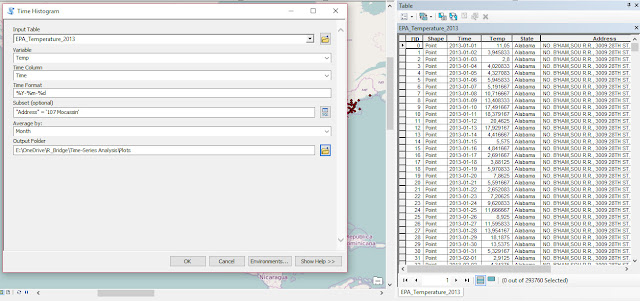
Examples of ANOVA and ANCOVA in R

For this example we are going to use one of the datasets available in the package agridatavailable in CRAN:

 install.packages("agridat")  

We also need to include other packages for the examples below. If some of these are not installed in your system please use again the function install.packages (replacing the name within quotation marks according to your needs) to install them.

 library(agridat)  
library(ggplot2)
library(plotrix)
library(moments)
library(car)
library(fitdistrplus)
library(nlme)
library(multcomp)
library(epade)
library(lme4)

Now we can load the dataset lasrosas.corn, which has more that 3400 observations of corn yield in a field in Argentina, plus several explanatory variables both factorial (or categorical) and continuous.

> dat = lasrosas.corn  
> str(dat)
'data.frame': 3443 obs. of 9 variables:
$ year : int 1999 1999 1999 1999 1999 1999 1999 1999 1999 1999 ...
$ lat : num -33.1 -33.1 -33.1 -33.1 -33.1 ...
$ long : num -63.8 -63.8 -63.8 -63.8 -63.8 ...
$ yield: num 72.1 73.8 77.2 76.3 75.5 ...
$ nitro: num 132 132 132 132 132 ...
$ topo : Factor w/ 4 levels "E","HT","LO",..: 4 4 4 4 4 4 4 4 4 4 ...
$ bv : num 163 170 168 177 171 ...
$ rep : Factor w/ 3 levels "R1","R2","R3": 1 1 1 1 1 1 1 1 1 1 ...
$ nf : Factor w/ 6 levels "N0","N1","N2",..: 6 6 6 6 6 6 6 6 6 6 ...

Important for the purpose of this tutorial is the target variable yield, which is what we are trying to model, and the explanatory variables: topo (topographic factor), bv (brightness value, which is a proxy for low organic matter content) and nf (factorial nitrogen levels). In addition we have rep, which is the blocking factor.

Checking Assumptions

Since we are planning to use an ANOVA we first need to check that our data fits with its assumptions. ANOVA is based on three assumptions:
  • Independence, in terms of independence of the error term
  • Normality of the response variable (y) 
  • Normality of the error term (i.e. residuals).
  • Equality of variances between groups
  • Balance design (i.e. all groups have the same number of samples)
NOTE:
Normality of the response variable is a contested point and not all authors agree with this. In my reading I found some author explicitly talk about normality of the response variable, while others only talk about normality of the errors. In the R Book the author states as assumption only normality of error, but says that the ANOVA can be applied to random variables, which in a way should imply normality of the response.

Let’s see how we can test for them in R. Clearly we are talking about environmental data so the assumption of independence is not met, because data are autocorrelated with distance. Theoretically speaking, for spatial data ANOVA cannot be employed and more robust methods should be employed (e.g. REML); however, over the years it has been widely used for analysis of environmental data and it is accepted by the community. That does not mean that it is the correct method though, and later on in this tutorial we will see the function to perform linear modelling with REML.
The third assumption is the one that is most easy to assess using the function tapply:

> tapply(dat$yield, INDEX=dat$nf, FUN=var)  
N0 N1 N2 N3 N4 N5
438.5448 368.8136 372.8698 369.6582 366.5705 405.5653


In this case we used tapply to calculate the variance of yield for each subgroup (i.e. level of nitrogen). There is some variation between groups but in my opinion it is not substantial. Now we can shift our focus on normality. There are tests to check for normality, but again the ANOVA is flexible (particularly where our dataset is big) and can still produce correct results even when its assumptions are violated up to a certain degree. For this reason, it is good practice to check normality with descriptive analysis alone, without any statistical test. For example, we could start by plotting the histogram of yield:

 hist(dat$yield, main="Histogram of Yield", xlab="Yield (quintals/ha)")  


By looking at this image it seems that our data are more or less normally distributed. Another plot we could create is the QQplot (http://www.itl.nist.gov/div898/handbook/eda/section3/qqplot.htm):

 qqnorm(dat$yield, main="QQplot of Yield")  
qqline(dat$yield)


For normally distributed data the points should all be on the line. This is clearly not the case but again the deviation is not substantial. The final element we can calculate is the skewness of the distribution, with the function skewnessin the package moments:


> skewness(dat$yield)  
[1] 0.3875977


According to Webster and Oliver (2007) is the skewness is below 0.5, we can consider the deviation from normality not big enough to transform the data. Moreover, according to Witte and Witte (2009) if we have more than 10 samples per group we should not worry too much about violating the assumption of normality or equality of variances.
To see how many samples we have for each level of nitrogen we can use once again the function tapply:

> tapply(dat$yield, INDEX=dat$nf, FUN=length)  
N0 N1 N2 N3 N4 N5
573 577 571 575 572 575


As you can see we have definitely more than 10 samples per group, but our design is not balanced (i.e. some groups have more samples). This implies that the normal ANOVA cannot be used, this is because the standard way of calculating the sum of squares is not appropriate for unbalanced designs (look here for more info: http://goanna.cs.rmit.edu.au/~fscholer/anova.php).

The same function tapply can be used to check the assumption of equality of variances. We just need to replace the function length with the function var for the option FUN.

In summary, even though from the descriptive analysis it appears that our data are close to being normal and have equal variance, our design is unbalanced, therefore the normal way of doing ANOVA cannot be used. In other words we cannot function aovfor this dataset. However, since this is a tutorial we are still going to start by applying the normal ANOVA with aov.

ANOVA with aov

The first thing we need to do is think about the hypothesis we would like to test. For example, we could be interested in looking at nitrogen levels and their impact on yield. Let’s start with some plotting to better understand our data:

 means.nf = tapply(dat$yield, INDEX=dat$nf, FUN=mean)  
StdErr.nf = tapply(dat$yield, INDEX=dat$nf, FUN= std.error)

BP = barplot(means.nf, ylim=c(0,max(means.nf)+10))
segments(BP, means.nf - (2*StdErr.nf), BP,
means.nf + (2*StdErr.nf), lwd = 1.5)

arrows(BP, means.nf - (2*StdErr.nf), BP,
means.nf + (2*StdErr.nf), lwd = 1.5, angle = 90,
code = 3, length = 0.05)


This code first uses the function tapply to compute mean and standard error of the mean for yield in each nitrogen group. Then it plots the means as bars and creates error bars using the standard error (please remember that with a normal distribution ± twice the standard error provides a 95% confidence interval around the mean value). The result is the following image:
By plotting our data we can start figuring out what is the interaction between nitrogen levels and yield. In particular, there is an increase in yield with higher level of nitrogen. However, some of the error bars are overlapping, and this may suggest that their values are not significantly different. For example, by looking at this plot N0 and N1 have error bars very close to overlap, but probably not overlapping, so it may be that N1 provides a significant different from N0. The rest are all probably significantly different from N0. For the rest their interval overlap most of the times, so their differences would probably not be significant.

We could formulate the hypothesis that nitrogen significantly affects yield and that the mean of each subgroup are significantly different. Now we just need to test this hypothesis with a one-way ANOVA:

 mod1 = aov(yield ~ nf, data=dat)   

The code above uses the function aov to perform an ANOVA; we can specify to perform a one-way ANOVA simply by including only one factorial term after the tilde (~) sign. We can plot the ANOVA table with the function summary:

> summary(mod1)  
Df Sum Sq Mean Sq F value Pr(>F)
nf 5 23987 4797 12.4 6.08e-12 ***
Residuals 3437 1330110 387
---
Signif. codes: 0 ‘***’ 0.001 ‘**’ 0.01 ‘*’ 0.05 ‘.’ 0.1 ‘ ’ 1


It is clear from this output that nitrogen significantly affects yield, so we tested our first hypothesis. To test the significance for individual levels of nitrogen we can use the Tukey’s test:

> TukeyHSD(mod1, conf.level=0.95)  
Tukey multiple comparisons of means
95% family-wise confidence level

Fit: aov(formula = yield ~ nf, data = dat)

$nf
diff lwr upr p adj
N1-N0 3.6434635 0.3353282 6.951599 0.0210713
N2-N0 4.6774357 1.3606516 7.994220 0.0008383
N3-N0 5.3629638 2.0519632 8.673964 0.0000588
N4-N0 7.5901274 4.2747959 10.905459 0.0000000
N5-N0 7.8588595 4.5478589 11.169860 0.0000000
N2-N1 1.0339723 -2.2770686 4.345013 0.9489077
N3-N1 1.7195004 -1.5857469 5.024748 0.6750283
N4-N1 3.9466640 0.6370782 7.256250 0.0089057
N5-N1 4.2153960 0.9101487 7.520643 0.0038074
N3-N2 0.6855281 -2.6283756 3.999432 0.9917341
N4-N2 2.9126917 -0.4055391 6.230923 0.1234409
N5-N2 3.1814238 -0.1324799 6.495327 0.0683500
N4-N3 2.2271636 -1.0852863 5.539614 0.3916824
N5-N3 2.4958957 -0.8122196 5.804011 0.2613027
N5-N4 0.2687320 -3.0437179 3.581182 0.9999099


There are significant differences between the control and the rest of the levels of nitrogen, plus other differences between N4 and N5 compared to N1, but nothing else. If you look back at the bar chart we produced before, and look carefully at the overlaps between error bars, you will see that for example N1, N2, and N3 have overlapping error bars, thus they are not significantly different. On the contrary, N1 has no overlaps with either N4 and N5 , which is what we demonstrated in the ANOVA.

The function model.tables provides a quick way to print the table of effects and the table of means:

> model.tables(mod1, type="effects")  
Tables of effects

nf
N0 N1 N2 N3 N4 N5
-4.855 -1.212 -0.178 0.5075 2.735 3.003
rep 573.000 577.000 571.000 575.0000 572.000 575.000


These values are all referred to the gran mean, which we can simply calculate with the function mean(dat$yield) and it is equal to 69.83. This means that the mean for N0 would be 69.83-4.855 = 64.97. we can verify that with another call to the function model.tables, this time with the option type=”means”:

> model.tables(mod1, type="means")  
Tables of means
Grand mean

69.82831

nf
N0 N1 N2 N3 N4 N5
64.97 68.62 69.65 70.34 72.56 72.83
rep 573.00 577.00 571.00 575.00 572.00 575.00


Linear Model with 1 factor

The same results can be obtain by fitting a linear model with the function lm, only their interpretation would be different. The assumption for fitting a linear models are again independence (which is always violated with environmental data), and normality.

Let’s look at the code:

 mod2 = lm(yield ~ nf, data=dat)   

This line fits the same model but with the standard linear equation. This become clearer by looking at the summary table:


> summary(mod2)  

Call:
lm(formula = yield ~ nf, data = dat)

Residuals:
Min 1Q Median 3Q Max
-52.313 -15.344 -3.126 13.563 45.337

Coefficients:
Estimate Std. Error t value Pr(>|t|)
(Intercept) 64.9729 0.8218 79.060 < 2e-16 ***
nfN1 3.6435 1.1602 3.140 0.0017 **
nfN2 4.6774 1.1632 4.021 5.92e-05 ***
nfN3 5.3630 1.1612 4.618 4.01e-06 ***
nfN4 7.5901 1.1627 6.528 7.65e-11 ***
nfN5 7.8589 1.1612 6.768 1.53e-11 ***
---
Signif. codes: 0 ‘***’ 0.001 ‘**’ 0.01 ‘*’ 0.05 ‘.’ 0.1 ‘ ’ 1

Residual standard error: 19.67 on 3437 degrees of freedom
Multiple R-squared: 0.01771, Adjusted R-squared: 0.01629
F-statistic: 12.4 on 5 and 3437 DF, p-value: 6.075e-12


There are several information in this table that we should clarify. First of all it already provides with some descriptive measures for the residuals, from which we can see that their distribution is relatively normal (first and last quartiles have similar but opposite values and the same is true for minimum and maximum). As you remember when we talked about assumptions, one was that the error term is normal. This first part of the output allows us to check whether we are meeting this assumption.

Other important information we should look at are the R-squared and Adjusted R-squared (please look at the end of the page to know more about these two values). In essence, R-squared tells us how much variance in the data can be explained by the model, in this case not much. However, this is an exploratory rather than a predictive model, so we know that there may be other factors that affect the variability of yield, but we are not interested in them. We are only interested in understanding in the impact of the level of nitrogen. Another important information is the F-statistics at the end, with the p-value (which is very low). The F-statistic is the ration between the variability between groups (meaning between different level of N) and within groups (meaning the variability with samples with the same value of N). This ratio and the related p-value tell us that our model is significant (because the variability that we obtain increasing N is higher that the normal variability we expect from random variation), which means that nitrogen has an effect on yield.

Then we have the table of the coefficients, with the intercept and all the slopes, plus their standard errors. These can be used to build confidence intervals for the coefficients, which are used to assess the uncertainty around their estimation. We can actually compute the confidence intervals with the function confint (the option level is used to specify for example that we are looking at the 95% confidence interval):

> confint(mod2, level = 0.95)  
2.5 % 97.5 %
(Intercept) 63.361592 66.584202
nfN1 1.368687 5.918240
nfN2 2.396712 6.958160
nfN3 3.086217 7.639711
nfN4 5.310402 9.869853
nfN5 5.582112 10.135607


Another important element about coefficients is that there measuring unit is the same as the dependent variable, because it provides an estimate of the effect of a predictor to the dependent variable, i.e. yield.

As you can see the level N0 is not shown in the list; this is called the reference level, which means that all the other are referenced back to it. In other words, the value of the intercept is the mean of nitrogen level 0 (in fact is the same we calculated above 64.97). To calculate the means for the other groups we need to sum the value of the reference level with the slopes. For example N1 is 64.97 + 3.64 = 68.61 (the same calculated from the ANOVA). The p-value and the significance are again in relation to the reference level, meaning for example that N1 is significantly different from N0 (reference level) and the p-value is 0.0017. This is similar to the Tukey’s test we performed above, but it is only valid in relation to N0. As you can see the p-value is computed from the t-statistic, this is because R computes t-test comparing all the factors to the reference level.

We need to change the reference level, and fit another model, to get the same information for other nitrogen levels:


 dat$nf = relevel(dat$nf, ref="N1")  

mod3 = lm(yield ~ nf, data=dat)
summary(mod3)


Now the reference level is N1, so all the results will tell us the effects of nitrogen in relation to N1.


> summary(mod3)  

Call:
lm(formula = yield ~ nf, data = dat)

Residuals:
Min 1Q Median 3Q Max
-52.313 -15.344 -3.126 13.563 45.337

Coefficients:
Estimate Std. Error t value Pr(>|t|)
(Intercept) 68.616 0.819 83.784 < 2e-16 ***
nfN0 -3.643 1.160 -3.140 0.001702 **
nfN2 1.034 1.161 0.890 0.373308
nfN3 1.720 1.159 1.483 0.138073
nfN4 3.947 1.161 3.400 0.000681 ***
nfN5 4.215 1.159 3.636 0.000280 ***
---
Signif. codes: 0 ‘***’ 0.001 ‘**’ 0.01 ‘*’ 0.05 ‘.’ 0.1 ‘ ’ 1

Residual standard error: 19.67 on 3437 degrees of freedom
Multiple R-squared: 0.01771, Adjusted R-squared: 0.01629
F-statistic: 12.4 on 5 and 3437 DF, p-value: 6.075e-12


For example, we can see that N0 has a lower value compared to N1, and that only N0, N4 and N5 are significantly different from N1, which is what we saw from the bar chart and what we found from the Tukey’s test.

Interpreting the output of the function aov is much easier compare to lm. However, in many cases we can only use the function lm (for example in an ANCOVA where alongside categorical we have continuous explanatory variables) so it is important that we learn how to interpret its summary table.

We can obtain the ANOVA table with the function anova:

> anova(mod2)  
Analysis of Variance Table

Response: yield
Df Sum Sq Mean Sq F value Pr(>F)
nf 5 23987 4797.4 12.396 6.075e-12 ***
Residuals 3437 1330110 387.0
---
Signif. codes: 0 ‘***’ 0.001 ‘**’ 0.01 ‘*’ 0.05 ‘.’ 0.1 ‘ ’ 1


This uses the type I sum of squares (more info at: http://www.utstat.utoronto.ca/reid/sta442f/2009/typeSS.pdf), which is the standard way and it is not indicated for unbalanced designs. The function Anova in the package car has the option to select which type of sum of squares to calculate and we can specify type=c(“III”)to correct for the unbalanced design:


> Anova(mod2, type=c("III"))  
Anova Table (Type III tests)

Response: yield
Sum Sq Df F value Pr(>F)
(Intercept) 2418907 1 6250.447 < 2.2e-16 ***
nf 23987 5 12.396 6.075e-12 ***
Residuals 1330110 3437
---
Signif. codes: 0 ‘***’ 0.001 ‘**’ 0.01 ‘*’ 0.05 ‘.’ 0.1 ‘ ’ 1


In this example the two results are the same, probably the large sample size helps in this respect. However, for smaller samples this distinction may become important. For this reason, if your design is unbalanced please remember not to use the function aov, but always lmand Anova with the option for type III sum of squares.

Two-way ANOVA

So far we have looked on the effect of nitrogen on yield. However, in the dataset we also have a factorial variable named topo, which stands for topographic factor and has 4 levels: W = West slope, HT = Hilltop, E = East slope, LO = Low East. We already formulated an hypothesis about nitrogen, so now we need to formulate an hypothesis about topo as well. Once again we can do that by using the function tapply and a simple bar charts with error bars. Look at the code below:


 means.topo = tapply(dat$yield, INDEX=dat$topo, FUN=mean)  
StdErr.topo = tapply(dat$yield, INDEX=dat$topo, FUN= std.error)

BP = barplot(means.topo, ylim=c(0,max(means.topo)+10))
segments(BP, means.topo - (2*StdErr.topo), BP,
means.topo + (2*StdErr.topo), lwd = 1.5)

arrows(BP, means.topo - (2*StdErr.topo), BP,
means.topo + (2*StdErr.topo), lwd = 1.5, angle = 90,
code = 3, length = 0.05)


Here we are using the same exact approach we used before to formulate an hypothesis about nitrogen. We first calculate mean and standard error of yield for each level of topo, and then plot a bar chart with error bars.

The result is the plot below:
From this plot it is clear that the topographic factor has an effect on yield. In particular, hilltop areas have low yield while the low east corner of the field has high yield. From the error bars we can say with a good level of confidence that probably all the differences will be significant, at least up to an alpha of 95% (significant level, meaning a p-value of 0.05).

We can test this hypothesis with a two way ANOVA, by simply adding the term topo to the equation:


 mod1b = aov(yield ~ nf + topo, data=dat)  

summary(mod1b)

Df Sum Sq Mean Sq F value Pr(>F)
nf 5 23987 4797 23.21 <2e-16 ***
topo 3 620389 206796 1000.59 <2e-16 ***
Residuals 3434 709721 207
---
Signif. codes: 0 ‘***’ 0.001 ‘**’ 0.01 ‘*’ 0.05 ‘.’ 0.1 ‘ ’ 1


From the summary table it is clear that both factors have a significant effect on yield, but just by looking at this it is very difficult to identify clearly which levels are the significant ones. Top do that we need the Tukey’s test:


 TukeyHSD(mod1b, conf.level=0.95, which=c("topo"))  

Tukey multiple comparisons of means
95% family-wise confidence level

Fit: aov(formula = yield ~ nf + topo, data = dat)

$topo
diff lwr upr p adj
HT-LO -36.240955 -38.052618 -34.429291 0
W-LO -18.168544 -19.857294 -16.479794 0
E-LO -6.206619 -8.054095 -4.359143 0
W-HT 18.072411 16.326440 19.818381 0
E-HT 30.034335 28.134414 31.934257 0
E-W 11.961925 10.178822 13.745028 0


The zero p-values indicate a large significance for each combination, as it was clear from the plot. With the function model.table you can easily obtain a table of means or effects, if you are interested.


Two-Way ANOVA with Interactions

One step further we can take to get more insights into our data is add an interaction between nitrogen and topo, and see if this can further narrow down the main sources of yield variation. Once again we need to start our analysis by formulating an hypothesis. Since we are talking about an interaction we are now concern in finding a way to plot yield responses for varying nitrogen level and topographic position, so we need a 3d bar chart. We can do that with the function bar3d.ade from the package epade, so please install this package and load it. 

Then please look at the following R code:

 dat$topo = factor(dat$topo,levels(dat$topo)[c(2,4,1,3)])  

means.INT = tapply(dat$yield, INDEX=list(dat$nf, dat$topo), FUN=mean)

bar3d.ade(means.INT, col="grey")


The first line is only used to reorder the levels in the factorial variable topo. This is because from the previous plot we clearly saw that HT is the one with the lowest yield, followed by W, E and LO. We are doing this only to make the 3d bar chart more readable.

The next line applies once again the function tapply, this time to calculate the mean of yield for subgroups divided by nitrogen and topographic factors. The result is a matrix that looks like this:


> means.INT  
LO HT W E
N0 81.03027 41.50652 62.08192 75.13902
N1 83.06276 48.33630 65.74627 78.12808
N2 85.06879 48.79830 66.70848 78.92632
N3 85.23255 50.18398 66.16531 78.99210
N4 87.14400 52.12039 70.10682 80.39213
N5 87.94122 51.03138 69.65933 80.55078


This can be used directly within the function bar3d.ade to create the 3d bar chart below:


From this plot we can see two things very clearly: the first is that there is an increase in yield from HT to LO in the topographic factor, the second is that we have again and increase from N0 to N1 in the nitrogen levels. These were all expected since we already noticed them before. What we do not see in these plot is any particular influence from the interaction between topography and nitrogen. For example, if you look at HT, you have an increase in yield from N0 to N5 (expected) and overall the yield is lower than the other bars (again expected). If there was an interaction we would expect this general pattern to change, for example with relatively high yield on the hilltop at high nitrogen level, or very low yield in the low east side with N0. This does not happen and all the bars follow an expected pattern, so we can hypothesise that the interaction will not be significant.

We can further explore a possible interaction between nf and topo by creating an interaction plot:

 with(dat, interaction.plot(topo, nf, yield))  

This line applies the function interaction plot within the call to the function with, which indicates to R that the names are referred to the dataset named dat. The result is the following image:

Again, all the lines increase with changes in topography, but there no additional effect provided by changes in nf. In fact, the lines never cross, or just cross slightly: this is a good indication of lack of interaction.

To formally test our hypothesis of lack of interaction, we need to run another ANOVA with an interaction term:

 mod1c = aov(yield ~ nf * topo, data=dat)  

This formula test for both main effects and their interaction. To see the significance we can use the summary table:

> summary(mod1c)  
Df Sum Sq Mean Sq F value Pr(>F)
nf 5 23987 4797 23.176 <2e-16 ***
topo 3 620389 206796 999.025 <2e-16 ***
nf:topo 15 1993 133 0.642 0.842
Residuals 3419 707727 207
---
Signif. codes: 0 ‘***’ 0.001 ‘**’ 0.01 ‘*’ 0.05 ‘.’ 0.1 ‘ ’ 1


From this we can conclude that our hypothesis was correct and that the interaction has no effect on yield.

We can have a even better ides of the interaction effect by using some functions in the package phia:

 library(phia)  

plot(interactionMeans(mod1c))

This function plots the effects of the interactions in a 2 by 2 plot, including the standard error of the coefficients, so that we can readily see which overlap:


We already knew from the 3d plot that there is a general increase between N0 and N5 that mainly drives the changes we see in the data. However, from the top-right plot we can see that topo plays a little role between N0 and the other (in fact the black line only slightly overlap with the other), but it has no effect on N1 to N5.

We can look at the numerical break-out of what we see in the plot with another function:

> testInteractions(mod1c)  
F Test:
P-value adjustment method: holm
Value Df Sum of Sq F Pr(>F)
N0-N1 : HT-W -3.1654 1 377 1.8230 1
N0-N2 : HT-W -2.6652 1 267 1.2879 1
N0-N3 : HT-W -4.5941 1 784 3.7880 1
N0-N4 : HT-W -2.5890 1 250 1.2072 1
N0-N5 : HT-W -1.9475 1 140 0.6767 1
N1-N2 : HT-W 0.5002 1 9 0.0458 1
N1-N3 : HT-W -1.4286 1 76 0.3694 1
N1-N4 : HT-W 0.5765 1 12 0.0604 1
N1-N5 : HT-W 1.2180 1 55 0.2669 1
N2-N3 : HT-W -1.9289 1 139 0.6711 1
N2-N4 : HT-W 0.0762 1 0 0.0011 1
N2-N5 : HT-W 0.7178 1 19 0.0924 1
N3-N4 : HT-W 2.0051 1 149 0.7204 1

The table is very long so only the first lines are included. However, from this it is clear that the interaction has no effect (p-value of 1), but if it was this function can give us numerous details about the specific effects.

Now we could try to compare the two models to see if they are different in the amount of variability they can explain in the data. This can be done with the function anova, and performing an F test:

> anova(mod1b, mod1c, test="F")  
Analysis of Variance Table
Model 1: yield ~ nf + topo
Model 2: yield ~ nf * topo
Res.Df RSS Df Sum of Sq F Pr(>F)
1 3434 709721
2 3419 707727 15 1993.2 0.6419 0.8421

As we can see from this output, the p-value is not significant. This means that the two model are no different in their explanatory power. This further support the fact that including an interaction does not change the accuracy of the model, and probably decreases it. We could test this last statement for example by looking at the AIC for both models, we will see how to do that later on in the tutorial.

Please remember that the method we just used can be employed to compare probably all the models we are going to fit in this tutorial, so it is a very powerful method!


ANCOVA with lm

The Analysis of covariance (ANCOVA) fits a new model where the effects of the treatments (or factorial variables) is corrected for the effect of continuous covariates, for which we can also see the effects on yield.

The code is very similar to what we saw before, and again we can perform an ANCOVA with the lm function; the only difference is that here we are including an additional continuous explanatory variable in the model:


> mod3 = lm(yield ~ nf + bv, data=dat)  
> summary(mod3)

Call:
lm(formula = yield ~ nf + bv, data = dat)

Residuals:
Min 1Q Median 3Q Max
-78.345 -10.847 -3.314 10.739 56.835

Coefficients:
Estimate Std. Error t value Pr(>|t|)
(Intercept) 271.55084 4.99308 54.385 < 2e-16 ***
nfN0 -3.52312 0.95075 -3.706 0.000214 ***
nfN2 1.54761 0.95167 1.626 0.103996
nfN3 2.08006 0.94996 2.190 0.028619 *
nfN4 3.82330 0.95117 4.020 5.96e-05 ***
nfN5 4.47993 0.94994 4.716 2.50e-06 ***
bv -1.16458 0.02839 -41.015 < 2e-16 ***
---
Signif. codes: 0 ‘***’ 0.001 ‘**’ 0.01 ‘*’ 0.05 ‘.’ 0.1 ‘ ’ 1

Residual standard error: 16.12 on 3436 degrees of freedom
Multiple R-squared: 0.3406, Adjusted R-squared: 0.3394
F-statistic: 295.8 on 6 and 3436 DF, p-value: < 2.2e-16


By printing the summary table we can already see some differences compared to the model we only nitrogen as explanatory variable. The first is related to the Adjusted R-squared (which is simply the R-squared corrected for the number of predictors so that it is less affected by overfitting), which in this case is around 0.3. If we look back at the summary table of the model with only nitrogen, the R-squared was only 0.01. This means that by adding the continuous variable bv we are able to massively increase the explanatory power of the model; in fact, this new model is capable of explaining 33% of the variation in yield. Moreover, we can also see that other terms become significant, for example N3. This is because the inclusion of bv changes the entire model and its interpretation becomes less obvious compared to the simple bar chart we plotted at the beginning.

The interpretation of the ANCOVA model is more complex that the one for the one-way ANOVA. In fact, the intercept value has changed and it is not the mean of the reference level N1. This is because the model now changes based on the covariate bv. The slope can be used to assess the relative impact of each term; for example, N0 has a negative impact on yield in relation to its reference level. Therefore, shifting from a nitrogen level N1 to N0 decreases the yield by -3.52, if bv is kept constant. 

Take a look at the following code:

> test.set = data.frame(nf="N1", bv=150)  
> predict(mod3, test.set)
1 2
96.86350 38.63438
>
> test.set = data.frame(nf="N0", bv=150)
> predict(mod3, test.set)
1
93.34037


Here we are using the model (mod3) to estimate new values of yield based on set parameters. In the first example we set nf to N1 (reference level) and bv constant at 150. With the function predictwe can see estimate these new values using mod3. For N1 and bv equal to 150 the yield is 96.86. In the second example we did the same but for nitrogen level N0. The result is a yield equal to 93.34, that is a difference of exactly 3.52, which is the slope of the model.

For computing the ANOVA table, we can again use either the function anova (if the design is balanced) or Anova with type III (for unbalanced designs).

Let's now look at some diagnostic plots we can use to test whether our model meets all the assumptions for linear models. We can use the default plot function in R to do so:

 par(mfrow=c(2,2))  
plot(mod3)

Here I first used the function par, to divide the plotting window into 2 rows and two columns so that we can plot all four diagnostic plots into the same window. The result is the following:


The top left plot is represents the residuals against the fitted values (or the estimates from the model). One of our assumptions was that the error term had mean equal to zero and constant variance. This means that we should see the residuals equally spread around zero. We should see a more or less horizontal line with intercept on the zero. In fact, we actually see that for low values of yield (x axis) we have a sort of equal spread around zero, but this changes with the increase in yield; this is clearly a violation of the assumption. The second plot on the top represents the QQplot of the residuals, which again should be on the middle line because another assumption is that the error should be normal. Again we have some values that do not fit with normality. A good thing is that R prints the ID of these values so that we can evaluate whether we think they are outliers or we have another explanation for the violations of the assumptions.
In the second row on the left we have a plot that again is used to check whether we meet the assumption of constant variance. We should again see a more or less horizontal line, but again we have an increase in variance, which violates the assumption. Finally, we have the residuals vs. leverage plot and the Cook's Distance. Leverage represents the influence of each point on the model; again we see that some points have larger influence on the model. This should not be the case, we should see again a more or less equal spread of point. Another information we can have from this plot is whether the extreme observations may be outliers. If our extreme points would lie outside the Cook's Distance zone we would suspect them to be outliers. However, in this case the zone is not even plotted because it is outside the plotting area, so we probably do not have outliers.

For more info about diagnostic plots please take a look here:
http://data.library.virginia.edu/diagnostic-plots/
http://www.statmethods.net/stats/rdiagnostics.html

We can further investigate as to why our model does not meet all assumptions by looking at the residuals vs. fitted values and try to color the points based for example on topo. We can do that easily with ggplot2:

 qplot(fitted(mod3), residuals(mod3), col=dat$topo, geom="point", xlab="Fitted Values", ylab="Residuals")  

This creates the following image:


From this image it is clear that all the points that look as possible outliers come from a specific topographic category. This may mean different things depending on the data. In this case I think it only means that we should include topo in our model. However, for other data it may mean that we should exclude certain categories, but the point I want to make is that it is always important not to look only at the summary table but try to explore the model a bit more in details to draw more meaningful conclusions.

Two-factors and one continuous explanatory variable

Let’s look now at another example with a slightly more complex model where we include two factorial and one continuous variable. We also include in the model the variable topo. We can check these with the function levels:

> levels(dat$topo)  
[1] "E""HT""LO""W"


Please notice that E is the first and therefore is the reference level for this factor. Now let’s fit the model and look at the summary table:


> mod4 = lm(yield ~ nf + bv + topo, data=dat)  
>
> summary(mod4)

Call:
lm(formula = yield ~ nf + bv + topo, data = dat)

Residuals:
Min 1Q Median 3Q Max
-46.394 -10.927 -2.211 10.364 47.338

Coefficients:
Estimate Std. Error t value Pr(>|t|)
(Intercept) 171.20921 5.28842 32.374 < 2e-16 ***
nfN0 -3.73225 0.81124 -4.601 4.36e-06 ***
nfN2 1.29704 0.81203 1.597 0.1103
nfN3 1.56499 0.81076 1.930 0.0537 .
nfN4 3.71277 0.81161 4.575 4.94e-06 ***
nfN5 3.88382 0.81091 4.789 1.74e-06 ***
bv -0.54206 0.03038 -17.845 < 2e-16 ***
topoHT -24.11882 0.78112 -30.877 < 2e-16 ***
topoLO 3.13643 0.70924 4.422 1.01e-05 ***
topoW -10.77758 0.66708 -16.156 < 2e-16 ***
---
Signif. codes: 0 ‘***’ 0.001 ‘**’ 0.01 ‘*’ 0.05 ‘.’ 0.1 ‘ ’ 1

Residual standard error: 13.75 on 3433 degrees of freedom
Multiple R-squared: 0.5204, Adjusted R-squared: 0.5191
F-statistic: 413.8 on 9 and 3433 DF, p-value: < 2.2e-16


The adjusted R-squared increases again and now we are able to explain around 52% of the variation in yield.

The interpretation is similar to what we said before, the only difference is that here both factors have a reference level. So for example, the effect of topoHT is related to the reference level, which is the one not shown E. So if we change the topographic position from E to HT, while keeping everything else in the model constant (meaning same value of bv and same nitrogen level), we obtain a decrease in yield of 24.12.

Another thing we can see from this table is that the p-value change, and for example N3 becomes less significant. This is probably because when we consider more variables the effect of N3 on yield is explained by other variables, maybe partly bv and partly topo.

One last thing we can check, and this is something we should check every time we perform an ANOVA or a linear model is the normality of the residuals. We already saw that the summary table provides us with some data about the residuals distribution (minimum, first quartile, median, third quartile and maximum) that gives us a good indication of normality, since the distribution is centred around 0. However, we can also use other tools to check this. For example a QQ plot:

 RES = residuals(mod4)  
qqnorm(RES)
qqline(RES)


The function residuals automatically extract the residuals from the model, which can then be used to create the following plot:


It looks approximately normal, but to have a further confirmation we can use again the function skewness, which returns a value below 0.5, so we can consider this a normal distribution.


ANCOVA with interactions

Let’s now add a further layer of complexity by adding an interaction term between bv and topo. Once again we need to formulate an hypothesis before proceeding to test it. Since we are interested in an interaction between a continuous variable (bv) and a factorial variable (topo) on yield, we could try to create scatterplots of yield versus bv, for the different levels in topo. We can easily do that with the package ggplot2:

 qplot(yield, bv, data=dat, geom="point", xlab="Yield", ylab="bv") +  
facet_wrap(~topo)+
geom_smooth(method = "lm", se = TRUE)


Explaining every bit of the three lines of code above would require some time and it is beyond the scope of this tutorial. In essence, these lines create a scatterplot yield versus bv for each subgroup of topo and then fit a linear regression line through the points. For more info about the use of ggplot2 please start by looking here: http://www.statmethods.net/advgraphs/ggplot2.html

This create the plot below:


From this plot it is clear that the four lines have different slopes, so the interaction between bv and topo may well be significant and help us further increase the explanatory power of our model. We can test that by adding this interaction:

 mod5 = lm(yield ~ nf + bv * topo, data=dat)  

We can use the function Anova to check the significance:

> Anova(mod5, type=c("III"))  
Anova Table (Type III tests)

Response: yield
Sum Sq Df F value Pr(>F)
(Intercept) 20607 1 115.225 < 2.2e-16 ***
nf 23032 5 25.758 < 2.2e-16 ***
bv 5887 1 32.920 1.044e-08 ***
topo 40610 3 75.691 < 2.2e-16 ***
bv:topo 36059 3 67.209 < 2.2e-16 ***
Residuals 613419 3430
---
Signif. codes: 0 ‘***’ 0.001 ‘**’ 0.01 ‘*’ 0.05 ‘.’ 0.1 ‘ ’ 1


As you can see this interaction is significant. To check the details we can look at the summary table:

> summary(mod5)  

Call:
lm(formula = yield ~ nf + bv * topo, data = dat)

Residuals:
Min 1Q Median 3Q Max
-46.056 -10.328 -1.516 9.622 50.184

Coefficients:
Estimate Std. Error t value Pr(>|t|)
(Intercept) 93.45783 8.70646 10.734 < 2e-16 ***
nfN1 3.96637 0.78898 5.027 5.23e-07 ***
nfN2 5.24313 0.79103 6.628 3.93e-11 ***
nfN3 5.46036 0.79001 6.912 5.68e-12 ***
nfN4 7.52685 0.79048 9.522 < 2e-16 ***
nfN5 7.73646 0.79003 9.793 < 2e-16 ***
bv -0.27108 0.04725 -5.738 1.04e-08 ***
topoW 88.11105 12.07428 7.297 3.63e-13 ***
topoE 236.12311 17.12941 13.785 < 2e-16 ***
topoLO -15.76280 17.27191 -0.913 0.3615
bv:topoW -0.41393 0.06726 -6.154 8.41e-10 ***
bv:topoE -1.21024 0.09761 -12.399 < 2e-16 ***
bv:topoLO 0.28445 0.10104 2.815 0.0049 **
---
Signif. codes: 0 ‘***’ 0.001 ‘**’ 0.01 ‘*’ 0.05 ‘.’ 0.1 ‘ ’ 1

Residual standard error: 13.37 on 3430 degrees of freedom
Multiple R-squared: 0.547, Adjusted R-squared: 0.5454
F-statistic: 345.1 on 12 and 3430 DF, p-value: < 2.2e-16


The R-squared is a bit higher, which means that we can explain more of the variability in yield by adding the interaction. For the interpretation, once again everything is related to the reference levels in the factors, even the interaction. So for example, bv:topoW tells us that the interaction between bv and topo changes the yield negatively if we change from HT to W, keeping everything else constant.

For information about individual changes we would need to use the model to estimate new data as we did for mod3.


GLS – For violations of independence

As we mentioned, there are certain assumptions we need to check before starting an analysis with linear models. Assumptions about normality and equality of variance can be relaxed, particularly if sample sizes are large enough. However, other assumptions for example balance in the design and independence tend to be stricter, and we need to be careful in violating them.

We can check for independence by looking at the correlation between predictors and coefficient directly in the summary table. We do that because we need to check the independence of the error (i.e. the residuals). If residuals are independent the correlation will be low.

> summary(mod5, cor=T)  
[…]
Correlation of Coefficients:
(Intercept) nfN1 nfN2 nfN3 nfN4 nfN5 bv topoW topoE topoLO
nfN1 -0.05
nfN2 -0.04 0.50
nfN3 -0.05 0.50 0.50
nfN4 -0.05 0.50 0.50 0.50
nfN5 -0.05 0.50 0.50 0.50 0.50
bv -1.00 0.01 -0.01 0.01 0.00 0.00
topoW -0.72 0.00 0.00 0.00 0.00 0.00 0.72
topoE -0.51 0.01 0.02 0.03 0.01 0.02 0.51 0.37
topoLO -0.50 -0.02 -0.01 0.02 -0.01 0.02 0.50 0.36 0.26
bv:topoW 0.70 0.00 0.00 0.00 0.00 0.00 -0.70 -1.00 -0.36 -0.35
bv:topoE 0.48 -0.01 -0.02 -0.03 -0.01 -0.02 -0.48 -0.35 -1.00 -0.24
bv:topoLO 0.47 0.02 0.01 -0.02 0.01 -0.02 -0.47 -0.34 -0.24 -1.00
bv:topoW bv:topoE
nfN1
nfN2
nfN3
nfN4
nfN5
bv
topoW
topoE
topoLO
bv:topoW
bv:topoE 0.34
bv:topoLO 0.33 0.23


If we exclude the interaction, which would clearly be correlated with the single covariates, the rest of the coefficients are not much correlated. From this we may conclude that our assumption of independence holds true for this dataset.

We can also graphically check the independence of the error by simply plotting the residuals agains the fitted values and then fit a line through the points:

 qplot(fitted(mod5), residuals(mod5), geom="point", xlab="Fitted Values", ylab="Residuals") +  
geom_smooth(method = "lm", se = TRUE)

The result is the image below, which is simply another way to obtain the same result we saw for the ANCOVA but this time in ggplot2:


As you can see the line is horizontal, which means the residuals have no trend. Moreover, their spread is more or less constant for the whole range of fitted values. As you remember we assume the error term of the linear model to have zero mean and constant variance. For both these reason I think we can consider that the model meets both assumptions. However, if we color the points based on the variable topo (which is not shown but it is very easy to do with the option col in qplot) we can see that the 3-4 smaller clouds we see in the plot above are produced by particular topographical categories. This coupled with the fact that our data are probably autocorrelated, since they are sampled in space, may let us conclude that we should not assume independence and therefore GLS would be the best method.

In cases where the assumption of independence is violated, we would need to use a more robust method of maximum likelihood (ML) and residuals maximum likelihood (REML) for computing the coefficients. This can be done with the function gls in the package nlme, using the same syntax as for lm:

 mod6 = gls(yield ~ nf + bv * topo, data=dat, method="REML")  

Anova(mod6, type=c("III"))

summary(mod6)


As you can see despite the different function (gls instead of lm), the rest of the syntax is the same as before. We can still use the function Anova to print the ANOVA table and summary to check the individual coefficients.

Moreover, we can also use the function anovato compare the two models (the one from glsand lm) and see which is the best performer:

> anova(mod6, mod5)  
Model df AIC BIC logLik
mod6 1 14 27651.21 27737.18 -13811.61
mod5 2 14 27651.21 27737.18 -13811.61


The indexes AIC, BIC and logLik are all used to check the accuracy of the model and should be as low as possible. For more info please look at the appendix about assessing the accuracy of our model. 


References and Further Reading

Finch, W.H., Bolin, J.E. and Kelley, K., 2014. Multilevel modeling using R. Crc Press.

Yan, X. and Su, X., 2009. Linear regression analysis: theory and computing. World Scientific.

James, G., Witten, D., Hastie, T. and Tibshirani, R., 2013. An introduction to statistical learning (Vol. 6). New York: springer. http://www-bcf.usc.edu/~gareth/ISL/ISLR%20Sixth%20Printing.pdf

Long, J. Scott. 1997. Regression Models for Categorical and Limited Dependent Variables. Sage. pp104-106. [For pseudo R-Squared equations, page available on google books]

Webster, R. and Oliver, M.A., 2007. Geostatistics for environmental scientists. John Wiley & Sons.

West, B.T., Galecki, A.T. and Welch, K.B., 2014. Linear mixed models. CRC Press.

Gałecki, A. and Burzykowski, T., 2013. Linear mixed-effects models using R: A step-by-step approach. Springer Science & Business Media.

Williams, R., 2004. One-Way Analysis of Variance. URL: https://www3.nd.edu/~rwilliam/stats1/x52.pdf

Witte, R. and Witte, J. 2009. Statistics. 9th ed. Wiley.


Generalized Linear Models and Mixed-Effects in Agriculture

$
0
0
After publishing my previous post, I realized that it was way too long and so I decided to split it in 2-3 parts. If you think something is missing in the explanation here it may be related to the fact that this was originally part of the previous post (http://r-video-tutorial.blogspot.co.uk/2017/06/linear-models-anova-glms-and-mixed.html), so please look there first (otherwise please post your question in the comment section and I will try to answer).

Dealing with non-normal data – Generalized Linear Models

As you remember, when we first introduced the simple linear model (Linear Models in Agriculture) we defined a set of assumptions that need to be met to apply this model. In the same post, we talked about methods to deal with deviations from assumptions of independence, equality of variances and balanced designs and the fact that, particularly if our dataset is large, we may reach robust results even if our data are not perfectly normal. However, there are datasets for which the target variable has a completely different distribution from the normal, this means that also the error terms will not be normally distributed.
In these cases we need to change our modelling method and employ generalized linear models (GLM). Common scenarios where GLM should be considered are studies where the variable of interest is binary, for example presence or absence of a species, or where we are interested in modelling counts, for example the number of insects present in a particular location. In these cases, where the target variable is not continuous but rather discrete or categorical, the assumption of normality is usually not met. In this section we will focus on the two scenarios mentioned above, but GLM can be used to deal with data distributed in many different ways, and we will introduce how to deal with more general cases.


Count Data

Data of this type, i.e. counts or rates, are characterized by the fact that their lower bound is always zero. This does not fit well with a normal linear model, where the regression line may well estimate negative values. For this type of variable we can employ a Poisson Regression, which fits the following model:

As you can see the equation is very similar to the standard linear model, the difference is that to insure that all Y are positive (since we cannot have negative values for count data) we are estimating the log of Y. This is referred to as the link function, meaning the transformation of y that we need to make to insure linearity of the response. For the model we are going to look at below, which are probably the most common, the link function is implicitly called, meaning that glm call the right function for us and we do not have to specify it explicitly. However, we can do that if needed.

From this equation you may think that instead of using glm we could log transform y and run a normal lm. The problem with that would be that lm is assuming a normal error term with constant variance (as we saw with the plot fitted versus residuals), but for this model this assumption would be violated. That is why we need to use glm.

In R fitting this model is very easy. For this example we are going to use another dataset available in the package agridat, named beall.webworms, which represents counts of webworms in a beet field, with insecticide treatments:

> dat = beall.webworms  
> str(dat)
'data.frame': 1300 obs. of 7 variables:
$ row : int 1 2 3 4 5 6 7 8 9 10 ...
$ col : int 1 1 1 1 1 1 1 1 1 1 ...
$ y : int 1 0 1 3 6 0 2 2 1 3 ...
$ block: Factor w/ 13 levels "B1","B10","B11",..: 1 1 1 1 1 6 6 6 6 6 ...
$ trt : Factor w/ 4 levels "T1","T2","T3",..: 1 1 1 1 1 1 1 1 1 1 ...
$ spray: Factor w/ 2 levels "N","Y": 1 1 1 1 1 1 1 1 1 1 ...
$ lead : Factor w/ 2 levels "N","Y": 1 1 1 1 1 1 1 1 1 1 ...


We can check the distribution of our data with the function hist:

 hist(dat$y, main="Histogram of Worm Count", xlab="Number of Worms")  


We are going to fit a simple model first to see how to interpret its results, and then compare it with a more complex model:

 pois.mod = glm(y ~ trt, data=dat, family=c("poisson"))  

As you can see the model features a new option called family, here you specify the distribution of the error term, in this case a poisson distribution. We should also specify a log link function as we saw before, but this is the default setting so there is no need to include it.

Once again the function summary will show some useful details about this model:

> summary(pois.mod)  

Call:
glm(formula = y ~ trt, family = c("poisson"), data = dat)

Deviance Residuals:
Min 1Q Median 3Q Max
-1.6733 -1.0046 -0.9081 0.6141 4.2771

Coefficients:
Estimate Std. Error z value Pr(>|z|)
(Intercept) 0.33647 0.04688 7.177 7.12e-13 ***
trtT2 -1.02043 0.09108 -11.204 < 2e-16 ***
trtT3 -0.49628 0.07621 -6.512 7.41e-11 ***
trtT4 -1.22246 0.09829 -12.438 < 2e-16 ***
---
Signif. codes: 0 ‘***’ 0.001 ‘**’ 0.01 ‘*’ 0.05 ‘.’ 0.1 ‘ ’ 1

(Dispersion parameter for poisson family taken to be 1)

Null deviance: 1955.9 on 1299 degrees of freedom
Residual deviance: 1720.4 on 1296 degrees of freedom
AIC: 3125.5

Number of Fisher Scoring iterations: 6


The first valuable information is related to the residuals of the model, which should be symmetrical as for any normal linear model. From this output we can see that minimum and maximum, as well as the first and third quartiles, are similar, so this assumption is confirmed. Then we can see that the variable trt (i.e. treatment factor) is highly significant for the model, with very low p-values. The statistical test in this case is not a t-test, as in the output of the function lm, but a Wald Test (Wald Test). This test computes the probability that the coefficient is 0, if the p is significant it means the chances the coefficient is zero are very low so the variable should be included in the model since it has an effect on y.
Another important information is the deviance, particularly the residual deviance. As a general rule, this value should be lower or in line than the residuals degrees of freedom for the model to be good. In this case the fact that the residual deviance is high (even though not dramatically) may suggests the explanatory power of the model is low. We will see below how to obtain p-value for the significance of the model.

We can use the function plot to obtain more info about how the model fits our data:

 par(mfrow=c(2,2))  
plot(pois.mod)

This creates the following plot, where the four outputs are included in the same image:


This plots tell a lot about the goodness of fit of the model. The first image in top left corner is the same we created for lm (i.e. residuals versus fitted values). This again does not show any trend, just a general underestimation. Then we have the normal QQ plot, where we see that the residuals are not normal, which violates one of the assumptions of the model. Even though we are talking about non-linear error term, we are "linearizing" the model with the link function and by specifying a different family for the error term. Therefore, we still need to obtain normal residuals.

The effects of the treatments are all negative and referred to the first level T1, meaning for example that a change from T1 to T2 will decrease the count by 1.02. We can check this effect by estimating changes between T1 and T2 with the function predict, and the option newdata:

> predict(pois.mod, newdata=data.frame(trt=c("T1","T2")))  
1 2
0.3364722 -0.6839588


Another important piece of information are the Null and Residuals deviances, which allow us to compute the probability that this model is better than the Null hypothesis, which states that a constant (with no variables) model would be better.
We can compute the p-value of the model with the following line:

> 1-pchisq(deviance(pois.mod), df.residual(pois.mod))  
[1] 1.709743e-14


This p-value is very low, meaning that this model fits the data well. However, it may not be the best possible model, and we can use the AIC parameter to compare it to other models. For example, we could include more variables:

 pois.mod2 = glm(y ~ block + spray*lead, data=dat, family=c("poisson"))  

How does this new model compare with the previous?

> AIC(pois.mod, pois.mod2)  
df AIC
pois.mod 4 3125.478
pois.mod2 16 3027.438


As you can see the second model has a lower AIC, meaning that fits the data better than the first.

One of the assumptions of the Poisson distribution is that its mean and variance have the same value. We can check by simply comparing mean and variance of our data:

> mean(dat$y)  
[1] 0.7923077
> var(dat$y)
[1] 1.290164


In cases such as this when the variance is larger than the mean (in this case we talk about overdispersed count data) we should employ different methods, for example a quasipoisson distribution:

 pois.mod3 = glm(y ~ trt, data=dat, family=c("quasipoisson"))  

The summary function provides us with the dispersion parameter, which for a Poisson distribution should be 1:

> summary(pois.mod3)  

Call:
glm(formula = y ~ trt, family = c("quasipoisson"), data = dat)

Deviance Residuals:
Min 1Q Median 3Q Max
-1.6733 -1.0046 -0.9081 0.6141 4.2771

Coefficients:
Estimate Std. Error t value Pr(>|t|)
(Intercept) 0.33647 0.05457 6.166 9.32e-10 ***
trtT2 -1.02043 0.10601 -9.626 < 2e-16 ***
trtT3 -0.49628 0.08870 -5.595 2.69e-08 ***
trtT4 -1.22246 0.11440 -10.686 < 2e-16 ***
---
Signif. codes: 0 ‘***’ 0.001 ‘**’ 0.01 ‘*’ 0.05 ‘.’ 0.1 ‘ ’ 1

(Dispersion parameter for quasipoisson family taken to be 1.35472)

Null deviance: 1955.9 on 1299 degrees of freedom
Residual deviance: 1720.4 on 1296 degrees of freedom
AIC: NA

Number of Fisher Scoring iterations: 6


Since the dispersion parameter is 1.35, we can conclude that our data are not terrible overdispersed, so maybe a Poisson regression would still be appropriate for this dataset.

Another way of directly comparing the two models is with the analysis of deviance, which can be performed with the function anova:

> anova(pois.mod, pois.mod2, test="Chisq")  
Analysis of Deviance Table
Model 1: y ~ trt
Model 2: y ~ block + spray * lead
Resid. Df Resid. Dev Df Deviance Pr(>Chi)
1 1296 1720.4
2 1284 1598.4 12 122.04 < 2.2e-16 ***
---
Signif. codes: 0 ‘***’ 0.001 ‘**’ 0.01 ‘*’ 0.05 ‘.’ 0.1 ‘ ’ 1

This test compares the residual deviance of the two models to see whether they are different and calculates a p-values. In this case the p-value is highly significant, meaning that the models are different. Since we already compared the AIC, we can conclude that pois.mod2 is significantly (low p-value) better (lower AIC) than pois.mod.

However, there are cases where the data are very overdispersed. In those cases, when we see that the distribution has lots of peaks we need to employ the negative binomial regression, with the function glm.nb available in the package MASS:

 library(MASS)  

NB.mod1 = glm.nb(y ~ trt, data=dat)


NOTE:
For GLM it is possible to also compute pseudo R-Squared to ease the interpretation of their accuracy. This can be done with the function pR2 from the package pscl. Please read below (Logistic Regression section) for an example on the use of this function.


Logistic Regression

Another popular form of regression that can be tackled with GLM is the logistic regression, where the variable of interest is binary (0 or 1, presence or absence and any other binary outcome). In this case the regression model takes the following equation:

Again, the equation is identical to the standard linear model, but what we are computing from this model is the log of the probability that one of the two outcomes will occur, also referred as logit function.

For this example we are going to use another dataset available in the package agridatcalled johnson.blight, where the binary variable of interest is the presence or absence of blight (either 0 or 1) in potatoes:

> dat = johnson.blight  
> str(dat)
'data.frame': 25 obs. of 6 variables:
$ year : int 1970 1971 1972 1973 1974 1975 1976 1977 1978 1979 ...
$ area : int 0 0 0 0 50 810 120 40 0 0 ...
$ blight : int 0 0 0 0 1 1 1 1 0 0 ...
$ rain.am : int 8 9 9 6 16 10 12 10 11 8 ...
$ rain.ja : int 1 4 6 1 6 7 12 4 10 9 ...
$ precip.m: num 5.84 6.86 47.29 8.89 7.37 ...


In R fitting this model is very easy. In this case we are trying to see if the presence of blight is related to the number of rainy days in April and May (column rain.am):

 mod9 = glm(blight ~ rain.am, data=dat, family=binomial)  

we are now using the binomial distribution for a logistic regression. To check the model we can rely again on summary:

> summary(mod9)  

Call:
glm(formula = blight ~ rain.am, family = binomial, data = dat)

Deviance Residuals:
Min 1Q Median 3Q Max
-1.9395 -0.6605 -0.3517 1.0228 1.6048

Coefficients:
Estimate Std. Error z value Pr(>|z|)
(Intercept) -4.9854 2.0720 -2.406 0.0161 *
rain.am 0.4467 0.1860 2.402 0.0163 *
---
Signif. codes: 0 ‘***’ 0.001 ‘**’ 0.01 ‘*’ 0.05 ‘.’ 0.1 ‘ ’ 1

(Dispersion parameter for binomial family taken to be 1)

Null deviance: 34.617 on 24 degrees of freedom
Residual deviance: 24.782 on 23 degrees of freedom
AIC: 28.782

Number of Fisher Scoring iterations: 5


This table is very similar to the one created for count data, so a lot of the discussion above can be used here. The main difference is in the way we can interpret the coefficients, because we need to remember that here we are calculating the logit function of the probability, so 0.4467 (coefficient for rain.am) is not the actual probability associated with an increase in rain. However, what we can say by just looking at the coefficients is that rain has a positive effect on blight, meaning that more rain increases the chances of finding blight in potatoes. 

To estimate probabilities we need to use the function predict (we could do it manually: Logistic Regression but this is easier):

> predict(mod9, type="response")  
1 2 3 4 5 6 7
0.19598032 0.27590141 0.27590141 0.09070472 0.89680283 0.37328295 0.59273722
8 9 10 11 12 13 14
0.37328295 0.48214935 0.19598032 0.69466455 0.19598032 0.84754431 0.27590141
15 16 17 18 19 20 21
0.93143346 0.05998586 0.19598032 0.05998586 0.84754431 0.59273722 0.59273722
22 23 24 25
0.48214935 0.59273722 0.98109229 0.89680283


This calculates the probability associated with the values of rain in the dataset. To know the probability associated with new values of rain we can again use predict with the option newdata:

>predict(mod9,newdata=data.frame(rain.am=c(15)),type="response")   
1
0.8475443


This tells us that when rain is equal to 15 days between April and May, we have 84% chances of finding blight (i.e. chances of finding 1) in potatoes.

We could use the same method to compute probabilities for a series of values of rain to see what is the threshold of rain that increases the probability of blight above 50%:

 prob.NEW = predict(mod9,newdata=data.frame(rain.am=1:30),type="response")   
plot(1:30, prob.NEW, xlab="Rain", ylab="Probability of Blight")
abline(h=0.5)

As you can see we are using once again the function predict, but in this case we are estimating the probabilities for increasing values of rain. Then we are plotting the results:

From this plot it is clear that we reach a 50% probability at around 12 rainy days between April and May.

To assess the accuracy of the model we can use two approaches, the first is based on the deviances listed in the summary. The Residual deviance compares this model with the one that fits the data perfectly. So if we calculate the following p-value (using the deviance and df in the summary table for residuals):

> 1-pchisq(24.782, 23)  
[1] 0.3616226


We see that because it is higher than 0.05 we cannot reject that this model fits the data as well as the perfect model, therefore our model seems to be good.

We can repeat the same procedure for the Null hypothesis, which again tests whether this model fits the data well:

> 1-pchisq(34.617, 24)  
[1] 0.07428544


Since this is again not significant it suggests (contrary to what we obtained before) that this model is not very good.

An additional and probably easier to understand way to assess the accuracy of a logistic model is calculating the pseudo R2, which can be done by installing the package pscl:

 install.packages("pscl")  
library(pscl)


Now we can run the following function:

> pR2(mod9)  
llh llhNull G2 McFadden r2ML r2CU
-12.3910108 -17.3086742 9.8353268 0.2841155 0.3252500 0.4338984


From this we can see that our model explains around 30-40% of the variation in blight, which is not particularly good. We can use this index to compare models, as we did for AIC.
Each of these R squared is computed in a different way and you can read the documentation to know more. In general, one of the most commonly reported is the McFadden, which however tends to be conservative, and the r2ML. In this paper you can find a complete overview/comparison of various pseudo R-Squared: http://www.glmj.org/archives/articles/Smith_v39n2.pdf


Dealing with other distributions and transformation

As mentioned, GLM can be used for fitting linear models not only in the two scenarios we described above, but in any occasion where data do not comply with the normality assumption. For example, we can look at another dataset available in agridat, where the variable of interest is slightly non-normal:

> dat = hughes.grapes  
> str(dat)
'data.frame': 270 obs. of 6 variables:
$ block : Factor w/ 3 levels "B1","B2","B3": 1 1 1 1 1 1 1 1 1 1 ...
$ trt : Factor w/ 6 levels "T1","T2","T3",..: 1 2 3 4 5 6 1 2 3 4 ...
$ vine : Factor w/ 3 levels "V1","V2","V3": 1 1 1 1 1 1 1 1 1 1 ...
$ shoot : Factor w/ 5 levels "S1","S2","S3",..: 1 1 1 1 1 1 2 2 2 2 ...
$ diseased: int 1 2 0 0 3 0 7 0 1 0 ...
$ total : int 14 12 12 13 8 9 8 10 14 10 ...


The variable total presents a skewness of 0.73, which means that probably with a transformation it should fit with a normal distribution. However, for the sake of the discussion we will assume it cannot be transformed. So now our problem is identify the best distribution for our data, to do so we can use the function descdist in the package fitdistrplus we already loaded:

 descdist(dat$total, discrete = FALSE)  

this returns the following plot:


Where we can see that our data (blue dot) are close to normal and maybe closer to a gamma distribution. So now we can further check this using another function from the same package:

 plot(fitdist(dat$total,distr="gamma"))  

which creates the following plot:


From this we can see that in fact our data seem to be close to a gamma distribution, so now we can proceed with modelling:

 mod8 = glm(total ~ trt * vine, data=dat, family=Gamma(link=identity))  

in the option family we included the name of the distribution, plus a link function that is used if we want to transform our data (in this case the function identity is for leaving data not transformed).

This is what we do to model other types of data that do not fit with a normal distribution. Other possible families supported by GLM are:

binomial, gaussian, Gamma, inverse.gaussian, poisson, quasi, quasibinomial, quasipoisson

Other possible link functions (which availability depends on the family) are:

logit, probit, cauchit, cloglog, identity, log, sqrt, 1/mu^2, inverse.


Generalized Linear Mixed Effects models

As linear model, linear mixed effects model need to comply with normality. If our data deviates too much we need to apply the generalized form, which is available in the package lme4:

 install.packages("lme4")  
library(lme4)

For this example we will use again the dataset johnson.blight:

 dat = johnson.blight  

Now we can fit a GLME model with random effects for area, and compare it with a model with only fixed effects:

 mod10 = glm(blight ~ precip.m, data=dat, family="binomial")  

mod11 = glmer(blight ~ precip.m + (1|area), data=dat, family="binomial")

> AIC(mod10, mod11)
df AIC
mod10 2 37.698821
mod11 3 9.287692


As you can see this new model reduces the AIC substantially.

The same function can be used for Poisson regression, but it does not work for quasipoisson overdispersed data. However, within lme4 there is the function glmer.nb for negative binomial mixed effect. The syntax is the same as glmer, except that in glmer.nb we do not need to include family.


Linear Mixed Effects Models in Agriculture

$
0
0
This post was originally part of my previous post about linear models. However, I later decided to split it into several texts because it was effectively too long and complex to navigate.
If you struggle to follow the code in this page please refer to this post (for example for the necessary packages): Linear Models (lm, ANOVA and ANCOVA) in Agriculture


Linear Mixed-Effects Models

This class of models is used to account for more than one source of random variation. For example, assume we have a dataset where we are trying to model yield as a function of nitrogen levels. However, the data were collected in many different farms. In this case, each farm would need to be consider a cluster and the model would need to take this clustering into account. Another common set of experiments where linear mixed-effects models are used is repeated measures, where time provides an additional source of correlation between measures. For these models we do not need to worry about the assumptions from previous models, since these are very robust against all of them. For example, for unbalanced design with blocking, probably these methods should be used instead of the standard ANOVA.

At the beginning on this tutorial we explored the equation that supports linear model:


This equation can be divided into two components, the fixed and random effects. For fixed effect we refer to those variables we are using to explain the model. These may be factorial (in ANOVA), continuous or a mixed of the two (ANCOVA) and they can also be the blocks used in our design. The other component in the equation is the random effect, which provides a level of uncertainty that it is difficult to account for in the model. For example, when we work with yield we might see differences between plants grown from similar soils and conditions. These may be related to the seeds or to other factors and are part of the within-subject variation that we cannot explain.

There are times however where in the data there are multiple sources of random variation. For example, data may be clustered in separate fields or separate farms. This will provide an additional source of random variation that needs to be taken into account in the model. To do so the standard equation can be amended in the following way:


This is referred to as a random intercept model, where the random variation is split into a cluster specific variation u and the standard error term. Effectively, this model assumes that each cluster will only have an effect on the slope of the linear model. In other word, we assume that data collected at different farm will have the same correlation pattern but will be shifted, see image below (source: Mixed Models):


A more complex form, that is normally used for repeated measures is the random slope and intercept model:


Where we add a new source of random variation v related to time T. In this case we assume that the random variation happends not only by changing the intercept of the linear model, but also its slope. The image below from the same website should again clarify things:


As a general rule we can use plotting to determine if and what random effects to use for modelling our data. In the examples above, a simple xy plot with colour would provide a lot of information. Alternatively, we could use the plotting method with ggplot2 and the function facet_wrap to divide our scatterplots by factors and see if there are changes only in intercept or also slope.

Random Intercept Model for Clustered Data

In the following examples we will use the function lme in the package nlme, so please install and/or load the package first. For this example we are using the same dataset lasrosas.corn from package agridat we used in the previous post Linear Models in Agriculture

Just to explain the syntax to use linear mixed-effects model in R for cluster data, we will assume that the factorial variable rep in our dataset describes some clusters. To fit a mixed-effects model we are going to use the function lme from the package nlme. This function can work with unbalanced designs:

 lme1 = lme(yield ~ nf + bv * topo, random= ~1|rep, data=dat)  

The syntax is very similar to all the models we fitted before, with a general formula describing our target variable yield and all the treatments, which are the fixed effects of the model. Then we have the option random, which allows us to include an additional random component for the clustering factor rep. In this case the ~1 indicates that the random effect will be associated with the intercept.

Once again we can use the function summary to explore our results:

> summary(lme1)  
Linear mixed-effects model fit by REML
Data: dat
AIC BIC logLik
27648.36 27740.46 -13809.18

Random effects:
Formula: ~1 | rep
(Intercept) Residual
StdDev: 0.798407 13.3573

Fixed effects: yield ~ nf + bv * topo
Value Std.Error DF t-value p-value
(Intercept) 327.3304 14.782524 3428 22.143068 0
nfN1 3.9643 0.788049 3428 5.030561 0
nfN2 5.2340 0.790104 3428 6.624449 0
nfN3 5.4498 0.789084 3428 6.906496 0
nfN4 7.5286 0.789551 3428 9.535320 0
nfN5 7.7254 0.789111 3428 9.789976 0
bv -1.4685 0.085507 3428 -17.173569 0
topoHT -233.3675 17.143956 3428 -13.612232 0
topoLO -251.9750 20.967003 3428 -12.017693 0
topoW -146.4066 16.968453 3428 -8.628162 0
bv:topoHT 1.1945 0.097696 3428 12.226279 0
bv:topoLO 1.4961 0.123424 3428 12.121624 0
bv:topoW 0.7873 0.097865 3428 8.044485 0


We can also use the function Anovato display the ANOVA table:

> Anova(lme2, type=c("III"))  
Analysis of Deviance Table (Type III tests)

Response: yield
Chisq Df Pr(>Chisq)
(Intercept) 752.25 1 < 2.2e-16 ***
nf 155.57 5 < 2.2e-16 ***
bv 291.49 1 < 2.2e-16 ***
topo 236.52 3 < 2.2e-16 ***
year 797.13 1 < 2.2e-16 ***
bv:topo 210.38 3 < 2.2e-16 ***
---
Signif. codes: 0 ‘***’ 0.001 ‘**’ 0.01 ‘*’ 0.05 ‘.’ 0.1 ‘ ’ 1


We might be interested in understanding if fitting a more complex model provides any advantage in terms of accuracy, compared with a model where no additional random effect is included. To do so we can compare this new model with mod6, which we created with the glsfunction and includes the same treatment structure.  We can do that with the function anova , specifying both models:

> anova(lme1, mod6)  
Model df AIC BIC logLik Test L.Ratio p-value
lme1 1 15 27648.36 27740.46 -13809.18
mod6 2 14 27651.21 27737.18 -13811.61 1 vs 2 4.857329 0.0275


As you can see there is a decrease in AIC for the model fitted with lme, and the difference is significant (p-value below 0.05). Therefore this new model where clustering is accounted for is better than the one without an additional random effect, even though only slightly. In this case we would need to decide if fitting a more complex model (which is probably more difficult to explain to readers) is the best way.

Another way to assess the accuracy of GLS and Mixed Effects Models is through the use of pseudo R squared, which are indexes that can be interpreted as the normal R-Squared but calculated in different ways, since in these more complex models we do not calculate the sum of squares.
There are two important functions for this, both included in the package MuMIn:

 library(MuMIn)  
> r.squaredLR(mod6)
[1] 0.5469906
attr(,"adj.r.squared")
[1] 0.5470721
> r.squaredGLMM(lme1)
R2m R2c
0.5459845 0.5476009

The first function r.squaredLR can be used for GLS models and provides both and R-Squared and an Adjusted R-Squared. The second function, r.squaredGLMM, is specific for mixed-effects models and provides two measures: R2m and R2c. The first reports the R2 of the model with just fixed effects, while the second the R squared of the full model.
In this case we can see again that the R squared are similar between models, and most importantly R2c is only slightly different compared to R2m, which means that including random effects does not improve the accuracy.

Random Intercept and Slope for repeated measures

If we collected data at several time steps we are looking at a repeated measures analysis, which is most cases can be treated as mixed random slope and intercept model. Again, we cannot just assume that because we have collected data over time we have a random slope and intercept, we always need to do some plotting first and take a closer look at our data. In cases like this where we are dealing with a factorial variable, we may be forced to rely on barcharts, divided by years. In such cases it may be difficult to understand whether we need a model this complex. So it may be that the only way is to just compare different models with anova (this function can be used with more than 2 models if needed).

The code to create such a model is the following:

 lme2 = lme(yield ~ nf + bv * topo + year, random= ~year|rep, data=dat)  

summary(lme2)

Anova(lme2, type=c("III"))


The syntax is very similar to what we wrote before, except that now the random component includes both time and clusters. Again we can use summary to get more info about the model. We can also use again the function anova to compare this with the previous model:

> anova(lme1, lme2)  
Model df AIC BIC logLik Test L.Ratio p-value
lme1 1 15 27648.36 27740.46 -13809.18
lme2 2 18 26938.83 27049.35 -13451.42 1 vs 2 715.5247 <.0001
Warning message:
In anova.lme(lme1, lme2) :
fitted objects with different fixed effects. REML comparisons are not meaningful.


From this output it is clear that the new model is better that the one before and their difference in highly significant. If this happens it is generally better to adopt the more complex model.

We can extract only the effects for the random components using the function ranef:

> ranef(lme2)  
(Intercept) year
R1 -0.3468601 -1.189799e-07
R2 -0.5681688 -1.973702e-07
R3 0.9150289 3.163501e-07


This tells us the changes in yield for each cluster and time step.

We can also do the same for the fixed effects, and this will return the coefficients of the model:

> fixef(lme2)  
(Intercept) nfN1 nfN2 nfN3 nfN4
-1.133614e+04 3.918006e+00 5.132136e+00 5.368513e+00 7.464542e+00
nfN5 bv topoHT topoLO topoW
7.639337e+00 -1.318391e+00 -2.049979e+02 -2.321431e+02 -1.136168e+02
year bv:topoHT bv:topoLO bv:topoW
5.818826e+00 1.027686e+00 1.383705e+00 5.998379e-01


To have an idea of their confidence interval we can use the function intervals:

> intervals(lme2, which = "fixed")  
Approximate 95% confidence intervals

Fixed effects:
lower est. upper
(Intercept) -1.214651e+04 -1.133614e+04 -1.052576e+04
nfN1 2.526139e+00 3.918006e+00 5.309873e+00
nfN2 3.736625e+00 5.132136e+00 6.527648e+00
nfN3 3.974809e+00 5.368513e+00 6.762216e+00
nfN4 6.070018e+00 7.464542e+00 8.859065e+00
nfN5 6.245584e+00 7.639337e+00 9.033089e+00
bv -1.469793e+00 -1.318391e+00 -1.166989e+00
topoHT -2.353450e+02 -2.049979e+02 -1.746508e+02
topoLO -2.692026e+02 -2.321431e+02 -1.950836e+02
topoW -1.436741e+02 -1.136168e+02 -8.355954e+01
year 5.414742e+00 5.818826e+00 6.222911e+00
bv:topoHT 8.547273e-01 1.027686e+00 1.200644e+00
bv:topoLO 1.165563e+00 1.383705e+00 1.601846e+00
bv:topoW 4.264933e-01 5.998379e-01 7.731826e-01
attr(,"label")
[1] "Fixed effects:"


Syntax with lme4

Another popular package to perform mixed-effects models we could also use the package lme4 and the function lmer.
For example, to fit the model with random intercept (what we called lme1) we would use the following syntax in lme4:

> lmer1 = lmer(yield ~ nf + bv * topo + (1|rep), data=dat)  
>
> summary(lmer1)
Linear mixed model fit by REML ['lmerMod']
Formula: yield ~ nf + bv * topo + (1 | rep)
Data: dat
REML criterion at convergence: 27618.4
Scaled residuals:
Min 1Q Median 3Q Max
-3.4267 -0.7767 -0.1109 0.7196 3.6892
Random effects:
Groups Name Variance Std.Dev.
rep (Intercept) 0.6375 0.7984
Residual 178.4174 13.3573
Number of obs: 3443, groups: rep, 3
Fixed effects:
Estimate Std. Error t value
(Intercept) 327.33043 14.78252 22.143
nfN1 3.96433 0.78805 5.031
nfN2 5.23400 0.79010 6.624
nfN3 5.44980 0.78908 6.906
nfN4 7.52862 0.78955 9.535
nfN5 7.72537 0.78911 9.790
bv -1.46846 0.08551 -17.174
topoHT -233.36750 17.14396 -13.612
topoLO -251.97500 20.96700 -12.018
topoW -146.40655 16.96845 -8.628
bv:topoHT 1.19446 0.09770 12.226
bv:topoLO 1.49609 0.12342 12.122
bv:topoW 0.78727 0.09786 8.044
Correlation matrix not shown by default, as p = 13 > 12.
Use print(x, correlation=TRUE) or
vcov(x) if you need it

There are several differences between nlme and lme4 and I am not sure which is actually better. What I found is that probably lme4 is the most popular, but nlme is used for example to fit generalized addictive mixed effects models in the package mgcv. For this reason probably the best thing would be to know how to use both packages.

As you can see from the summary above, in this table there are no p-values, so it is a bit difficult to know which levels are significant for the model. We can solve this by installing and/or loading the package lmerTest. If we load lmerTest and run again the same function we would obtain the following summary table:

> lmer1 = lmer(yield ~ nf + bv * topo + (1|rep), data=dat)  
>
> summary(lmer1)
Linear mixed model fit by REML t-tests use Satterthwaite approximations to degrees of freedom [
lmerMod]
Formula: yield ~ nf + bv * topo + (1 | rep)
Data: dat
REML criterion at convergence: 27618.4
Scaled residuals:
Min 1Q Median 3Q Max
-3.4267 -0.7767 -0.1109 0.7196 3.6892
Random effects:
Groups Name Variance Std.Dev.
rep (Intercept) 0.6375 0.7984
Residual 178.4174 13.3573
Number of obs: 3443, groups: rep, 3
Fixed effects:
Estimate Std. Error df t value Pr(>|t|)
(Intercept) 327.33043 14.78252 3411.00000 22.143 < 2e-16 ***
nfN1 3.96433 0.78805 3428.00000 5.031 5.14e-07 ***
nfN2 5.23400 0.79010 3428.00000 6.624 4.03e-11 ***
nfN3 5.44980 0.78908 3428.00000 6.906 5.90e-12 ***
nfN4 7.52862 0.78955 3428.00000 9.535 < 2e-16 ***
nfN5 7.72537 0.78911 3428.00000 9.790 < 2e-16 ***
bv -1.46846 0.08551 3428.00000 -17.174 < 2e-16 ***
topoHT -233.36750 17.14396 3429.00000 -13.612 < 2e-16 ***
topoLO -251.97500 20.96700 3430.00000 -12.018 < 2e-16 ***
topoW -146.40655 16.96845 3430.00000 -8.628 < 2e-16 ***
bv:topoHT 1.19446 0.09770 3429.00000 12.226 < 2e-16 ***
bv:topoLO 1.49609 0.12342 3430.00000 12.122 < 2e-16 ***
bv:topoW 0.78727 0.09786 3430.00000 8.044 1.33e-15 ***
---
Signif. codes: 0 ‘***’ 0.001 ‘**’ 0.01 ‘*’ 0.05 ‘.’ 0.1 ‘ ’ 1
Correlation matrix not shown by default, as p = 13 > 12.
Use print(x, correlation=TRUE) or
vcov(x) if you need it

As you can see now the p-values are showing and we can assess the significance for each term.

Clearly, all the functions we used above for the function lme can be used also with the package lme4 and lmerTest. For example, we can produce the anova table with the function anova or compute the R Squared with the function r.squaredGLMM.


When we are dealing with random slope and intercept we would use the following syntax:

 lmer2 = lmer(yield ~ nf + bv * topo + year + (year|rep), data=dat)  

Assessing the Accuracy of our models (R Squared, Adjusted R Squared, RMSE, MAE, AIC)

$
0
0

Assessing the accuracy of our model

There are several ways to check the accuracy of our models, some are printed directly in R within the summary output, others are just as easy to calculate with specific functions. Please take a look at my previous post for more info on the code.


R Squared

This is probably the most commonly used statistics and allows us to understand the percentage of variance in the target variable explained by the model. It can be computed as a ratio of the regression sum of squares and the total sum of squares. This is one of the standard measures of accuracy that R prints out, through the function summary, for linear models and ANOVAs.


Adjusted R Squared

This is a form of R-squared that is adjusted for the number of predictors in the model. It can be computed as follows:

Where R2 is the R squared of the model, n is the sample size and p is the number of terms (or predictors) in the model. This index is extremely useful to determine whether our model is overfitting the data. This happens particularly when the sample size is small, in such cases if we fill the model with more predictors we may end up increasing the R squared simply because the model starts adapting to the noise (or random error) and not properly describing the data. It is a generally good indication if the adjusted R squared is similar to the standard R squared.


Root Mean Squared Deviation or Root Mean Squared Error

The previous indexes measure the amount of variance in the target variable that can be explained by our model. This is a good indication but in some cases we are more interested in quantifying the error in the same measuring unit of the variable. In such cases we need to compute indexes that average the residuals of the model. The problem is residuals are both positive and negative and their distribution should be fairly symmetrical (this is actually one of the assumptions in most linear models, so if this is not the case we should be worried). This means that their average will always be zero. So we need to find other indexes to quantify the average residuals, for example by averaging the squared residuals:

This is the square root of the mean of the squared residuals, with Yhat_t being the estimated value at point t, Y_t being the observed value in t and n being the sample size. The RMSE has the same measuring unit of the variable y.


Mean Squared Deviation or Mean Squared Error

This is simply the numerator of the previous equation, but it is not used often. The issue with both the RMSE and the MSE is that, since they square the residuals, they tend to be more affected by extreme values. This means that even if our model explains the large majority of the variation in the data very well, with few exceptions; these exceptions will inflate the value of RMSE if the discrepancy between observed and predicted is large. Since this large residuals may be caused by potential outliers, this issue may cause overestimation of the error.


Mean Absolute Deviation or Mean Absolute Error

To solve the problem with potential outliers, we can use the mean absolute error, where we average the absolute value of the residuals:
This index is more robust against large residuals. Since RMSE is still widely used, even though its problems are well known, it is always better to calculate and present both in a research paper.


Akaike Information Criterion

This is another popular index we have used in previous posts to compare different models. It is very popular because it corrects the RMSE for the number of predictors in the model, thus allowing to account for overfitting. It can be simply computed as follows:


Where again p is the number of terms in the model.

Generalized Additive Models and Mixed-Effects in Agriculture

$
0
0

Introduction

In the previous post I explored the use of linear model in the forms most commonly used in agricultural research.
Clearly, when we are talking about linear models we are implicitly assuming that all relations between the dependent variable y and the predictors x are linear. In fact, in a linear model we could specify different shapes for the relation between y and x, for example by including polynomials (read for example: https://datascienceplus.com/fitting-polynomial-regression-r/). However, we can do that only in cases where we can clearly see a particular shape of the relation, for example quadratic. The problem is in many cases we can see from a scatterplot that we have a non-linear distribution of the points, but it is difficult to understand its form. Moreover, in a linear model the interpretation of polynomial coefficients become more difficult and this may decrease their usefulness.
An alternative approach is provided by Generalized Additive Models, which allows us to fit models with non-linear smoothers without specifying a particular shape a priori.

I will not go into much details about the theory behind GAMs. You can refer to these two books (freely available online) to know more:

Wood, S.N., 2017. Generalized additive models: an introduction with R. CRC press.
http://reseau-mexico.fr/sites/reseau-mexico.fr/files/igam.pdf

Crawley, M.J., 2012. The R book. John Wiley & Sons.
https://www.cs.upc.edu/~robert/teaching/estadistica/TheRBook.pdf


Some Background

As mentioned above, GAM models are more powerful that the other linear model we have seen in previous posts since they allow to include non-linear smoothers into the mix. In mathematical terms GAM solve the following equation:

It may seem like a complex equation, but actually it is pretty simple to understand. The first thing to notice is that with GAM we are not necessarily estimating the response directly, i.e. we are not modelling y. In fact, as with GLM we have the possibility to use link functions to model non-normal response variables (and thus perform poisson or logistic regression). Therefore, the term g(μ) is simply the transformation of y needed to "linearize" the model. When we are dealing with a normally distributed response this term is simply replace by y.
Now we can explore the second part of the equation, where we have two terms: the parametric and the non-parametric part. In GAM we can include all the parametric terms we can include in lm or glm, for example linear or polynomial terms. The second part is the non-parametric smoother that will be fitted automatically and it is the key point of GAMs.
To better understand the difference between the two parts of the equation we can explore an example. Let's say we have a response variable (normally distributed) and two predictors x1 and x2. We look at the data and we observe a clear linear relation between x1 and y, but a complex curvilinear pattern between x2 and y. Because of this we decide to fit a generalized additive model that in this particular case will take the following equation:

Since y is normal we do not need the link function g(). Then we are modelling x1 as a linear model with intercept beta zero and coefficient beta one. However, since we observed a curvilinear relation between x2 and y we also including a non-parametric smoothing function to model x2.


Practical Example

In this tutorial we will work once again with the package agridat so that we can work directly with real data in agriculture. Other packages we will use are ggplot2, moments, pscl and MuMIn:

 library(agridat)  
library(ggplot2)
library(moments)
library(pscl)
library(MuMIn)

In R there are two packages to fit generalized additive models, I will talk about the package mgcv. For an overview of GAMs from the package gam you can refer to this post: https://datascienceplus.com/generalized-additive-models/

The first thing we need to do is install the package mgcv:

 install.packages("mgcv")  
library(mgcv)

Now we can load once again the package lasrosas.corn with measures of yield based on nitrogen treatments, plus topographic position and brightness value (for more info please take a look at my previous post: Linear Models (lm, ANOVA and ANCOVA) in Agriculture). Then we can use the function pairs to plot all variable in scatterplots, colored by topographic position:

 dat = lasrosas.corn  
attach(dat)
pairs(dat[,4:9], lower.panel = NULL, col=topo)

This produces the following image:


In the previous post we only fitted linear models to these data, and therefore the relations between yield and all other predictors were always modelled as lines. However, if we look at the scatterplot between yield and bv, we can clearly see a pattern that does not really look linear, with some blue dots that deviates from the main cloud. If these blue dots were not present we would be happy in modelling this relation as linear. In fact we can prove that by only focusing on this plot and removing the level W from topo:

 par(mfrow=c(1,2))  
plot(yield ~ bv, pch=20, data=dat, xlim=c(100,220))
plot(yield ~ bv, pch=20, data=dat[dat$topo!="W",], xlim=c(100,220))

which creates the following plot:

From this plot it is clear that the level W is an anomaly compared to the rest of the dataset. However, even removing this from the dataset does not really produce a linear pattern, but more a quadratic one. For this reason, it may be that if we want to obtain the best possible results in terms of modelling yield we would need to split the data by topographic position. However, for this post we are not interested in this, but only in showing the use of GAMs. Therefore, we will keep all levels of topo and then try to model the relation between yield and topo with a non-parametric smoother.

 mod.lm = lm(yield ~ bv)  
mod.quad = lm(yield ~ bv + I(bv^2))
mod.gam = gam(yield ~ s(bv), data=dat)

Here we are testing three models: standard linear model, a linear model with a quadratic term and finally a GAM. We do that because clearly we are not sure which model is the best and we want to make sure we do not overfit our data.
We can compare these models in the same way we explored in previous posts: by calculating the Akaike Information Criterion (AIC) and with an F test.

> AIC(mod.lm, mod.quad, mod.gam)  
df AIC
mod.lm 3.000000 29005.32
mod.quad 4.000000 28924.18
mod.gam 7.738304 28853.72
> anova(mod.lm, mod.quad, mod.gam, test="F")
Analysis of Variance Table
Model 1: yield ~ bv
Model 2: yield ~ bv + I(bv^2)
Model 3: yield ~ s(bv)
Res.Df RSS Df Sum of Sq F Pr(>F)
1 3441.0 917043
2 3440.0 895165 1.0000 21879 85.908 < 2.2e-16 ***
3 3436.3 875130 3.7383 20034 21.043 3.305e-16 ***
---
Signif. codes: 0 ‘***’ 0.001 ‘**’ 0.01 ‘*’ 0.05 ‘.’ 0.1 ‘ ’ 1

The AIC suggests that the GAM is slightly more accurate that the other two, even with more degrees of freedom. The F test again results in significant difference between models, thus suggesting that we should use the more complex model.

We can look at the difference in fitting of the three models graphically first using the standard plotting function and then with ggplot2:

 plot(yield ~ bv, pch=20)  
abline(mod.lm,col="blue",lwd=2)
lines(50:250,predict(mod.gam, newdata=data.frame(bv=50:250)),col="red",lwd=2)
lines(50:250,predict(mod.quad, newdata=data.frame(bv=50:250)),col="green",lwd=2)

This produces the following image:


The same can be achieved with ggplot2:

 ggplot(data=dat, aes(x=bv, y=yield)) +  
geom_point(aes(col=dat$topo)) +
geom_smooth(method = "lm", se = F, col="red")+
geom_smooth(method="gam", formula=y~s(x), se = F, col="blue") +
stat_smooth(method="lm", formula=yield~x+I(x^2),se = F, col="green")

which produces the following:


This second image is even more informative because when we decide to use a categorical variable to color the dots, ggplot2 automatically creates a legend for it, so we know which level causes the shift in the data (i.e. W).

As you can see all of these lines do not really fit the data perfectly, since the large cloud around 100 in yield and 180 in bv is not considered. However, the blue line of the non-parametric smoother seems to better catch the violet dots on the left and also bends when reaches the cloud, mimicking the quadratic behavior we observed before.

With GAM we can still use the function summary to look at the model in details:

> summary(mod.gam)  
Family: gaussian
Link function: identity
Formula:
yield ~ s(bv)
Parametric coefficients:
Estimate Std. Error t value Pr(>|t|)
(Intercept) 69.828 0.272 256.7 <2e-16 ***
---
Signif. codes: 0 ‘***’ 0.001 ‘**’ 0.01 ‘*’ 0.05 ‘.’ 0.1 ‘ ’ 1
Approximate significance of smooth terms:
edf Ref.df F p-value
s(bv) 5.738 6.919 270.7 <2e-16 ***
---
Signif. codes: 0 ‘***’ 0.001 ‘**’ 0.01 ‘*’ 0.05 ‘.’ 0.1 ‘ ’ 1
R-sq.(adj) = 0.353 Deviance explained = 35.4%
GCV = 255.17 Scale est. = 254.68 n = 3443

The interpretation is similar to linear models, and probably a bit easier that with GLM since in GAM we also have an R Squared directly from the summary output. As you can see the smooth term is highly significant and we can see its estimated degrees of freedom (around 6) and its F and p values. At the bottom of the output we see a numerical value for GCV, which stands for Generalized Cross Validation Score. This is what the model tries to reduce by default and it is given by the equation below:


where D is the deviance, n is the number of samples, and df the effective degrees of freedom of the model. for more info please refer to Wood's book. I read on-line in an answer on StackOverflow that GCV may produce underfitting, I am not completely sure about this because I have not found any mention of it on official documentations. However, just in case later on I will show you how to fit the smoother with REML, which according to StackOverflow should solve the issue with underfitting.

Include more parameters


Now that we have a general idea about what function to fit for bv we can add more predictors and try to create a more accurate model.

> #Include more predictors  
> mod.lm = lm(yield ~ nitro + nf + topo + bv)
> mod.gam = gam(yield ~ nitro + nf + topo + s(bv), data=dat)
>
> #Comparison R Squared
> summary(mod.lm)$adj.r.squared
[1] 0.5211237
> summary(mod.gam)$r.sq
[1] 0.5292042

In the code above we are comparing two models with all of the predictors we have in the datasets. As you can see there is not much difference in the two models in terms of R Squared, so both model are able to explain pretty much the same level of variation in yield.

However, as you remember from above, we clearly noticed changes in bv depending on topo, and we also noticed that if we exclude certain topographic categories the behavior of the curve would probably change. We can include this new hypothesis in the model by using the option by within s, to fit a non-parametric smoother to each topographic factor individually.

> mod.gam2 = gam(yield ~ nitro + nf * topo + s(bv, by=topo), data=dat)  
>
> summary(mod.gam2)$r.sq
[1] 0.5612617

As you can see if we fit a curve to each subset of the plot above we can increase the R Squared, and therefore explain more variation in yield.
We can further explore the difference in models with function AIC and anova, as we've seen in previous posts:

> AIC(mod.lm, mod.gam, mod.gam2)  
df AIC
mod.lm 12.00000 27815.23
mod.gam 18.60852 27763.83
mod.gam2 42.22616 27548.63
>
> #F test
> anova(mod.lm, mod.gam, mod.gam2, test="F")
Analysis of Variance Table
Model 1: yield ~ nitro + nf + topo + bv
Model 2: yield ~ nitro + nf + topo + s(bv)
Model 3: yield ~ nitro + nf * topo + s(bv, by = topo)
Res.Df RSS Df Sum of Sq F Pr(>F)
1 3432.0 645661
2 3425.4 633656 6.6085 12005 10.525 1.512e-12 ***
3 3401.8 587151 23.6176 46505 11.408 < 2.2e-16 ***
---
Signif. codes: 0 ‘***’ 0.001 ‘**’ 0.01 ‘*’ 0.05 ‘.’ 0.1 ‘ ’ 1

The AIC is lower for mod.gam2, and the F test suggest it is significantly different from the other, meaning that we should use the more complex model.

Another way of assessing the accuracy of our two models would be to use some diagnostic plots. Let's start with the model with a non-parametric smoother fitted to the whole datasets (mod.gam):

 plot(mod.gam, all.terms=F, residuals=T, pch=20)  

which produce the following image:

This plot can be interpreted exactly like the fitted vs. residuals plot we produced for the post about linear model (see here: Linear Models (lm, ANOVA and ANCOVA) in Agriculture). For the model to be good we would expect this line to be horizontal and the spread to be more or less homogeneous. However, this is clearly not the case and this strongly suggest our model is not a good one.
Now let's take a look at the same plot for mod.gam2, the one where we fitted a curve for each level of topo:

 par(mfrow=c(2,2))  
plot(mod.gam2, all.terms=F, residuals=T, pch=20)

In this case we need to use the function par to create 4 sub-plots within the plotting window. This is because now the model fits a curve for each of the four categories in topo, so four plots will be created.

The result is clearly much better. All lines are more or less horizontal, even tough in some case the spread of the confidence intervals in uneven. However, this model is clearly a step forward in term of accuracy compared to mod.gam.

Another useful function for producing diagnostic plots is gam.check:

 par(mfrow=c(2,2))  
gam.check(mod.gam2)

which creates the following:


This shows similar plots to what we see in the previous post about linear models. Again we are aiming at normally distributed residuals. Moreover, the plot residuals vs. fitted should show a cloud centered around 0 and with more or less equal variance throughout the range of fitted values, which is approximately what we see here.


Changing Parameters

The function s, used to fit non-parametric smoother, can take a series of option that changes it behavior. We will now look at some of them:

 mod.gam1 = gam(yield ~ s(bv), data=dat)  
mod.gam2 = gam(yield ~ s(bv), data=dat, gamma=1.4)
mod.gam3 = gam(yield ~ s(bv), data=dat, method="REML")
mod.gam4 = gam(yield ~ s(bv, bs="cr"), data=dat) #All options for bs at help(smooth.terms)
mod.gam5 = gam(yield ~ s(bv, bs="ps"), data=dat)
mod.gam6 = gam(yield ~ s(bv, k=2), data=dat)

The first line is the standard use, without any option and we will use it just for comparison. The second call (mod.gam2) changes the gamma, which increases the "penalty" per increment in degree of freedom. Its default value is 1, but Wood suggest that increasing it to 1.4 can reduce over-fitting (Pag. 227 of Wood's book, link on top of the page). The third model fits the GAM using REML instead of the standard GCV score, which should provide a more robust fitting. The fourth and fifth models use the option bs within the function s to change the way the curve is fitted. In mod.gam4, cr stands for cubic regression spline, while in mod.gam5 ps stands for P-Splines. There are several options available for bs and you can look at them with help(smooth.terms). Each of these option comes with advantages and disadvantages; to know more about this topic you can read pag. 222 from Wood's book.
The final model (mod.gam6) changes the dimension of the curve, with which we can select the maximum degrees of freedom (default value is 10). In this case we are basically telling R to fit a quadratic curve.
We can plot all the lines generated from the models above to have an idea of individual impacts:

 plot(yield ~ bv, pch=20)  
lines(50:250,predict(mod.gam1, newdata=data.frame(bv=50:250)),col="blue",lwd=2)
lines(50:250,predict(mod.gam2, newdata=data.frame(bv=50:250)),col="red",lwd=2)
lines(50:250,predict(mod.gam3, newdata=data.frame(bv=50:250)),col="green",lwd=2)
lines(50:250,predict(mod.gam4, newdata=data.frame(bv=50:250)),col="yellow",lwd=2)
lines(50:250,predict(mod.gam5, newdata=data.frame(bv=50:250)),col="orange",lwd=2)
lines(50:250,predict(mod.gam6, newdata=data.frame(bv=50:250)),col="violet",lwd=2)


As you can see the violet line is basically a quadratic curve, while the rest are quite complex in shape. In particular, the orange line created with P-splines looks like is overfitting the data, while the other look generally the same.


Count Data - Poisson Regression

GAM can be used with all the distributions and link function we have explored for GLM (Generalized Linear Models). To explore this we are going to use another dataset from the package agridat: named mead.cauliflower. This dataset presents leaves for cauliflower plants at different times.

 dat = mead.cauliflower  
str(dat)
attach(dat)
pairs(dat, lower.panel = NULL)

From the pairs plot it seems that a linear model would probably describe the relation between leaves and the variable degdays pretty well. However, since we are talking about GAMs we will try to fit a generalized additive model and see how it compares to that standard GLM.

 pois.glm = glm(leaves ~ year + degdays, data=dat, family=c("poisson"))  
pois.gam = gam(leaves ~ year + s(degdays), data=dat, family=c("poisson"))

as you can see there are only minor differences in the syntax between the two lines. We are still using the option family to specify that we want the poisson distribution for the error term, plus the log link (used by default so we do not need to specify it).
To compare the model we can again use AIC and anova:

> AIC(pois.glm, pois.gam)  
df AIC
pois.glm 3.000000 101.4505
pois.gam 3.431062 101.1504
>
> anova(pois.glm, pois.gam)
Analysis of Deviance Table
Model 1: leaves ~ year + degdays
Model 2: leaves ~ year + s(degdays)
Resid. Df Resid. Dev Df Deviance
1 11.000 6.0593
2 10.569 4.8970 0.43106 1.1623

Both results suggest that in fact a GAM for this dataset is not needed, since it is only slightly different from the GLM model. We could also compare the R Squared of the two models, using the function to compute it for GLM we tested in the previous post:

> pR2(pois.glm)  
llh llhNull G2 McFadden r2ML r2CU
-47.7252627 -132.3402086 169.2298918 0.6393744 0.9999944 0.9999944
> r.squaredLR(pois.glm)
[1] 0.9999944
attr(,"adj.r.squared")
[1] 0.9999944
>
> summary(pois.gam)$r.sq
[1] 0.9663474

For overdispersed data we have the option to use both the quasipoisson and the negative binomial distributions:

 pois.gam.quasi = gam(leaves ~ year + s(degdays), data=dat, family=c("quasipoisson"))  
pois.gam.nb = gam(leaves ~ year + s(degdays), data=dat, family=nb())

For more info about the use of the negative binomial please look at this article:
GAMs with the negative binomial distribution


Logistic Regression

Since we can use of the families we have in GLMs we can also use GAM with binary data, the syntax again is very similar to what we used for GLM:

 dat = johnson.blight  
str(dat)
attach(dat)
logit.glm = glm(blight ~ rain.am + rain.ja + precip.m, data=dat, family=binomial)
logit.gam = gam(blight ~ s(rain.am, rain.ja,k=5) + s(precip.m), data=dat, family=binomial)

As you can see we are using an interaction between rain.am and rain.ja in the model, plus another smooth curve fitted only to precip.m.
We can compare the two models as follows:

> anova(logit.glm, logit.gam, test="Chi")  
Analysis of Deviance Table
Model 1: blight ~ rain.am + rain.ja + precip.m
Model 2: blight ~ s(rain.am, rain.ja, k = 5) + s(precip.m)
Resid. Df Resid. Dev Df Deviance Pr(>Chi)
1 21 20.029
2 21 20.029 1.0222e-05 3.4208e-06 6.492e-05 ***
---
Signif. codes: 0 ‘***’ 0.001 ‘**’ 0.01 ‘*’ 0.05 ‘.’ 0.1 ‘ ’ 1
>
> AIC(logit.glm, logit.gam)
df AIC
logit.glm 4.00000 28.02893
logit.gam 4.00001 28.02895

Despite the identical AIC values, the fact that the anova test is significant suggests we should use the more complex model, i.e. the GAM.

In the package mgcv there is also a function dedicated to the visualization of the curve on the response variable:

 vis.gam(logit.gam, view=c("rain.am", "rain.ja"), type="response")  

this creates the following 3D plot:

This shows the response on the z axis and the two variables associated in the interaction. Since this plot is a bit difficult to interpret we can also plot is as contours:

 vis.gam(logit.gam, view=c("rain.am", "rain.ja"), type="response", plot.type="contour")  

This allows to determine the changes in Leaves dependent only from the interaction between rain.am and rain.ja.


Generalized Additive Mixed Effects Models

In the package mgcv there is the function gamm, which allows fitting generalized additive mixed effects model, with a syntax taken from the package nlme. However, compared to what we see in the post about Mixed-Effects Models there are some changes we need to make.
Let's focus again on the dataset lasrosas.corn, which has a column year that we can consider as a possible source of additional random variation. The code below imports the dataset and then transform the variable year from numeric to factorial:

 dat = lasrosas.corn  
dat$year = as.factor(paste(dat$year))

We will start by looking at a random intercept model. If this was not a GAM with mixed effects, but a simpler linear mixed effects model, the code to fit it would be the following:

 LME = lme(yield ~ nitro + nf + topo + bv, data=dat, random=~1|year)  

This is probably the same line of code we used in the previous post. In the package nlme this same model can be fitted using a list as input for the option random. Look at the code below:

 LME1 = lme(yield ~ nitro + nf + topo + bv, data=dat, random=list(year=~1))   

Here in the list we are creating a new value year, which takes a value of ~1, indicating that its random effect applies only to the intercept.
We can use the anova function to see that LME and LME2 are in fact the same model:

> anova(LME, LME1)  
Model df AIC BIC logLik
LME 1 13 27138.22 27218.05 -13556.11
LME1 2 13 27138.22 27218.05 -13556.11

I showed you this alternative syntax with list because in gamm this is the only syntax we can use. So for fitting a GAM with random intercept for year we should use the following code:

 gam.ME = gamm(yield ~ nitro + nf + topo + s(bv), data=dat, random=list(year=~1))  

The object gam.ME is a list with two component, a mixed effect mode and a GAM. To check their summaries we need to use two lines:

 summary(gam.ME[[1]])  
summary(gam.ME[[2]])


Now we can see the code to fit a random slope and intercept model. gain we need to use the syntax with a list:

 gam.ME2 = gamm(yield ~ nitro + nf + topo + s(bv), data=dat, random=list(year=~1, year=~nf))  

Here we are including two random effects, one for just the intercept (year=~1) and another for random slope and intercept for each level of nf (year=~nf).

Power analysis and sample size calculation for Agriculture

$
0
0
Power analysis is extremely important in statistics since it allows us to calculate how many chances we have of obtaining realistic results. Sometimes researchers tend to underestimate this aspect and they are just interested in obtaining significant p-values. The problem with this is that a significance level of 0.05 does not necessarily mean that what you are observing is real.
In the book "Statistics Done Wrong" by Alex Reinhart (which you can read for free here: https://www.statisticsdonewrong.com/) this problem is discussed with an example where we can clearly see that a significance of 0.05 does not mean that we have 5% chances of getting it wrong, but actually we have closer to 30% chances of obtaining unrealistic results. This is because there are two types of errors in which we can incur (for example when performing an ANOVA), the type I (i.e. rejecting a null hypothesis when it is actually true) and type II (i.e. accepting a null hypothesis when it is actually false).

Image taken from: https://datasciencedojo.com/

The probability of incurring in a type I error is indicated by α (or significance level) and usually takes a value of 5%; this means that we are happy to consider a scenario where we have 5% chances of rejecting the null hypothesis when it is actually true. If we are not happy with this, we can further decrease this probability by decreasing the value of α (for example to 1%). On the contrary the probability of incurring in a type II error is expressed by β, which usually takes a value of 20% (meaning a power of 80%). This means we are happy to work assuming that we have a 20% chance of accepting the null hypothesis when it is actually false.
If our experiment is not designed properly we cannot be sure whether we actually incurred in one of these two errors. In other words, if we run a bad experiment and we obtain a insignificant p-value it may be that we incurred in a type II error, meaning that in reality our treatment works but its effect cannot be detected by our experiment. However, it may also be that we obtained a significant p-value but we incurred in a type I error, and if we repeat the experiment we will find different results.
The only way we can be sure to run a good experiment is by running a power analysis. By definition power is the probability of obtaining statistical significance (not necessarily a small p-value, but at least a realistic outcome). Power analysis can be used before an experiment to test whether our design has good chances of succeeding (a priori) or after to test whether the results we obtained were realistic.


Effect Size

A simple and effective definition of effect size is provided in the book "Power Analysis for Experimental Research" by Bausell & Li. They say: 
"effect size is nothing more than a standardized measure of the size of the mean difference(s) among the study’s groups or of the strength of the relationship(s) among its variables".

Despite its simple definition the calculation of the effect size is not always straightforward and many indexes have been proposed over the years. Bausell & Li propose the following definition, in line with what proposed by Cohen in his "Statistical Power Analysis for the Behavioral Sciences":

where ES is the effect size (in Cohen this is referred as d). In this equation, Ya is the mean of the measures for treatment A, and Yb is the mean for treatment B. The denominator is the pooled standard deviation, which is computed as follows:


where SD are the standard deviation for treatments B and A, and n are the number of samples for treatment B and A.

This is the main definition but then every software or functions tend to use indexes correlated to this but not identical. We will see each way of calculating the effect size case by case.


One-Way ANOVA 

Sample size

For simple models the power calculating can be performed with the package pwr:

 library(pwr)  

In the previous post (Linear Models) we worked on a dataset where we tested the impact on yield of 6 levels of nitrogen. Let's assume that we need to run a similar experiment and we would like to know how many samples we should collect (or how many plants we should use in the glass house) for each level of nitrogen. To calculate this we need to do a power analysis.

To compute the sample size required to reach good power we can run the following line of code:

 pwr.anova.test(k=6, f=0.25, sig.level=0.05, power=0.8)  

Let's start describing the options from the end. We have the option power, to specify the power you require for your experiment. In general, this can be set to 0.8, as mentioned above. The significance level is alpha and usually we are happy to accept a significance of 5%. Another option is k, which is the number of groups in our experiment, in this case we have 6 groups. Clearly if we were considering two treatments, the first with 6 levels and the second with 3, k would have been 6*3=18.
Finally we have the option f, which is the effect size. As I mentioned above, there are many indexes to express the effect size and f is one of them.
According to Cohen, f can be expressed as:


where the numerator is the is the standard deviation of the effects that we want to test and the denominator is the common standard deviation. For two means, as in the equation we have seen above, f is simply equal to:


Clearly, before running the experiment we do not really know what the effect size would be. In some case we may have an idea, for example from previous experiments or a pilot study. However, most of the times we do not have a clue. In such cases we can use the classification suggested by Cohen, who considered the following values for f:

The general rule is that if we do not know anything about our experiment we should use a medium effect size, so in this case 0.25. This was suggested in the book Bausell & Li and it is based on a review of 302 studies in the social and behavioral sciences. for this reason it may well be that the effect size of your experiment would be different. However, if you do not have any additional information this is the only thing the literature suggest.

The function above returns the following output:

> pwr.anova.test(k=6, f=0.25, sig.level=0.05, power=0.8)  
Balanced one-way analysis of variance power calculation
k = 6
n = 35.14095
f = 0.25
sig.level = 0.05
power = 0.8
NOTE: n is number in each group

In this example we would need 36 samples for each nitrogen level to achieve a power of 80% with a significance of 5%.


Power Calculation

As I mentioned above, sometimes we have a dataset we collected assuming we could reach good power but we are not actually sure if that is the case. In those instances what we can do is the a posteriori power analysis, where we basically compute the power for a model we already fitted.

As you remember is the previous post about linear models, we fitted the following:

 mod1 = aov(yield ~ nf, data=dat)  

To compute the power we achieved here we first need to calculate the effect size. As discussed above we have several options: d, f and another index called partial eta squared.
Let's start from d, which can be simply calculated using means and standard deviation of two groups, for example N0 (control) and N5:

 Control = dat[dat$nf=="N0","yield"]
Treatment1 = dat[dat$nf=="N5","yield"]

numerator = (mean(Treatment1)-mean(Control))
denominator = sqrt((((length(Treatment1)-1)*sd(Treatment1)^2)+((length(Control)-1)*sd(Control)^2))/(length(Treatment1)+length(Control)+2))

d = numerator/denominator

This code simply computes the numerator (difference in means) and the denominator (pooled standard deviation) and then computes the Cohen's d, you just need to change the vectors for objects Control and Treatment1. The effect size results in 0.38.

Again Cohen provides some values for the d, so that we can determine how large is our effects, which are presented below:

From this table we can see that our effect size is actually low, and not medium as we assumed for the a priori analysis. This is important because if we run the experiment with 36 samples per group we may end up with unrealistic results simply due to low power. For this reason it is my opinion that we should always be a bit more conservative and maybe include some additional replicates or blocks, just to account for potential unforeseen differences between our assumptions and reality.

The function to compute power is again pwr.anova.test, in which the effect size is expressed as f. We have two ways of doing that, the first is by using the d values we just calculated and halve it, so in this case f = 0.38/2 = 0.19. However, this will tell you the specific effects size for the relation between N0 and N5, and not for the full set of treatments.

NOTE:
At this link there is an Excel file that you can use to convert between indexes of effect size:
http://www.stat-help.com/spreadsheets/Converting%20effect%20sizes%202012-06-19.xls


Another way to get a fuller picture is by using the partial Eta Squared, which can be calculated using the sum of squares:


This will tell us the average effect size for all the treatments we applied, so not only for N5 compared to N0, but for all of them.
To compute the partial eta squared we first need to access the anova table, with the function anova:

> anova(mod1)  
Analysis of Variance Table
Response: yield
Df Sum Sq Mean Sq F value Pr(>F)
nf 5 23987 4797.4 12.396 6.075e-12 ***
Residuals 3437 1330110 387.0
---
Signif. codes: 0 ‘***’ 0.001 ‘**’ 0.01 ‘*’ 0.05 ‘.’ 0.1 ‘ ’ 1

From this table we can extract the sum of squares for the treatment (i.e. nf) and the sum of squares of the residuals and then solve the equation above:

> EtaSQ = 23987/(23987+1330110)  
> print(EtaSQ)
[1] 0.01771439

As for the other indexes, eta squares also has its table of interpretation:

The relation between f and eta squared is the following:


so to compute the f related to the full treatment we can simply do the following:

> f = sqrt(EtaSQ / (1-EtaSQ))  
> print(f)
[1] 0.1342902

So now we have everything we need to calculate the power of our model:

> pwr.anova.test(k=6, n=571, f=f, sig.level=0.05)  
Balanced one-way analysis of variance power calculation
k = 6
n = 571
f = 0.1342902
sig.level = 0.05
power = 1
NOTE: n is number in each group

To compute the power we need to run again the function pwr.anova.test, but this time without specifying the option power, but replacing it with the option n, which is the number of samples per group.
As you remember from the previous post this was an unbalanced design, so the number of samples per group is not constant. We could either use a vector as input for n, with all the samples per each group. In that case the function will return a power for each group. However, what I did here is putting the lowest number, so that we are sure to reach good power for the lowest sample size.

As you can see even with the small effect size we are still able to reach a power of 1, meaning 100%. This is because the sample size is more than adequate to catch even such a small effect. You could try to run again the sample size calculation to actually see what would be the minimum sample requirement for the observed effect size.


Linear Model

The method we have seen above is only valid for one-way ANOVAs. For more complex model, which may simply be ANOVA with two treatments we should use the function specific for linear models.

Sample Size

To calculate the sample size for this analysis we can refer once again to the package pwr, but now use the function pwr.f2.test.
Using this function is slightly more complex because here we start reasoning in terms of degrees of freedom for the F ratio, which can be obtained using the following equation:

From: https://cnx.org/contents/crKQFJtQ@14/F-Distribution-and-One-Way-ANO
where MS between is the mean square variance between groups and MS within is the mean square variance within each group.
These two terms have the following equations (again from: https://cnx.org/contents/crKQFJtQ@14/F-Distribution-and-One-Way-ANO) :


The degrees of freedom we need to consider are the denominators of the last two equations. For an a priori power analysis we need to input the option u, with the degrees of freedom of the numerator of the F ratio, thus MS between. As you can see this can be computed as k-1, for a one-way ANOVA.
For more complex model we need to calculate the degrees of freedom ourselves. This is not difficult because we can generate dummy datasets in R with the specific treatment structure we require, so that R will compute the degrees of freedom for us.
We can generate dummy dataset very easily with the function expand.grid:

> data = expand.grid(rep=1:3, FC1=c("A","B","C"), FC2=c("TR1","TR2"))  
> data
rep FC1 FC2
1 1 A TR1
2 2 A TR1
3 3 A TR1
4 1 B TR1
5 2 B TR1
6 3 B TR1
7 1 C TR1
8 2 C TR1
9 3 C TR1
10 1 A TR2
11 2 A TR2
12 3 A TR2
13 1 B TR2
14 2 B TR2
15 3 B TR2
16 1 C TR2
17 2 C TR2
18 3 C TR2

Working with expand.grid is very simple. We just need to specify the level for each treatment and the number of replicates (or blocks) and the function will generate a dataset with every combination.
Now we just need to add the dependent variable, which we can generate randomly from a normal distribution:

 data$Y = rnorm(nrow(data))  

Now our dataset is ready so we can fit a linear model to it and generate the ANOVA table:

> mod.pilot = lm(Y ~ FC1*FC2, data=data)  
> anova(mod.pilot)
Analysis of Variance Table
Response: Y
Df Sum Sq Mean Sq F value Pr(>F)
FC1 2 0.8627 0.4314 0.3586 0.7059
FC2 1 3.3515 3.3515 2.7859 0.1210
FC1:FC2 2 1.8915 0.9458 0.7862 0.4777
Residuals 12 14.4359 1.2030

Since this is a dummy dataset all the sum of squares and the other values are meaningless. We are only interested in looking at the degrees of freedom.
To calculate the sample size for this analysis we can refer once again to the package pwr, but now use the function pwr.f2.test, as follows:

 pwr.f2.test(u = 2, f2 = 0.25, sig.level = 0.05, power=0.8)  

The first option in the function is u, which represents the degrees of freedom of the numerator of the F ratio. This is related to the degrees of freedom of the component we want to focus on. As you probably noticed from the model, we are trying to see if there is an interaction between two treatments. From the ANOVA table above we can see that the degrees of freedom of the interaction are equal to 2, so that it what we include as u.
Other options are again power and significance level, which we already discussed. Moreover, in this function the effect size is f2, which is again different from the f we've seen before. F2 again has its own table:

Since we assume we have no idea about the real effect size we use a medium value for the a priori testing.

The function returns the following table:

> pwr.f2.test(u = 2, f2 = 0.25, sig.level = 0.05, power=0.8)  
Multiple regression power calculation
u = 2
v = 38.68562
f2 = 0.25
sig.level = 0.05
power = 0.8

As you can see what the function is actually providing us is the value of the degrees of freedom for the denominator of the F test (with v), which results in 38.68, so 39 since we always round it by excess.
If we look to the equation to compute MS withing we can see that the degrees of freedom is given by n-k, meaning that to transform the degrees of freedom into a sample size we need to add what we calculated before for the option u. The sample size is then equal to n = v + u + 1, so in this case the sample size is equal 39 + 2 + 1 = 42

This is not the number of samples per group but it is the total number of samples.


Another way of looking at the problem would be to compute the total power of our model, and not just how much power we have to discriminate between levels of one of the treatments (as we saw above). To do so we can still use the function pwr.f2.test, but with some differences. The first is that we need to compute u using all elements in the model, so basically sum the decrees of freedom of the ANOVA table, or sum all the coefficients in the model minus the intercept:

 u = length(coef(mod3))-1  

Another difference is in how we compute the effects size f2. Before we used its relation with partial eta square, now we can use its relation with the R2 of the model:


With these additional element we can compute the power of the model.


Power Calculation

Now we look at estimating the power for a model we've already fitted, which can be done with the same function.
We will work with one of the models we used in the post about Linear Models:

 mod3 = lm(yield ~ nf + bv, data=dat)   

Once again we first need to calculate the observed effect size as the eta squared, using again the sum of squares:

> Anova(mod3, type="III")  
Anova Table (Type III tests)
Response: yield
Sum Sq Df F value Pr(>F)
(Intercept) 747872 1 2877.809 < 2.2e-16 ***
nf 24111 5 18.555 < 2.2e-16 ***
bv 437177 1 1682.256 < 2.2e-16 ***
Residuals 892933 3436
---
Signif. codes: 0 ‘***’ 0.001 ‘**’ 0.01 ‘*’ 0.05 ‘.’ 0.1 ‘ ’ 1

In this example, I used the function Anova (with option type="III") in the package car just to remind you that if you have an unbalanced design, like in this case, you should use the type III sum of squares.
From this table we can obtain the sum of squares we need to compute the eta squared, for example for nf we will use the following code:

> EtaSQ = 24111/(24111+892933)  
> EtaSQ
[1] 0.02629209

Then we need to transform this into f2 (of f squared), which is what the pwr.f2.test function uses:

> f2 = EtaSQ / (1-EtaSQ)  
> f2
[1] 0.02700203

The only thing we need to do now is calculating the value of v, i.e. the denominator degrees of freedom. This is equal to the n (number of samples) - u - 1, but a quick way of obtaining this number is looking at the anova table above and take the degrees of freedom of the residuals, i.e. 3436.

Now we have everything we need to obtain the observed power:

> pwr.f2.test(u = 5, v = 3436, f2 = f2, sig.level = 0.05)  
Multiple regression power calculation
u = 5
v = 3436
f2 = 0.02700203
sig.level = 0.05
power = 1

which again returns a very high power, since we have a lot of samples.


Generalized Linear Models

For GLM we need to install the package lmsupport:

 #install.packages("lmSupport")  
library(lmSupport)

Sample Size

For calculating the sample size for GLM we can use the same procedure we used for linear models.


Power Calculation

For this example we are going to use one of the model we discussed in the post about GLM, using the dataset beall.webworms (n = 1300):

 dat = beall.webworms  
pois.mod2 = glm(y ~ block + spray*lead, data=dat, family=c("poisson"))

Once again we would need to compute effect size and degrees of freedom. As before, we can use the function anova to generate the data we need:

> anova(pois.mod2)  
Analysis of Deviance Table
Model: poisson, link: log
Response: y
Terms added sequentially (first to last)
Df Deviance Resid. Df Resid. Dev
NULL 1299 1955.9
block 12 122.040 1287 1833.8
spray 1 188.707 1286 1645.2
lead 1 42.294 1285 1602.8
spray:lead 1 4.452 1284 1598.4

Let's say we are interested in looking at the interaction between spray and lead, its degrees of freedom are 1, so this is our u. On its side we also have the residuals degrees of freedom, so v is 1284.
The other thing we need is the effect size, which we can compute with the function modelEffectSizes from the package lmSupport:

> modelEffectSizes(pois.mod2)  
glm(formula = y ~ block + spray * lead, family = c("poisson"),
data = dat)
Coefficients
SSR df pEta-sqr dR-sqr
block 122.0402 12 0.0709 NA
spray 142.3487 1 0.0818 0.0849
lead 43.7211 1 0.0266 0.0261
Sum of squared errors (SSE): 1598.4
Sum of squared total (SST): 1675.9

This function calculates the partial eta squares, and it works also for lm models. As you can see it does not provide the eta squared for the interaction, but just to be on the safe side we can use the lowest value (0.03) from the values provided for sparay and lead.
Now that we have the observed eta squared we can use the function modelPower:

> modelPower(u=1, v=1284, alpha=0.05, peta2=0.03)
Results from Power Analysis

pEta2 = 0.030
u = 1
v = 1284.0
alpha = 0.050
power = 1.000

This function can take the option f2, as we've seen before for the package pwr. However, since computing the partial eta square is generally easier, we can use the option peta2 and use directly this index.
Once again our power is very high.


Linear Mixed Effects Models

For power analysis with mixed effects models we would need to install the following packages:

 #install.packages("simr")  
library(simr)

In this example we will be working with models fitted with the package lme4, but what is discussed here should work also with models fitted with nlme.

Sample Size

A priori power analysis for mixed effect model is not easy. There are packages that should provide functions to do that (e.g. simstudy and longpower), but they are probably more related to the medical sciences and I found them difficult to use. For this reason I decided that probably the easiest way to test the power of an experiment for which we need to use a mixed-effect model (e.g. involving clustering or repeated measures) would be to use a dummy dataset again and simulation. However, please be advised that I am not 100% sure of the validity of this procedure.

To create the dummy dataset we can use the same procedure we employed above, with expand.grid:

 data = expand.grid(subject=1:5, treatment=c("Tr1", "Tr2", "Tr3"))  
data$Y = numeric(nrow(data))

In this case we are simulating a simple experiment with 5 subjects, 3 treatments and a within subject design, like a crossover I suppose.
As you can see the Y has not been drawn from a normal distribution, this is because for the time being it is just a list of zeroes. We need to create data for each treatment as follows:

 data[data$treatment=="Tr1","Y"] = rnorm(nrow(data[data$treatment=="Tr1",]), mean=20, sd=1)  
data[data$treatment=="Tr2","Y"] = rnorm(nrow(data[data$treatment=="Tr2",]), mean=20.5, sd=1)
data[data$treatment=="Tr3","Y"] = rnorm(nrow(data[data$treatment=="Tr3",]), mean=21, sd=1)

In these lines I created three samples, from normal distributions, which means differ by half their standard deviation. This (when SD = 1)  provides an effect size (d) of 0.5, so medium.

Now we can create the model:

 mod1 = lmer(Y ~ treatment + (1|subject), data=data)  
summary(mod1)

and then test its power with the function powerSim from the package simr. This function runs 1000 simulation and provide a measure for the power of the experiment:

> powerSim(mod1, alpha=0.05)  
Power for predictor 'treatment', (95% confidence interval):
25.90% (23.21, 28.73)
Test: Likelihood ratio
Based on 1000 simulations, (84 warnings, 0 errors)
alpha = 0.05, nrow = 15
Time elapsed: 0 h 3 m 2 s
nb: result might be an observed power calculation
Warning message:
In observedPowerWarning(sim) :
This appears to be an "observed power" calculation

From this output we can see that our power is very low, so we probably need to increase the number of subjects and then try again the simulation.

Let's now look at repeated measures. In this case we do not only have the effect size to account for in the data, but also the correlation between in time between measures.

 library(mvtnorm)  

sigma <- matrix(c(1, 0.5, 0.5, 0.5,
0.5, 1, 0.5, 0.5,
0.5, 0.5, 1, 0.5,
0.5, 0.5, 0.5 ,1 ), ncol=4, byrow=T)


data = expand.grid(subject=1:4, treatment=c("Tr1", "Tr2", "Tr3"), time=c("t1","t2","t3","t4"))
data$Y = numeric(nrow(data))

T1 = rmvnorm(4, mean=rep(20, 4), sigma=sigma)
T2 = rmvnorm(4, mean=rep(20.5, 4), sigma=sigma)
T3 = rmvnorm(4, mean=rep(21, 4), sigma=sigma)

data[data$subject==1&data$treatment=="Tr1","Y"] = T1[1,]
data[data$subject==2&data$treatment=="Tr1","Y"] = T1[2,]
data[data$subject==3&data$treatment=="Tr1","Y"] = T1[3,]
data[data$subject==4&data$treatment=="Tr1","Y"] = T1[4,]

data[data$subject==1&data$treatment=="Tr2","Y"] = T2[1,]
data[data$subject==2&data$treatment=="Tr2","Y"] = T2[2,]
data[data$subject==3&data$treatment=="Tr2","Y"] = T2[3,]
data[data$subject==4&data$treatment=="Tr2","Y"] = T2[4,]

data[data$subject==1&data$treatment=="Tr3","Y"] = T3[1,]
data[data$subject==2&data$treatment=="Tr3","Y"] = T3[2,]
data[data$subject==3&data$treatment=="Tr3","Y"] = T3[3,]
data[data$subject==4&data$treatment=="Tr3","Y"] = T3[4,]


modRM = lmer(Y ~ treatment + (time|subject), data=data)
summary(modRM)

powerSim(modRM, alpha=0.05)

In this case we need to use the function rmvnorm to draw, from a normal distribution, samples with a certain correlation. For this example I followed the approach suggested by William Huber here: https://stats.stackexchange.com/questions/24257/how-to-simulate-multivariate-outcomes-in-r/24271#24271

Basically, if we assume a correlation equal to 0.5 between time samples (which is what the software G*Power does for repeated measures), we first need to create a symmetrical matrix in sigma. This will allow rmvnorm to produce values from distributions with standard deviation equal to 1 and 0.5 correlation.
A more elegant approach is the one suggested by Ben Amsel on his blog: https://cognitivedatascientist.com/2015/12/14/power-simulation-in-r-the-repeated-measures-anova-5/

 sigma = 1 # population standard deviation  
rho = 0.5 #Correlation between repeated measurs
# create k x k matrix populated with sigma
sigma.mat <- rep(sigma, 4)
S <- matrix(sigma.mat, ncol=length(sigma.mat), nrow=length(sigma.mat))
# compute covariance between measures
Sigma <- t(S) * S * rho
# put the variances on the diagonal
diag(Sigma) <- sigma^2

The result is the same but at least here you can specify different values for SD and correlation.

The other elementS the function needs are mean values, for which I used the same as before. This should guarantee a difference of around half a standard deviation between treatments.
The remaining of the procedure is the same we used before with no changes.

As I said before, I am not sure if this is the correct way of computing power for linear mixed effects models. It may be completely or partially wrong, and if you know how to do this or you have comments please do not hesitate to write them below.


Power Analysis

As we have seen with the a priori analysis, computing the power of mixed effects models is actually very easy with the function powerSim.


References

PWR package Vignette: https://cran.r-project.org/web/packages/pwr/vignettes/pwr-vignette.html

William E. Berndtson (1991). "A simple, rapid and reliable method for selecting or assessing the number of replicates for animal experiments"
http://scholars.unh.edu/cgi/viewcontent.cgi?article=1312&context=nhaes

NOTE:
This paper is what some of my colleagues, who deal particularly with animal experiments, use to calculate how many subjects to use for their experiments. The method presented here is base on the coefficient of variation (CV%), which is something that also in agriculture is often used to estimate the number of replicates needed.


Berkowitz J. "Sample Size Estimation" - http://www.columbia.edu/~mvp19/RMC/M6/M6.doc

This document gives you some rule of thumb to determine the sample size for a number of experiments.


Final Note about the use of CV% 

AS I mentioned above, CV% and the percentage of difference between means is one of the indexes used to estimate the number of replicates needed to run experiments. For this reason I decided to create some code to test whether power analysis and the method based on CV% provide similar results.
Below is the function I created for this:

 d.ES = function(n, M, SD, DV){  
M1=M
M2=M+(SD/DV)
PC.DIFF = (abs(M1-M2)/((M1+M2)/2))*100
numerator = (mean(M2)-mean(M1))
denominator = sqrt((((n-1)*SD^2)+((n-1)*SD^2))/(n+n-2))
ES=numerator/denominator
samp = sapply(ES, function(x){pwr.anova.test(k=2, f=x/2, sig.level=0.05, power=0.8)$n})
CV1=SD/M1
return(list(EffectSize=ES, PercentageDifference=PC.DIFF, CV.Control=CV1*100, n.samples=samp))
}

This function takes 4 arguments: number of samples (n), mean of control (M), standard deviation (here we assume the standard deviation to be identical between groups), and DV, which indicates the number of times to divide the standard deviation to compute the mean of the treatment. If DV is equal to 2 then the mean of the treatment will be half the mean of control.

The equation for the percentage of difference was taken from: https://www.calculatorsoup.com/calculators/algebra/percent-difference-calculator.php

Now we can use this function to estimate Effect Size, percentage of differences in means, CV% and number of samples from power analysis (assuming an ANOVA with 2 groups).

The first example looks at changing the standard deviation, and keeping everything else constant:

> d.ES(n=10, M=20, SD=seq(1, 15, by=1), DV=8)  
$EffectSize
[1] 1.00000000 0.50000000 0.33333333 0.25000000 0.20000000 0.16666667
[7] 0.14285714 0.12500000 0.11111111 0.10000000 0.09090909 0.08333333
[13] 0.07692308 0.07142857 0.06666667
$PercentageDifference
[1] 0.623053 1.242236 1.857585 2.469136 3.076923 3.680982 4.281346 4.878049
[9] 5.471125 6.060606 6.646526 7.228916 7.807808 8.383234 8.955224
$CV.Control
[1] 5 10 15 20 25 30 35 40 45 50 55 60 65 70 75
$n.samples
[1] 10.54166 39.15340 86.88807 153.72338 239.65639 344.68632
[7] 468.81295 612.03614 774.35589 955.77211 1156.28483 1375.89403
[13] 1614.59972 1872.40183 2149.30043

If you look at the tables presented in the paper by Berndtson you will see that the results are similar in terms of number of samples.

Larger differences are seen when we look at changes in mean, while everything else stays constant:

> d.ES(n=10, M=seq(1,25,1), SD=5, DV=8)  
$EffectSize
[1] 0.125
$PercentageDifference
[1] 47.619048 27.027027 18.867925 14.492754 11.764706 9.900990 8.547009
[8] 7.518797 6.711409 6.060606 5.524862 5.076142 4.694836 4.366812
[15] 4.081633 3.831418 3.610108 3.412969 3.236246 3.076923 2.932551
[22] 2.801120 2.680965 2.570694 2.469136
$CV.Control
[1] 500.00000 250.00000 166.66667 125.00000 100.00000 83.33333 71.42857
[8] 62.50000 55.55556 50.00000 45.45455 41.66667 38.46154 35.71429
[15] 33.33333 31.25000 29.41176 27.77778 26.31579 25.00000 23.80952
[22] 22.72727 21.73913 20.83333 20.00000
$n.samples
[1] 612.0361

In this case the mean of the treatment is again 1/8 of the mean of the control, and the standard deviation is fixed at 5. Since the difference in means is the same, and the standard deviation is constant, the effect size also stays constant at 0.125, so very small.
However, both percentage of difference and CV% change quite a bit and therefore the estimates from Berndtson could differ. For example, take element 12 in the percentage of difference (5.07) and extract the same element from CV% (42%). If we look at the table from Berndtson (below) we will see that he suggests a number of samples of 1005 per group, much more that the 613 suggested by the power analysis.


So the question is, which is the correct answer?
To test this we need to try a simulation:

 M = 12  
SD = 5
Samples = 613
p.values = c()
for(i in 1:1000){
data = expand.grid(samples=1:Samples, treatment=c("Tr1", "Tr2"))
data$Y = numeric(nrow(data))
data[data$treatment=="Tr1","Y"] = rnorm(nrow(data[data$treatment=="Tr1",]), mean=M, sd=SD)
data[data$treatment=="Tr2","Y"] = rnorm(nrow(data[data$treatment=="Tr2",]), mean=M+(SD/8), sd=SD)
mod = aov(Y ~ treatment, data=data)
S=summary(mod)
p.values = append(p.values, S[[1]][["Pr(>F)"]][1])
}
sum(p.values<=0.05)

This loop simulates 1000 times the outcome of ANOVA fitted to two groups, which data are drawn randomly from normal distributions with constant standard deviation equal to 5 and means equal to 12 for the control, and 12+(SD/8)=12.625, for the treatment.

If we run this experiment we end up with around 600 p-values equal or below 0.05. If we run the same analysis with 1005 samples per group we reach 80%.
So it seems that the method based on CV% works better!!

Am I missing something or making some sort of mistake?

Maybe the right answer is simply: in doubt, simulate!!


Experiment designs for Agriculture

$
0
0
This post is more for personal use than anything else. It is just a collection of code and functions to produce some of the most used experimental designs in agriculture and animal science. 

I will not go into details about these designs. If you want to know more about what to use in which situation you can find material at the following links:

Design of Experiments (Penn State): https://onlinecourses.science.psu.edu/stat503/node/5

Statistical Methods for Bioscience (Wisconsin-Madison): http://www.stat.wisc.edu/courses/st572-larget/Spring2007/

R Packages to create several designs are presented here: https://cran.r-project.org/web/views/ExperimentalDesign.html

A very good tutorial about the use of the package Agricolae can be found here:
https://cran.r-project.org/web/packages/agricolae/vignettes/tutorial.pdf

Complete Randomized Design

This is probably the most common design, and it is generally used when conditions are uniform, so we do not need to account for variations due for example to soil conditions. 
In R we can create a simple CRD with the function expand.grid and then with some randomization:

 TR.Structure = expand.grid(rep=1:3, Treatment1=c("A","B"), Treatment2=c("A","B","C"))  
Data.CRD = TR.Structure[sample(1:nrow(TR.Structure),nrow(TR.Structure)),]

Data.CRD = cbind(PlotN=1:nrow(Data.CRD), Data.CRD[,-1])

write.csv(Data.CRD, "CompleteRandomDesign.csv", row.names=F)

The first line create a basic treatment structure, with rep that identifies the number of replicate, that looks like this:

> TR.Structure  
rep Treatment1 Treatment2
1 1 A A
2 2 A A
3 3 A A
4 1 B A
5 2 B A
6 3 B A
7 1 A B
8 2 A B
9 3 A B
10 1 B B
11 2 B B
12 3 B B
13 1 A C
14 2 A C
15 3 A C
16 1 B C
17 2 B C
18 3 B C


The second line randomizes the whole data.frame to obtain a CRD, then we add with cbind a column at the beginning with an ID for the plot, while also eliminating the columns with rep.


Add Control

To add a Control we need to write two separate lines, one for the treatment structure and the other for the control:

 TR.Structure = expand.grid(rep=1:3, Treatment1=c("A","B"), Treatment2=c("A","B","C"))  
CR.Structure = expand.grid(rep=1:3, Treatment1=c("Control"), Treatment2=c("Control"))

Data.CCRD = rbind(TR.Structure, CR.Structure)

This will generate the following table:

> Data.CCRD  
rep Treatment1 Treatment2
1 1 A A
2 2 A A
3 3 A A
4 1 B A
5 2 B A
6 3 B A
7 1 A B
8 2 A B
9 3 A B
10 1 B B
11 2 B B
12 3 B B
13 1 A C
14 2 A C
15 3 A C
16 1 B C
17 2 B C
18 3 B C
19 1 Control Control
20 2 Control Control
21 3 Control Control


As you can see the control is totally excluded from the rest. Now we just need to randomize, again using the function sample:

 Data.CCRD = Data.CCRD[sample(1:nrow(Data.CCRD),nrow(Data.CCRD)),]  

Data.CCRD = cbind(PlotN=1:nrow(Data.CCRD), Data.CCRD[,-1])

write.csv(Data.CCRD, "CompleteRandomDesign_Control.csv", row.names=F)


Block Design with Control

The starting is the same as before. The difference starts when we need to randomize, because in CRD we randomize over the entire table, but with blocks, we need to do it by block.

 TR.Structure = expand.grid(Treatment1=c("A","B"), Treatment2=c("A","B","C"))  
CR.Structure = expand.grid(Treatment1=c("Control"), Treatment2=c("Control"))

Data.CBD = rbind(TR.Structure, CR.Structure)

Block1 = Data.CBD[sample(1:nrow(Data.CBD),nrow(Data.CBD)),]
Block2 = Data.CBD[sample(1:nrow(Data.CBD),nrow(Data.CBD)),]
Block3 = Data.CBD[sample(1:nrow(Data.CBD),nrow(Data.CBD)),]

Data.CBD = rbind(Block1, Block2, Block3)

BlockID = rep(1:nrow(Block1),3)

Data.CBD = cbind(Block = BlockID, Data.CBD)

write.csv(Data.CBD, "BlockDesign_Control.csv", row.names=F)

As you can see from the code above, we've created three objects, one for each block, where we used the function sample to randomize.


Other Designs with Agricolae

The package agricolae includes many designs, which I am sure will cover all your needs in terms of setting up field and lab experiments.
We will look at some of them, so first let's install the package:

 install.packages("agricolae")  
library(agricolae)


The main syntax for design in agricolae is the following:

 Trt1 = c("A","B","C")  
design.crd(trt=Trt1, r=3)

The result is the output below:

> design.crd(trt=Trt1, r=3)  
$parameters
$parameters$design
[1] "crd"

$parameters$trt
[1] "A""B""C"

$parameters$r
[1] 3 3 3

$parameters$serie
[1] 2

$parameters$seed
[1] 1572684797

$parameters$kinds
[1] "Super-Duper"

$parameters[[7]]
[1] TRUE


$book
plots r Trt1
1 101 1 A
2 102 1 B
3 103 2 B
4 104 2 A
5 105 1 C
6 106 3 A
7 107 2 C
8 108 3 C
9 109 3 B


As you can see the function takes only one argument for treatments and another for replicates. Therefore, if we need to include a more complex treatment structure we first need to work on them:

 Trt1 = c("A","B","C")  
Trt2 = c("1","2")
Trt3 = c("+","-")

TRT.tmp = as.vector(sapply(Trt1, function(x){paste0(x,Trt2)}))
TRT = as.vector(sapply(TRT.tmp, function(x){paste0(x,Trt3)}))
TRT.Control = c(TRT, rep("Control", 3))

As you can see we have now three treatments, which are merged into unique strings within the function sapply:

> TRT  
[1] "A1+""A1-""A2+""A2-""B1+""B1-""B2+""B2-""C1+""C1-""C2+""C2-"

Then we need to include the control, and then we can use the object TRT.Control with the function design.crd, from which we can directly obtain the data.frame with $book:

> design.crd(trt=TRT.Control, r=3)$book  
plots r TRT.Control
1 101 1 A2+
2 102 1 B1+
3 103 1 Control
4 104 1 B2+
5 105 1 A1+
6 106 1 C2+
7 107 2 A2+
8 108 1 C2-
9 109 2 Control
10 110 1 B2-
11 111 3 Control
12 112 1 Control
13 113 2 C2-
14 114 2 Control
15 115 1 C1+
16 116 2 C1+
17 117 2 B2-
18 118 1 C1-
19 119 2 C2+
20 120 3 C2-
21 121 1 A2-
22 122 2 C1-
23 123 2 A1+
24 124 3 C1+
25 125 1 B1-
26 126 3 Control
27 127 3 A1+
28 128 2 B1+
29 129 2 B2+
30 130 3 B2+
31 131 1 A1-
32 132 2 B1-
33 133 2 A2-
34 134 1 Control
35 135 3 C2+
36 136 2 Control
37 137 2 A1-
38 138 3 B1+
39 139 3 Control
40 140 3 A2-
41 141 3 A1-
42 142 3 A2+
43 143 3 B2-
44 144 3 C1-
45 145 3 B1-


Other possible designs are:

 #Random Block Design  
design.rcbd(trt=TRT.Control, r=3)$book

#Incomplete Block Design
design.bib(trt=TRT.Control, r=7, k=3)

#Split-Plot Design
design.split(Trt1, Trt2, r=3, design=c("crd"))

#Latin Square
design.lsd(trt=TRT.tmp)$sketch

Others not included above are: Alpha designs, Cyclic designs, Augmented block designs, Graeco - latin square designs, Lattice designs, Strip Plot Designs, Incomplete Latin Square Design


Final Note

For repeated measures and crossover designs I think we can create designs simply using again the function expand.grid and including time and subjects, as I did in my previous post about Power Analysis. However, there is also the package Crossover that deals specifically with crossover design and on this page you can find more packages that deal with clinical designs: https://cran.r-project.org/web/views/ClinicalTrials.html

Street Crime UK - Shiny App

$
0
0

Introduction

This is a shiny app to visualize heat maps of Street Crimes across Britain from 2010-12 to 2018-01 and test their spatial pattern.
The code for both ui.R and server.R is available from my GitHub at: https://github.com/fveronesi/StreetCrimeUK_Shiny

Usage

Please be aware that this apps downloads data from my personal Dropbox once it starts and every time the user changes some of the settings. This was the only work-around I could think of to use external data in shinyapps.io for free. However, this also makes the app a bit slow, so please be patient.
Users can select a date with two sliders (I personally do not like the dateInput tool), then a crime type and click Draw Map to update the map with new data. I also included a option to plot the Ripley K-function (function Kest in package spatstat) and the p-value of the quadrat.test (again from spatstat). Both tools work using the data shown within the screen area, so their results change as users interact with the map. The Ripley K function shows a red dashed line with the expected nearest neighbour distribution of points that are randomly distributed in space (i.e. follow a Poisson distribution). The black line is the one computed from the points shown on screen. If the black line is above the red means the observations shown on the map are clustered, while if it is below the red line means the crimes are scattered regularly in space. A more complete overview of the Ripley K function is available at this link from ESRI.
The p-value from the quadrat test is testing a null hypothesis that the crimes are scattered randomly in space, against an alternative that they are clustered. If the p-value is below 0.05 (significance level of 5%) we can accept the alternative hypothesis that our data are clustered. Please be aware that this test does not account for regularly space crimes.

NOTE

Please not that the code here is not reproducible straight away. The app communicates with my Dropbox, though the package rdrop2, which requires a token to download data from Dropbox. More info github.com/karthik/rdrop2.
I am sharing the code to potentially use a taken downloaded from elsewhere, but the url that points to my Dropbox will clearly not be shared.

Preparing the dataset

Csv files with crime data can be downloaded directly from the data.police.uk website. Please check the dates carefully, since each of these files contains more that one years of monthly data. The main issue with these data is that they are divided by local police forces, so for example we will have a csv for each month from the Bedfordshire Police, which only covers that part of the country. Moreover, these csv contain a lot of data, not only coordinates; they also contain the type of crimes, plus other details, which we do not need and which makes the full collection a couple of Gb in size.
For these reasons I did some pre-processing, First of all I extracted all csv files into a folder named "CrimeUK" and then I ran the code below:
lista = list.files("E:/CrimesUK",pattern="street",recursive=T,include.dirs=T,full.names=T,ignore.case = T)

for(i in lista){
DF = read.csv(i)

write.table(data.frame(LAT=DF$Latitude, LON=DF$Longitude, TYPE=DF$Crime.type),
file=paste0("E:/CrimesUK/CrimesUK",substr(paste(DF$Month[1]),1,4),"_",substr(paste(DF$Month[1]),6,7),".csv"),
sep=",",row.names=F,col.names=F, append=T)
print(i)
}
Here I first create a list of all csv files, with full link, searching inside all sub directory. Then I started a for loop to iterate through the files. The loop simply loads each file and than save part of its contents (namely coordinates and crime type) into new csv named after using year and month. This will help me identify which files to download from Dropbox, based on user inputs.
Once I had these files I simply uploded them to my Dropbox.

The link to test the app is:

fveronesi.shinyapps.io/CrimeUK/


A snapshot of the screen is below:

Data Visualization Website with Shiny

$
0
0
My second Shiny app is dedicated to data visualization.
Here users can simply upload any csv or txt file and create several plots:

  • Histograms (with option for faceting)
  • Barchart (with error bars, and option for color with dodging and faceting)
  • BoxPlots (with option for faceting)
  • Scatterplots (with options for color, size and faceting)
  • TimeSeries


  • Error bars in barcharts are computed with the mean_se function in ggplot2, which computes error bars as mean ± standard error. When the color option is set, barcharts are plotted one next to the other for each color (option dodging).

    For scatterplots, if the option for faceting is provided each plot will include a linear regression lines.


    Some examples are below:


    For the time being there is no option for saving plots, apart from saving the image from the screen. However, I would like to implement an option to have plots in tiff at 300dpi, but all the code I tried so far did not work. I will keep trying.

    The app can be accessed here: https://fveronesi.shinyapps.io/DataViz/

    The R code is available here: https://github.com/fveronesi/Shiny_DataViz

    Viewing all 44 articles
    Browse latest View live